Using Spatial Adjustment for Georeferencing Mosquito Point Data in ArcMap

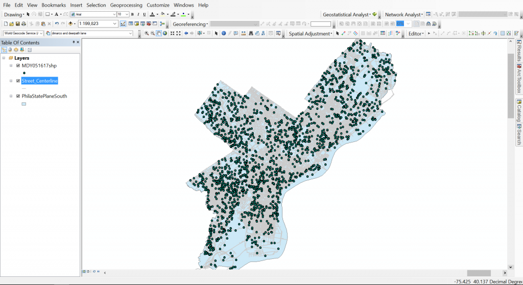
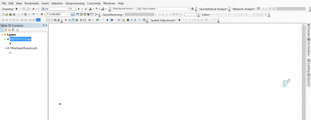
For the Philadelphia Public Health Department, I have been asked to track mosquito trapping results through the past 17 years. The data is submitted to a state website that then testing centers upload results of tests for West Nile and Zika viruses. Luckily, every input into the state website produces and Lat Lon so when pulling the test results, I am easily able to plot the xy’s. A little more difficult of a process is getting the point set on the correct scale and in the right location as the polygon layer. Even though both layers are projected into Philadelphia State Plane South (EPSG: 2272), there is quite a big difference in location and size as you can see in the image below.


So with that, the goal is to move the point set and georeference it to Philadelphia in State Plane South Philadelphia City Limits layer.
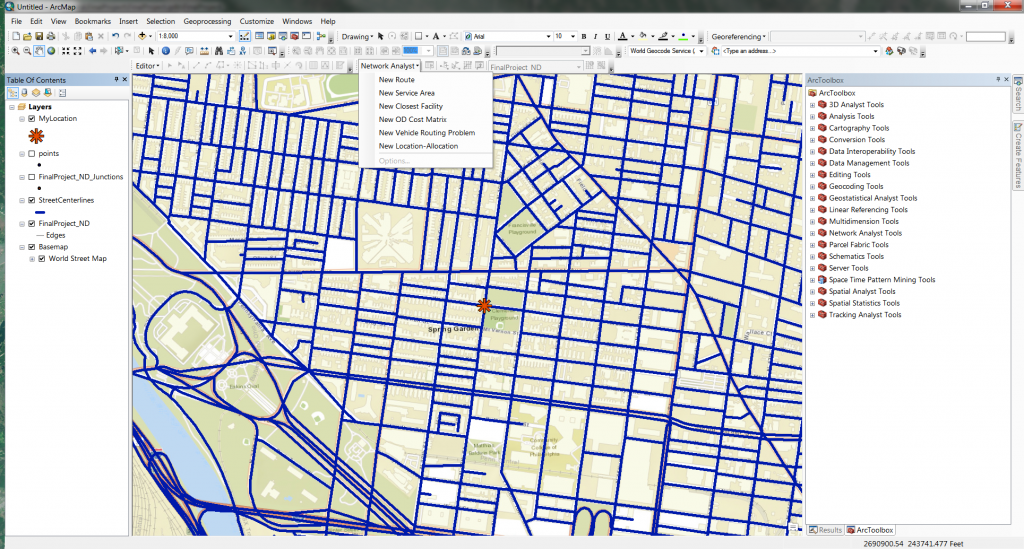
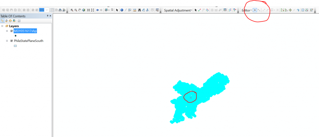
To start this process, you need to be able to edit the point set layer, which you can’t do if you have just plotted the xy’s. You’ll need to export the data as a new shapefile. Once you’ve done that, click on Editor -> Start Editing. If you don’t see Editor, you will have to add the toolbar from the Customize drop-down menu. In Editor, you may need to select the layer you plan on editing, in this case, the point set that was just created. Next, select all points by right-clicking on the layer in the Table of Contents and pressing select all. An X will appear in the center of the points layer and you can grab the entire point set and move it closer to the Philadelphia layer. If you are unable to grab it, it’s because you have to have the editor’s cursor arrow selected like in the image below.


Now it’s time to georeference but using spatial adjustment. If you don’t see this toolbar, you need to select it in the Customize tab. Check your current coordinate system to ensure that you are in the ESPG that you want, in my case, it was 2272.

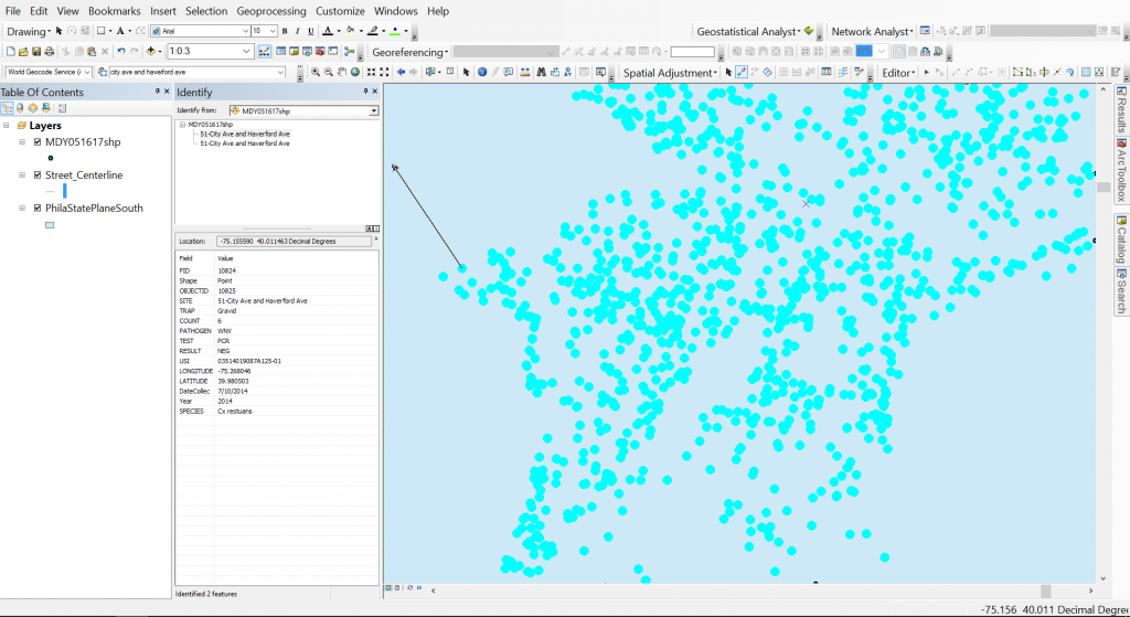
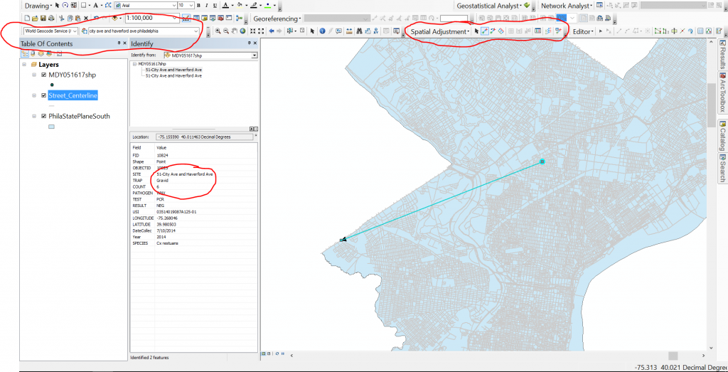
I used the information button to get the cross streets from my data set and then placed the first point for link adjust on that point. After that, I used the world geocoder service that ESRI provides as a basic geocoder to locate that area on the Philadelphia layer and click that exact location to drop the second point. This creates a line that will be used to measure the adjustment needed. The recommendation is to have at least 3 links but I use at least 4. You can see what that looks like below.


During this entire process, you want to make sure that the entire point set it selected. It is not fun to realize you left 2 points way off to the left and you have to start over. Placement of your links are vital to the success of your adjustment. Be sure to scatter them.


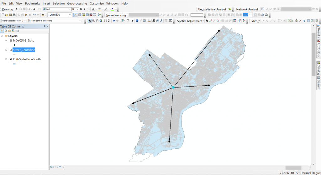
Once you’ve created at least 3 links, click the spatial adjustment drop-down menu and click Adjust. It is as easy as that. Here is the final point set. Make sure to save all your edits in Editor!


Land Classification and Land Use

After the completion of my Geo-referencing tasks (years 1995, 1975, and 1959), I was given the option between more Geo-referencing (1965) or a slightly different route, which consisted of creating a method to classify land types and land uses. If it wasn’t obvious by the title, I chose Geo-referencing 1965…

Land classification is the method of determining what a feature is on imagery purely based on pixel value (pixel value can be interpreted differently depending on the situation). This allows for a colorful rendition and separation, which results in an easy to read and visualize context of where different features are located. Results can vary and are heavily reliant on image quality. The lower quality the image or imagery, the more generalization and inaccuracy of the classifications.

Anyway, land classification can be simple and it can also be quite difficult. If you are using tools that already exist, or software that are built to classify imagery, you can easily begin land classification/land use. If you are using preexisting material it will quickly become a matter of finding the right combination of numbers in order to get the classifications you want. This method is not too difficult, just more tedious in regards to acquiring your result. However, if you approach it from scratch, it will be significantly more engaging. In order to approach it from the bottom up, you have to essentially dissect the process. You have to analyze your imagery, extract pixel values, group the pixel values, combine all of them into a single file, and finally symbolize them based on attribution or pixel value which was recorded earlier. It is much easier said than done.

I am currently approaching the task via already created tools, however if I had a choice in the matter, I would have approached it via the bottom up method and attempted to create it from scratch as there is more learning in that and it is much more appealing to me. Regardless, I am creating info files, or files that contain the numbers, ranges, and classifications I am using to determine good land classifications. In contrast to what I stated earlier, this is quite difficult for me as the imagery is low quality and I am not a fan of continuously typing in ranges until I thread the needle.

The current tool I am using is the reclassify tool that is available through the ESRI suite and it requires the Spatial Analyst extension. This tool allows for the input of a single image, ranges you would like to use to classify the selected image, and output file. After much testing, I am pretty sure there can only be a maximum of 24 classifications (which is probably more than enough). In addition, the tool can be batch ran (as most ESRI tools can be), which means it can be run on multiple images at once. This is a much needed features for many situations, as I presume most times, individuals are not going to classify one image and be done (or at least I am not going to be one and done).

That is an image that was reclassified using the reclassify tool. I am not sure how good of a classification this is as I have not fully grasped the tool yet and every time I give it ranges, it spits out the same generic ranges that I did not input (which is a bit frustrating, but it comes with the territory). I am sure it is human error though and not the tool messing up. I am not sure what the final result is supposed to be, but I will be sure to fill you in once I achieve it (if I ever do…).

Creating a Network Analysis Dataset and Generating a Service Area Layer

Network analysis can be an extremely beneficial tool for any organization which relies on GIS to understand the area it serves. This is particularly true if the organization deals primarily with transportation or the distribution of goods. The network analysis package through ArcGIS allows organizations to gain critical insight into how people and goods move around within their designated service or study area. More specifically, the engineers that I work with at McMahon utilize GIS network analysis to gain enhanced insight on the regions in which they serve as transportation engineers and planners. The baseline method of analysis utilized is creating a service area layer, or series of layers, to gain an understanding of how much distance can be traveled on a road network given a set of parameters.

A Basic Example of a Service Area Layer, With Three Interval Breaks

The first step in creating a service area layer is to create a network dataset. A network dataset is a special type of ESRI dataset, which contains both spatial layers and network layers, as well as custom preferences and parameters to fine tune the output of the network dataset. To create a network dataset, first, download a road network layer that represents the area in which you want to create service areas. Often times, these layers are available from government agencies. For example, all Pennsylvania state and local roads are available on PASDA, provided by PennDOT. Once the streets / roads layer is downloaded, it is important to clip the layer to what you expect you might utilize from the service area analysis. If you choose not to clip the layer, you may find creating and working with the network dataset to be slow and difficult to manage.

You will also need to create a source point file that will represent the location or locations from which the service areas will be generated. You can create the actual points either now or after the network dataset is created, but the point feature class itself needs to be created beforehand. You will also need to create a file geodatabase and feature dataset to store all of these layers and datasets in.

Once the layer is downloaded, clipped, and present in your working directory with the source point file you can create the network dataset. This can be done by right-clicking inside any feature dataset and clicking new > network dataset. A dialog window should appear with options regarding the new network dataset. Name the network dataset and click next. You can leave most of the settings at their default values unless otherwise instructed or if you know the network dataset will be used for purposes in addition to creating a service area. Finally, on the second to last page of options, check the box next to “build service area indexes”. This will speed up the creation of service areas in the future.

Creating a New Network Dataset Inside of a Feature Dataset

Click finish, and you will be asked if you want to build the network dataset. Click Yes. Once the network dataset has been created, open ArcMap and bring the newly created network dataset into the dataframe. When prompted to bring in any associated layers, say yes. Add the Network Analyst toolbar and click “New Service Area” under the Network Analyst dropdown.

Creating a New Service Area with Network Analyst

Click the button directly to the right of the Network Analyst dropdown, to open Network Analyst Window. Here, you can load any origin points (previously created), polygon or line barriers, as well as set options for the service area that is going to be created. You can drag the point layer which contains the origin points into the Facilities group. Clicking the Service Area Properties button (top right corner of the Network Analyst Window) will allow you to set important preferences for the service area that is about to be created. Some of the most useful settings include the accumulation tab, which allows you to track distance and time along the service area, and the analysis settings tab. The analysis settings tab will allow you to set the direction of the service area, as well as any breaks, and to implement a temporal aspect to the service area.

Service Area Properties

Apply any preferences and settings that have changed, and close the service area properties window. When everything is configured as desired, click the Solve button on the network analyst toolbar to run the analysis and create the service area. The analysis can be re-run an infinite number of times, and with the service area index that was created earlier, creating a service area should not take long each time. This way, you can tweak and fine tune the service area quickly and easily until you gain the desired result.

A Service Area Created Using Network Analyst

Understanding Projections: Geo-referencing

Recently I started working on the year 1959, which is currently the last set of images I have to work on.

1959 was a unique set compared to 1975 and 1995 for a few reasons. The first reason being related to the significant difference in development, which is obvious due to how far back in time the images were taken. The second reason is probably common among Geo-referencing projects, but I have not encountered it until this year. The set was split into two types of images: Geo-referenced or projected images and non-referenced or non-projected images. The projected images are similar to the images I have completed in 1975 and 1995, they were already projected to the desired coordinate system and allowed for immediate Geo-referencing. The non-referenced images are a little more difficult.

These images would gray out the toolbar and not allow for any Geo-referencing. At first I was a bit confused, but quickly started brainstorming ideas. My first idea came in the form of projecting them to the same coordinate system as the data frame. Unfortunately, due to the size of the images, projecting these images was impossible on the machine I had (16 GB of RAM). Nearly instantly the tools would fail. However, I thought this had to be the reason, so I continued to experiment with different ways to project the images. The next was to project to an intermediate coordinate system, then proceed to the more advanced system in hopes of reducing the burden, but that also fizzled out. It seems that no matter what system you are coming from (although I don’t fully understand geographic transformations), it attempts to perform the full process. Running out of ideas, I tried one final solution. I thought that perhaps the size of the images were the reason and decided to slim them down by splitting them into eight sections. After creating a few scripts that would split every image, which went smoothly, it approached the projection part of the script and crashed nearly instantly (although it may have lasted slightly longer).


After none of my ideas worked, I decided to restart the computer…and that worked. Even though the images are not the same coordinate system as the data frame, I can still add control points, fit to display, etc. This was a bit frustrating since it was such a simple solution, but the lesson here is that it is best to try the simplest solution before trying the more difficult ideas.

After talking with a few people, the coordinate system should be irrelevant because as soon as you begin Geo-referencing the image should convert to that of the data frame and even that will not matter in the end. Once the images are completed another individual will tether or mosaic them together and assign a coordinate system that way, which will result in the current coordinate system being overwritten.

Understanding Transformations within Geo-referencing: 1st Order and Spline

If you have ever been tasked with a Geo-referencing assignment, you may have heard of transformations. If you have not, or have never worked with Geo-referencing, transformations are essentially different algorithms that will determine how the image you’re Geo-referencing will shift, distort, bend, warp, or be altered. In regards to the ESRI suite’s (version 10.4) use of Geo-referencing, there are eight transformations (there may be more, but I have only been exposed to that offered by ESRI) available to you.

The transformations are as follows:

*In order to ‘unlock’ transformation for use, you need to meet a control point threshold

Zero polynomial – Essentially no image movement, just shifting

Similarity Polynomial – Image will move, but little to no distortion

1st Order Polynomial

2nd Order Polynomial*

3rd Order Polynomial*

Adjust – Significant emphasis on Control Points

Projective Transformation

Spline*


I tend to only use two transformations: 1st Order Polynomial and Spline. I am not an expert on Geo-referencing, so I tend to lean towards the ones I understand more easily. With that being said, those are the two I will discuss in further detail and how I have used them.

1st Order Polynomial:

This is a transformation that is available to the user the moment they start to Geo-reference an image. It requires no set amount of control points and allows for a consistent, but diminishing movement of the image you are working on. This consistency is what I like about this transformation and if you can successfully get an image to line up with your reference image in a few control points, this is the transformation for you.

However, the more control points you add, the less effective this transformation becomes. What I mean by that is within the first 6 control points, your image will shift greatly and begin to quickly line up with your reference, but after that threshold, the shifts become minimal and the amount of control points you have to add to gain the same effect rapidly get out of hand, which leads into the next transformation: Spline.

Spline:

Spline is a transformation that benefits heavily with the amount of control points you have. This transformation requires at least 10 control points be in play before you can even begin using it. It requires a lot of control points because it heavily distorts the images, essentially moving a part of your image exactly to the control point location. This is also a great detriment to the transformation. If you wish to use this transformation, you must place control points everywhere on your image, which can mean anywhere from 50-150+ control points, or else you are prone to having some parts of your image lining up and others being completely off.

Spline is very picky and requires delicate positioning of control points. Because they distort a given area, and you require a lot in order to maximize the effectiveness, you need to be careful with where you place them. If two or more control points are too close to each other, you will witness extreme warping in that location and will likely acquire the opposite effect of what you are looking for (unless you are an art major or artist, then you might find what you want).


To summarize both transformations within a sentence or two, 1st Order is a transformation if you want satisfactory, but not perfect Geo-referencing and you are on a time budget, while Spline is something you should use if you want a perfectly Geo-referenced image and have a lot more time available to you.

This should help transition into my next blog post: Understanding what you want and what you have time for within Geo-referencing.

Gathering Data in the Field with the Collector for ArcGIS App

When I first started working with GIS, I often wondered, where did all of this spatial data come from? As I progressed through my initial undergrad coursework and internship experiences, the answers quickly revealed themselves. Some of the data is created by someone sitting at a desk. Other data is automatically generated as a subset or byproduct of another dataset. A large amount of data, however, is collected on-site, by people in the field.

When I began my first internship I was doing exactly that. Weather permitting, I would be out in the field collecting data with a high-tech, high-end Trimble GPS.

As many of us know, GIS does not typically have the capability or need to achieve survey-grade accuracy. For this reason, it has become an increasingly popular choice to skip purchasing a $10,000 GPS unit and instead purchase an Android tablet or iPad for $1000 or less. This trend has been on the rise ever since powerful tablets with an acceptable battery life for mobile data collection became an affordable option. Because of this, GIS software companies have developed native Android and iOS apps for mobile spatial data collection. There are several apps out there, including free and open source options. Data collection with these native apps can even be performed on a smart phone.

            Two Options for Mobile Data Collection

This post will focus on ESRI’s Collector for ArcGIS app, as it will tie in with the article I wrote two weeks ago detailing how to create and host a dataset in ArcGIS Online tailored for mobile data collection.

Collector for ArcGIS

The Collector app is available on the Google Play store for Android and the App Store for iOS. After downloading the app, login to your organization’s account just as you would on ArcGIS Online. Any webmaps that exist in your organization’s ArcGIS Online account will be visible in the Collector’s main menu.

Collector for ArcGIS Main Menu

Select and open the map that you wish to collect data in. In this case, the Inventory map that was created in the previous blog post. The Collector’s map interface is relatively simple and its capabilities are intuitive and user friendly. Depending on your device, the layout may be slightly different, but the same functionality is present across all device types. Below is a screenshot of the initial Collector window, with a brief outline of what each button does.

  1.  The maps button will return to the main menu.
  2. The find my location button will use your device’s built in GPS to find your location and display it on the map.
  3. The bookmarks button allows for saving of specific locations / map extents as bookmarks. This eliminates the guesswork if you need to quickly reference or jump between two areas.
  4. If you are collecting more than one type of feature, the Layers tool is useful for turning on and off datasets when one type may not be in use.
  5. The search tool works like a Google Maps search, allowing you to search for and zoom to any location on Earth. It can also be configured to search through attribute values for a feature layer in the map.
  6. The measurement tool allows you to measure distances and areas by drawing temporary lines and polygons on the map.
  7. The basemap tool allows you to select and change the basemap. Available basemaps include Topographic, Imagery (and an option to include labels), OpenStreetMap, ESRI Streets, Terrain, and the USGS National Map, among others. You can also create and load a custom basemap if, for example, you have higher resolution imagery available for your study area.
  8. Clicking on or dragging the plus sign to the left will allow for the creation of new features. Feature templates defined in ArcMap or ArcGIS Online will be visible here for any feature layer that is present in the webmap.

Once you’ve familiarized yourself with the tools available in the Collector, you can begin collecting data. Click on or pull the plus sign (point 8) to the left to see templates available for creation. On some versions of the Collector, the location of the feature will automatically be assigned your current location. If this doesn’t automatically begin, you can click the symbol that looks like a person with the find my location target next to it to use your location for the feature. You can also tap any location on the map to set the feature’s location to that point. The Collector also allows you to draw vertices for line and polygon feature layers this way. There is also the capability to “walk” a line or polygon feature, the Collector will drop a verticy at a predefined distance as you walk along a feature until you tell it to stop.

A Feature Collected in the Field

Next, you can begin assigning values to the attributes for that feature. Note that the domain value lists are present for the attributes that you configured to have them. This helps to greatly streamline a collection effort and can cut the time it takes to collect a single feature tremendously. Editing can be done in the field if any mistakes were made, and the progress of the inventory can be seen back at the office in real time as the collection effort occurs in the field.

In the next blog post, I will go further in how to utilize ArcGIS Online’s suite of tools to better represent, share, and understand the data that has been collected.