Using FFmpeg as an Animation Conversion Command Line Tool

Editing maps and doing data analysis, that’s my thing! But when it comes to video editing, I’m a bit out of my league. In addition to that, I have no expensive software that will make things look cool and fun. Or at least I thought I didn’t.

FFmpeg is “a complete, cross-platform solution to record, convert and stream audio and video.” You can download it here. This tool is limitless when it comes to production.

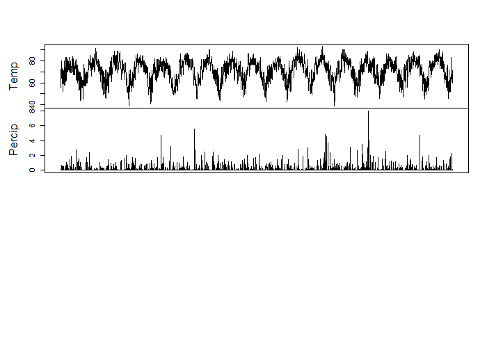
So, working with the time series images that I created from the precipitation data and working with FFmpeg, I was able to create an animation!

You’ll be working in command line window so you need to know where that lives. For me and my Windows 10 computer, it lives here … “C:\Windows\WinSxS\amd64_microsoft-windows-explorer-shortcuts_31bf3856ad364e35_10.0.10586.0_none_443d824ebb4341e2\01 – Command Prompt.lnk” but it may be easier just hitting the windows start button and typing command prompt.

ffmpeg -framerate 24 -i Rplot_%04d.png output.mp4

My images were named Rplot_0001.png. If your image was named img_001.jpeg you would refer to your image as img%03d.jpeg. That took me a few minutes to figure out but after I hit enter, I had a time series precipitation video. I wasn’t very specific in my frame rate but you can be. I received a lot of help from this FFmpeg wiki.

imagestovideo

Plotting Time Series Graphs for Animation with MapMate Package in R

Animations can be a little tough to create but luckily, Matthew Leonawicz has created a package for R that plots and saves images easily called MapMate. The map portion of the package I have yet to master, as it is globe based and my project was to map a static city. But the time series climate data of precipitation that I collected from The National Oceanic and Atmospheric Administration Department of Commerce was a great project to produce an animation.

Needed for the images to save is ImageMagick which is a free download.

The first step to creating an animation was to make a sequential numeric column named FrameID for the order of plotting. The next step was to identify the x limits and the y limits.

climate1 <- climate
climate1$FrameID <- 1:nrow(climate1)                  
xlim <- range(climate1$Date)
ylim <- range(climate1$Percip)
save_ts(climate1, x = "Date", y = "Percip", id = "FrameID", col = "grey",
         xlm = xlim, ylm = ylim, dir = "C:/Users/tuf29742/Documents/Vector Control/Animation/")

With x as the date and the y as the precipitation, and a specified location for the images to be saved, this image creator took roughly 30 minutes to produce 3,159 images for animation. Below are just 5 images from the package capture.

These images could now be used in a video editor to create an animation. I would check out Matt’s MapMate Instructional Page for more fun with animation!

Working with Time Series Data in R

Time series analysis is very useful in economics but I have been using it in my studies of mosquitoes and climate change in environmental health. The relationship that I am examining is whether or not the climate change had any effect on increased mosquito quantity within trapping areas over 17+ years. The first step of that process is to see if there was a change in climate over the 17+ years that match the mosquito collection data.

The mosquito season starts in May and ends in October, and it is common for field workers to set traps every Monday through Thursday, leave them for 24 hours and then collect the traps to have the mosquitoes tested. So, all precipitation and temperature data was collected from The National Oceanic and Atmospheric Administration Department of Commerce.

Working within R and using the Stats package, I was able to transform the dataframe into a time series class and visualize over time.

library(stats)print(climate)
class(climate)
length(climate)

Results :

print(climate)
Temp Percip       Date       time
1      55   0.00   5/1/2000 2000-05-01
2      59   0.09   5/2/2000 2000-05-02
3      60   0.00   5/3/2000 2000-05-03
...
class(climate)
[1] "tbl_df"     "tbl"        "data.frame"
length(climate)
[1] 4

Now, we transform the dataframe to a ts object

climatets <- ts(climate, start = 1, frequency = 1)
print(climatets)
length(climatets)

Results :

> climatets <- ts(climate, start = 1, frequency = 1) Warning message: In data.matrix(data) : NAs introduced by coercion
print(climatets)
Time Series:
Start = 1
End = 3159
Frequency = 1
Temp Percip Date
1   55   0.00   NA
2   59   0.09   NA
3   60   0.00   NA
...
length(climatets)
[1] 12636
plot(climatets)


It is common for string dates to be eliminated in the time series transformation. If you would like to keep them for labeling purposes, I would investigate ?as.POSIXlt() for date time numeric conversion.

You can see that there is a slight upward trend in temperature over the 17+ years. But for the most part, the climate over the 17 years doesn’t change much in trend. Which tells me that if there has been an increase in mosquito quantity at trapping sites, it may not be connected to temperature.

This way of visualizing data is essential in making predictive modeling and recognizing trends.

Using Spatial Adjustment for Georeferencing Mosquito Point Data in ArcMap

For the Philadelphia Public Health Department, I have been asked to track mosquito trapping results through the past 17 years. The data is submitted to a state website that then testing centers upload results of tests for West Nile and Zika viruses. Luckily, every input into the state website produces and Lat Lon so when pulling the test results, I am easily able to plot the xy’s. A little more difficult of a process is getting the point set on the correct scale and in the right location as the polygon layer. Even though both layers are projected into Philadelphia State Plane South (EPSG: 2272), there is quite a big difference in location and size as you can see in the image below.


So with that, the goal is to move the point set and georeference it to Philadelphia in State Plane South Philadelphia City Limits layer.
To start this process, you need to be able to edit the point set layer, which you can’t do if you have just plotted the xy’s. You’ll need to export the data as a new shapefile. Once you’ve done that, click on Editor -> Start Editing. If you don’t see Editor, you will have to add the toolbar from the Customize drop-down menu. In Editor, you may need to select the layer you plan on editing, in this case, the point set that was just created. Next, select all points by right-clicking on the layer in the Table of Contents and pressing select all. An X will appear in the center of the points layer and you can grab the entire point set and move it closer to the Philadelphia layer. If you are unable to grab it, it’s because you have to have the editor’s cursor arrow selected like in the image below.


Now it’s time to georeference but using spatial adjustment. If you don’t see this toolbar, you need to select it in the Customize tab. Check your current coordinate system to ensure that you are in the ESPG that you want, in my case, it was 2272.

I used the information button to get the cross streets from my data set and then placed the first point for link adjust on that point. After that, I used the world geocoder service that ESRI provides as a basic geocoder to locate that area on the Philadelphia layer and click that exact location to drop the second point. This creates a line that will be used to measure the adjustment needed. The recommendation is to have at least 3 links but I use at least 4. You can see what that looks like below.


During thisĀ entire process, you want to make sure that the entire point set it selected. It is not fun to realize you left 2 points way off to the left and you have to start over. Placement of your links are vital to the success of your adjustment. Be sure to scatter them.


Once you’ve created at least 3 links, click the spatial adjustment drop-down menu and click Adjust. It is as easy as that. Here is the final point set. Make sure to save all your edits in Editor!