Using FFmpeg as an Animation Conversion Command Line Tool

Editing maps and doing data analysis, that’s my thing! But when it comes to video editing, I’m a bit out of my league. In addition to that, I have no expensive software that will make things look cool and fun. Or at least I thought I didn’t.

FFmpeg is “a complete, cross-platform solution to record, convert and stream audio and video.” You can download it here. This tool is limitless when it comes to production.

So, working with the time series images that I created from the precipitation data and working with FFmpeg, I was able to create an animation!

You’ll be working in command line window so you need to know where that lives. For me and my Windows 10 computer, it lives here … “C:\Windows\WinSxS\amd64_microsoft-windows-explorer-shortcuts_31bf3856ad364e35_10.0.10586.0_none_443d824ebb4341e2\01 – Command Prompt.lnk” but it may be easier just hitting the windows start button and typing command prompt.

ffmpeg -framerate 24 -i Rplot_%04d.png output.mp4

My images were named Rplot_0001.png. If your image was named img_001.jpeg you would refer to your image as img%03d.jpeg. That took me a few minutes to figure out but after I hit enter, I had a time series precipitation video. I wasn’t very specific in my frame rate but you can be. I received a lot of help from this FFmpeg wiki.

imagestovideo

Plotting Time Series Graphs for Animation with MapMate Package in R

Animations can be a little tough to create but luckily, Matthew Leonawicz has created a package for R that plots and saves images easily called MapMate. The map portion of the package I have yet to master, as it is globe based and my project was to map a static city. But the time series climate data of precipitation that I collected from The National Oceanic and Atmospheric Administration Department of Commerce was a great project to produce an animation.

Needed for the images to save is ImageMagick which is a free download.

The first step to creating an animation was to make a sequential numeric column named FrameID for the order of plotting. The next step was to identify the x limits and the y limits.

climate1 <- climate
climate1$FrameID <- 1:nrow(climate1)                  
xlim <- range(climate1$Date)
ylim <- range(climate1$Percip)
save_ts(climate1, x = "Date", y = "Percip", id = "FrameID", col = "grey",
         xlm = xlim, ylm = ylim, dir = "C:/Users/tuf29742/Documents/Vector Control/Animation/")

With x as the date and the y as the precipitation, and a specified location for the images to be saved, this image creator took roughly 30 minutes to produce 3,159 images for animation. Below are just 5 images from the package capture.

These images could now be used in a video editor to create an animation. I would check out Matt’s MapMate Instructional Page for more fun with animation!

Working with Time Series Data in R

Time series analysis is very useful in economics but I have been using it in my studies of mosquitoes and climate change in environmental health. The relationship that I am examining is whether or not the climate change had any effect on increased mosquito quantity within trapping areas over 17+ years. The first step of that process is to see if there was a change in climate over the 17+ years that match the mosquito collection data.

The mosquito season starts in May and ends in October, and it is common for field workers to set traps every Monday through Thursday, leave them for 24 hours and then collect the traps to have the mosquitoes tested. So, all precipitation and temperature data was collected from The National Oceanic and Atmospheric Administration Department of Commerce.

Working within R and using the Stats package, I was able to transform the dataframe into a time series class and visualize over time.

library(stats)print(climate)
class(climate)
length(climate)

Results :

print(climate)
Temp Percip       Date       time
1      55   0.00   5/1/2000 2000-05-01
2      59   0.09   5/2/2000 2000-05-02
3      60   0.00   5/3/2000 2000-05-03
...
class(climate)
[1] "tbl_df"     "tbl"        "data.frame"
length(climate)
[1] 4

Now, we transform the dataframe to a ts object

climatets <- ts(climate, start = 1, frequency = 1)
print(climatets)
length(climatets)

Results :

> climatets <- ts(climate, start = 1, frequency = 1) Warning message: In data.matrix(data) : NAs introduced by coercion
print(climatets)
Time Series:
Start = 1
End = 3159
Frequency = 1
Temp Percip Date
1   55   0.00   NA
2   59   0.09   NA
3   60   0.00   NA
...
length(climatets)
[1] 12636
plot(climatets)


It is common for string dates to be eliminated in the time series transformation. If you would like to keep them for labeling purposes, I would investigate ?as.POSIXlt() for date time numeric conversion.

You can see that there is a slight upward trend in temperature over the 17+ years. But for the most part, the climate over the 17 years doesn’t change much in trend. Which tells me that if there has been an increase in mosquito quantity at trapping sites, it may not be connected to temperature.

This way of visualizing data is essential in making predictive modeling and recognizing trends.

Alternative Graphics Editor

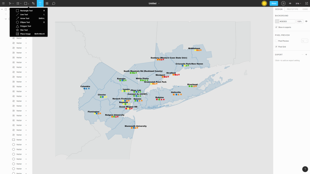
As someone that is about to lose access to my Temple sponsored software one of the things I’m going to miss the most is Adobe Illustrator (AI). The Cartographic Design requirement for the PSM in GIS really made it clear how a few simple image adjustments using a program like Illustrator can make a map product exported from ArcGIS or QGIS look thousands of times better. Luckily while attending a recent Technical Workshop at Azavea one of the lightning talks was about improving product visualization. The speaker Jeff Frankl, User Experience Designer at Azavea demonstrated Figma.com, an online alternative to AI. Currently Figma is free to use as an individual, with the ability to have three active projects stored for 30 days. The user interface is very similar to AI, but if you’re new to both programs there are plenty of instructional videos, the major difference being that Figma projects can be shared online and worked on collaboratively.

There are also plenty of other free or low cost design products like Inkspace and GIMP there is a pretty thorough list available at this link.


Adding Citations to R Markdown

Versions of this blog entry are available as an HTML page, PDF and a text file containing the info from the Rmd file.  If you download the text file and save it with an .Rmd extension you will be able to create this document in R Markdown and edit it to fit your report requirements.

Abstract

Putting this section in between asterisks prints it out in italics. This blog goes shows you how to add citations to an Rmarkdown document.

Introduction

Adding citations is an important part of any complete document, this blog in addition to the previous entry about setting up an R markdown document should hopefully get you started.

Methods

  • Create a new R markdown document and save it with the file extension .Rmd to your working directory, which should be set somewhere convenient as you need to save other files to this location. Delete everything in that file but the info at the top in between the set of three dashes. Add a new line to that section ‘bibliography: bibliography.bib’.
  • You will need to save the references as a .bib file. Luckily for most items available from the Temple University Library system most journals and other items have an ‘Export citation’ look for something that says .bib or BibTex.
  • Save those files and open a new text file named bibliography.bib in your working directory, copy the data from the library file to your bibliography file. Example here
  • The format to create your own .bib file is written up very clearly here  if you can’t get the completed file from your source library.
  • In your text if you want to cite something just use the @ sign and brackets to wrap the name of the reference from the first line of the .bib data. This usually is just the author’s name underscore year.
  • For example writing [see @R_Core_Team_2017] produces (see R Core Team 2017)
  • Or just write @R_Core_Team_2017 so the text appears as part of the docume nt like this: as noted in R Core Team (2017)
  • References will show up at the bottom of your document after last text entry, so add a header and you’re done!

As an extra bonus R Studio has a spell-checking function- just hit F7

References

Osborne, Martin J. 2008. “Using Bibtex: A Short Guide.” https://www.economics.utoronto.ca/osborne/latex/BIBTEX.HTM.

R Core Team. 2017. R: A Language and Environment for Statistical Computing. Vienna, Austria: R
Foundation for Statistical Computing. https://www.R-project.org/.