A short list of a city’s physical elements may include: buildings, streets, public spaces, and the natural landscape. All contribute something to a place’s geographical character, but, in urban environments the scale, concentration, and sheer number of buildings allow the architectural element to achieve visual and spatial dominance, a condition that imbues architecture with particular power over the physical orientation of individuals moving through the cityscape. However, once urban entities are translated into cartographic form, the street grid supersedes as the prominent navigational element—an argument supported by the default zoom level of both Google Maps and OpenStreetMap. Building polygons are not yet visible, space is explained with densely nested hierarchical ribbons of asphalt. But what happens when these familiar elements are stripped from the urban map? Are there other physical elements that can express the presence and characteristics of a metropolis? Natural features like mountains or rivers may be enough to orient the acquainted viewer, but for the unfamiliar, for example, the confluence of the Schuylkill and Delaware Rivers does little to impart that there are 1.5 million people living in between.
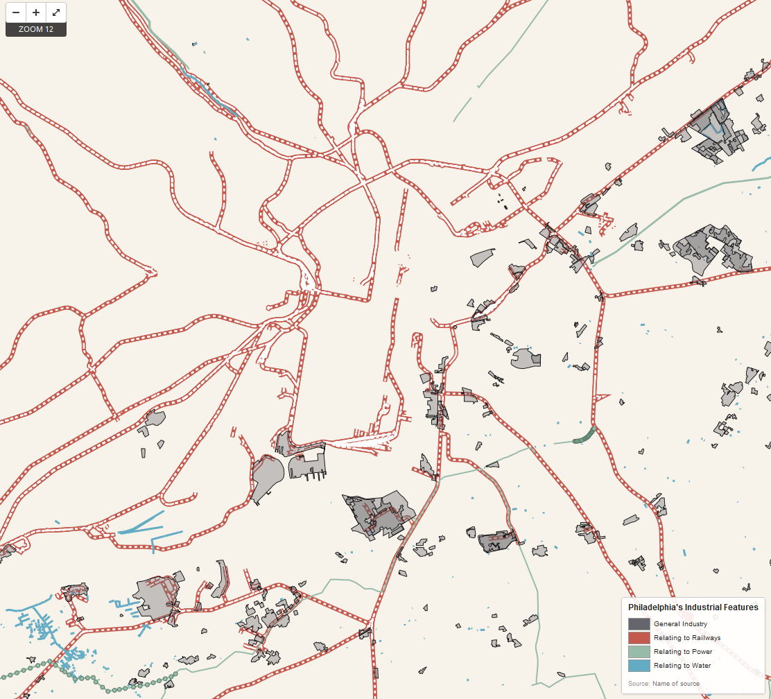
The industrial elements of Philadelphia—power lines, railways, power plants—were mapped using data from OpenStreetMap (download from Metro Extracts, http://metro.teczno.com/) and referenced against the accompanying OSM wiki. OpenStreetMap is entirely volunteered geographic information, yielding some interesting insights about what exactly the public feels compelled to map. Features were styled using CartoCSS in TileMill. The terms industrial and utility were taken to mean any structures or conduits that help facilitate general commercial activity, but are generally not directly accessed by the general public. For example, individuals among the general public access electricity but do not come into direct contact with power lines, thus power lines are an industrial/utility feature. An exception to this rule was the inclusion of railways, which serve to move both freight and the general public. They were included because 1.) While both Google Maps and OpenStreetMap demarcate railways, they are clearly secondary to roadways in visual hierarchy, 2.) Because unlike roadways, the general public is unable to make navigational choices or even see an unobstructed view along these routes and so are less likely to be able to conceive railways in their entirety, and 3.) The great dependence of manufacturing and industrial activity on rail systems. Though freight often moves along highways, roads were not included for the first two reasons listed in the last sentence; this is a cartographic exercise in removing the two most familiar means of urban cartographic orientation. Four categories of features were styled relating to general industry (factories, industrial land use, storage tanks), railways (railroads, railyards, train stations, and excepting subway or monorail lines which move people not freight), power (power cables, power lines, electrical poles, portals), and water (pipelines, canals, piers, drains, ditches).
Mapped, the city’s industrial underbelly clearly offers suggestions of Philadelphia’s scale and regional relationships. Cities are intense agglomerations of human effort and material exchange. These industrial underpinnings are the conduit of that interchange. Rail lines radiate from the city’s center, but also show a distinct southwest to northeast direction, suggestive of Philadelphia’s regional context in the country’s northwest urban corridor from Washington, D.C. to Boston. Industrial buildings and land uses also follow the same diagonal pattern, reiterating the interstates that connect Philadelphia with the other regional metros. Railways visually dominate the map, perhaps because the public, who volunteered the data, interacts most frequently with this industrial feature. Interestingly, power lines and poles radiate into Philadelphia, but disappear in the city’s actual confines, their ubiquity is superseded by the cacophony of other forms.