Using R Markdown to Create Reports

Intro

Using R and Rstudio along with the R Markdown package allows you to produce documents in markdown that can be easily converted to MS Word, PDF, or saved as an HTML file that can be hosted as a website. The R Markdown file can contain just text like simple written report or a much more complex document with embedded R code to create charts, graphs, maps, or any other plot that can be produced using R. The text plots and formatting can all be created in a single document with a streamlined workflow. Instead of producing charts, tables, and graphs in MS Excel, and then placing those items in the text of a Word document, and then adding any other images (maps etc.) all that work can be completed in one place. If the report is required to be replicated with new data, it is simple to update the data rerun the code and produce a new version of the document.

Important links

The following preliminary steps should be taken before proceeding.
Download and install:
R https://cran.r-project.org/bin/windows/base/.
RSTUDIO https://www.rstudio.com/products/rstudio/download/#download.
To produce PDF documents you may also have to download and install pandoc, which is available here.

Package Installation

In the tools menu of RStudio click ‘Install packages’ and type Rmarkdown, make sure that the ‘install dependencies’ box is checked, that will also install some other important packages, including knitr.

For reference you can download the most recent Rmarkdown cheat sheet by navigating to the help menu and selecting the appropriate file under cheatsheets.

Once all of that is completed go to the file tab in RStudio and select new file -> R Markdown fill out the boxes and click okay on the window that pops up, that info can be updated later.

Save the new document that R Studio opens somewhere convenient and make sure the file ends in “.Rmd” (the case is very important here).

See the slightly darker bands? Those are called ‘code chunks’ within each chunk you can select various options via the gear symbol such as: to display the R code, to run and display the code, to not run or display code (this is used when you want to set up for an action completed later -like call a library), show or hide warnings in your final document etc.

The other sections are where you place your text. The text is formatted using the Pandoc format (summarized on the cheatsheet) which shows up after create the in your desired format. A # means Header size 1 and two spaces creates a paragraph break etc. You can play with the formatting of the sample page, add text and format a few lines to see how they come out.

Then select the small pull down at the top of the Source panel (where your new document appeared) that says Knitr and looks like a ball of yarn -there are options to Knit to HTML, PDF or Word,

From the Rmarkdown cheatsheet:
When you render, R Markdown
1. runs the R code, embeds results and text into .md file with knitr
2. then converts the .md file into the finished format with pandoc

Running R Code

Here is a flow chart of the R Markdown process which was included to show how to include plot made by the R code:

```{r, echo=TRUE}
DiagrammeR::DiagrammeR("graph LR;
 A(Rmd)-->B((knitr)); 
 B-->C{pandoc};
 C-->D>HTML];
 C-->E>PDF];
 C-->F>Word];")
 C-->F>Word];")
```

As far as I can tell WordPress does not allow for directly loading a .md file so versions of this blog entry are available as an HTML page, PDF and a text file containing the info from the Rmd file.

Flow charts in R using DiagrammeR

This is really short but I was really excited to share this info. When I was trying to find a way to create a flow chart in R I started with a few different packages that required a huge amount of prep work  before plotting a flow chart, and then I found the magical DiagrammeR  package.

It really should be more difficult:

library(DiagrammeR)
DiagrammeR("graph LR;
           A-->B;
           B-->C;
           B-->D")

Creates this:

Pretty cool, Right?

By assigning each letter you can update the flow direction, text and shape

DiagrammeR("graph TB;
    A(Rounded)-->B[Squared];
    B---C{Rhombus!};
    C-->D>flag shape];
    C-->E((Circle));")

Creates this:

Notice that after graph it says TB (top bottom) vs LR, Text can be added, type of brackets dictate the output shape and — vs –> makes a line instead of an arrow.

This package is really impressive and the documentation has some  very interesting images of very complicated graphs and flow charts, this image was made using the example provided in the package instructions.

Address Locating Trees in Philadelphia Neighborhoods

This final PHS project sought to create an address locator that would move points from the center of a parcel to just outside it. These points were to represent neighborhood trees. The process was completed and managed using address locator tools in ArcMap. Please refer to the image at the end for reference to the project results.

  1. First navigate in ArcToolbox to the following tool: Geocoding Tools/Create Address Locator
  2. Input the following information and create the geocoders:
    1. Parcels:
      1. Address Locator Style: General- Single Field
      2. Reference Data: City of Philadelphia PWD Parcels
      3. Key Field: ADDRESS
      4. Name: Parcels
    2. Streets:
      1. Address Locator Style: US- Dual Ranges
      2. Reference Data: Philadelphia Street Centerline
      3. Key Fields will fill in automatically
      4. Name: Streets
  3. Editing the Street Geocoder for Accuracy:
    1. Once the Street geocoder is created right click on the tool in ArcCatalog
    2. Navigate to the properties
    3. Open the ‘Geocoding Options window
    4. Set ‘Side Offest’ to 25 feet.
    5. Apply changes and close the window
  4. Navigate to the following tool: Geocoding Tools/Geocode Addresses
  5. Input the following information to create geocoded points for trees using parcels:
    1. Input Table: Trees
    2. Input Address Locator: Parcels
    3. Input Address Fields: Key Field: ADDRESS
    4. Name: Trees_parcels
  6. Navigate to the following tool: Geocoding Tools/Reverse Geocode
  7. Input the following information to create final points using the street geocoder:
    1. Input Features: Trees_parcels
    2. Input Address Locator: Streets
    3. Output Feature Class: Final_trees

R Shiny –Task: create an input select box that is dependent on a previous input choice.

The R shiny package is impressive, it gives you the power of R, plus any number of packages, and in combination with your data allows you to create a personalized web application without having to know any JavaScript. There are endless possibilities of display options, add-on widgets, and visualization possibilities. While working on another project I ran into a really simple problem that took way too long solve. I watched innumerable tutorials and read up on the documentation, but for some reason I could not get an input selector to display reactive data based on a previously selected input. The ability to narrow down an input is something that is encountered on websites daily when entering address fields- Enter Country; which drives the next pull-down menu to offer up a list of States, but it took a while to make it for me to get to work in a Shiny app.

In order to make someone’s life a bit easier here is an example that I cobbled together that offers up county names based on the State selected, here for brevity’s sake the example uses a table created in the R code that only includes Delaware and Rhode Island- no extra data is needed to be downloaded. As a bonus I added a plot output using the “maps” package to highlight the selected county. There is code to install the “map” package, the assumption is being made that if you’re this far the “shiny” package is already installed and you are doing all of this through RStudio.

In RStudio paste the following code into a new file and name that file app.R so that RStudio recognizes it as a shiny app, as a best practice save it in a new folder that does not have any other files in it. Once saved as app.R the “Run” button at the top of the console should now say “Run App”. Click the “Run App” button and the app should load in a new window.

Breakdown of the file:
Section 1: runs once before the app is created and establishes the data in the app- could use this to upload a file, but in this example the datatable is created here.

Section 2: User interface(UI): this section sets up the appearance of the app, in this example the most important part was calling the input selectboxes using the “htmlOutput()” call that grabs information from the next section.

Section 3: Server: The “output$state_selector” uses the “renderUI()” call to utilize the “selectInput()” parameters set up the appearance and data in the state select input box of the UI. The second similar call “output$county_selector” uses the data from the state_selector call to filter the datatable and then this filtered data (now named “data_available”) is called by the second selectInput() command. Notice that each of the selectInput calls are wrapped in their own renderUI call. The last bit“output$plot1”, uses the info from the previous calls to display a map highlighting the selected county using the “renderPlot() call.

Section 4: make sure this is the last line of code in your file.

The following code is extensively commented, and should allow you to reuse as needed.

#install.packages( "maps", dependencies = TRUE) #run this to install R package maps
 ################################- warning this will update existing packages if already installed

#*save the following code in a file named app.R *
 library(shiny)
 library(maps)

##Section 1 ____________________________________________________
 #load your data or create a data table as follows:
 countyData = read.table(
 text = "State County
 Delaware Kent
 Delaware 'New Castle'
 Delaware Sussex
 'Rhode Island' Bristol
 'Rhode Island' Kent
 'Rhode Island' Newport
 'Rhode Island' Providence
 'Rhode Island' Washington",
 header = TRUE, stringsAsFactors = FALSE)

##Section 2 ____________________________________________________
 #set up the user interface
 ui = shinyUI(
 fluidPage( #allows layout to fill browser window
 titlePanel("Reactive select input boxes"),
 #adds a title to page and browser tab
 #-use "title = 'tab name'" to name browser tab
 sidebarPanel( #designates location of following items
 htmlOutput("state_selector"),#add selectinput boxs
 htmlOutput("county_selector")# from objects created in server
 ),

mainPanel(
 plotOutput("plot1") #put plot item in main area
           )
       ) )


 ##Section 3 ____________________________________________________
 #server controls what is displayed by the user interface
 server = shinyServer(function(input, output) {
 #creates logic behind ui outputs ** pay attention to letter case in names

output$state_selector = renderUI({ #creates State select box object called in ui
 selectInput(inputId = "state", #name of input
 label = "State:", #label displayed in ui
 choices = as.character(unique(countyData$State)),
 # calls unique values from the State column in the previously created table
 selected = "Delaware") #default choice (not required)
 })
 output$county_selector = renderUI({#creates County select box object called in ui

data_available = countyData[countyData$State == input$state, "County"]
 #creates a reactive list of available counties based on the State selection made

selectInput(inputId = "county", #name of input
 label = "County:", #label displayed in ui
 choices = unique(data_available), #calls list of available counties
 selected = unique(data_available)[1])
 })

output$plot1 = renderPlot({ #creates a the plot to go in the mainPanel
 map('county', region = input$state)
 #uses the map function based on the state selected
 map('county', region =paste(input$state,input$county, sep=','),
 add = T, fill = T, col = 'red')
 #adds plot of the selected county filled in red
 })
 })#close the shinyServer

##Section 4____________________________________________________
 shinyApp(ui = ui, server = server) #need this if combining ui and server into one file.


See the wonder live at shinyapps.io

Mapping Alan Lomax’s Southern Journey (Web Map)

Map Link

Legendary folklorist Alan Lomax is celebrated for both the size and variety of his astounding collection. An esteemed ethnomusicologist, Lomax has cataloged the sounds of nearly 1,000 cultural groups from around the world, often giving voice to the poor or marginalized that wouldn’t be included on any record or in any museum. 

Lomax amassed a great deal of his most famous material during two trips to the American South in 1959 and 1960. During these trips, Lomax and his companion Shirley Collins wandered from Virginia to Mississippi with windows open listening for the voices of singers and musicians to interview, record, and photograph. Unbelievably, these trips resulted in the first stereo field recordings made in the South.

This story map offers a geographic visualization of these seminal trips for Southern American music. The map data was collected directly from the Lomax Family Collections at the American Folklife Center, part at the Library of Congress. This collection consists of more than 100 individual collections and includes 700 linear feet of manuscripts, 10,000 sound recordings,6,000 graphic images, and 6,000 moving images. Astoundingly, none of the material in the entire Lomax Collection contains any maps. Furthermore, the book “The Southern Journey of Alan Lomax: Word, Photographs, and Music” was used for supplemental information, as it offers more of a narrative story ­based structure than the abundance of documents in the Lomax Archive. 

The ten musicians for the map were selected because of their popularity in American Southern music as well as their variety of geography and musical genre.These musicians were also included in the first CD that Lomax put out of his recordings from these trips, which were used for the music on the story map as well.

This story map successfully synthesizes multiple forms of media to show the viewer when, where, and who Alan recorded all during his iconic Southern Journey. Furthermore, the story map offers some unique insights into the spatial relationship between places on Lomax’s journey. For example, as you move out west there is a noticeable change in the tempo and style of the music. The music of Fred McDowell, Vera Ward Hall, and the prisoners at the Mississippi State Penitentiary in the Western portion of the map sounds much slower and drawn out than the more energetic sounds of Eastern musicians Bessie Jones, Wade Ward, and the Union Choir of the Church of God and Saints of Christ.

This map also successfully conceptualizes the nonlinear, meandering nature of the journey and helps pinpoint locations such as Northwestern Mississippi, Western Virginia, and around Norfolk, Virginia, where Lomax unearthed a hotbed of talented musicians that are now among the most important in American Southern music.

Using SQL to Manage Parcel Subdivisions

Managing a municipality’s parcel dataset can be a full-time job, depending on several factors including the size of the municipality and the nature of growth in that municipality. For example, an up-to-date parcel dataset will include the most recent information about several potentially regularly changing attributes, such as who owns the property, and what kind of taxes are owed by the owner. Not only is the attribution of the parcel dataset changing on a regular basis, but the geometry that represents the boundaries of each parcel can also change. One of the most common causes of a change in parcel geometry is a subdivision.

Take, for example, a parcel representing a large farm. If the farm is sold to a development company, it is unlikely that the purchasing company will retain the property as a single land entity. They are likely going to build several houses on the property, divide the property into plots for each home, and sell the plots one by one to new homeowners. Not only do new attribute records need to be kept for each new parcel, but new geometries need to be drawn and the original geometry needs to be modified to reflect its new boundary. Often times the leftover areas of the original parcel will represent common areas, such as parks, playgrounds, or streets.

Fortunately, if you are managing data in a desktop GIS environment, there are several tools at your disposal that will allow you to create new polygons and cut out their footprints from the original polygons. However, if your data is hosted in a spatial database, you may not have the tools at your disposal to do this. The following SQL script was written for this exact function, assuming that you already have the footprints of the subdivided parcels created, and you need to update the geometry of the original parcel to reflect the subdivisions that have been removed. The script discussed below was written for Microsoft SQL Server (T-SQL), however, the common principals can be applied to many other versions of SQL. Below is the full script, followed by a walkthrough of important steps in the code and what they do.

SQL script used to cut several polygon geometries out of a single, source polygon

The script does the following:

  1. Predefines the original parcel’s geometry record ID that you wish to modify.
  2. Select’s the spatial record based off of a list of ID’s provided (representing the geometries of new parcel created, to be clipped out of the original parcel) and passes those records into a cursor.
  3. Within the cursor, the geometry of the first record is selected.
  4. Next, all other geometries are unioned together.
  5. Once the cursor has completed unioning new parcel geometries, the original parcel’s location record is selected.
  6. Finally, the original parcel’s geometry is updated, using STDifference to remove the unioned parcels’ geometries from the original parcel’s geometry.

The result of running the SQL script to cut a single polygon by the union of several other polygons.

After running the script on a sample of data, the result can be seen above. The light blue outline represents the original polygon, while the smaller light green parcels represent the new subdivisions.

Developing Routes for Groups of Land Maintenance Sites

Over the past eight weeks, I have been working for PHS for my capstone project. As many may have seen my updates on this site. The project has pretty much come to an end and been troubleshot! Because of this, I have taken on a few additional projects that I will post about. This project, sought to find an easy way to create a route that we could give to contractors instead of just a bunch of addresses that they would have to sort through themselves. In an effort to do this, I utilized Network Analyst in ArcMap as the team is familiar with the tools and their functionality. Below, I have included the step by step guide that I gave to the team for the future as well as a few pictures of the outcome!

Each route will be designated by pre-defined groups of sites if they exist for the data that is being managed. This tutorial will use the Maintenance Only (MO) Reentry Site Shapefile as an example.

  1. Navigate to and add the following shapefiles to ArcMap:
    1. “U:\PhiladelphiaLandCare2\06_AllCurrentYearWork\2017\Shapefiles\MO_Reentry_parcels2017_ACYW.shp”
    2. “U:\02_External_data\Streets\Phila\Phila_Street_Centerline_ND.nd”
  1. Enable the ‘Network Analyst’ toolbar under the Customization tab on the top left of ArcMap. You may need to go to the extensions tab, also under Customization and enable Network Analyst as well. This is only necessary if you have never used Network Analyst before.
  2. Once we have enabled the toolbar, it should pop-up in the middle of the ArcMap window. This is okay, but feel free to move it if you are bothered. Look around the tool and get a feel for the set-up. Be sure to enable the ‘Network Analyst Window’ as we will take advantage of this in later steps. This is the first icon from the left.
  3. Next, using the dropdown menu in Network Analyst, select ‘New Route’. This will add a series of empty layers to both the Analyst Window and the Table of Contents.
  4. We will next add the points or ‘Stops’ as the route generator calls them to the Analyst Window. Before we can do this, we will need centroids of our sites we are routing.
    1. To begin, navigate to the attribute table of the MO parcels shapefile. Add two fields with the following names with the field type as ‘double’: x_coord and y_coord.
    2. Next, right click on the name of the field in the attribute table. Navigate to ‘Calculate Geometry’. Click next until you get to the main window. Here set the geometry we are calculating to the respective centroid field (x_coord calculates ‘X Coordinate of Centroid’). Repeat this with the other coordinate.
    3. Export the attribute table as a ‘.dbf’ to your workspace. Add the table to the map image.
    4. Right click on the table in the table of contents. Navigate to ‘Display XY Data’. Here, set X = x_coord and Y = y_coord. Click okay. You should now see centroids for all the MO sites in Philadelphia County.
    5. Export the table to your working folder and add the shapefile to the map. This will be our centroid shapefile for the remainder of the assignment.
  5. Next, we will add the centroids to Network Analyst as ‘Stops’. To do this, right click on ‘Stops’ in the Network Analyst Window on the far left of your screen. Navigate to ‘Load Locations’. Set the ‘Sort Field’ and ‘RouteName’ to the grouping factor. For many shapefiles, this will be ‘Group’ or ‘Group_Number’. In this shapefile, the grouping factor is ‘Contractor’. Leave all other factors as they are. Once this is done, click okay. The loading may take a moment.
  6. Now we will make the routes. To do this, go back to the Network Analyst Toolbar and click on the small button labeled ‘Solve Network’. Be patient as this may take a bit of time again.
  7. A series of routes should now be visible for reach of the contractors or groups that we based our breaks on or ‘Sort Field’. To see where the stops are along the routes, select the ‘Network Directions’ button, again on the Toolbar. Each route will be displayed with the stops along the routes and the address of each site. Export this table as you see fit, as these are your results. Be patient working through this as there are many sites run through each time.
    1. Note: It may work to partition the sites into smaller shapefiles before the Solve is run. This would occur via a ‘Select by Attribute’ for the group or groups in question, then perform steps 6 – 8 for each individual group. This would be tedious to select each group, but could speed up processing slightly without coding the process externally.
  8. Each route can be exported individually by right clicking it in the Network Analyst Window and selecting export. If the entire shapefile is exported at once, each route will be combined into one. This could be broken down using the geoprocessing ‘Dissolve’ function if you would like to streamline with only two steps.


Below, the first image is of all routes created using the Philadelphia County Streets Network. The second image shows one route zoomed in with the sites that are navigated to.


Testing and Troubleshooting PHS LandCare Update Process

During this sprint of my capstone project, I worked on doing a final run-through of the process I had written for PHS’ LandCare updates and updated the documentation. Over the course of the project I had run each section individually, but had not run all together. Because I had failed to review the way in which many of the shapefiles interact with each other in further sections, I had not considered that some changes may affect other processes.

With my update test, I found that a number of the geometry functions could not work when tested all together. Some functions that failed include: copying or inserting geometries, exporting and updating geometries. Because of this, the first major issue to handle was the type of geometry the project intended to use. Originally, each shapefile had been imported with ArcMap ST geometry, a form that would not be compatible for export from SpatiaLite. Eventually after some level of significant research, I found that the SpatiaLite geometry with the SRID specified in the PHS selected projection (2272, Pennsylvania State Plane South) would work for this project. Eventually I worked out with some troubleshooting that an R-Tree Index could not be specified upon upload for further updates in QGIS.

Next, I found that without the ST geometry format, it would not be possible to use the ST_Union function that was relied upon heavily in the update process. This was remedied using QGIS. Once corrected, it would be possible to connect to the database in QGIS then utilize a plugin called ‘Geometry Updater’. This plugin allowed for us to manipulate geometries when moved from one table to another (like every single one of our update procedures). Once run, geometries were updated in the shapefiles based on the field specified using a reference shapefile.

Finally, when exporting, I found that the ‘CREATE TABLE AS’ option would not function with the changed geometry type. Because of our need to manipulate columns and change their names for the City of Philadelphia data management system, we needed a new way to export. Again, a QGIS plugin was used to change column names, delete columns, and reorganize them in the shapefile. The completed shapefile can then be exported and opened in ArcMap where the ArcMap specific metadata can be added. Because of the unique ESRI format, it was not possible to streamline this through SpatiaLite or QGIS.

When all is said and done, the final product takes about 30 minutes to run. This does not include the download of software and major excel preparation. As our new data changes come from one large audit excel, it is important to make sure we adjust the data for what we want before copying to the metacoding spreadsheets. An example of this could be the address updates and their ambiguity. Because some address updates will read as “Update address to 1501 – 1507 N 15TH ST” we will have to pick through and determine what needs to be added. While this can still take some time, the overall method is much faster than what was performed previously in ArcMap.

Using Remote Sensing to Show Land Changes with Highway Construction

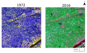
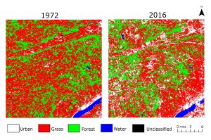
This past semester, through my remote sensing course, I had the opportunity to analyze land changes that result from the construction of highways. Specifically images from 1972 and 2016 of route 476 were analyzed using remote sensing software. The land analyzed was tested for changes in urban spaces, grass, forest, and water. These for areas allowed for the best analysis with the most understandable results. The original composite images (bands 4, 5 and 7) are shown below prior to any testing or remote sensing analysis.

Highway 467 was the primary area of interest for this analysis as the construction in the Philadelphia area was regarded as highly controversial. Construction of the highway took many years, and removed many homes, trees, and other green space. This analysis sought results showing the amount of green space removed for construction purposes. This area would have been replaced with urban space.

Results were calculated using some ArcMap analysis but primarily ENVI software was used. All final maps were edited for readability and clarity using Adobe Illustrator. The following analysis was performed: a tasseled cap analysis, a supervised land classification using a majority analysis, and land change results were calculated.

Shown below, the classification shows the land in the original state (1972) and the final state (2016). It is evident when viewing this map, that there was some change in land type from grass or forest to urban spaces. While much of this was due to highway construction, it could be interpreted that the highway led to the urbanization of the surrounding suburbs.

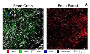
The image below is a deeper explanation of the land that changed from forest or grass to the new land it consists of. What seemed interesting with these results were that much of the forest land changed to urban but also grass land. This was also similar with grass land and vice versa. One consideration for this could have been the increased interest in large green backyards. While many new homes were constructed, these homes typically had large sprawling yards. The area analyzed is primarily upper class when median household incomes were considered in this analysis.

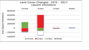
Finally, the image below depicts the actual land changes from one category to another when analyzed in square kilometers. As was unexpected, much of the forest and grass land changed from one to the other. Yes, urban space was gained significantly, but the amount of grass and forest retained was entirely unexpected.  Future analysis should consider the type of forest growth (primary, secondary, etc) to determine the overall growth and health of the newly greened land spaces.

The overall results of this project showed that much greenspace was lost to urbanization with the construction of highways, but much land was retained and converted to other types of greenspaces. Future analysis suggests that a consideration of these new greenspaces be tested. While greenery is implemented, the overall health of the area has not been considered. As many plain greenspaces can harm environmental health, forest density versus grass should be regarded as an important future testing point.