Excellent Examples of University Campus Maps

Many of my posts this semester have discussed the integration of CAD and GIS for Temple’s campus to build a better campus map.  This is a process that many universities have been doing in order to understand more about the data that lives on their campus.  Having a better visualization of the campus ultimately improves the experience for students, staff, visitors, and the larger community.    Here are a few examples of institutions with excellent campus maps and what makes them impressive:


University of Arizona

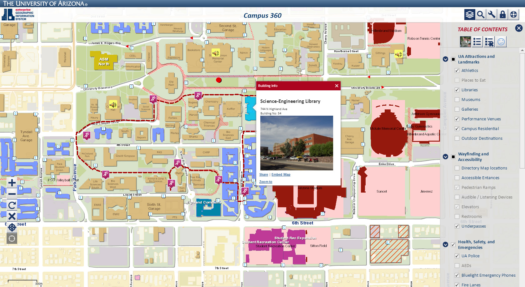
The University of Arizona has an exceptional collection of campus data available on their website.  I picked University of Arizona for this list because they made several types of maps for different audiences- such as the public campus map, the private university interior map, or the campus sustainability map.  All the maps look different and are for unique audiences, yet still have a tremendous wealth of information, an easy to use interface, and look graphically appealing.

University of Maryland

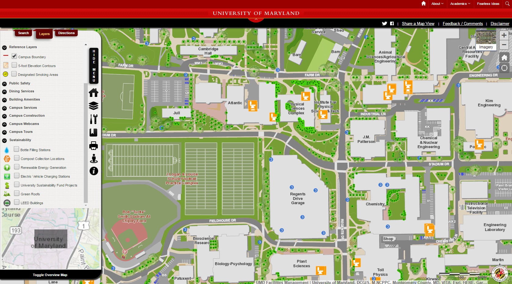
A campus plant inventory!  Designated smoking areas! Bottle filling stations!  The University of Maryland campus map truly sets the bar for campus information.  Also, the map includes a helpful Overview Map and a search feature that is very easy to use.

Arizona State University

Arizona State has one of the most beautiful campus maps you will see.  They worked with the company CampusBird to produce a series of illustrative maps that look more like a classic retro video game instead of an education institution.  Additionally, they have a remarkable amount of information including the species of every tree on campus and high-quality panoramic images of campus landmarks.


ESRI Campus Viewer

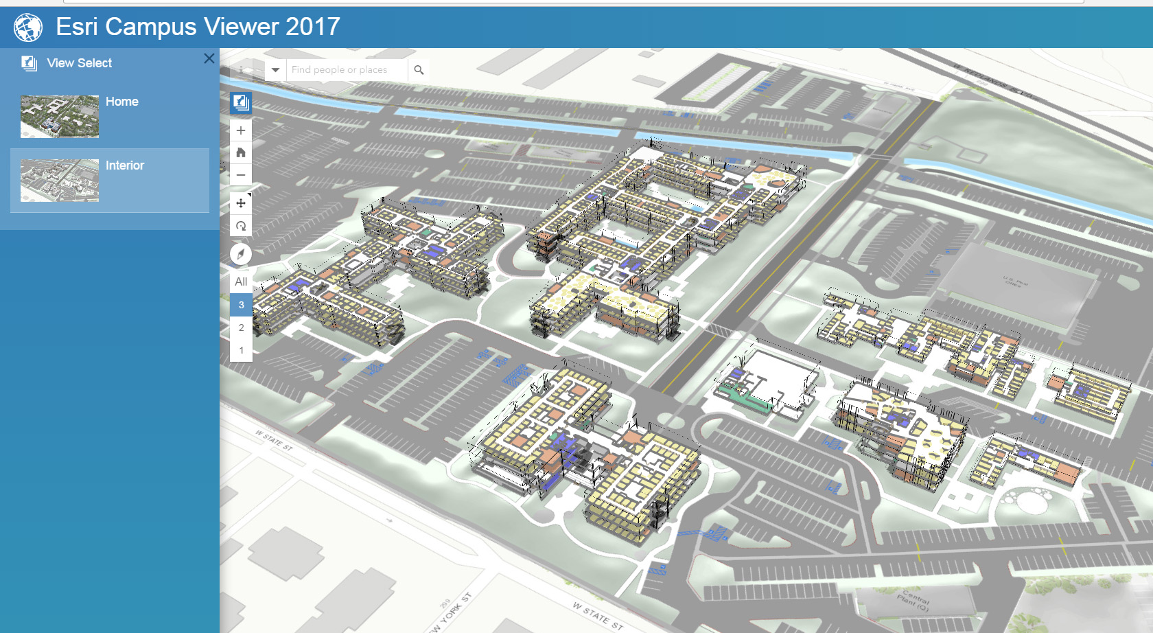
The ESRI Campus Viewer is a demo campus application that ESRI is developing to make 3D campuses.  As you could see, it isn’t perfect but almost all applications visualizing floorplans in 3D struggle to be easy to navigate.  There is a fantastic wayfinding tool built in to get from room to room, but it still looks like there is some way to go until this is a viable option.  However, it’s worth keeping an eye on how the Campus Viewer tool is developed because it won’t be too long until universities start considering developing 3D campus maps.


Having a multitude of data on the campus means that different departments can work together to analyze campus problems.  For example, Campus Safety and Sustainability could work together to understand the patterns of bike thefts on campus.  Furthermore, emergency management can work with scheduling to understand when and where students are at certain times of the day in order to plan for an emergency.  This type of deeper understanding of the campus is essential to understanding how space is used on campus.


Understanding Projections: Geo-referencing

Recently I started working on the year 1959, which is currently the last set of images I have to work on.

1959 was a unique set compared to 1975 and 1995 for a few reasons. The first reason being related to the significant difference in development, which is obvious due to how far back in time the images were taken. The second reason is probably common among Geo-referencing projects, but I have not encountered it until this year. The set was split into two types of images: Geo-referenced or projected images and non-referenced or non-projected images. The projected images are similar to the images I have completed in 1975 and 1995, they were already projected to the desired coordinate system and allowed for immediate Geo-referencing. The non-referenced images are a little more difficult.

These images would gray out the toolbar and not allow for any Geo-referencing. At first I was a bit confused, but quickly started brainstorming ideas. My first idea came in the form of projecting them to the same coordinate system as the data frame. Unfortunately, due to the size of the images, projecting these images was impossible on the machine I had (16 GB of RAM). Nearly instantly the tools would fail. However, I thought this had to be the reason, so I continued to experiment with different ways to project the images. The next was to project to an intermediate coordinate system, then proceed to the more advanced system in hopes of reducing the burden, but that also fizzled out. It seems that no matter what system you are coming from (although I don’t fully understand geographic transformations), it attempts to perform the full process. Running out of ideas, I tried one final solution. I thought that perhaps the size of the images were the reason and decided to slim them down by splitting them into eight sections. After creating a few scripts that would split every image, which went smoothly, it approached the projection part of the script and crashed nearly instantly (although it may have lasted slightly longer).


After none of my ideas worked, I decided to restart the computer…and that worked. Even though the images are not the same coordinate system as the data frame, I can still add control points, fit to display, etc. This was a bit frustrating since it was such a simple solution, but the lesson here is that it is best to try the simplest solution before trying the more difficult ideas.

After talking with a few people, the coordinate system should be irrelevant because as soon as you begin Geo-referencing the image should convert to that of the data frame and even that will not matter in the end. Once the images are completed another individual will tether or mosaic them together and assign a coordinate system that way, which will result in the current coordinate system being overwritten.

Creating A Basic WebMap with ArcGIS API for Javascript

While ArcGIS Online provides a lot of great functionality out of the box, sometimes there are levels of customization that can only be brought about by designing a webmap programmatically. Fortunately, there are several Application Programming Interfaces (APIs) that take care of a lot of the baseline programming required for creating a custom webmap. Two of the most popular APIs include Leaflet and the ArcGIS API for Javascript. Although Leaflet is what is taught at Temple in GUS 4064, Web Mapping and Map Servers, I will be focusing on the ArcGIS API for Javascript. The concepts are the same, however, the ArcGIS API provides built in support for vector (SVG) path map graphics, which will be the focus of the next blog post. This post will focus on the basics of getting a webmap up and running using the API.

Unlike its desktop environment counterpart, the ArcGIS API for Javascript is free to use. They do, however, charge you to utilize their more advanced online analysis services, such as performing network analysis or geocoding locations. For the purposes of creating a simple and interactive webmap, what is provided for free should suffice.

The first step is to download a code editor that will allow you to write code for basic web development. There are many options that will work for the purposes of this blog post, and you may already have a favorite picked out and installed. After installing your code editor of choice, create a working directory where you will save all of the files create which store your code. Once you have the directory created, open the newly installed code editor and create a blank / empty document. Save this document as Index.html into your working directory. This will both create the file in which your code will be saved, but also let your editor know that you are going to be writing an HTML document.

By following the instructions on this page, I was able to create a functioning webmap based off of the code below:

Code to Create a Basic Webmap

There are three primary components to a basic webmap using the ArcGIS API:

  1. Referencing the ArcGIS API, this line essentially attaches your code to all of the functionality that has been pre-programmed and designed by ESRI.
  2. Create the map HTML element (above 2). This creates a div element in the HTML page that will be fill with the map content. Below 2, Initializing the function that creates the map. This is a Javascript function that actually creates the map seen in the div element. You can set properties in this function, such as the basemap (more can be found here), an array containing the default map center, and default zoom level.
  3. Lastly, setting the CSS style to take up space in the browser window. You don’t have to use 100%, but the body / map must use some portion of the window in order for you to see it.

Opening the Index.html file by either running it from your code editor, or opening it from the file explorer will allow you to preview the map you have created.

A Basic Webmap

Joining Attribution Layers to Shapefiles in CAD

As discussed in my previous posts, CAD to GIS integration is a bit messy at times and needs some creative workarounds to make the data usable.  This post will discuss how to combine polygons and attribution layers in GIS to make the labels look better and to possibly join to other data tables.  The demo requires AutoCAD Map 3D or the ArcGIS for AutoCAD Extension, in order to export from CAD to SHP.

Step One:  Export the Rooms Shapefile and Attribution Shapefile from AutoCAD

Type MAPEXPORT in the dialog box and name your shapefile.  Next, select the layers you want to export and the data type.  You should do this twice- once for rooms and once for Attribution.  Obviously, rooms need to be exported as polygons while the attributions should be exported as points.  Save the files and open them in your GIS Software.


Step Two: Split the Attribution String at Each New Line

Open the Attribute Table for Attribution Point data and add new fields for however many lines there are in your attribution.  Use your judgement to make them the appropriate data type.  Then open the Field Calculator and use the .split() Python function to get the data from each line.  You are using this script to split on every \n (new line) and ask for whatever line you need.  For example, [TEXTSTRING].split(‘\n’)[0]  will return the first line and [TEXTSTRING].split(‘\n’)[1] will return the second.  Do this so the data is split up and organized before we join to the polygon.

Step Three: Run a Spatial Join

Spatial Join can be found in the Toolbox->Analysis Tools->Spatial Join.  Put the Polygons as the Target Feature and the Attribution as the Join Feature.  Join One-to-One using the Intersect Match Option.  Make sure all fields are selected to join in the dialog box.  Run the spatial join and a new polygon layer should appear in a few seconds.

Step Four: Connect to Other Data using Attribution Info (If Possible)

If your attribution included your unique identifier (such as a Room Number or Object ID), you can now use that to connect to other data.  The CAD attribution I was working with contained the Room Number which I used to connect to our Archibus database to join all the data from the database.


BEFORE: Labels look off-center and are actually a separate layer than the polygon rooms


After: Labels are centered and only contain the Room Name because we split the information into different layers (Step 2)

Geo-referencing: Understanding what you have time for and what you want, Quality VS. Time Spent

I have currently been Geo-referencing historic imagery for the past 3 months and would like to share my thoughts on some issues regarding project results and time.

As you may know, I am tasked with Geo-referencing historic imagery from the years 95′, 75′, and 59′ to the most recent imagery available to me, 2015. There are 140 images per year and about 105 of them that actually overlay the 2015 imagery. I have never done another Geo-referencing project of this size, so I am not sure if 105 images is a lot, but it seems like a lot. In addition, the images have to meet a certain accuracy standard, which is reasonable and understandable, while also tethering to each other on the edges. Essentially, images and imagery have to perfectly overlap and mosaic. These are all reasonable expectations from someone tasked with Geo-referencing.

However, time must be taken into consideration, especially during a task as tedious and vast as Geo-referencing. To give a little background, I began the tasks by originally putting in a conservative amount of control points (6-12) and lining up the images, however the edges would usually not line up due to camera positioning, sun angle, etc and this resulted in a revision, which is good for myself as I acquired more practice. During my revision, I focused on tethering the images together with a similar amount of control points (6-12), not so much lining them up to the imagery, although they did line up, just not as accurately or precisely as my first run through. This attempt also resulted in a revision, accompanied by a request to tether and accurately match the images to the imagery. This is where my post comes in.

In order to acquire both accurate and tethered imagery, I needed to place many more control points. Common sense would tell you that placing more data would require more time. Control points changed from 6-12 to 14-22, and placement and transformations became more prioritized. Image placement time skyrocketed from 5-10 minutes to 30 minutes – 1 hour. This quickly resulted in a scenario of something that could have been completed in a reasonable amount of time to something that may take months depending on your devotion to such a task.

The question for management becomes: Are we willing to spend such and such on a near perfect product or should we sacrifice some accuracy and quality for time and money. This question depends on what the Geo-referencing projects final use will be. In regards to my project, I am not sure the exact intent, but I think its eventual purpose will be public viewing. If that is the end goal, I think it would be best to skimp on some accuracy as the public does not generally have a professional eye and will not notice the small details such as perfect tethering and/or complete imagery line up.

Geo-referencing: Learning to Save the Hard Way (Easy Way for you)

Introduction:

I began my internship at the office of innovation and technology in Philadelphia tasked with Geo-referencing historic images to the most recent imagery Philadelphia has to offer. In order to ease me into the tougher, later dates, they had me begin in 1995, which is much more similar to the most recent imagery than the 1950’s to the most recent imagery.

If you have Geo-referenced before, then you know it can be quite simple, but obviously depends on how similar the images are. But, you would also know how tedious and monotonous Geo-referencing is. My undergraduate GIS classes delved into Geo-referencing a little bit just to get the student’s feet wet, but because I was not versed in the little nuances Geo-referencing requires, I shot myself in the foot and learned the hard way.

Tip of the Sprint:

In order to effectively Geo-reference I suggest understanding what actually saves your control points and what does not. If you don’t know what control points are, control points are the references you place all over your target image when you attempt to tell the software this is where this specific placement on the target image is on the reference image in order to stitch them together seamlessly.

Some images require little to no control points, while others (in my case) seem to take in the 20 range…and sometimes more. Now imagine not understanding how Geo-referencing tracked your control points and going through an entire package of images (140 in my case) only to realize none of your work actually registered.

Let me be the first to say, you and I will never make that mistake again. To cut to the chase, as far as my current knowledge is concerned, there are two ways to essentially save your control point placements. The first way is to ‘rectify’, which will create a new image with the corrections you made. This option is found in the drop down menu of the Geo-referencing toolbar in ArcMap. However, if you do not wish to create new images, option two may be a better fit. Option two revolves around updating the current image through the function ‘Update Geo-referencing’ within the Geo-referencing toolbar in ArcMap. I should have done a better job of understanding this crucial aspect before spending two days ‘completing’ a large task.


Josh


Understanding Transformations within Geo-referencing: 1st Order and Spline

If you have ever been tasked with a Geo-referencing assignment, you may have heard of transformations. If you have not, or have never worked with Geo-referencing, transformations are essentially different algorithms that will determine how the image you’re Geo-referencing will shift, distort, bend, warp, or be altered. In regards to the ESRI suite’s (version 10.4) use of Geo-referencing, there are eight transformations (there may be more, but I have only been exposed to that offered by ESRI) available to you.

The transformations are as follows:

*In order to ‘unlock’ transformation for use, you need to meet a control point threshold

Zero polynomial – Essentially no image movement, just shifting

Similarity Polynomial – Image will move, but little to no distortion

1st Order Polynomial

2nd Order Polynomial*

3rd Order Polynomial*

Adjust – Significant emphasis on Control Points

Projective Transformation

Spline*


I tend to only use two transformations: 1st Order Polynomial and Spline. I am not an expert on Geo-referencing, so I tend to lean towards the ones I understand more easily. With that being said, those are the two I will discuss in further detail and how I have used them.

1st Order Polynomial:

This is a transformation that is available to the user the moment they start to Geo-reference an image. It requires no set amount of control points and allows for a consistent, but diminishing movement of the image you are working on. This consistency is what I like about this transformation and if you can successfully get an image to line up with your reference image in a few control points, this is the transformation for you.

However, the more control points you add, the less effective this transformation becomes. What I mean by that is within the first 6 control points, your image will shift greatly and begin to quickly line up with your reference, but after that threshold, the shifts become minimal and the amount of control points you have to add to gain the same effect rapidly get out of hand, which leads into the next transformation: Spline.

Spline:

Spline is a transformation that benefits heavily with the amount of control points you have. This transformation requires at least 10 control points be in play before you can even begin using it. It requires a lot of control points because it heavily distorts the images, essentially moving a part of your image exactly to the control point location. This is also a great detriment to the transformation. If you wish to use this transformation, you must place control points everywhere on your image, which can mean anywhere from 50-150+ control points, or else you are prone to having some parts of your image lining up and others being completely off.

Spline is very picky and requires delicate positioning of control points. Because they distort a given area, and you require a lot in order to maximize the effectiveness, you need to be careful with where you place them. If two or more control points are too close to each other, you will witness extreme warping in that location and will likely acquire the opposite effect of what you are looking for (unless you are an art major or artist, then you might find what you want).


To summarize both transformations within a sentence or two, 1st Order is a transformation if you want satisfactory, but not perfect Geo-referencing and you are on a time budget, while Spline is something you should use if you want a perfectly Geo-referenced image and have a lot more time available to you.

This should help transition into my next blog post: Understanding what you want and what you have time for within Geo-referencing.

Feature Layer Views & Symbolization in ArcGIS Online

ESRI recently implemented new functionality into ArcGIS Online which greatly expands the ability of the webmaps that are created and hosted there. Called “Feature Layer Views”, this new type of data storage allows a commonly utilized symbolization method in desktop GIS to be applied to ArcGIS Online feature layers. In a desktop GIS application, a single spatial file can be represented in a dataframe one or more times. Each instance of the spatial file can have its own unique symbolization settings and templates applied to it. This is a great way to reduce duplication of efforts when creating maps , while at the same time visualizing information from more than one attribute.

Around the beginning of the new year, ESRI released new functionality to ArcGIS Online which facilitates this. As previously mentioned, this functionality is called “Feature Layer Views”, and a basic diagram of its usefulness can be seen below.

To begin creating and utilizing feature layer views, open up the feature layer which you would like to create a view for in the My Content section of ArcGIS Online by clicking on the layer name. You will notice to the right there are several options, select Create View.

Assign a unique title, description, tags, and a location to save the view and click OK. Open an existing webmap, or create a new webmap to display the data in. This can be different than the map in which data collection is being performed, or the same one. In many cases, it may be more desirable to create a new webmap strictly for displaying information and tracking the collection of data.

Once the webmap is open and the source feature layer and feature layer view have been added to the map, you can begin modifying symbology for one or both layers. Since, in the example I have been using, symbology was defined before uploading the feature layer, I will only demonstrate modifying the view’s symbology.

Feature Layer & Feature Layer View in the same webmap

Note the two layers listed in the image above. If data is added or modified to one of the layers, the change is reflected in both. Both the view and the source feature layer can be configured to allow or disallow editing and creation of data. In cases where a source layer and a view are in the same map, you may want to disable editing and creation of data in the view. However, if you want to utilize different symbolization throughout several different webmaps, you may want to allow editing and creation of data across both the feature layer and its view.

To change the attribute that a feature layer or view is being symbolized on, click on a feature layer or view’s name and then click “Change Style” (the button that appears as three shapes). Next, choose the new attribute you wish to symbolize on. A common use of views is to symbolize an attribute that represents a feature’s condition or status. This way, you can see the type of feature and an additional descriptive which may influence the action that needs to be taken on that feature.

In the example I have been working with, which can be seen below, by adding a simple shape and associating a color to the condition attribute, we are able to see both the Signs Type and Condition without switching symbolization methods.

Signs Symbolized by Type and Condition

Importing Individual CAD Layers into GIS using ArcPy

Complex CAD files often come into the GIS software with an overwhelming amount of layers.   This makes it very difficult to work with the data to identify useful layers and often drastically slows down your computer.  This post will walk through a way to convert only the necessary CAD layers into a geodatabase, instead of sifting through the unneeded layers, lines, and details in GIS.  The demo script walks through my process of importing the room polygons of Temple’s Alter Hall and converting them to a geodatabase to later join with our university room database.

Step 1:  #Import System Modules

import arcpy

Don’t forget to import ArcPy!


Step 2: #Establish Workspace Environment

arcpy.env.workspace = “C:/Users/tug28727.TU/Desktop/cad_dwgs/alter”

This line establishes your workspace.  Select the location where your CAD Drawings are.  For my script I used the folder location for Alter Hall.


Step 3: # Create a value table

vTab = arcpy.ValueTable()

A value table is necessary to hold input feature classes when you run a merge later in the script.


Step 4: # Create Geodatabase

arcpy.CreateFileGDB_management(“C:/Users/tug28727.TU/Desktop/cad_dwgs/alter”, “alter.gdb”)

A geodatabase needs to be create to store all of the features.


Step 5: #Identify CAD drawings and Create Features from CAD Layers

for fd in arcpy.ListDatasets(“*.dwg”):
     layername = fd + “_Layer”
     # Select only the Polygon features on the drawing layer rooms
     arcpy.MakeFeatureLayer_management(fd + “/Polygon”, layername, “\”Layer\” = ‘RM$'”)
     vTab.addRow(layername)

First, this cycles through all of the files in the workspace and identifies those files that end in .dwg- which are the CAD files.  Next, it creates and layer name.  After that, it creates features searching for whatever CAD details you want to add (here I am searching for Polygons on the RM$ layer).  Lastly, the features are populated on the value table created in step 3.


Step 6: #Merge into one Feature Class

arcpy.Merge_management(vTab, “C:/Users/tug28727.TU/Desktop/cad_dwgs/alter/alter.gdb/rooms”)

This tool merges all of the CAD features from Step 5 into one feature class in the geodatabase we created in Step 4.  If you wanted to merge the value table with other data you would add brackets and commas separating the data to merge where the vTab is located (ex. [vTab, “alter_rooms.shp”], “C:/fake_cad_folder/all_buildings”).


This script should successfully search through your workspace files to identify CAD drawings, and bring in the layers you want in a geodatabase.   Step 5 is where you are able to change which CAD layer you are looking for.   This script hopefully streamlines your process of import CAD files into GIS.  ArcGIS has plenty of resources on CAD and GIS integration located here.