Determine crimes between schools and Public Libraries

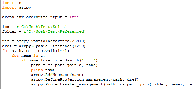
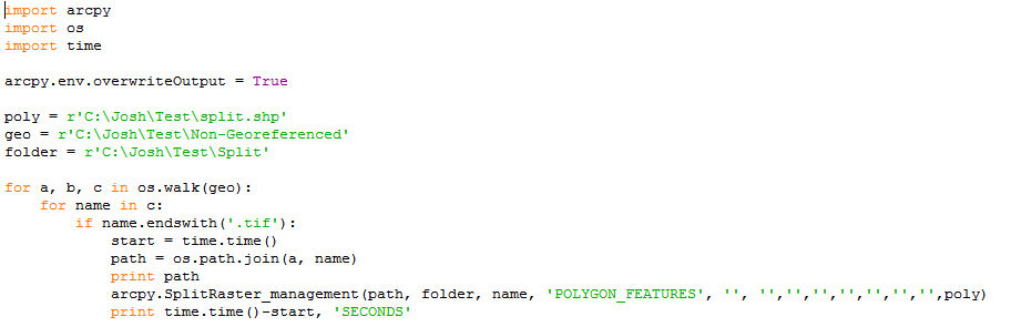
There are about 550 schools and total 55 public libraries in Philadelphia. From all US small and largest cities, Philadelphia has one of the highest crime rate (44 per one thousand). This project tries to determine the risk for students when they want to go to the nearest public library. It also determines how many schools are in one mile from each library that will show how the libraries are unevenly distributed into the city area or the public libraries did not consider the number of schools around it when they established. This also shows where the schools and library and how many crimes happened around each school and library. So, this will predict the possibility to become a victim with the neighborhood crimes. To do this, I have used PostgreSQL which is easier to calculate and measure the risk on the way from a school to a closest library.

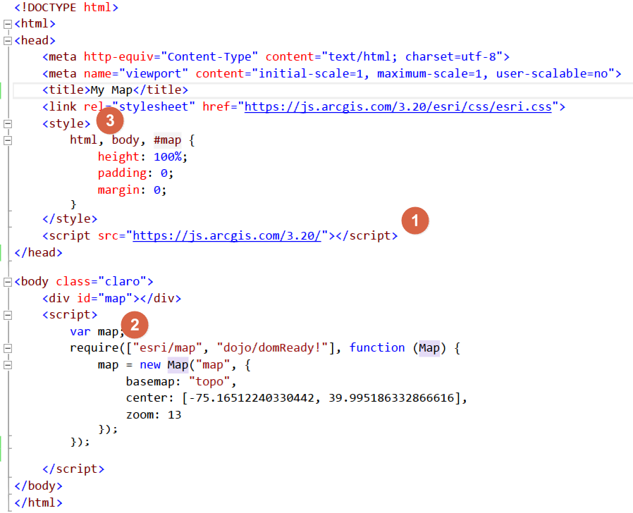
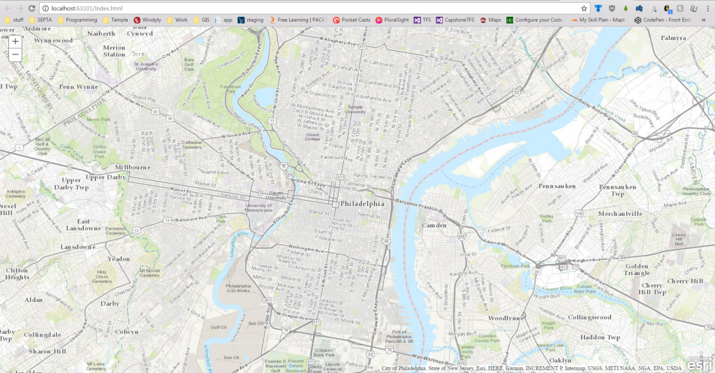
I used three important data sources such as school data as .csv, library data as a shapefile and the crime data that shows all the reported crimes that happened in Philadelphia from 2007 to 2014. All these data are acquired from OpenDataPhilly which is a open data source. After download all the necessary data performed a data normalization to reduce the data redundancy. To use these data with PostgreSQL, need to upload in the SQL server (for the shapefile use the shp2pgsql command and for the .csv file use the simple SQL console). The map below shows the location of schools and libraries,  crime incidences around one mile of each schools  and the numbers of schools within one miles from each public libraries.

1 mile_librarySchool Buffer

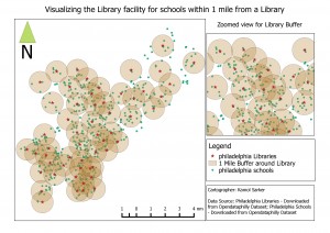
After applying some quarries, I have found that there many schools where more than 2000 crimes happened and there are three schools where more than 5000 crimes happened within 1000 feet, and there are 5 libraries where more than 2000 crimes happened in those 7 years. The libraries are unevenly distributed around the city depending on the number of schools. There some libraries in which there are only one school, and there are two libraries where more than 20 schools within one mile. Even there are some schools that are more than one and half miles away from the closest libraries. The figure below shows the lines between the schools and the closest libraries with hundred feet buffer around the lines.


CREATE TABLE phl.shortest_distance_buffer AS
SELECT e.from_school, e.close_library, ST_Buffer(geom,100)::geometry(Polygon,2272) AS geom
FROM (
SELECT d.school as from_school,
d.library as close_library,
ST_MakeLine(d.geom1, d.geom2) as geom
FROM(
SELECT
s.facil_name AS school,
s.geom AS geom1,
A.branch_nam AS library,
A.geom AS geom2,
ST_Distance(s.geom, A.geom) as distance
FROM
phl.all_philly_school as s
CROSS JOIN LATERAL
(
SELECT l.branch_nam, l.geom
FROM phl.philly_libraries as l
ORDER BY l.geom s.geom
LIMIT 1
) AS A) as d) as e;


SELECT a.from_school, a.close_library, count(b.objectid)
FROM phl.shortest_distance_buffer as a
JOIN phl.philly_crime_incident_coded as b
ON ST_Contains(a.geom, b.geom)
GROUP BY a.from_school, a.close_library
ORDER BY count(b.objectid);

The above queries, I have use to make a straight line between each school to the closest libraries and make a 100 feet buffer around the each line. The bottom part of the query count crimes in each buffer. The intention of doing this is to determine the number of crimes happen in each buffer line and to find out the possibility to become victim if a student want to go to the closest library from school. The result of this query shows that there are 14 line distance from schools and libraries where more than 650 crime happen  from 2007 to 2014. Therefore, it is more likely to become a victim with the neighborhood crimes than other 531 line distances from schools to libraries. Alternatively, there are 12 line distances between schools and closest libraries where less than 10 crimes happen from 2007 to 2014.

There are some limitations in the project like the straight lines that created between schools and closest libraries are not the route to get to a library, so, the crime calculations are not right just an assumption. Also, at the time of crime calculation I did not concern the time of crime, and the student’s intending time to go to a library. It is important to consider the time of crime and the intending time for a student to go to a library to make a rational estimate of crimes (including the type of crime) that happen into the buffer areas. Depending on the limitations, the further research can be done in which the researcher can use the PG Routing to get the exact routes with distance between a school and a closest library and connect that result with the crimes considering the time and type of crimes to make an potential report to see the possibilities of becoming a victim by a neighborhood crime when a student intended to go to a library. The research can also find the alternative routes and day time where and when (safest way and time) has very less possibilities to become a victim by the neighborhood crime.


For project detail contact email: kamol.sarker@temple.edu

First Look at the New Indoor CAD to GIS Tool

To continue my series discussing CAD to GIS integration, I will look at ESRI’s new Indoor CAD to GIS Tool.  This tool is included with the newest update to ArcGIS Desktop 10.5 or ArcGIS Pro 10.4 and requires Microsoft Excel or LibreOffice/OpenOffice.  The tool was designed to conform to the American Institute of Architects (AIA) specifications for indoor spaces and is part of ESRI’s new collection of CampusViewerTools.

Where you need to specify which CAD layer is floor plan line, interior space, or identifier.

The tool uses an .xlsx worksheet with three tabs for the CAD Data.  The CAD LAYER TO FC MAPPING tab is where you manually separate all CAD layers as either Floor Plan Lines, Interior Spaces, or Identifiers.  The Building Properties Tab is where general building information such as Building Name or Date Built is stored to be included with all data imported.  The Floor Properties tab is where you identify the floors of the CAD layer and set the order, elevation, and ceiling heights for each floor- which is necessary if you plan on incorporating these into a 3D GIS.

Running the tool in ArcGIS- very simple to use and most of the fields auto-populate when you open it.

Once the .xlsx worksheet is complete, you save it as a .csv so can be used in ArcGIS. Once in ArcGIS, you open navigate to the tool using your Catalog and much of the import is already auto-populated.  Just locate your .gdb to save it to and the spatial reference and run the tool.  When it’s done, you’ll see the gdb now has your building footprint, floor footprint, floor plan lines, and interior spaces ready to use.

The resulting floor plan- looks great!

Ultimately, the new Indoor CAD to GIS Tool is very easy use and has great results.  As I’ve discussed in several posts, CAD to GIS conversion can be very messy and time-consuming, and the new Indoor CAD to GIS Tool is now an essential tool when doing this work.

It does have several limitations, being it requires your CAD data to have consistent layer naming and be in a real-world coordinate system.  If you are working with an entire campus of data that has a variety of layer naming standards and no coordinate system, it will take you several steps to even begin using this tool.  However, assigning a coordinate system and renaming layers within a consistent standard between drawings can both be accomplished using a Python script or a LISP script in AutoCAD.

The tool runs pretty slow (one building with 3 floors took just under 10 minutes) and any typo at any point in the spreadsheet can lead to the tool not working.  While it takes a while to populate the spreadsheets, it is still much quicker than manually importing the CAD files and cleaning them up one-by-one.

More info on the new Indoor CAD to GIS tool can be found HERE.

Land Classification and Land Use

After the completion of my Geo-referencing tasks (years 1995, 1975, and 1959), I was given the option between more Geo-referencing (1965) or a slightly different route, which consisted of creating a method to classify land types and land uses. If it wasn’t obvious by the title, I chose Geo-referencing 1965…

Land classification is the method of determining what a feature is on imagery purely based on pixel value (pixel value can be interpreted differently depending on the situation). This allows for a colorful rendition and separation, which results in an easy to read and visualize context of where different features are located. Results can vary and are heavily reliant on image quality. The lower quality the image or imagery, the more generalization and inaccuracy of the classifications.

Anyway, land classification can be simple and it can also be quite difficult. If you are using tools that already exist, or software that are built to classify imagery, you can easily begin land classification/land use. If you are using preexisting material it will quickly become a matter of finding the right combination of numbers in order to get the classifications you want. This method is not too difficult, just more tedious in regards to acquiring your result. However, if you approach it from scratch, it will be significantly more engaging. In order to approach it from the bottom up, you have to essentially dissect the process. You have to analyze your imagery, extract pixel values, group the pixel values, combine all of them into a single file, and finally symbolize them based on attribution or pixel value which was recorded earlier. It is much easier said than done.

I am currently approaching the task via already created tools, however if I had a choice in the matter, I would have approached it via the bottom up method and attempted to create it from scratch as there is more learning in that and it is much more appealing to me. Regardless, I am creating info files, or files that contain the numbers, ranges, and classifications I am using to determine good land classifications. In contrast to what I stated earlier, this is quite difficult for me as the imagery is low quality and I am not a fan of continuously typing in ranges until I thread the needle.

The current tool I am using is the reclassify tool that is available through the ESRI suite and it requires the Spatial Analyst extension. This tool allows for the input of a single image, ranges you would like to use to classify the selected image, and output file. After much testing, I am pretty sure there can only be a maximum of 24 classifications (which is probably more than enough). In addition, the tool can be batch ran (as most ESRI tools can be), which means it can be run on multiple images at once. This is a much needed features for many situations, as I presume most times, individuals are not going to classify one image and be done (or at least I am not going to be one and done).

That is an image that was reclassified using the reclassify tool. I am not sure how good of a classification this is as I have not fully grasped the tool yet and every time I give it ranges, it spits out the same generic ranges that I did not input (which is a bit frustrating, but it comes with the territory). I am sure it is human error though and not the tool messing up. I am not sure what the final result is supposed to be, but I will be sure to fill you in once I achieve it (if I ever do…).

Creating a Network Analysis Dataset and Generating a Service Area Layer

Network analysis can be an extremely beneficial tool for any organization which relies on GIS to understand the area it serves. This is particularly true if the organization deals primarily with transportation or the distribution of goods. The network analysis package through ArcGIS allows organizations to gain critical insight into how people and goods move around within their designated service or study area. More specifically, the engineers that I work with at McMahon utilize GIS network analysis to gain enhanced insight on the regions in which they serve as transportation engineers and planners. The baseline method of analysis utilized is creating a service area layer, or series of layers, to gain an understanding of how much distance can be traveled on a road network given a set of parameters.

A Basic Example of a Service Area Layer, With Three Interval Breaks

The first step in creating a service area layer is to create a network dataset. A network dataset is a special type of ESRI dataset, which contains both spatial layers and network layers, as well as custom preferences and parameters to fine tune the output of the network dataset. To create a network dataset, first, download a road network layer that represents the area in which you want to create service areas. Often times, these layers are available from government agencies. For example, all Pennsylvania state and local roads are available on PASDA, provided by PennDOT. Once the streets / roads layer is downloaded, it is important to clip the layer to what you expect you might utilize from the service area analysis. If you choose not to clip the layer, you may find creating and working with the network dataset to be slow and difficult to manage.

You will also need to create a source point file that will represent the location or locations from which the service areas will be generated. You can create the actual points either now or after the network dataset is created, but the point feature class itself needs to be created beforehand. You will also need to create a file geodatabase and feature dataset to store all of these layers and datasets in.

Once the layer is downloaded, clipped, and present in your working directory with the source point file you can create the network dataset. This can be done by right-clicking inside any feature dataset and clicking new > network dataset. A dialog window should appear with options regarding the new network dataset. Name the network dataset and click next. You can leave most of the settings at their default values unless otherwise instructed or if you know the network dataset will be used for purposes in addition to creating a service area. Finally, on the second to last page of options, check the box next to “build service area indexes”. This will speed up the creation of service areas in the future.

Creating a New Network Dataset Inside of a Feature Dataset

Click finish, and you will be asked if you want to build the network dataset. Click Yes. Once the network dataset has been created, open ArcMap and bring the newly created network dataset into the dataframe. When prompted to bring in any associated layers, say yes. Add the Network Analyst toolbar and click “New Service Area” under the Network Analyst dropdown.

Creating a New Service Area with Network Analyst

Click the button directly to the right of the Network Analyst dropdown, to open Network Analyst Window. Here, you can load any origin points (previously created), polygon or line barriers, as well as set options for the service area that is going to be created. You can drag the point layer which contains the origin points into the Facilities group. Clicking the Service Area Properties button (top right corner of the Network Analyst Window) will allow you to set important preferences for the service area that is about to be created. Some of the most useful settings include the accumulation tab, which allows you to track distance and time along the service area, and the analysis settings tab. The analysis settings tab will allow you to set the direction of the service area, as well as any breaks, and to implement a temporal aspect to the service area.

Service Area Properties

Apply any preferences and settings that have changed, and close the service area properties window. When everything is configured as desired, click the Solve button on the network analyst toolbar to run the analysis and create the service area. The analysis can be re-run an infinite number of times, and with the service area index that was created earlier, creating a service area should not take long each time. This way, you can tweak and fine tune the service area quickly and easily until you gain the desired result.

A Service Area Created Using Network Analyst

Excellent Examples of University Campus Maps

Many of my posts this semester have discussed the integration of CAD and GIS for Temple’s campus to build a better campus map.  This is a process that many universities have been doing in order to understand more about the data that lives on their campus.  Having a better visualization of the campus ultimately improves the experience for students, staff, visitors, and the larger community.    Here are a few examples of institutions with excellent campus maps and what makes them impressive:


University of Arizona

The University of Arizona has an exceptional collection of campus data available on their website.  I picked University of Arizona for this list because they made several types of maps for different audiences- such as the public campus map, the private university interior map, or the campus sustainability map.  All the maps look different and are for unique audiences, yet still have a tremendous wealth of information, an easy to use interface, and look graphically appealing.

University of Maryland

A campus plant inventory!  Designated smoking areas! Bottle filling stations!  The University of Maryland campus map truly sets the bar for campus information.  Also, the map includes a helpful Overview Map and a search feature that is very easy to use.

Arizona State University

Arizona State has one of the most beautiful campus maps you will see.  They worked with the company CampusBird to produce a series of illustrative maps that look more like a classic retro video game instead of an education institution.  Additionally, they have a remarkable amount of information including the species of every tree on campus and high-quality panoramic images of campus landmarks.


ESRI Campus Viewer

The ESRI Campus Viewer is a demo campus application that ESRI is developing to make 3D campuses.  As you could see, it isn’t perfect but almost all applications visualizing floorplans in 3D struggle to be easy to navigate.  There is a fantastic wayfinding tool built in to get from room to room, but it still looks like there is some way to go until this is a viable option.  However, it’s worth keeping an eye on how the Campus Viewer tool is developed because it won’t be too long until universities start considering developing 3D campus maps.


Having a multitude of data on the campus means that different departments can work together to analyze campus problems.  For example, Campus Safety and Sustainability could work together to understand the patterns of bike thefts on campus.  Furthermore, emergency management can work with scheduling to understand when and where students are at certain times of the day in order to plan for an emergency.  This type of deeper understanding of the campus is essential to understanding how space is used on campus.


Understanding Projections: Geo-referencing

Recently I started working on the year 1959, which is currently the last set of images I have to work on.

1959 was a unique set compared to 1975 and 1995 for a few reasons. The first reason being related to the significant difference in development, which is obvious due to how far back in time the images were taken. The second reason is probably common among Geo-referencing projects, but I have not encountered it until this year. The set was split into two types of images: Geo-referenced or projected images and non-referenced or non-projected images. The projected images are similar to the images I have completed in 1975 and 1995, they were already projected to the desired coordinate system and allowed for immediate Geo-referencing. The non-referenced images are a little more difficult.

These images would gray out the toolbar and not allow for any Geo-referencing. At first I was a bit confused, but quickly started brainstorming ideas. My first idea came in the form of projecting them to the same coordinate system as the data frame. Unfortunately, due to the size of the images, projecting these images was impossible on the machine I had (16 GB of RAM). Nearly instantly the tools would fail. However, I thought this had to be the reason, so I continued to experiment with different ways to project the images. The next was to project to an intermediate coordinate system, then proceed to the more advanced system in hopes of reducing the burden, but that also fizzled out. It seems that no matter what system you are coming from (although I don’t fully understand geographic transformations), it attempts to perform the full process. Running out of ideas, I tried one final solution. I thought that perhaps the size of the images were the reason and decided to slim them down by splitting them into eight sections. After creating a few scripts that would split every image, which went smoothly, it approached the projection part of the script and crashed nearly instantly (although it may have lasted slightly longer).


After none of my ideas worked, I decided to restart the computer…and that worked. Even though the images are not the same coordinate system as the data frame, I can still add control points, fit to display, etc. This was a bit frustrating since it was such a simple solution, but the lesson here is that it is best to try the simplest solution before trying the more difficult ideas.

After talking with a few people, the coordinate system should be irrelevant because as soon as you begin Geo-referencing the image should convert to that of the data frame and even that will not matter in the end. Once the images are completed another individual will tether or mosaic them together and assign a coordinate system that way, which will result in the current coordinate system being overwritten.

Creating A Basic WebMap with ArcGIS API for Javascript

While ArcGIS Online provides a lot of great functionality out of the box, sometimes there are levels of customization that can only be brought about by designing a webmap programmatically. Fortunately, there are several Application Programming Interfaces (APIs) that take care of a lot of the baseline programming required for creating a custom webmap. Two of the most popular APIs include Leaflet and the ArcGIS API for Javascript. Although Leaflet is what is taught at Temple in GUS 4064, Web Mapping and Map Servers, I will be focusing on the ArcGIS API for Javascript. The concepts are the same, however, the ArcGIS API provides built in support for vector (SVG) path map graphics, which will be the focus of the next blog post. This post will focus on the basics of getting a webmap up and running using the API.

Unlike its desktop environment counterpart, the ArcGIS API for Javascript is free to use. They do, however, charge you to utilize their more advanced online analysis services, such as performing network analysis or geocoding locations. For the purposes of creating a simple and interactive webmap, what is provided for free should suffice.

The first step is to download a code editor that will allow you to write code for basic web development. There are many options that will work for the purposes of this blog post, and you may already have a favorite picked out and installed. After installing your code editor of choice, create a working directory where you will save all of the files create which store your code. Once you have the directory created, open the newly installed code editor and create a blank / empty document. Save this document as Index.html into your working directory. This will both create the file in which your code will be saved, but also let your editor know that you are going to be writing an HTML document.

By following the instructions on this page, I was able to create a functioning webmap based off of the code below:

Code to Create a Basic Webmap

There are three primary components to a basic webmap using the ArcGIS API:

  1. Referencing the ArcGIS API, this line essentially attaches your code to all of the functionality that has been pre-programmed and designed by ESRI.
  2. Create the map HTML element (above 2). This creates a div element in the HTML page that will be fill with the map content. Below 2, Initializing the function that creates the map. This is a Javascript function that actually creates the map seen in the div element. You can set properties in this function, such as the basemap (more can be found here), an array containing the default map center, and default zoom level.
  3. Lastly, setting the CSS style to take up space in the browser window. You don’t have to use 100%, but the body / map must use some portion of the window in order for you to see it.

Opening the Index.html file by either running it from your code editor, or opening it from the file explorer will allow you to preview the map you have created.

A Basic Webmap

Joining Attribution Layers to Shapefiles in CAD

As discussed in my previous posts, CAD to GIS integration is a bit messy at times and needs some creative workarounds to make the data usable.  This post will discuss how to combine polygons and attribution layers in GIS to make the labels look better and to possibly join to other data tables.  The demo requires AutoCAD Map 3D or the ArcGIS for AutoCAD Extension, in order to export from CAD to SHP.

Step One:  Export the Rooms Shapefile and Attribution Shapefile from AutoCAD

Type MAPEXPORT in the dialog box and name your shapefile.  Next, select the layers you want to export and the data type.  You should do this twice- once for rooms and once for Attribution.  Obviously, rooms need to be exported as polygons while the attributions should be exported as points.  Save the files and open them in your GIS Software.


Step Two: Split the Attribution String at Each New Line

Open the Attribute Table for Attribution Point data and add new fields for however many lines there are in your attribution.  Use your judgement to make them the appropriate data type.  Then open the Field Calculator and use the .split() Python function to get the data from each line.  You are using this script to split on every \n (new line) and ask for whatever line you need.  For example, [TEXTSTRING].split(‘\n’)[0]  will return the first line and [TEXTSTRING].split(‘\n’)[1] will return the second.  Do this so the data is split up and organized before we join to the polygon.

Step Three: Run a Spatial Join

Spatial Join can be found in the Toolbox->Analysis Tools->Spatial Join.  Put the Polygons as the Target Feature and the Attribution as the Join Feature.  Join One-to-One using the Intersect Match Option.  Make sure all fields are selected to join in the dialog box.  Run the spatial join and a new polygon layer should appear in a few seconds.

Step Four: Connect to Other Data using Attribution Info (If Possible)

If your attribution included your unique identifier (such as a Room Number or Object ID), you can now use that to connect to other data.  The CAD attribution I was working with contained the Room Number which I used to connect to our Archibus database to join all the data from the database.


BEFORE: Labels look off-center and are actually a separate layer than the polygon rooms


After: Labels are centered and only contain the Room Name because we split the information into different layers (Step 2)

Geo-referencing: Understanding what you have time for and what you want, Quality VS. Time Spent

I have currently been Geo-referencing historic imagery for the past 3 months and would like to share my thoughts on some issues regarding project results and time.

As you may know, I am tasked with Geo-referencing historic imagery from the years 95′, 75′, and 59′ to the most recent imagery available to me, 2015. There are 140 images per year and about 105 of them that actually overlay the 2015 imagery. I have never done another Geo-referencing project of this size, so I am not sure if 105 images is a lot, but it seems like a lot. In addition, the images have to meet a certain accuracy standard, which is reasonable and understandable, while also tethering to each other on the edges. Essentially, images and imagery have to perfectly overlap and mosaic. These are all reasonable expectations from someone tasked with Geo-referencing.

However, time must be taken into consideration, especially during a task as tedious and vast as Geo-referencing. To give a little background, I began the tasks by originally putting in a conservative amount of control points (6-12) and lining up the images, however the edges would usually not line up due to camera positioning, sun angle, etc and this resulted in a revision, which is good for myself as I acquired more practice. During my revision, I focused on tethering the images together with a similar amount of control points (6-12), not so much lining them up to the imagery, although they did line up, just not as accurately or precisely as my first run through. This attempt also resulted in a revision, accompanied by a request to tether and accurately match the images to the imagery. This is where my post comes in.

In order to acquire both accurate and tethered imagery, I needed to place many more control points. Common sense would tell you that placing more data would require more time. Control points changed from 6-12 to 14-22, and placement and transformations became more prioritized. Image placement time skyrocketed from 5-10 minutes to 30 minutes – 1 hour. This quickly resulted in a scenario of something that could have been completed in a reasonable amount of time to something that may take months depending on your devotion to such a task.

The question for management becomes: Are we willing to spend such and such on a near perfect product or should we sacrifice some accuracy and quality for time and money. This question depends on what the Geo-referencing projects final use will be. In regards to my project, I am not sure the exact intent, but I think its eventual purpose will be public viewing. If that is the end goal, I think it would be best to skimp on some accuracy as the public does not generally have a professional eye and will not notice the small details such as perfect tethering and/or complete imagery line up.

Geo-referencing: Learning to Save the Hard Way (Easy Way for you)

Introduction:

I began my internship at the office of innovation and technology in Philadelphia tasked with Geo-referencing historic images to the most recent imagery Philadelphia has to offer. In order to ease me into the tougher, later dates, they had me begin in 1995, which is much more similar to the most recent imagery than the 1950’s to the most recent imagery.

If you have Geo-referenced before, then you know it can be quite simple, but obviously depends on how similar the images are. But, you would also know how tedious and monotonous Geo-referencing is. My undergraduate GIS classes delved into Geo-referencing a little bit just to get the student’s feet wet, but because I was not versed in the little nuances Geo-referencing requires, I shot myself in the foot and learned the hard way.

Tip of the Sprint:

In order to effectively Geo-reference I suggest understanding what actually saves your control points and what does not. If you don’t know what control points are, control points are the references you place all over your target image when you attempt to tell the software this is where this specific placement on the target image is on the reference image in order to stitch them together seamlessly.

Some images require little to no control points, while others (in my case) seem to take in the 20 range…and sometimes more. Now imagine not understanding how Geo-referencing tracked your control points and going through an entire package of images (140 in my case) only to realize none of your work actually registered.

Let me be the first to say, you and I will never make that mistake again. To cut to the chase, as far as my current knowledge is concerned, there are two ways to essentially save your control point placements. The first way is to ‘rectify’, which will create a new image with the corrections you made. This option is found in the drop down menu of the Geo-referencing toolbar in ArcMap. However, if you do not wish to create new images, option two may be a better fit. Option two revolves around updating the current image through the function ‘Update Geo-referencing’ within the Geo-referencing toolbar in ArcMap. I should have done a better job of understanding this crucial aspect before spending two days ‘completing’ a large task.


Josh