Plotting Time Series Graphs for Animation with MapMate Package in R

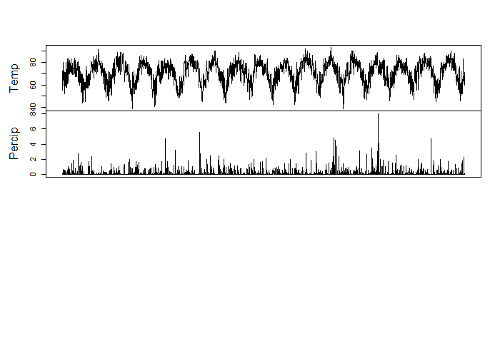
Animations can be a little tough to create but luckily, Matthew Leonawicz has created a package for R that plots and saves images easily called MapMate. The map portion of the package I have yet to master, as it is globe based and my project was to map a static city. But the time series climate data of precipitation that I collected from The National Oceanic and Atmospheric Administration Department of Commerce was a great project to produce an animation.

Needed for the images to save is ImageMagick which is a free download.

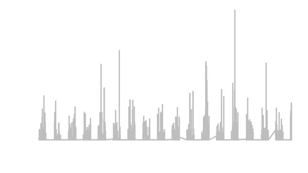
The first step to creating an animation was to make a sequential numeric column named FrameID for the order of plotting. The next step was to identify the x limits and the y limits.

climate1 <- climate
climate1$FrameID <- 1:nrow(climate1)                  
xlim <- range(climate1$Date)
ylim <- range(climate1$Percip)
save_ts(climate1, x = "Date", y = "Percip", id = "FrameID", col = "grey",
         xlm = xlim, ylm = ylim, dir = "C:/Users/tuf29742/Documents/Vector Control/Animation/")

With x as the date and the y as the precipitation, and a specified location for the images to be saved, this image creator took roughly 30 minutes to produce 3,159 images for animation. Below are just 5 images from the package capture.

These images could now be used in a video editor to create an animation. I would check out Matt’s MapMate Instructional Page for more fun with animation!

Working with Time Series Data in R

Time series analysis is very useful in economics but I have been using it in my studies of mosquitoes and climate change in environmental health. The relationship that I am examining is whether or not the climate change had any effect on increased mosquito quantity within trapping areas over 17+ years. The first step of that process is to see if there was a change in climate over the 17+ years that match the mosquito collection data.

The mosquito season starts in May and ends in October, and it is common for field workers to set traps every Monday through Thursday, leave them for 24 hours and then collect the traps to have the mosquitoes tested. So, all precipitation and temperature data was collected from The National Oceanic and Atmospheric Administration Department of Commerce.

Working within R and using the Stats package, I was able to transform the dataframe into a time series class and visualize over time.

library(stats)print(climate)
class(climate)
length(climate)

Results :

print(climate)
Temp Percip       Date       time
1      55   0.00   5/1/2000 2000-05-01
2      59   0.09   5/2/2000 2000-05-02
3      60   0.00   5/3/2000 2000-05-03
...
class(climate)
[1] "tbl_df"     "tbl"        "data.frame"
length(climate)
[1] 4

Now, we transform the dataframe to a ts object

climatets <- ts(climate, start = 1, frequency = 1)
print(climatets)
length(climatets)

Results :

> climatets <- ts(climate, start = 1, frequency = 1) Warning message: In data.matrix(data) : NAs introduced by coercion
print(climatets)
Time Series:
Start = 1
End = 3159
Frequency = 1
Temp Percip Date
1   55   0.00   NA
2   59   0.09   NA
3   60   0.00   NA
...
length(climatets)
[1] 12636
plot(climatets)


It is common for string dates to be eliminated in the time series transformation. If you would like to keep them for labeling purposes, I would investigate ?as.POSIXlt() for date time numeric conversion.

You can see that there is a slight upward trend in temperature over the 17+ years. But for the most part, the climate over the 17 years doesn’t change much in trend. Which tells me that if there has been an increase in mosquito quantity at trapping sites, it may not be connected to temperature.

This way of visualizing data is essential in making predictive modeling and recognizing trends.