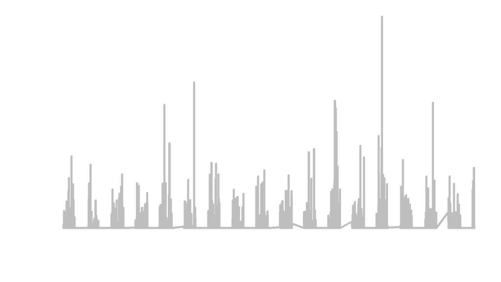
Animations can be a little tough to create but luckily, Matthew Leonawicz has created a package for R that plots and saves images easily called MapMate. The map portion of the package I have yet to master, as it is globe based and my project was to map a static city. But the time series climate data of precipitation that I collected from The National Oceanic and Atmospheric Administration Department of Commerce was a great project to produce an animation.
Needed for the images to save is ImageMagick which is a free download.
The first step to creating an animation was to make a sequential numeric column named FrameID for the order of plotting. The next step was to identify the x limits and the y limits.
climate1 <- climate
climate1$FrameID <- 1:nrow(climate1)
xlim <- range(climate1$Date)
ylim <- range(climate1$Percip)
save_ts(climate1, x = "Date", y = "Percip", id = "FrameID", col = "grey",
         xlm = xlim, ylm = ylim, dir = "C:/Users/tuf29742/Documents/Vector Control/Animation/")
With x as the date and the y as the precipitation, and a specified location for the images to be saved, this image creator took roughly 30 minutes to produce 3,159 images for animation. Below are just 5 images from the package capture.


These images could now be used in a video editor to create an animation. I would check out Matt’s MapMate Instructional Page for more fun with animation!
