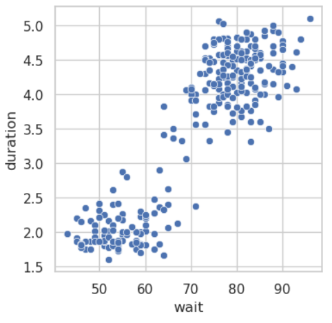
On my TODO list for this summer summer is preparing to teach Elements of Data Science for the Physical and Life Sciences in the fall. One of the labs in the class uses data collected on eruptions of the famous Old Faithful geyser in Yellowstone National Park. The data come from a classic 1990 paper by Azzalini and Bowman that has 299 measurement pairs of the time between the start of geyser eruptions and the how long each eruption lasted. The relationship is an approximately linear — the longer the wait since the last eruption the greater the duration of the next eruption.

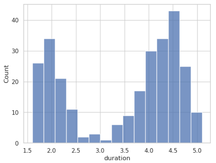
Notice that the distribution is bimodal, forming two obvious clusters. You can see this with a simple histogram plot of duration.

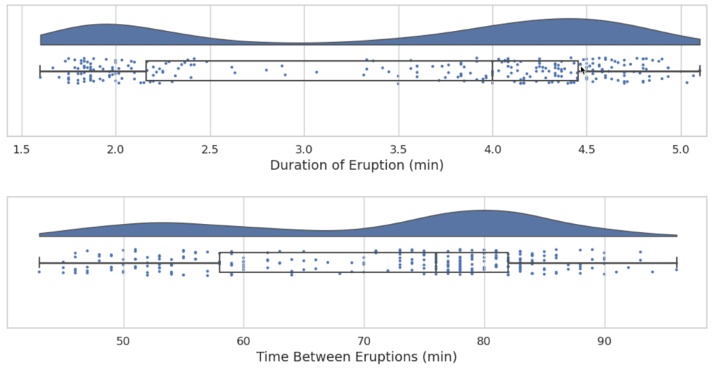
“Raincloud plots,” as highlighted in this recent blog post, are another way to show data distributions. Raincloud plots, also called “pirate plots” (by the R community, naturally, Arrh!) combine three different kinds of plots: (1) a Box plot, a jittered strip plot (the rain), and a density plot, a sort of a smoothed, normalized histogram (the raincloud). Below are raincloud plots of the duration and time between eruptions (the wait).
What I like is the way the three plot elements compensate for each other. The Box plot doesn’t capture the bimodal distribution but he density plot makes up for this, and the strip plot of the data points helps with the visualization. The three together provide a nice, intuitive feel for how the data are distributed.

Raincloud plots are relatively new. The debate is ongoing about the best way to construct them. Read the blog post to learn more or or the original paper for a more in-depth discussion. To learn more about the Old Faithful data and the geologic mechanisms behind the deyser eruption timings, I encourage you to read the Azzalini and Bowman’s paper.
Azzalini, A., & Bowman, A. W. (1990). A look at some data on the Old Faithful geyser. Journal of the Royal Statistical Society: Series C (Applied Statistics), 39(3), 357-365.
