
As I discussed in earlier posts, last fall I taught a new General Education class that satisfies Temple’s quantitative literacy requirement — Evil Plots — a class that is all about graphical miscommunication, whether deliberate or accidental. For their final projects, students had to create their “Personal Portfolio of Evil,” a collection of examples they discovered related to their own major field of study or personal areas of interest. In this blog post, I will share three of my favorite student discoveries.
Digital vs Analog
The first example comes from a theater student who is studying to be a sound and lightning production designer. He spotted the following advertisement.
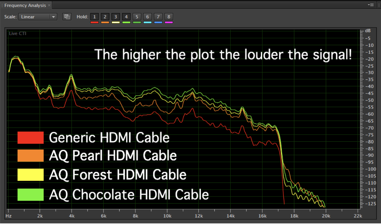
As the student noted, HDMI cables are digital, not analog, so stronger transmission does not mean the sound is louder. He wrote:
“This graph shows the audio’s frequency in Hertz, and the level/noise loss by db. This is an extremely accurate way to test analog cables. The issue with the graph is that it is using db to test digital audio, in the form of HDMI. I suspect that other testing (oscilloscopes, data meters, etc) showed absolutely no difference, so the company decided to make this seemly convincing chart instead. A much better Y-axis would have shown data loss or data noise, rather than db levels… especially since 1s and 0s didn’t have any sort of loudness setting last time I checked.”
I really like the way the student used expertise acquired in his major to spot the flaws in this graph!
Rock Music and Oil Production
Spurious correlations are a major topic in this class, and a voice major in my class found a fun one. As the student wrote:
“The graph was created by Mark Lee in an article discussing the creative genius and evolution of rock music in response to a Rolling Stone article “500 Greatest Songs of All Time”. In Lee’s article he analyses the parallel between the decline of rock music quality and the decline in US oil discovery and production.”

I certainly hope the article was tongue in cheek!
Axes of Evil
In the class, we discuss a common source of graphical mischief, distorting the axes. Another theater major found this graph.
She wrote:
“The biggest flaw with all four graphs is the y-axis. On the first graph looking at gross revenue, the y-axis starts close to the smallest data value and ends close to the largest data value. This makes the slope of the line look very steep, as if gross revenue is increasing dramatically. The other three graphs have been given the exact opposite treatment. The data in these graphs fall in a relatively small range, yet the y-axis has many unnecessary values above and below the line that flattens it and makes the slope look less steep. Additionally, the New York City Visitors graph extends to 2014 even though no value is plotted.”
These three examples are just a taste of what the students found. Evil plots are everywhere!