
At part of an experimental General Education class, this past fall I taught a two-week course module to non-science majors entitled “Evil Plots” all about the ways graphs can be used to misrepresent data. The idea was to teach students graphics by bad example, and to introduce a healthy level of skepticism to their media consumption (I’m looking at you, Fox News).
The module covered three ways plots can go bad:
- The plots itself is faulty – such as distorted axes.
- The data is questionable – such as non-representative samples.
- The interpretation is suspect – such as spurious correlations.
In this post, I will focus on item three. There is a fun book on spurious correlations that I recommend. But there is nothing like working with your own data to drive home the point, so I started the class by asking students to answer the following series of pseudorandom questions:
- How many hours a week do you spend on school assignments and studying?
- How much do you love math on a scale of 1-10 (1=would rather have my teeth drilled, 10=math problems are better than ice cream and kittens)
- What day of the month were you born?
- What is your height in inches to the nearest inch?
- How many days did you spend at the beach this year?
- What is the most miles you’ve driven a car in a single day, ever?
- How many songs do you listen to in a day?
- How many slices of pizza did you eat in the past month (best estimate).
- How many states have you visited in your life? (Driving though or stopped in an airport count)
- How many letters are in your first and last name combined?
I then hunted for correlation between all the possible combinations of variables. Naturally, most were pure scatter, but sure enough, some exhibited reasonable correlation. For example:
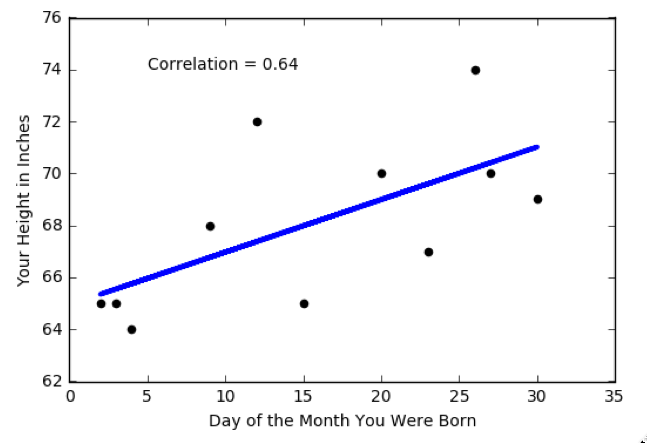
It is possible to predict your height based on the day of the month in which you were born. Who knew!?