
Background
Library Search, Temple University Libraries’ discovery layer, recently underwent a significant updates to the user interface. In Fall 2023, the Discovery Oversight Group, a group responsible for providing guidance and setting priorities for the development of Library Search, began closely examining our approach to the display of MARC record data in Library Search. Traditionally in the physical card catalog format, International Standard Bibliographic Description (ISBD) punctuation has been used as a way of recognizing and displaying distinct data elements in catalog records and acting as a visual delimiter between MARC subfields.

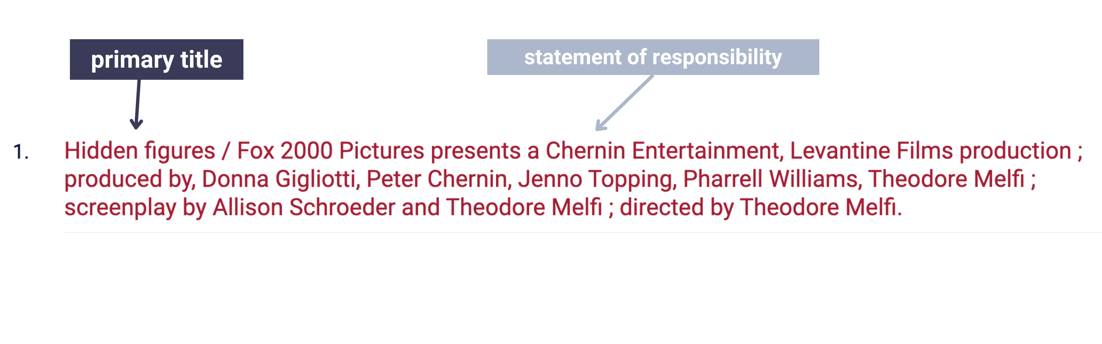
With this configuration, item records with long title statements or multiple subfields (like the one above) can become lengthy and hard to decipher, making search results hard to scan and distinguish from one another. It’s not ideal for how users read online, scanning quickly for the information most relevant to them. We know from our own past user research that users tend to scan through results in Library Search quickly, in search of key bibliographic information like author, title, or date, that serve as sign posts to help them find what they need and discard what they don’t. We’re also aware of how challenging it can be to distinguish one item from another when looking through dozens of results.
With Library of Congress moving towards omitting ISBD punctuation from MARC records, we needed to rethink how we are indexing and delimiting between different MARC subfields for relevant Library Search displays, such as title statement, imprint, etc. With the physical space of a 3×5 card catalog record no longer a limiting factor in how we display information about works, we can explore alternative approaches that do not rely on prescribed punctuation, such as using the infrastructure of our discovery systems to create a human-readable display.
Design sprint
The Discovery Oversight Group formed a working group to investigate these opportunities and challenges. Led by Emily Toner (Library Technology Development), the group included Leanne Finnegan (Metadata and Digitization Services), Jackie Sipes, (user experience) Holly Tomren (Metadata and Digitization Services), and Joi Waller (graphic design). Ahead of the fall Library Search development sprint, the working group held a week-long design sprint to explore how we might display MARC data without the use of ISBD punctuation. The design sprint was held ahead of the development sprint to allow ample time for collecting user feedback before moving forward with significant design changes.
We completed the design sprint across 5 days with group members spending anywhere from a 1-3hrs per day on meetings or other sprint activities. Focusing on highly visible data, such as title, author, and publication information that provides essential information to our users when they are reviewing search results and record pages, we proposed three “How might we” questions to guide us as we brainstormed solutions:
- How might we convey the different levels of information for record details (ex. hierarchy of title/subtitle, author/creator/contributor, etc.)?
- How might we help users to disambiguate records?
- How might we make finding and identifying items quick and intuitive for users?
A few of our ideas included:
- Separate title, subtitle, statement of responsibility
- Highlight fields with background color
- Make different levels of information visually distinct — different font sizes, line breaks, etc.
- Strip out unnecessary punctuation and use other visual indicators
- Create separate field for secondary creator/contributors (rather than displaying that info alongside primary author)
- Prominently display information that helps users distinguish between records (resource type, location
- Simplify brief record displays
Based on these ideas, Joi created 6 different prototypes, each with different configurations of the title, subtitle, and statement of responsibility.
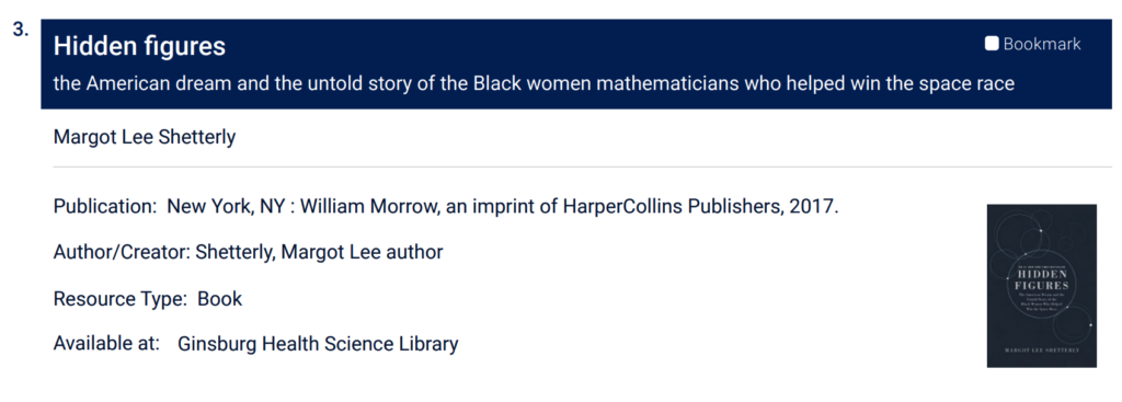
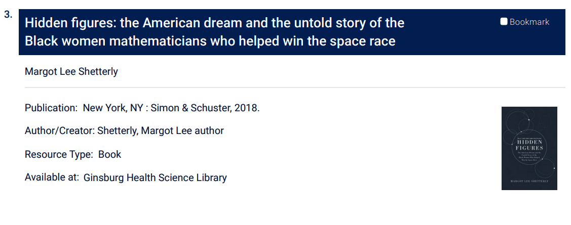
For the prototypes, we used the search Hidden Figures which provides more than one example of the problems we wanted to solve – helping users disambiguate between different items by the same title in multiple formats as well as containing items with longer title statements where ISBD punctuation is used to separate MARC data.
User feedback
To gather feedback, Joi and I (with lots of help from John Pyle) set up a table and rolling whiteboard in the Charles atrium. Noticing that traffic in the building felt unusually low that day, we hauled our setup outside and positioned ourselves under the overhang near the 13th street entrance on a perfect, sunny, fall day.

We had 8 participants in total, including 3 undergraduates, 3 graduate students, 1 faculty, and 1 staff. All but two had used Library Search previously, and those who hadn’t had experience using library catalogs at their previous institutions. Participants came from a range of TU schools and colleges including Biology, English, French, Music, and Public Health.
To get feedback we used a combination of visual preference testing, informal in interviews, and a brief survey.
For the preference testing, we showed participants the 6 prototypes printed on large 11×17 paper and taped to the white board for easy comparison. Participants were given the following prompt:
Here’s a scenario. You’ve just searched for the book Hidden Figures, and these are the first three results you see. Spend a minute or so examining the prototypes. There are subtle differences; don’t get too caught up trying to look for those. Just think about would be most helpful to you if you were looking at these results and trying to evaluate these results.
Title statements
Of our prototypes, most participants preferred E, with F a close second. Though design differences were subtle throughout the prototypes, participants agreed that the blue background in E and F helped draw them to the item title right away. The response to the updated displays was generally very positive, confirming our decision to separate the statement of responsibility, which contains author information, as well we any other persons, corporate bodies, etc. that contributed to the content of the source, out from the title section.
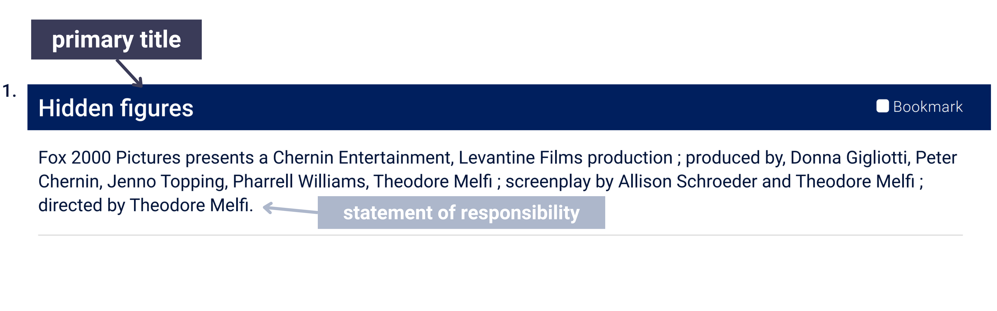
To implement a separated the title and statement of responsibility in Library Search, we created separate fields for indexing the title and the statement of responsibility and configured the display of those fields through design elements and page structure. Shifting the statement of responsibility below the title suggests a hierarchy to the information presented, while additional styling elements, such as the high-contrast font and royal-blue background color and reconfigured (larger!) font sizes in the title area, help users hone-in on the details needed to identify and disambiguate sources as they browse search results.
There was less consensus from users around the display of subtitles. Some participants found prototype E (with the subtitle on a separate line) to be less cluttered and easier to read. A participant who preferred F, commented that she liked seeing title and subtitle together on a single line as it provided context for how the item was different than the titles above and below.
We initially planned to implement the separated subtitle (prototype E), but once the development sprint started, we realized the need for a careful and more thorough investigation before proceeding with additional metadata mapping updates. So, that change is on hold for now.
Summary previews and other improvements
The near consensus from users on the visual design was interesting, but not unsurprising. Breaking the statement of responsibility out of the title statement was a clear improvement for readability. Talking with users also helped us clarify what item information they find most useful in the search results display. We asked participants to review a list of 10 items and indicate which 5 they rely on most when scanning search results.
| Summary (brief overview) | 8/8 |
| Resource type | 8/8 |
| Author(s) / Creator(s) | 7/8 |
| Title | 6/8 |
| Availability | 6/8 |
| Date | 5/8 |
| Physical description | 1/8 |
| Information about the publisher | 1/8 |
| Table of contents | 0/8 |
| Contributor(s) (e.g., editor, illustrator, etc.) | 0/8 |
All participants selected summary and resource type, neither of which were displayed very prominently in Library Search before this update. In response, we added a summary preview to the brief record display in the search results (this wasn’t the first time we’d heard users express a desire for making this information more prominent) with a toggle to expand to the full summary. We also moved resource type to the title section to make it more noticeable.
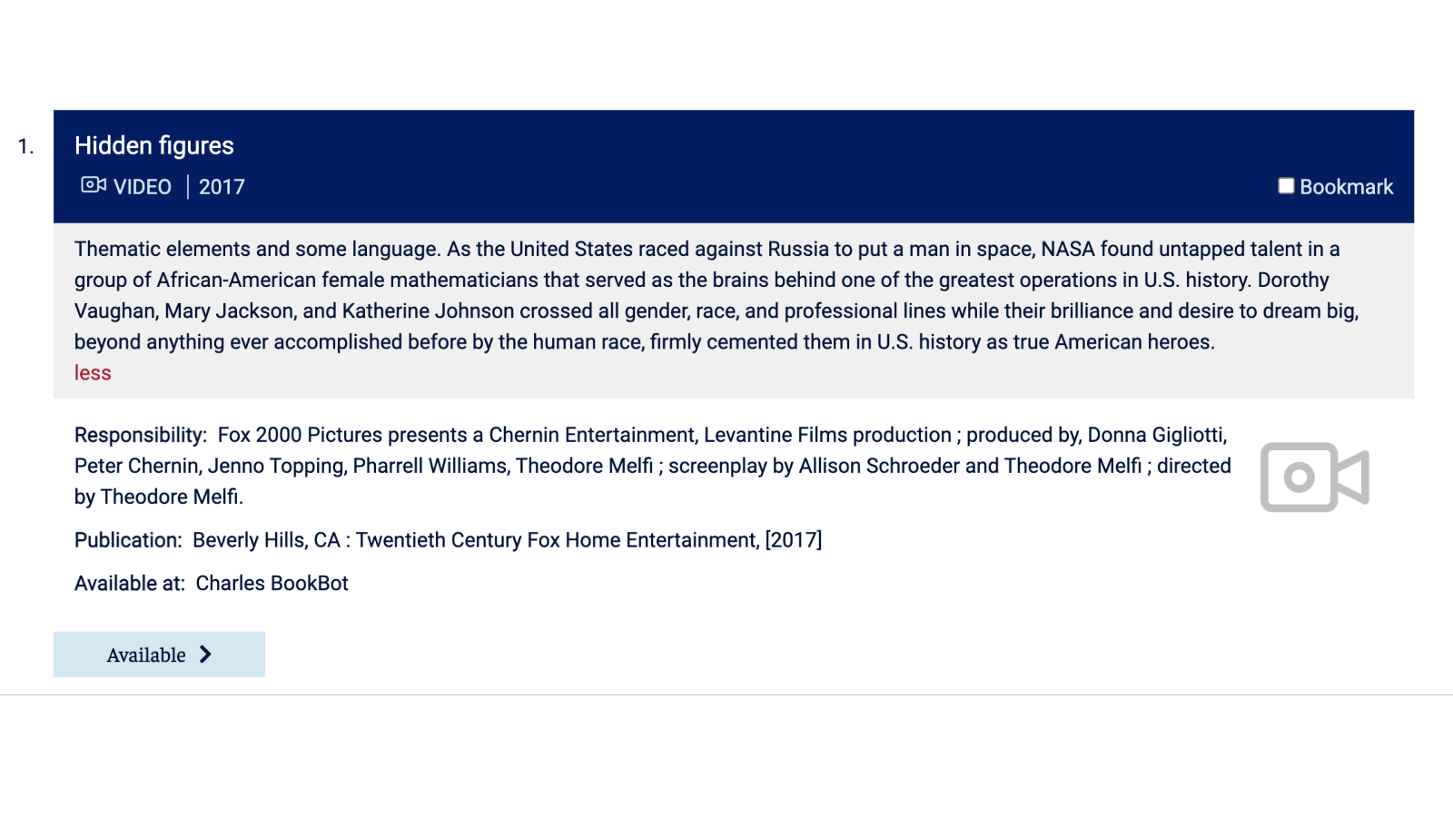
Before the update, item records mostly lacked any significant visual indicators that might signal hierarchical or other relationships between data. Scrolling through results that share similar or exact titles or exist in multiple formats (see: Hidden Figures, MacBeth, Jaws) it was easy to overlook important details such as resource type, statement of responsibility, or date. Moving towards omitting ISBD punctuation from MARC records offers the opportunity to build a display more readable, usable display.
Sharing our designs with users and talking with them about their search habits was immensely helpful as we grappled with the complexities on both the cataloging end and user end. As we moved through the end of our design sprint and later into a full development sprint with the Blacklight team, the user feedback helped to ground various technical and design decisions that arose along the way.