Class Description
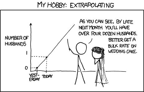
Computer technology and the internet have produced a glut of digital information that can’t be communicated without using charts and graphs. But like all forms of human communication, graphs can fib a little or lie outright. There are three basic ways data visualizations can go wrong: (1) The plot can be evil, designed to persuade or mislead rather than inform; (2) the data set may be suspect (too small, biased, or full of errors), or (3) even if the plot and data are okay, they may not support the claims being made. In this class, we will explore the representation and misrepresentation of data, learn the questions to ask about data quality, and how to spot bullshit in the digital age. Examples will be drawn from science, politics, marketing, business and more. Protect yourself by learning to spot evil plots!
