The debate has raged for decades over the best use of student course feedback, or indeed, whether it should be used at all. Detractors cite studies that show racial and gender bias. Proponents argue that the student voice should be heard and their complaints addressed. My personal view is that student feedback can be enormously useful to the instructor, but is a crude instrument when used by administrators to assess the instructor’s performance, and certainly should not be the only measure.
To be clear, decisions about the staffing of GenEd classes at Temple are made by department chairs and college deans. My interest is more programmatic. I sit up and take notice when a particular course is getting low marks from students across the board, or when the time students report spending on their studies is exceedingly low or high. In short, I think student evaluations are useful for spotting extremes, but I do not believe in giving much weight to small differences.
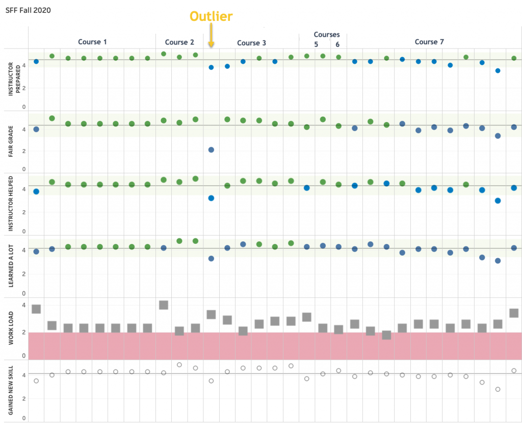
Recently, I’ve started using data visualization in Tableau to scan through the hundreds of GenEd sections for outliers. The figure below shows a snapshot of one of these visualizations with the course and instructor information redacted.
The figure above shows student feedback for multiple sections of seven different GenEd courses for Fall 2020.
The questions are:
- The instructor was organized and prepared for class.
- So far, the instructor has applied grading policies fairly.
- Overall, the instructor was effective in helping me learn the material in this course.
- Overall, I learned a great deal from this course.
Possible responses are:
- Not Applicable (0)
- Strongly Disagree (1)
- Disagree (2)
- Neither Agree Nor Disagree (3)
- Agree (4)
- Strongly Agree (5)
The fifth question asks:
- On average, how many hours per week have you spent on this course (or section), including attending class, doing homework, attending rehearsals, doing readings, reviewing notes, writing papers, attending study groups, doing lab work (unless the lab is a separate section), and any other course-related work. The possible responses are: 0-3 (1), 4-6 (2), 7-9 (3), 10-12 (4), 13-15 (5), 16-18 (6), 19+ (7).
The final prompt is directed at GenEd classes. The possible answers are the same as for the first four.
- I gained new skills that will help me with other courses and my professional life as I move forward.
For every course section, the average response is represented with a marker (circle or square). For all but prompt five, a horizontal reference line shows the average response across all sections, and the green band represents two standard deviations from that average. So responses outside the green band are clear outliers. For prompt 5, regarding student effort, the light red band shows responses that, on average, students report spending fewer than 4-6 hours per week, including time spent in class.
The attractive feature of this dashboard is that one can scroll rapidly through hundreds of sections and spot the outliers. As illustrated in the figure, an outlier instructor tends to get low scores across all questions. If all instructors teaching a class are getting low marks, that is a sign the course needs review. If an individual instructor is an outlier, there may or may not be a problem, but it merits further investigation, perhaps a classroom observation, and certainly a review of students’ open-ended responses.
The open-ended responses are often far more informative than ratings on a Likert scale, as any experienced instructor will tell you. I will return to this subject in a future blog post when I will discuss the visualization of open-ended response data.

