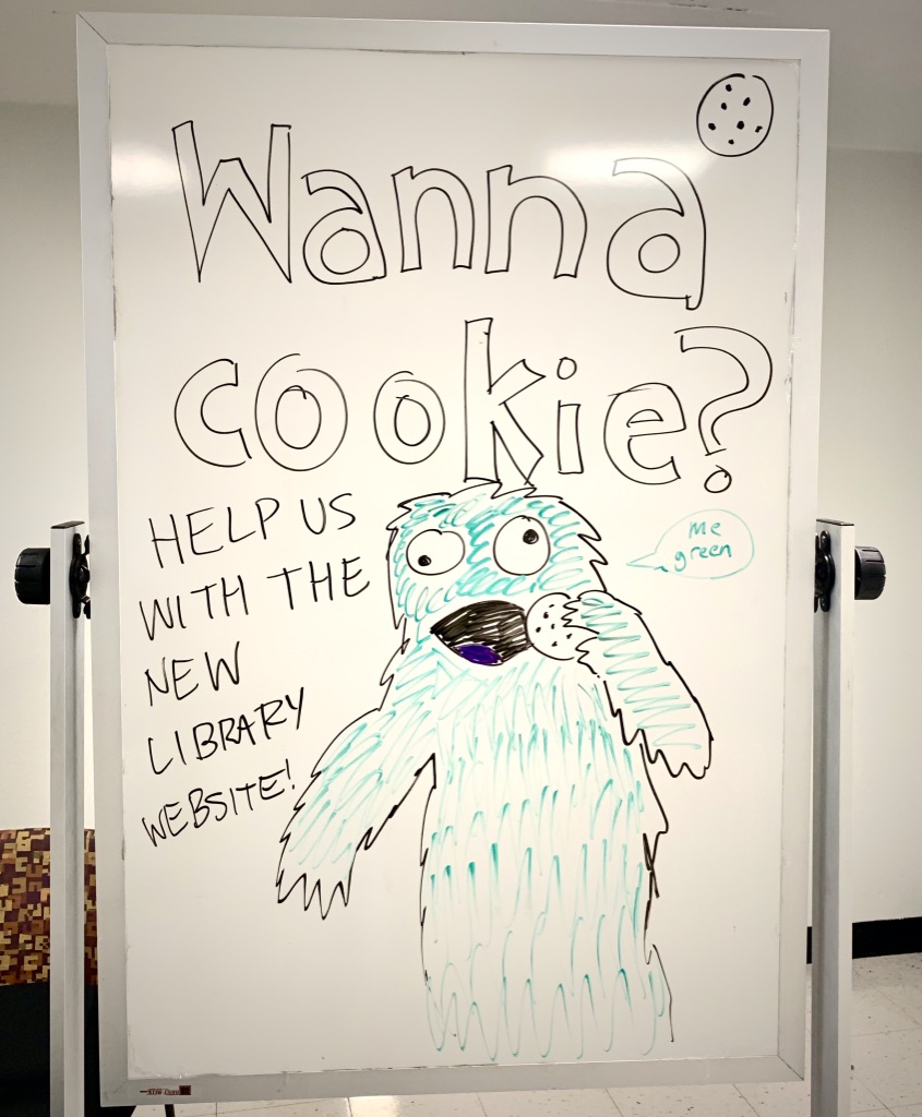
Cookie Monster invites you to help with the library website…
In late February, the Library Website Redesign project turned its focus to incorporating user research into the design process. With the help and support of Cynthia Schwarz, Nancy Turner, David Lacy, the UX group, and others, Rachel Cox and I began a month long “UX intensive.” The goal was to refine how content is organized on the site and to identify the primary site navigation.
During the UX intensive, we tested design prototypes with 48 users, recruiting passersby in the Paley lobby with cookies, granola bars, and coffee. The UX intensive also afforded us the opportunity to consider how to add user research and iterative design to the project on an on-going basis.
Organizing Content
When Rachel and I started our work, the site content was loosely organized based on the site’s backend infrastructure. The entity model allows us to group content into different entity types, such as services, policies, spaces, etc., and ultimately this model will make it easier for users to locate website content through search.
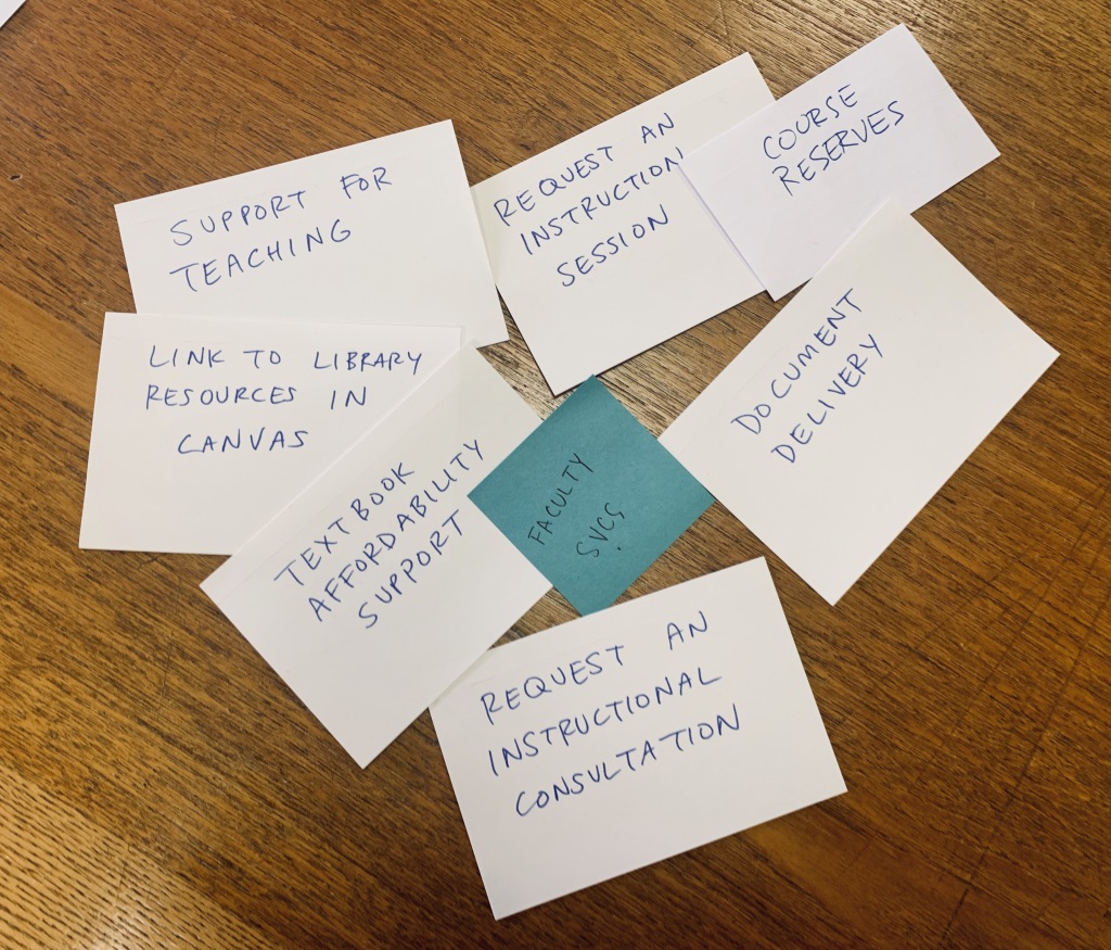
Cardsorting with library staff in 137
Our first step was to review the site content and organize it in a way that makes sense to users — we agreed that the organization of the front-end user interface shouldn’t necessarily mirror the backend entity structure. While the website’s infrastructure promotes discoverability of content, we didn’t think this was the most intuitive structure for navigating the site. Plus, we wanted to offer users a way to discover our content through browsing, in addition to searching.
Building on user research from earlier in the winter on the categorization of library services content, we did a holistic review of all of our site content. With the help of library staff we spent a day and a half in room 137, sorting our content into categories. We also spent time brainstorming category labels that accurately described the content within and were free of library jargon. Based on the card sort, we created two sets of content groupings, one a more “traditional” (and minimal) navigation similar to many other academic library websites, and an “action-oriented” navigation based on what users can do on our site.
Testing the Navigation with Users & Library Staff
The UX group then conducted tree testing with users on the two navigation menus.
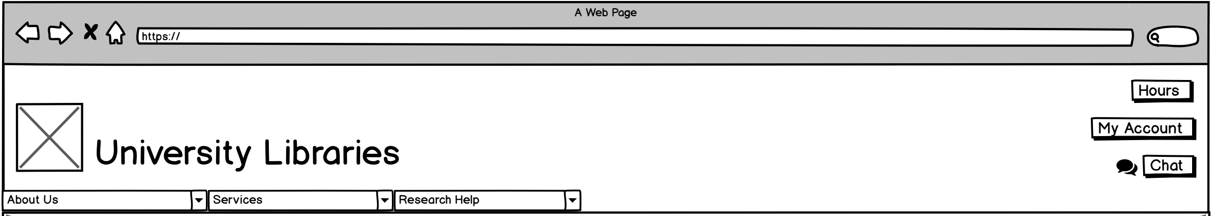
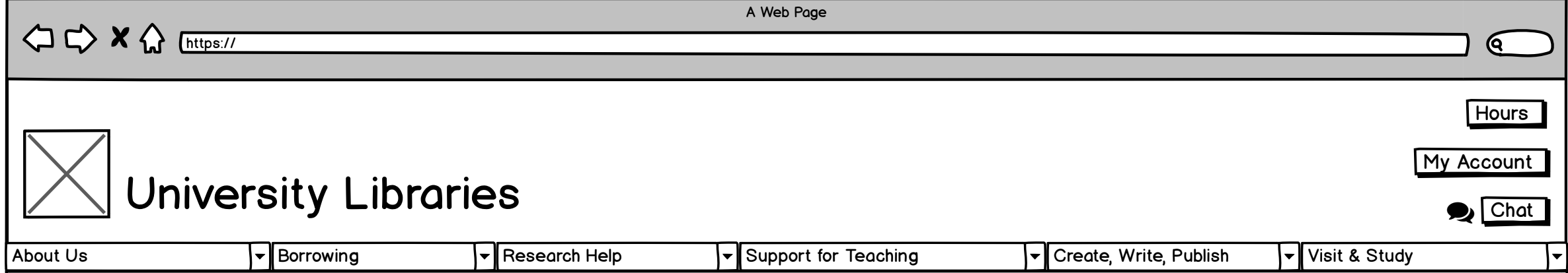
“Traditional” navigation
Ultimately, the “traditional” navigation tested better. Users were able to locate information with less effort and some commented that they liked the simplicity of fewer navigation options.
“Action-oriented” navigation
However, one category from the action-oriented menu, “Visit & Study” was very successful. We went back to the drawing board, creating a single navigation menu comprised of the best elements of each.
We also asked interview questions to get a sense of what users expected to find in each of the category and whether the terminology we chose made sense.
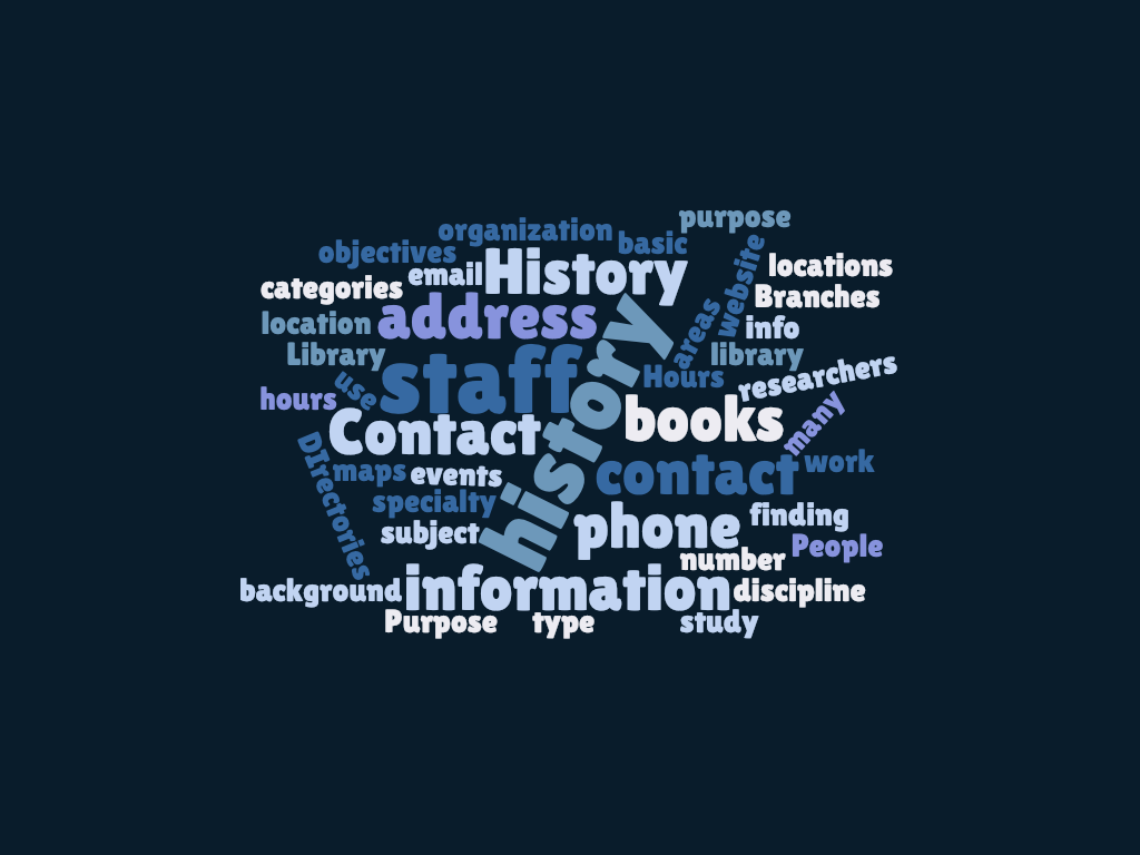
What users expect to find under About
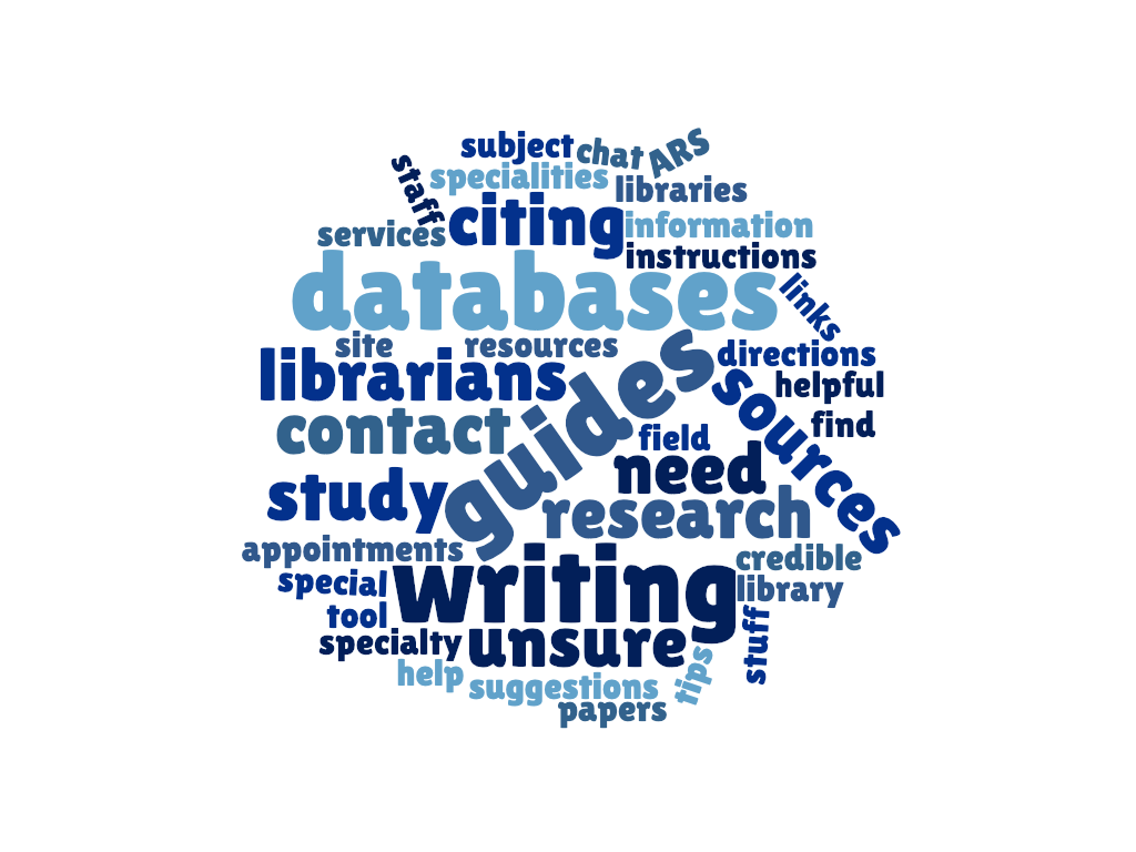
What users expect to find under Research
Refining Content Categories
From there, we continued refining the content and categories of content within the top-level navigation categories, i.e., we decided what site content should go under “About” “Visit & Study” “Services” and “Research.”
At this point, we realized we needed to meet with internal stakeholders. There was a lot of content about library services that we simply weren’t familiar with. We met with library staff from the Research Data Services Strategic Steering Team, the Scholarly Communication Strategic Steering Team, and the Digital Scholarship Center to learn more about their emerging services.
We shared the revised wireframes with library staff at an open forum in February where attendees gave feedback about labels, navigation, and organization of content. This feedback helped us to finalize the architecture of the site.
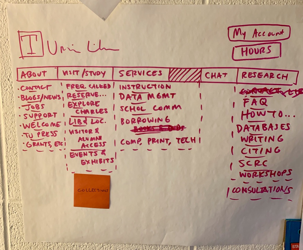
An early attempt at finalizing the navigation and content categories
Building a Site Prototype
Once the site structure was finalized, Rachel created landing pages to correspond with the primary navigation, i.e. the pages where a user ends up after clicking a top-level navigation category. We used Balsamiq to design low-fidelity prototypes (or wireframes). Balsamiq allowed us to create interactive, clickable, prototypes that could be shared and tested with users.
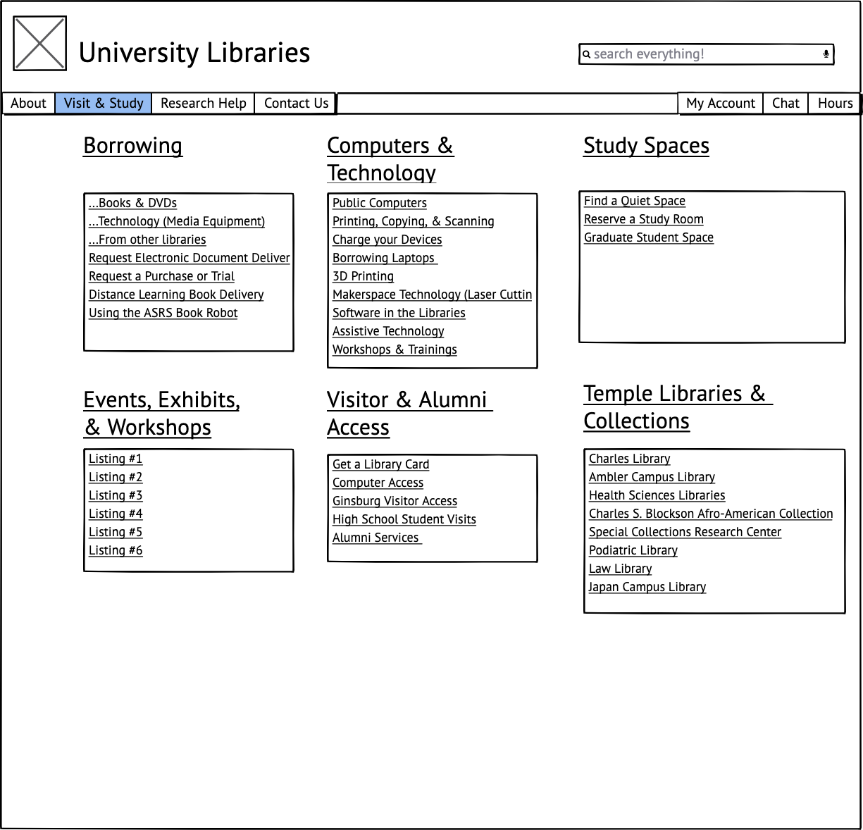
The first landing page prototype was fairly bare bones; we listed content as text within each category.
In the first round of user testing, we observed that participants spent a lot of time scanning the landing pages for the information they needed. Participants found the pages overwhelming and overlooked content in the categories. Some of the subcategory labels were also confusing. For instance, participants didn’t realize that “Libraries and Collections” meant Temple’s libraries and collections.
Based on results, we revised some of the terminology (e.g. “Libraries and Collections” was renamed “Temple Libraries & Collections”) and reorganized some of the content, but the biggest change was the elimination of the subcategory links from the landing pages. We designed icon-based prototypes of the landing pages hoping the icons would make the pages easier to scan. We tested the icon-based design with users just two days later with great success.
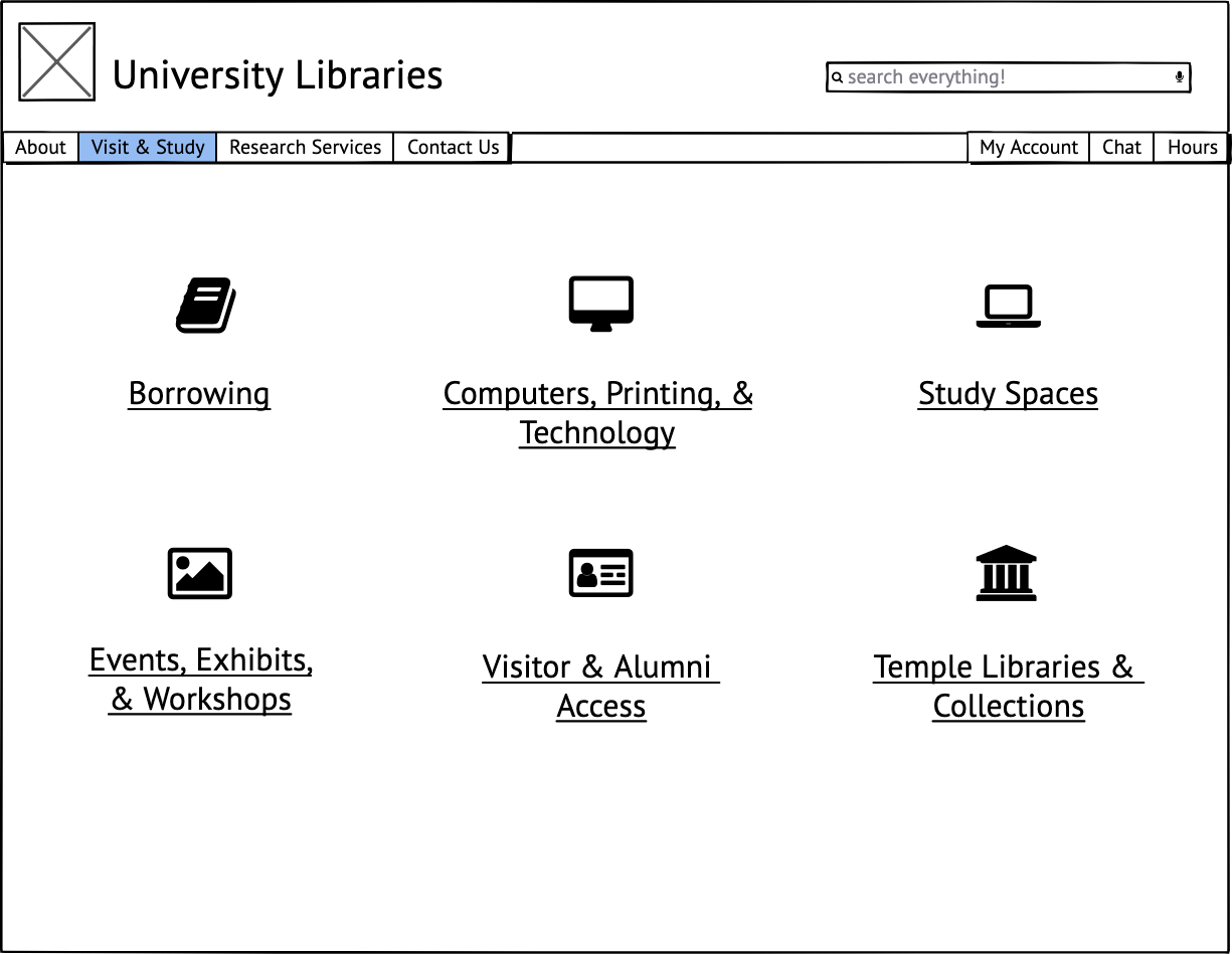
Icon-based landing page
Since February, we’ve continued to make user research a routine part of the design process. Earlier in the website redesign project, design concepts often went from a basic prototype to final product with minimal staff or user input in between. Testing initial prototypes with users and library staff helped us to identify usability issues and iterate on the design before it moved to the final coding and review stage.
Today the UX group ran our last user research session in the lobby of Paley before the Library closes on May 9th. I look forward to continuing user research in Charles Library (as well as other campus locations) and integrating user experience into a variety of projects.