
Earlier this year, a group was formed to consider ways to improve the user experience of requesting and retrieving items from the Charles Library BookBot. The group was composed of Brian Boling, Carly Hustedt, Karen Kohn, John Oram, Jackie Sipes, and Emily Toner. Karen led the group with UX support from Jackie. Our goal was to consider all aspects of the request/retrieval experience, from making an online request to physically picking up the book. We each brought different expertise, including knowledge of the service desk, the technology behind the request process, and the field of user experience research.
By the time the group convened, we already had a fairly long list of issues that we might address, identified by previous usability testing and staff focus groups. We reviewed the list and ranked each issue according to the potential impact on the user and the effort required by library staff to address it. Shortly after we began meeting, the library closed its buildings due to covid-19, which affected our priorities and how we were able to work. However, with some adjustments we were able to complete three projects: Retrieval Times, Request Button Clarification, and Encouraging Self-Service at the One-Stop Desk.
Retrieval Times
We began with a relatively simple project to come up with language that would appropriately set patron expectations around retrieving a book from the BookBot. We knew from focus groups we had conducted with public services staff that they were fielding many questions about how long retrievals would take, and that their responses ranged from ten minutes to an hour.
To decide on a message, we first needed to learn how long requests were actually taking, which we did by looking at data that Karen had compiled on requests and retrievals made from the start of the Fall semester 2019 to the March closure. Looking only at requests made while the crane was in operation, we saw that more than half of requests were delivered within 5 minutes and 87% within 20 minutes. The average retrieval time was just under 23 minutes.
Next we needed to turn the numbers into a concise message for patrons. We conducted a structured group brainstorm, where each of us wrote our own version of a message that reflected the average retrieval times we saw in the data. We then shared our individual messages with the group. The chat window in Zoom works well for this process, which became a very familiar one for us! By noting what we liked about each other’s wording, we came to consensus on the following message:
“The Bookbot typically delivers items within 20 minutes. Requests placed outside of operating hours will take longer.”
Unfortunately, because the library was closed at the time, it did not make sense to add this message to the website. We expect that the time it takes to retrieve an item may be somewhat different now, due to the absence of student workers to help with the process and the lower volume of requests. We hope, however, that we can use similar phrasing in the future with an updated estimate of retrieval times.
Request Button Clarification
Our next project addressed an ongoing problem with the Request feature in Library Search. Users often could not tell which items were requestable and which were not, and the website did not explain the logic behind why certain items could not be requested. We’d heard from public services staff that items in the fourth floor open stacks were particularly problematic; users try to request those items and can get frustrated or confused when that option turns out not to be available. After Emily explained some of the technical constraints that impact how request options are presented, we had a better sense of the scope of potential changes we could suggest. At this point, we left open the possibility that the solution could be either a change in wording or in the functionality of the Request button.
Because there were several different ways we could potentially approach this problem, the group took some preparatory steps before brainstorming solutions. First we wrote a problem statement, which defined the problem as being related to both user expectations and communication. Next we reviewed logs of virtual reference questions. Karen arranged the logs on a virtual whiteboard, which allowed us to cluster “sticky notes,” putting similar questions near each other. The reference questions confirmed what we’d heard from staff already – they were indeed getting a lot of questions from users attempting to use the Request button for items on the 4th floor of Charles! Reading through these reference transactions also provided us with some interesting new information. Patrons do not actually mind retrieving items themselves from the fourth floor; they just don’t know that this is what they are expected to do. Self-service does not need to be presented apologetically. Another finding is that while we’d initially seen communication as an issue, staff had many successful ways of communicating to patrons the need to retrieve items themselves.
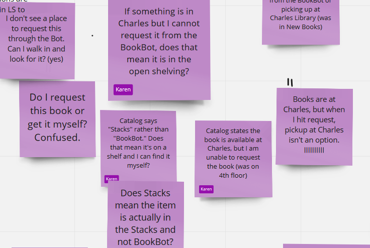
Patron questions represented on clustered virtual post-it notes
Our next step was to clarify for ourselves the policy regarding self-service, using a Five Whys exercise. Using several use cases, we took turns asking “Why can’t I request this?” and then countering the answer with another “But why?” We had fun pretending to be challenging patrons, and as we did so we started to see the logic of why certain items or locations are requestable and others not. We realized that, despite the complicated programming logic behind how the Request button worked, the human logic was relatively simple: an item is not requestable if we believe the patron can get it themselves (i.e., it is in open stacks on the patron’s home campus).
With the situation clearer in our minds, we were able to brainstorm solutions. We changed the text on the button from Request to How to get this. We wanted to use language that conveyed that requesting is not the only way to get an item. For much of our collection, there are a variety of ways to obtain a desired title.
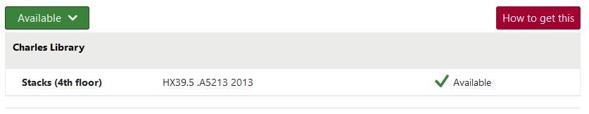
How to get this button in Library Search
With design support from Rachel Cox and more group brainstorming (we got very good at brainstorming phrasing together) we added information about retrieving items from open stacks. When a user clicks the How to get this button for an item in any open stacks location, one of the options they now see is Find item on the shelves. The text instructs the user to “Close this window to view the location and call number, then find the item using this information.” An added benefit of this new design is that the How to get this button provides a place to offer a range of options for obtaining an item. After the building reopened in August and our books were once again available in physical form, we continued to offer the popular Get Help Finding a Digital Copy service alongside the options for getting a physical copy. This service is now offered as a link within the How to get this menu.
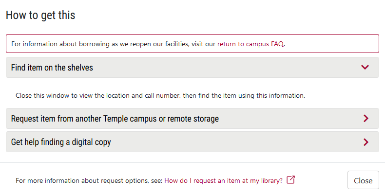
Menu that appears after clicking the How to get this button
Future assessment is needed to determine if these changes helped to clarify the request menu options for patrons.
Encouraging Self-Service at the OSAD and Hold Shelf
Several of the issues we had previously identified as high-priority related to patrons not realizing certain services were designed to be self-service, such as picking up requests from the Hold Shelf. As Charles Library reopened to patrons in August, the group looked for ways to encourage self-service in order to reduce person-to-person contact between patrons and library staff.
Because we wanted to move quickly on this project, we did not follow all the steps of a formal design-thinking process. We identified the most critical information for successful self-checkout and then brainstormed how to communicate that information at key touchpoints. To encourage self-service, we wanted to communicate five messages to patrons:
- Go directly to the Hold Shelf
- Books are alphabetical by the first four letters of your last name and last 4 digits of your TUID
- Books are not yet checked out to you
- Please use the self-checkout machine
- Return items on the cart
These messages were incorporated into the whiteboard signs near the desk, which Katerina Montaniel and Emily Schiller redesigned. Carly also arranged for the paper sleeves on Resources Sharing books to contain a note telling patrons to please check out the item. She also designed 8.5” x 11” signs to sit in plastic holders on the Hold Shelf saying “Please remember to check out your items.” Jackie and Rachel Cox worked on signs for the self-checkout machines identifying them as such. As most of our team members were not working on-site, we relied heavily on photographs from John Oram of the OSAD/Hold Shelf area, as well as assistance from Carly and Cynthia Schwarz for sign placement.
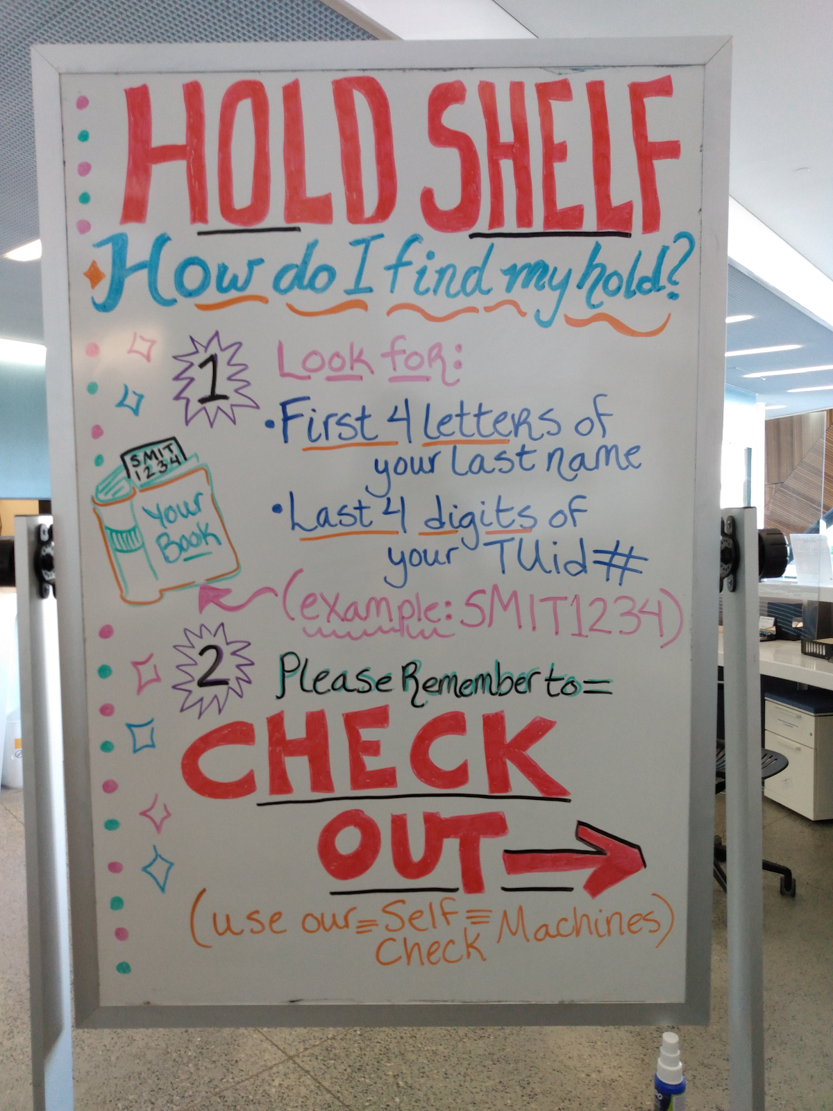
Hold Shelf sign created by Emily Schiller
Unlike the previous project, we started this one with a clear sense of the problem and did not need to spend time defining one. Our goal was to nudge patrons toward self-service in the hopes of limiting contact and creating a safe and healthy environment for everyone in the building. However, data from LibInsight questions recorded at our service desks was helpful in understanding which parts of the pickup and checkout experience were confusing for patrons.
We have already begun to assess the effectiveness of our solutions with a few different strategies. We surveyed OSAD staff about the perceived effectiveness of the whiteboard signs and made some changes based on this feedback. Brian Boling created a report using Alma Analytics of checkouts from Spring and Fall 2020, with a breakdown of staff-mediated vs self-checkouts. The reports showed us that even before our interventions, patrons were already substantially more likely to use the self-checkout machines than they were in the Spring semester. We plan to use this report as a baseline to see if future changes will make the percentage of staff-mediated checkouts decrease even further.
The group is on pause right now, but some of our recommendations will be passed on to others in the Libraries, and we hope to keep assessing the effectiveness of the changes we’ve made. Learning about and following the design thinking process has been enjoyable and using data to make improvements to our services feels satisfying. We hope our work has benefited our patrons and colleagues.