Loretta C. Duckworth Scholars Studio

⠀

Menu
  • Scholars Studio Blog
    • Disciplinary Fields
      • Anthropology
      • Archaeology
      • Architecture
      • Art History
      • Business
      • Computer Science
      • Critical Digital Studies
      • Cultural Studies
      • Dance
      • Economics
      • Education
      • Environmental Studies
      • Film Studies
      • Gaming Studies
      • Geography
      • History
      • Information Science
      • Linguistics
      • Literary Studies
      • Marketing
      • Media and Communication Studies
      • Music Studies
      • Political Science
      • Psychology
      • Public Health
      • Sculpture
      • Sociology
      • Urban Studies
      • Visual Art
    • Digital Methods
      • coding
      • critical making
      • data visualization
      • digital pedagogy
      • immersive technology (AR/VR)
      • mapping
      • textual analysis
      • web scraping
  • About
    • Current Staff
    • Current Fellows
    • Faculty Fellowships
    • Graduate Extern Program
Menu

Progress in QGIS: Heat Maps and Georeferencing

Posted on September 3, 2015April 22, 2020 by Danielle Guimaraes

By Danielle A Guimaraes

In my previous blog post, I explained my project “Models of Early Modern Charity: The Example of Venice,” which I was transitioning from the WorldMap platform into QGIS. Since my data was initially in an Excel spreadsheet, a safe and stable platform, all I had to do was import my spreadsheet as a .csv file into QGIS. In my last post, I showed how I had made my map categories more specific and, using a plugin called TimeFrame, I was able to show the foundation of Venetian hospitals through time.


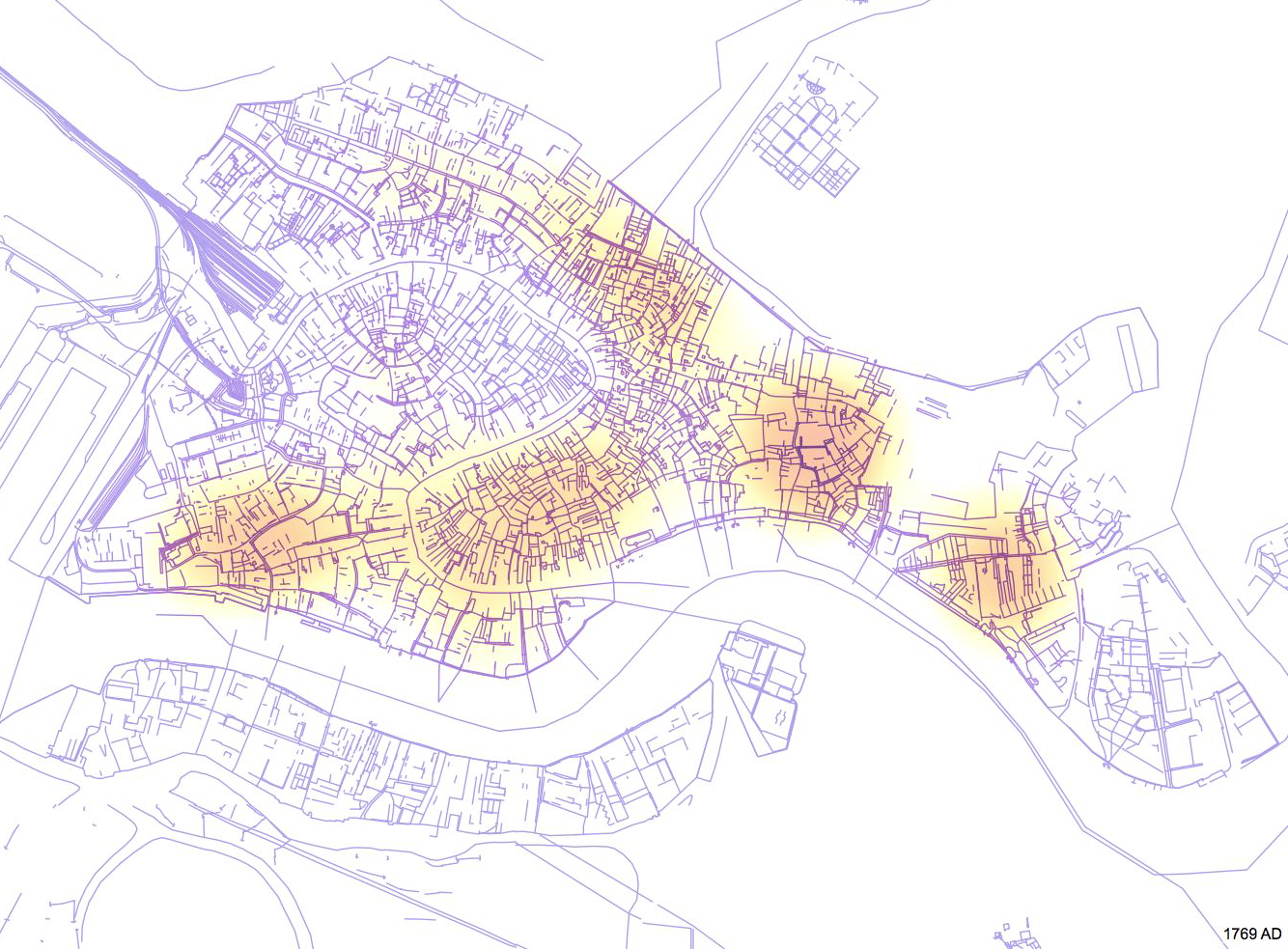
Continuing to use TimeFrame, but moving away from my categories based on the patronage of these institutions, I created a heat map that shows the foundation of charitable organizations through time. Essentially, this is a heat map of charity in Venice, and it is interesting to see clusters in specific neighborhoods. Below is a screenshot of the video created with TimeFrame, and you can see the hot spots of charity in Venice by the end of eighteenth century.


Screen Shot 2015-09-01 at 2.01.30 PM


As you can see from the image above and my previous post, my project employs a modern-day map of Venice. While it would be possible to have historical maps as layers, the broad time frame of my project makes the selection of one specific map difficult. Rather, due to my particular research interest in early modern Venice, I am interested in narrowing this project to the fifteenth and sixteenth centuries. To make the data more relevant, however, I would like to incorporate a map or diagram that shows the contemporary parishes in each one of the six districts (known as sestieri in Italian) in early modern Venice. Established in ca. 1100, parishes were communities separated from each other by water, and by this date, most of Venice’s seventy parishes had been instituted. In essence, they helped the government administer the city.


Currently, I am in the process of researching Venetian parishes and changes that have occurred in their division in order to find a diagram that accurately depicts their boundaries in the early modern period. I have experimented with two diagrams already, but I am running into issues as I try to georeference and overlay them on a modern-day map due to the original diagrams’ lack of inaccuracy. My search continues, and I hope to have a successful report on my next post!

Share this:

  • Twitter
  • Facebook
  • Reddit
  • Email

Related Posts

Leave a Reply

Your email address will not be published. Required fields are marked *

This site uses Akismet to reduce spam. Learn how your comment data is processed.

Recent Posts

  • Digital Practices for the Study of Cultural Heritage (Part 2) April 7, 2022
  • Visualizing Changes in Colombian Wetlands with ArcGIS Story Maps March 21, 2022
  • Digital Practices for the Study of Cultural Heritage (Part 1) February 8, 2022
My Tweets

Tags

3D modeling 3D printing 360 video arduino augmented reality coding corpus building critical making Cultural Heritage data cleaning data visualization digital art history Digital Preservation digital reconstruction digital scholarship film editing games GIS linked open data machine learning makerspace mapping network analysis oculus rift omeka OpenRefine Photogrammetry physical computing Python QGIS R SketchUp stylometry terrain modeling text analysis text mining textual analysis top news twitter video analysis virtual reality visual analysis voyant web scraping YouTube

Archives

©2022 Loretta C. Duckworth Scholars Studio | Design: Newspaperly WordPress Theme
loading Cancel
Post was not sent - check your email addresses!
Email check failed, please try again
Sorry, your blog cannot share posts by email.