I first got hooked on watching birds when living on Peaks Island, Maine. Sitting at my kitchen table one morning and gazing out a window to the back yard, a flock of cedar waxwings settled onto a tree. I never saw those birds again, but I was captivated by the moment and its natural beauty.
My back yard in Syracuse butted up against a waterway too – the Erie Canal. We installed multiple bird feeders, allowing me to participate in my first “citizen science” project out of Cornell’s Lab of Ornithology. For an hour or so a week, volunteers count every bird that visits the feeders, submitting the identification and numbers to the project. The instructions are easy to follow but are strict. “Report the highest number of birds seen at a single time. Don’t count a bird twice.” Contributors submit data from all over the country. Not only is this vast corpus of sighting data a treasure for ornithologists, but it is also a great way to engage many people in science, in thinking differently about climate, and paying attention to the natural world.
Bird watching in the city is quite different. Here in the city, I’ve started up again with bird watching and signed up to participate in Cornell’s eBird project. Again, the instructions for submitting checklists (birding experiences) are quite strict, with detailed instructions on how to report bird sightings. And all data submitted is subject to review for accuracy, checked to make sure that the identifications, time of year, and location make sense.
What is the connection with library assessment? We collect data too – the more the better. But it needs to be thorough and accurate.
Last week Olivia Given Castello and I provided training to staff in the Blockson Collection and the Special Collections Research Center on the use of the data entry form for tracking reference transactions. As part of the training, we reviewed the definitions for “reference”, “consultation” and “referral.” Josue Hurtado and I will monitor the data entry for the first month or so, ensuring that we have a common understanding of the definitions and documentation process.
A big thank you to all the staff at Blockson and SCRC for contributing to this work. We are THRILLED to have their data standardized and available as part of the larger LibInsight dataset. Like the eBird and Feeder Watch projects, having reliable data from a broad set of contributors improves the opportunity for analysis of trends in reference. The data will be put to good use by Temple libraries as well as other libraries and organizations (ARL and ACRL) to better understand patterns and changes in reference – a core library service.
Reaching out to students where they are is a critical part of our communication and outreach program, and our new assistant director for editorial, Ella Lathan, is expert at creatively using social media platforms to connect with our community. She and student worker Nika Svirinavichyus are really paying attention to our numbers too. I asked Ella to share with me how they were using this data to assess the effectiveness of our social media campaign.
Nancy:Tell us about the social media landscape here at TULUP (Temple University Libraries and University Press)? What are the platforms we post to?
Ella: We currently maintain an active presence on several popular social media platforms, including Facebook, Instagram, LinkedIn, X (formerly known as Twitter), and we have recently launched a TikTok account. Our strategic approach involves leveraging a diverse range of social media channels to effectively disseminate information and engage with both students and professionals within our community.
Nancy: I know that you recently compiled the usage data from these. Can you tell us something about what you learned? What trends are you seeing? What is popular and what does not get so much attention?
Ella: The recent compilation of usage data from these platforms has provided valuable insights into emerging trends and audience preferences. One notable observation is the increasing popularity of video content, particularly on platforms like TikTok. The most successful posts on our social media accounts tend to be collaborative efforts with other Temple University accounts, such as @Templeuniv, @templedss, and @TUsustainability. Additionally, our audience demonstrates a strong affinity for digital archive photos, especially those featuring nostalgic or historically significant events, such as an eclipse that occurred in Philadelphia in the 1920s. Interestingly, posts featuring pets also garner significant engagement on our Instagram account. Conversely, posts promoting specific events tend to receive comparatively less attention, which is unfortunate given the potential interest in these workshops.
Solar eclipse Instagram post, liked by 128
Nancy: What are the challenges in analyzing this data? For instance, is it difficult to collect, or hard to interpret?
Ella: Most social media platforms have extensive data tracking tools that track beyond likes and reposts! Facebook and Instagram offer multiple metrics, such as a posts’ reach and the amount of clicks from the post to our profile. Our main challenge in analyzing this data is understanding the algorithm and our followers. Posts are promoted in an algorithm depending on the time of the post, and other factors. It can be tricky to understand how the algorithm works and ensure our posts have reach. We wish there was more information on what our followers enjoy as well, to make sure we are providing relevant and helpful information for followers.
Nancy: This is such an ever-changing space. How do you keep up with what’s going on, and most importantly, where students are in the space and how we can be most effective in connecting with them there?
Ella: In this rapidly evolving digital landscape, staying abreast of the latest developments and trends is crucial. We diligently monitor the platforms where our students are most active and strive to establish an effective presence there. Collaborating with other Temple University accounts has proven to be an effective strategy for expanding our reach and connecting with students.
Climate series X post, 2385 views
Furthermore, we continuously research and analyze the interests and preferences of our target audience, as well as the content strategies employed by other successful accounts, to inform and refine our approach.
Nancy: It’s a challenge, particularly as our target audience is bombarded with so much information, as well as very cute puppy pictures. Thanks very much for these insights, and for all the work that you and Nika do to make sure students are aware of our resources, wherever they are.
Inspired by Hyangeun (Jenny) Ji’s workshop out of the Scholars Studio yesterday on How to Talk with AI: Prompt Engineering, I continued my exploration of how generative AI tools might support my work in data analysis and assessment. Jenny’s lesson #1: The best way to learn about AI is to experiment, and her tips and guidance provided just the motivation to do so.
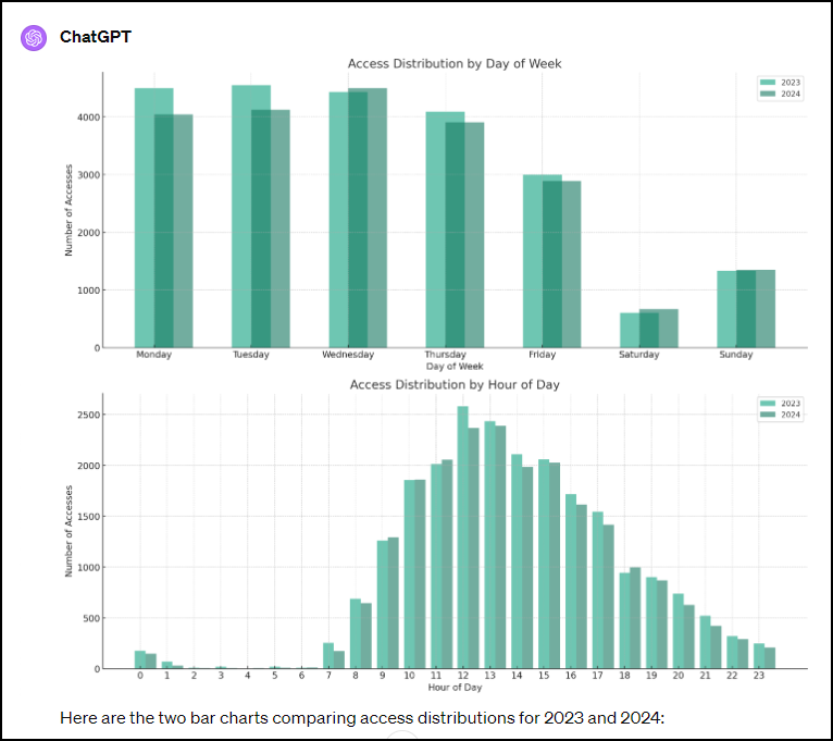
We need to understand trends in the use of the Charles Library. We see thousands of students come through the door each day. But our knowledge of day, time, and demographics can be anecdotal. We do get weekly gate reports, .csv files that include date, time, college, and student level. In this experiment, I asked ChatGPT to analyze two gate reports from a busy week in February (February 19-25, 2024 and February 20-26, 2023). My starting instructions: “Analyze these two csv files and then I will ask questions of you to compare the data in each.”
ChatGPT proceeds to output a data overview of each file, detailing each column name, such as date, time, academic level and college, and entrance used. It’s rather dry and technical, just raw numbers. But kindly, ChatGPT suggests,
“If you have specific questions or analyses you’d like to perform on these datasets, please let me know! “
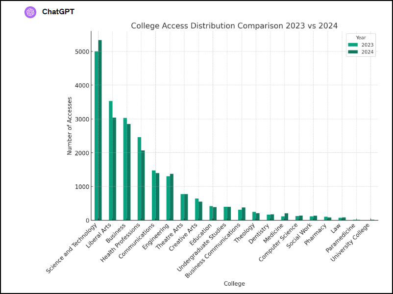
What a nice invitation! I did have some questions. I asked ChatGPT to compare traffic by days of the week, by time of day, and also by college. Since I like visualizations, I asked this data to be shown as a bar graph. ChatGPT complied:
I’m impressed. But the analysis is not perfect. For instance, there is no school of Theology at Temple, nor is there a Creative Arts school. Chat GPT is using a two-letter code and predicting what that might stand for. But still…
Chat GPTas Consultant
What would it look like to have an external data “consultant” review this data and provide their perspective? I asked ChatGPT to take on the consultant “persona” and provide me, an academic library administrator, with some insights. Here’s the result:
Resource Allocation:
The clear peak usage times around midday (10 AM to 2 PM) suggest a need for optimal staffing and resource allocation during these hours to ensure efficient operations and user satisfaction. Consider scheduling more staff or offering additional support services during these peak times.
Space Utilization:
With weekdays experiencing significantly higher traffic than weekends, consider evaluating the effectiveness of the space and resources available during these peak days. This could also be an opportunity to promote the library as a study space during less busy times, like weekends, to even out usage.
Targeted Programs and Services:
The data shows varying access patterns among different colleges. Tailoring programs or workshops to the needs and schedules of students from colleges with the highest foot traffic (e.g., Science and Technology, Liberal Arts) could improve engagement and utilization of library resources.
For colleges with increasing access year over year, such as Engineering and Medicine, consider collaborating with faculty to offer specialized resources or services that support these disciplines.
Security and Access Control:
The analysis did not directly address security, but consistent monitoring of access patterns can help in identifying any irregularities or security concerns. Ensuring that access control systems are up to date and conducting regular reviews of access logs can enhance security measures.
Observations:
The significant access by the Science and Technology college, particularly its increase from 2023 to 2024, suggests a high engagement level that might correlate with specific resource needs or study patterns. This could warrant a closer look to ensure resources meet demand.
The decrease in accesses for the Health Professions and Liberal Arts colleges might reflect changes in enrollment, curriculum delivery methods (e.g., more online resources), or shifts in study habits. It would be useful to investigate these trends further to adapt library services accordingly.
The notable increase in Medicine and slight increase in University College suggest growing areas of academic focus or expansion. These trends could guide future resource acquisitions or service expansions.
Human Reflections
The analysis provided by ChatAI is quite thorough, even insightful, given the limited quantity of data provided. Imagine what we might learn with more numbers, or the efficiencies we might gain by refining these queries. Of course we need to be concerned about replicating our analysis, and hallucinations can be problematic. In this case, ChatGPT (4) allows me to peek under the hood by viewing the Python codes used for analysis. I can also share the query and response with others through a QR code or link. But I like how ChatGPT presented its analysis in an organized and usable style that is easily shared with others, like colleagues in access services and facilities. What a wonderful way to initiate a conversation with human stakeholders.
I incorporated another hint from Jenny, one based on research. She suggests we use polite, respectful and encouraging language when conversing with ChatGPT. While this can actually provide better responses, it also created a relationship that felt like a partnership as we worked through the analysis together. The conversation became a collaboration, and that tight division between human and AI seemed less obvious to me.
Thank you to Hyangeun and to all the library staff who provide guidance (through workshops and consultations) on best practices as we explore and understand AI tools in our work.
Happy New Year! What a year we had in 2023. Tumultuous. I predict that 2024 will be equally filled with change and uncertainty. Before we move on to those new challenges, a brief update on an important assessment effort conducted last year, the Strategic Resources Review.
The Review was undertaken to get a clearer sense of how staff, in the aggregate, are spending time towards providing library services.
How many staff are engaged in work related to collection management?
Preparing for instruction?
What percentage of our time is spent with administrative work?
Are there ways in which we should be shifting our efforts towards a different future of work? For instance, do we need more time to spend on licensing electronic resources? More time developing workshops for students and faculty on the use of artificial intelligence tools?
Our aim was to systematically document how time was being spent on what types of activities This descriptive picture has potential to benchmark current work effort as we identify emerging areas of service to guide future investment.
The approach
Understanding how staff spend time is complicated. We might have asked everyone to document each hour of each day’s work for a year! Instead, we asked each department and unit head to provide a list of all activities and services provided by their unit and the percentage of time (over a year) that staff, in the aggregate, spend on this work. For each department, the total work effort should add up to 100%.
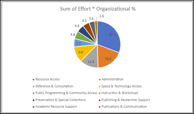
All this was compiled into a large, shared spreadsheet (293 rows), with percentages multiplied by the number of staff in each – amounting to a rough calculation of how much effort we expend, as an organization on services. To strengthen the analysis, we asked about service audience (internal, external) and whether work in that area was increasing or decreasing. We asked how trends were documented (for instance, tracking transactions).
We designated this descriptive phase of the review our Services and Work Effort Catalog. Admittedly subjective and broad, this kind of analysis allowa us to see at a high level, how we use our time.
Early findings
Findings from the effort inventory were not too surprising but describe in a new way how we are currently investing in categories of service at the libraries.
For instance,
1/3 of our activity is devoted to “Resource Access” – this includes circulation, cataloging, acquisition of new materials and stacks management.
Almost 1/5 relates to Administration – this might be HR functions, committee and professional service activity, or time spent with internal communications.
We learned that for many services, we’re just not tracking our time investment in a consistent, systematic way. This makes sense. It’s easy to count our instruction sessions, less straightforward to calculate time spent preparing that instruction.
While this descriptive exercise was interesting, there are bigger, unanswered questions. Does this allocation of effort reflect our values as an organization? Is the effort aligned with the impact we desire to have on our communities in support of the work of students, faculty and the community? And how do we measure that value and impact? Perhaps our biggest takeaway is the difficulty quantifying our work in this way, that “return on investment” and true productivity and value are more than numbers that can be calculated with a formula.
I’ve been exploring prompt engineering this week in my efforts to learn more about the uses of AI – for personal interests and professional work. It connects to our thinking about the use of AI tools for instruction and by students – a recent study reported in Inside Higher Ed indicated that college students are far more likely to use AI than their instructors. Temple is ahead of the game in developing policies for student use of AI. But what does “use” mean exactly?
ChatGPT can do far more than write homework assignments. My early learning in prompt “engineering” through Coursera gets into these complexities and possibilities. I highly recommend it.
In learning about the Chain of Thought prompt, I asked ChatGPT to Provide steps for a novice viola player to take in practicing a part for in a chamber ensemble. Break out the practice routine into simple steps for 30 minutes of daily practice.
The prompt yielded this output:
Practicing a part for a chamber ensemble on the viola requires a structured and focused routine. Here’s a step-by-step practice routine broken down into simple 30-minute sessions for a novice viola player:
Day 1: Establishing the Foundation (30 minutes)
Warm-up (5 minutes): Start with some basic warm-up exercises to get your fingers and muscles ready. Practice scales or simple finger exercises to improve dexterity.
Review the Sheet Music (5 minutes): Spend a few minutes looking over the sheet music for your part. Familiarize yourself with the key signature, time signature, and any challenging passages.
Basic Technique (10 minutes): Focus on the fundamental techniques such as bowing, finger placement, and intonation. Play through the section slowly, paying attention to correct fingerings and bowing direction.
Rhythm and Timing (5 minutes): Work on the rhythm of your part. Use a metronome to ensure you’re playing in time. Start at a slow tempo and gradually increase it as you become more comfortable.
Play Through (5 minutes): Play through the entire part at a slow tempo, concentrating on maintaining proper technique and rhythm.
Day 2-4: Refining Technique (30 minutes each day)
Warm-up (5 minutes): Begin with warm-up exercises to prepare your fingers and muscles.
Isolated Practice (15 minutes): Break your part into smaller sections or phrases. Work on one section at a time, paying close attention to intonation, bowing, and dynamics. Repeat each section until you’re comfortable.
Integrate with Metronome (5 minutes): Combine the sections you’ve practiced with a metronome to improve your overall timing and coordination.
Play Through (5 minutes): Play through the entire part at a slow to moderate tempo, focusing on smooth transitions between sections and maintaining correct technique.
Day 5-6: Musical Expression (30 minutes each day)
Warm-up (5 minutes): Start with your usual warm-up routine.
Expression and Dynamics (15 minutes): Pay attention to the musicality of your part. Experiment with dynamics, phrasing, and articulation to make your playing more expressive. Try different bowing techniques to achieve the desired musical effect.
Slow Practice (5 minutes): Play your part at a slower tempo, concentrating on expressive playing. Use vibrato and bow control to add depth to your performance.
Play Through (5 minutes): Play through the entire part, focusing on musical expression and dynamics. Try to convey the emotions and nuances of the music.
Day 7: Putting It All Together (30 minutes)
Warm-up (5 minutes): Begin with your warm-up exercises.
Full Tempo (15 minutes): Play your part at or close to the intended performance tempo. Focus on maintaining all the techniques and expressions you’ve practiced.
Play Through (10 minutes): Play through the entire part multiple times, gradually increasing your confidence and fluency.
Remember to take short breaks between practice sessions to prevent fatigue. Consistent daily practice and attention to detail will help you prepare your viola part for a chamber ensemble effectively. Adjust the practice routine as needed to accommodate your progress and specific challenges in the music.
Citation: Chat GPT 3.5 November 1, 2023
This program made a lot of sense to me – I’d love to hear from other musicians about it.
In addition to being a novice viola player, I enjoy photography. I took lots of pictures when traveling in Ireland, and I particularly liked this one:
I asked ChatGPT, How could I make this photograph more impactful? and again, the bot’s suggestions are worth considering:
The photograph you’ve shared captures a serene urban scene with beautiful natural reflections on the water. Here are some suggestions to make the photograph more impactful:
Cropping: Consider a tighter crop to eliminate unnecessary distractions. For example, cropping out some of the sky can place more emphasis on the reflections in the water.
Enhancing Colors: Increase the saturation slightly to make the colors pop, especially the golden hues from the sunlight and the greens from the trees.
Contrast and Brightness: Adjusting the contrast can help to make the image look more dynamic. Brightening specific areas can also help draw the viewer’s attention to key elements.
Highlighting Reflections: Emphasize the reflections in the water by increasing clarity or sharpness. This will add depth to the photo.
Leading Lines: The railing in the foreground is a strong leading line. You might want to ensure it leads the viewer’s eyes towards the main subjects, such as the bridge or the line of buildings.
Sky Enhancements: If the sky appears too bland, consider using gradient filters to darken the top part, bringing out more details in the clouds.
Vignetting: Add a slight vignette to the edges of the photo. This darkens the corners slightly and can help draw the viewer’s eye to the center of the image.
Remove Distractions: Consider removing any small distractions using a tool like the clone stamp. For example, any litter on the pavement or small objects floating on the water.
Experiment with Black and White: Sometimes, turning a photo black and white can give it a timeless, classic feel, emphasizing shapes, lines, and contrasts.
Add a Focal Point: While the scene is beautiful, adding a focal point such as a solitary person on the bridge or a boat on the water might create a story or theme for the viewer to latch onto.
Remember, the best edits will often depend on the mood or emotion you want to convey with the photograph. Always keep your intended audience and the purpose of the photograph in mind when making edits.
Citation: ChatGPT 3.5 November 1, 2023
Finally, I asked ChatGPT, What famous paintings are similar to this picture in terms of color and content? While I’m not familiar with all these paintings, the suggestions seemed to me quite useful, providing a helpful starting place for further exploration.
The photograph you’ve shared showcases an urban scene with buildings, a bridge, calm water with reflections, and a rich golden hue, reminiscent of the warm lighting found during the golden hour. Here are some famous paintings that share similarities in terms of color palette and content:
“The Bridge at Argenteuil” by Claude Monet: Monet painted many scenes featuring reflections on water, bridges, and buildings. The colors and tranquility of this specific painting resemble the mood captured in your photograph.
“Boulevard Montmartre at Sunset” by Camille Pissarro: The warm colors and urban setting of this painting align with the mood and content of your photograph.
“Houses of Parliament, Sunset” by Claude Monet: The golden and warm hues of the setting sun, along with the reflection on the water and the silhouette of a city, have similarities to the photo you’ve shared.
“View of Delft” by Johannes Vermeer: Although the color palette is cooler, the focus on buildings, water, and reflection has parallels to your image.
“The Starry Night Over the Rhone” by Vincent van Gogh: This painting has a night scene with reflections on water and buildings on the side. The colors are richer and darker but evoke a similar tranquil mood.
“Evening on Karl Johan” by Edvard Munch: The urban setting, with a play of light and shadow, creates an atmosphere that can be related to your photograph.
While these paintings might not be exact matches, they each share certain elements of color, content, or mood that resonate with your photograph. If you’re interested, you might want to explore these works further to see how artists have historically captured similar themes and scenes.
Citation: Chat GPT 3.5 November 1, 2023
These examples are just for fun, but as we consider our policies related to the use of generative AI in higher education, it’s easy to see how challenging and complex the determination of “use” might be. For what purpose might we use AI and at what stage of the research or creative process? We would never discourage a student from asking for assistance from their human instructor about best approaches to practice, improvements on a draft or creative work, or recommendations for related content to explore. And what an opportunity for learning – to learn how best to mine large learning models, ask better questions, and to critique the results.
The ways in which we use libraries is changing. How we conduct research. How we use (and don’t use) print collections to seek information. How we design our physical spaces to welcome students and create a sense of belonging for diverse communities. A theme throughout the Designing Libraries conference last week was how situating services and spaces together and creating unexpected aesthetic experiences provide for both convenience and a welcoming environment for students today. Browsing the book stacks is no longer what drives traffic to the library.
The conference was held at the University of Arizona’s sprawling Tucson campus. Imagine a Student Success District comprised of three adjacent buildings over nine acres! (Well, space is different in the West).
Designing the exterior landscape that connects those buildings presented many engineering and aesthetic challenges, according to keynote speaker Christine Ten Eyck. In Tucson, providing for shade is necessary and the plants must be able to thrive in the hot, arid climate. With little maintenance. The landscape design is inspired by the city’s surrounding arroyo’s – meandering paths for waterflow, here providing for an urban oasis that attracts both students and wildlife. Ten Eyck’s themes of aesthetics and nature ran throughout the conference. Others spoke to how outdoor landscaping and indoor plants contribute to students’ sense of well-being.
Another example of situating aesthetics in new ways to support student wellness and belonging is the Artist in Residence Program at Geogia Tech. This is a school that is predominantly graduate level STEM (Science, Technology, Engineering & Mat) – disciplines not frequently associated with the arts. Artist residents are asked to engage the community in an artistic and aesthetic exploration of the role of the libraries in society. The project, now in its third year, supports artists, and as importantly, engages students in an experience that encourages them to think about art in new ways.
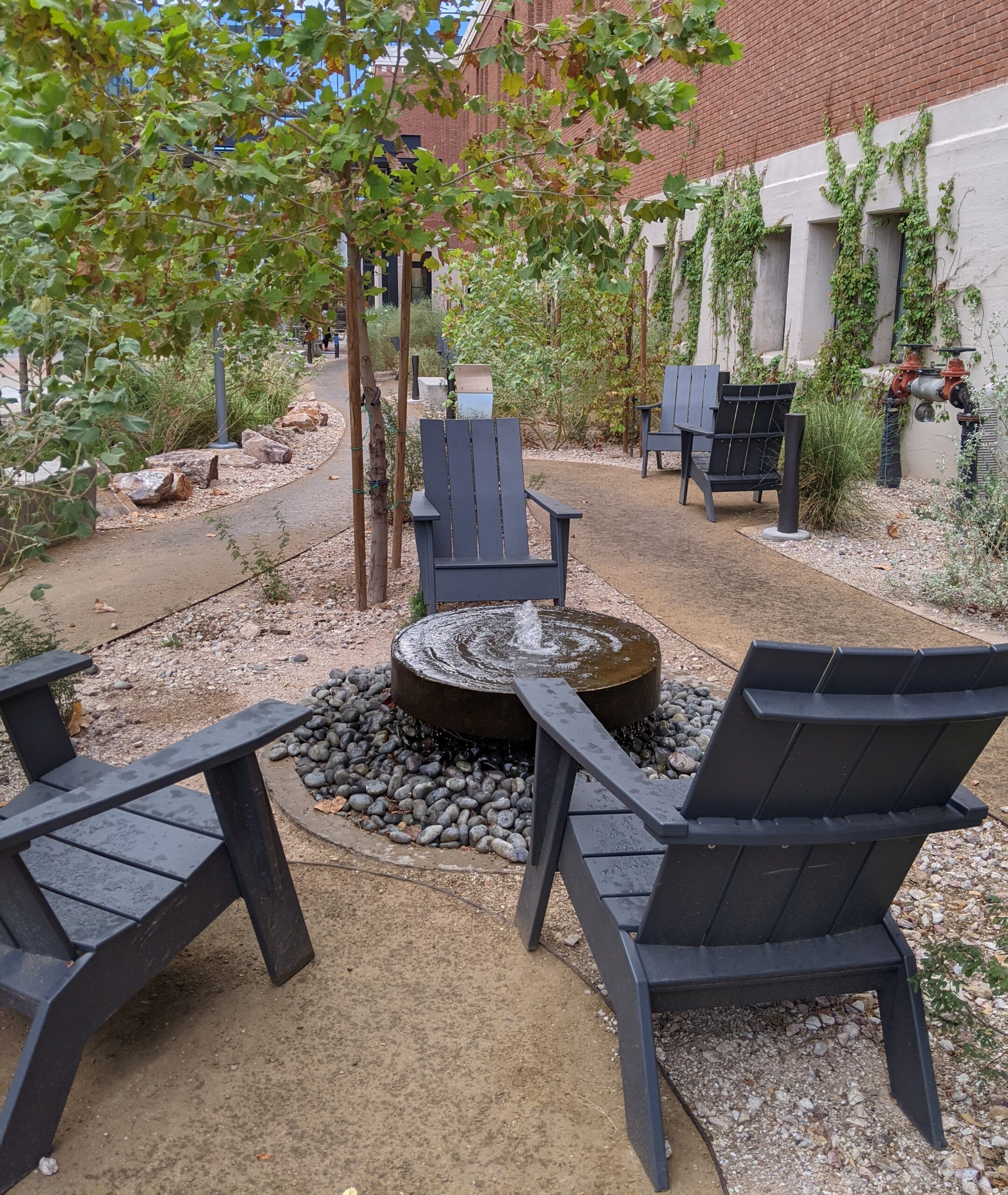
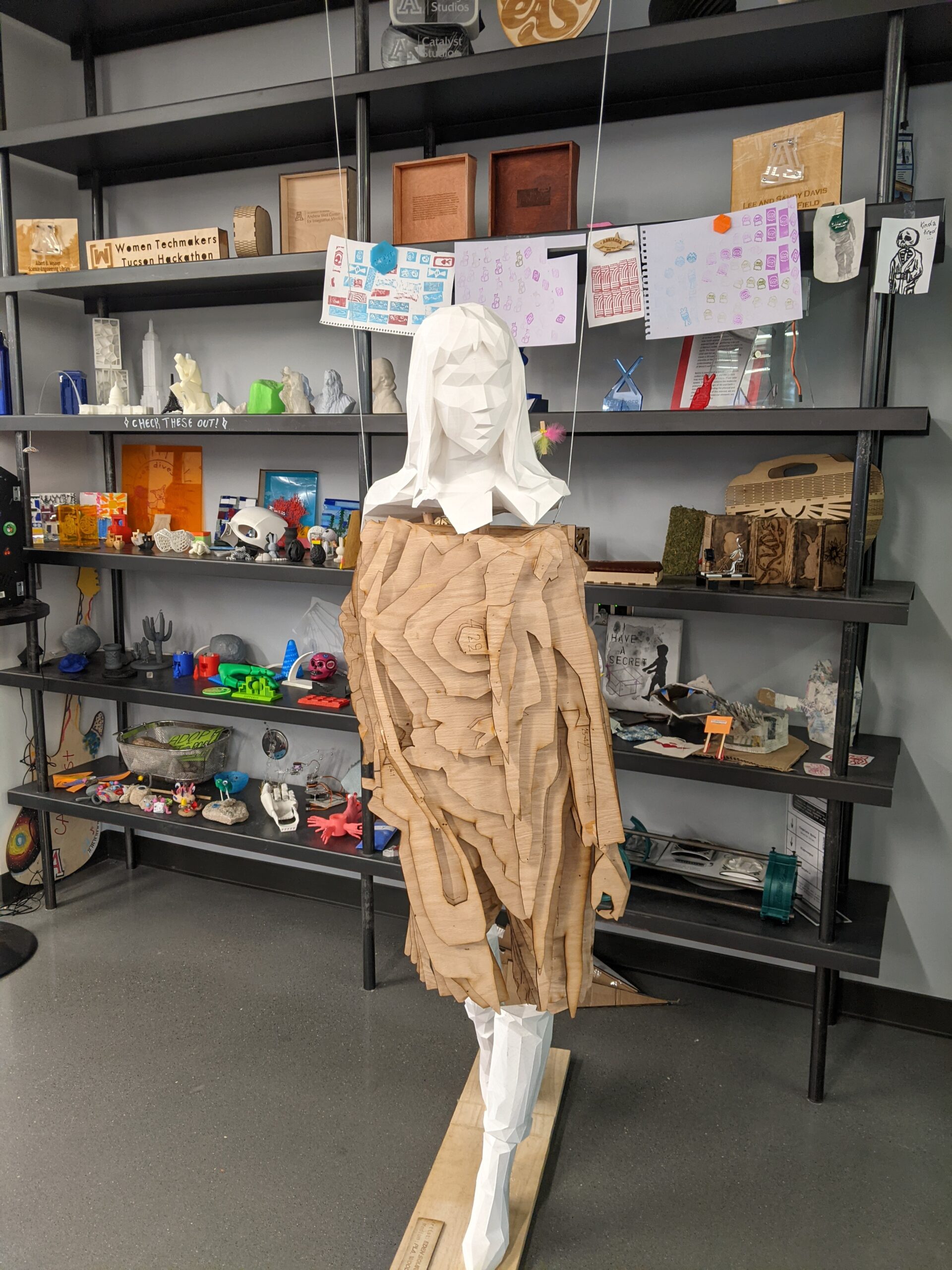
A centerpiece for the conference was the University’s Student Success District. The main library is part of the district alongside technology help (and lending), career services, academic support and tutoring, study rooms, a data visualization lab and a space for makers.
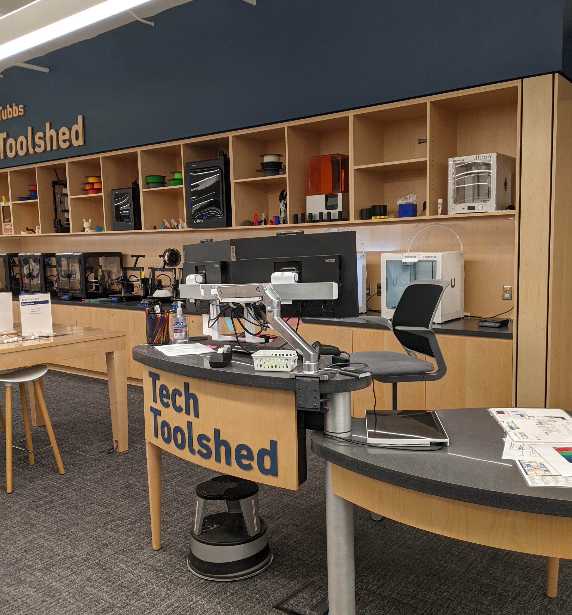
CATalyst Maker Space at the Student Success DistrictTechnology tools to borrow
While the luxury of space provided by three buildings is not something we all can afford, the Success District demonstrates also creative thinking and attention to student needs made possible by collaboration between multiple administrative organizations. These services are not all under the control of the library! But the shared goal of providing a welcoming space for students that supports their learning in a variety of ways – that can be replicated by all of us.
The convenience and ready access to a variety of services is not limited to books, technology or academic support. Food is at the ready too, with these darling robots that travel autonomously throughout campus to deliver food and drink. A service that works better when there is sunshine 350 days out of the year.
Student pets robot. Credit: Chris Richards/University of Arizona
We start the semester off with a post from Karen Kohn and members of the Open Education Group (Steven Bell, Andrew Diamond, Courtney Eger, Kristina De Voe, Janeen Lamontagne, Alicia Pucci) that describes in detail how Karen and the team are evaluating the effectiveness of promoting this important but time-intensive effort. Karen’s account is a great example of assessment, but also how hard we work towards ensuring our collections support the curricular needs of our students.
Since Spring 2018, Temple University Libraries have been systematically purchasing electronic copies of books assigned in courses. We began this effort in response to research showing the difficulties students have in paying for textbooks. (See previousposts on the Library News blog.) Building a partnership with the campus bookstore, we request a list each semester of all the books faculty have asked the bookstore to order for their courses. As Collections Analysis Librarian and part of the Acquisitions department, I (Karen Kohn) am responsible for reviewing the list and ordering textbooks. I check the list against our library holdings to see what we have as an ebook, and then I check which additional texts we’d be able to buy as ebooks. For many years, Media Services Librarian Brian Boling has been maintaining an Etextbook Database to facilitate students’ finding the library copies of their texts.
After the Libraries’ Open Education Group formed in fall 2019, we added an assessment component to the etextbook acquisition and promotion process. The original goal of our assessment was to estimate how much money the Libraries had saved students by purchasing electronic copies of their textbooks. After seeing a presentation by Villanova librarians John Banionis and Marianne Watson in fall 2020, I mapped out a process that the Open Education Group has since used for estimating savings. The calculations have turned out to be useful in ways beyond our initial intention.
The Details of Calculating Cost Savings
In theory, the estimated amount of money the Libraries save students is the cost of the book multiplied by the number of students who didn’t have to pay that cost. In practice, the calculations are a little more complicated. Student workers record the final enrollment for each course and the price of the textbook. We instruct them to record the “Buy Used” price, as this falls between the cost of a new book and the cost of a rental. Once the semester is over, I collect information on how many times each book was used. If a book is available on several sites, I add together the usage from all the sites. Usage is measured with COUNTER reports, which follow an international standard. COUNTER reports provide a metric called Unique Title Requests, which tallies how many sessions were spent in a given book.
Including usage data allows us to adjust the savings estimate downward if not every student used the book. I calculate the estimated savings using whichever is lower–the number of enrolled students or the Unique Title Requests. An example can illustrate the reason for doing this. If a course had 25 students and its textbook was used 100 times, we have only saved at most 25 students the cost of buying the book. If a course had 25 students and its textbook was used 5 times, then at most 5 students used it, and we only saved those five the cost of purchasing the book. Multiplying the lower number by the Buy Used price produces an estimate of the amount the Libraries have saved students by providing an electronic copy of their textbook.
Promoting the Etextbook Purchase Program
A surprise for the Open Education Group initially was the number of etextbooks that were not used at all! While the number of unused books varies by semester, it is still notable that any book assigned in a course and available through the Libraries would have no use! We decided to try promoting the books more to see if it would make a difference.
Looking at the textbook usage over time has allowed us to see the impact of various changes in our processes and promotion efforts. In fall 2022 for the first time the Open Education Group used a mail merge to notify every faculty member that the Libraries had their textbook. The mail merge feature lets us customize emails by pulling information from a spreadsheet, so each email contains the professor’s name, the course number, title of the book, and a link to our catalog. We got a generally positive response to this, and a slight decrease in the number of books that were unused.
Promotion Is Working
So far, the lowest-ever number of unused etextbooks was the past spring. Two parts of the process might have affected this number. One was the mail merge, which we used that semester for the second time (thanks to Andrew Diamond). Another factor was that for the first time, the bookstore sent us the textbook list ahead of the start of the semester, and we were able to notify faculty before the semester started. In fall 2023 we were not able to notify faculty until the end of the first week of classes, so we will watch to see if that leads to fewer books being used. Over time, assessment will help us see the impact of both our purchases and our promotion efforts, so we can make the etextbook collection as useful as possible to Temple students.
This month’s post is from Sarah Bauman, Head of the Charles A. Kraus Library at Temple’s Schools of Podiatric Medicine. Sarah was so excited by the recent conference she attended, I asked her to post about it.
How do we select an appropriate study design for a research question?
How do we find evidence?
How do we create a good clinical foreground question using the PICOTT approach (Patient, Intervention, Comparison, Outcome, Type of Question, and Type of Study)?
The workshop consisted of lectures and small group work, where we learned to assess standard research methods used in the health sciences, like systematic reviews. We used a traditional a CASP checklist for the assessment in our critical appraisal by looking at whether the review, in general, addressed a sensible clinical question, the search was relevant and exhaustive, the studies found were of high methodological quality, and the selection and assessment of studies were reproducible.
Librarians in the health sciences are not usually required to evaluate the calculations used in medical research. Still, we learned some “basics,” like how to use nomograms to specify likelihood ratios and create tables to calculate the sensitivity, specificity, positive and negative predictive values, and positive and negative likelihood ratios. Understanding what’s behind these calculations helps one appreciate how the efficacy of trials and treatments for patient care is rigorously evaluated before publication—or at least the best practices.
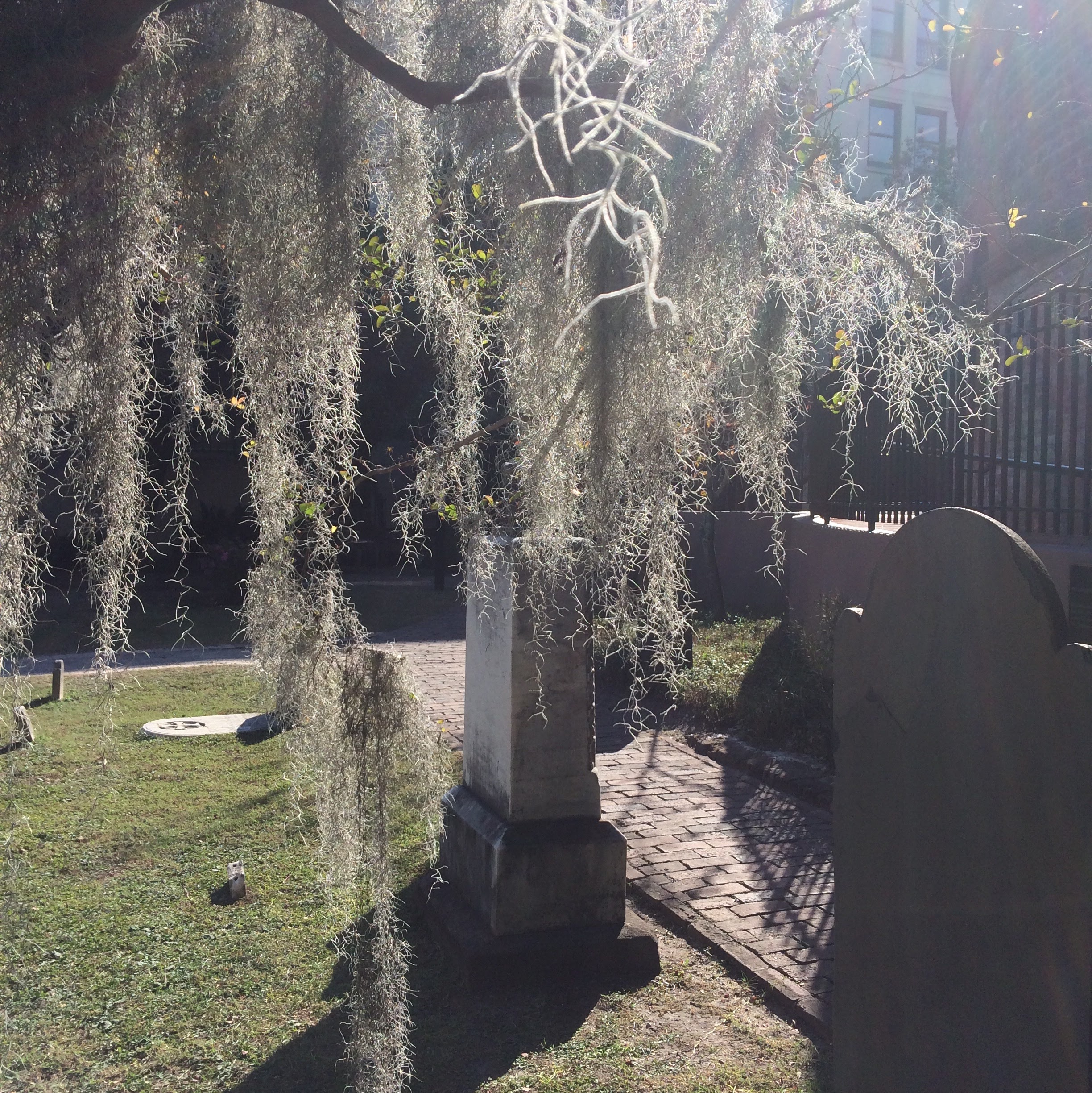
I liked learning about this so much; I plan to take the Critical Appraisal Institute for Librarians course this spring semester to delve deeper into the topic. And the workshop was not all work – I also enjoyed restaurant “dine-arounds” and even a ghost tour of Charleston.
Ghostly Graveyard (Photo by N Turner, Charleston, SC, 2016)
In my capacity as coordinator of library assessment, I’m often consulted about survey design. I even represent the Libraries on the University’s Survey Coordinating Committee. So I should know and use best practices.
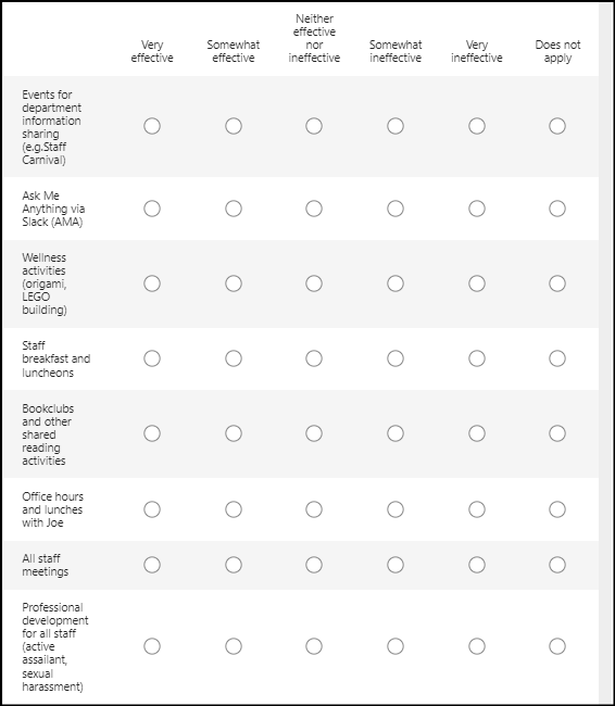
But frequently we want to toss out a quick survey to gauge reactions to a situation – surveys are generally considered a straightforward and suitable method for this. I wanted to gather feedback from library and press staff on the perceived effectiveness of activities put into place to build staff engagement. The survey followed was our staff engagement event (retreat) conducted in December. Six months post event seemed like a good time to conduct a brief assessment using examples of staff activities taken directly from the report’s recommended next steps.
It was a short survey. The first question,
On a scale of 1-5, how effective is this activity in helping you connect to others in the organization?
A minor mis-step.
The question references a scale of 1 to 5, but the options were not numbered! I doubt that this confused too many, but it was, admittedly, a bit sloppy on my part.
But the second question did cause some confusion. Using the same set of activities, the survey asked,
On a scale of 1-5, how effective is this activity for communication and building trust?
This is an example of a double-barreled question. A common survey question mistake, asking about two things at once. Communication is not always the same as building trust. When a survey question is not clear and precise, responders are justly confused, and the data collected is difficult to analyze. Because the question is not understood in the way it was intended.
Fortunately, the stakes here were not too high. The survey yielded important feedback and suggestions for improvement. But for those large-scale efforts, the University Survey Coordinating Committee, and the Office of Institutional Research & Assessment, serve an essential purpose. This office protects Temple students and faculty from being over-surveyed. Additionally, its review process puts lots of expert eyes on surveys that go out to our community. Ultimately, our committee work supports better response rates as it prevents survey-fatigue, and the careful review helps ensure the survey data we do collect is sound.
And of course, it’s a lesson for me and other assessment professionals — to always know there is room for improvement!
The crowds are back! For ALA’s annual conference, almost 16,000 registrants gathered at Chicago’s McCormick Place Convention Center. The return to fully in-person meetings, coupled with sessions on the new hybrid work environment, has me revisiting the question of howspace, both physical and digital, contributes to fostering connection and community within an organization. The topic has interested me since the move to Charles Library’s open office spaces and the subsequent pandemic, as it impacts our work, our communication and our sense of cohesion as an organization.
We had perfect weather for a tour of library renovations sponsored by ALA CORE’s Buildings for College and University Libraries Committee, on Innovative Learning Spaces: A Tour of Chicago-Area Academic Institutions.
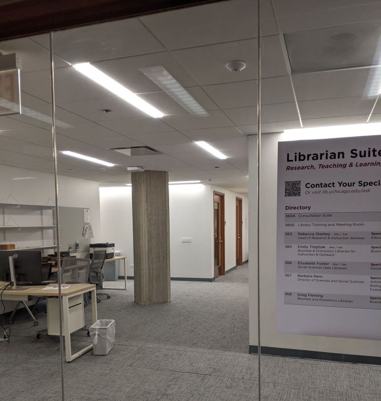
I was most interested in the staff space renovation taking place at Regenstein Library, a 1970’s brutalist structure, almost 600,000 square feet and housing 3+ million volumes (including an onsite ASRS). John Carey, Director of Building Services and Operations, described a post-pandemic shift in building use. While the library sees over 5,000 visitors a day, there is a shift towards pandemic-weary undergraduates seeking in-person experiences as well as wifi and power outlets.
I was particularly interested in the staff areas. The renovation plan deliberately included an “investment” in staff spaces, towards all librarians having an “enclosed” space. We toured these new office suites, including both large (for supervisors) and smaller for librarians. There are consultation spaces for work with patrons, a staff kitchenette, conference room, and a common table for informal unit gatherings. While enclosed, the suite is located near open stacks and study areas and available for drop-in service. Only one staff member occupied the space on our Friday visit, but according to a UC colleague, staff are using up vacation time. Plus the upcoming NASCAR race wreaking havoc with commutes! So it will be interesting to see how these spaces work when classes are in session and library staff are onsite once again.
Renovated space for librarian offices at the University of Chicago.
Hybrid Work Culture Post-Pandemic: Challenges and Opportunities from Geographically Diverse Libraries was a panel discussion on how pandemic lessons are informing our increasingly hybrid work environment. Panelists from North Caroline, Virginia and Miami shared experiences and best practices.
From the University of Miami:
Think creatively about the library organization structure
Expect to train managers of hybrid teams
Understand that achieving fairness and inclusion may be more difficult than expected
Maintaining a healthy work/life balance and engaging in networking can also be challenging
Glen Wiley, Associate Dean for Access and Discovery Services
North Carolina State University also has:
a renewed emphasis on staff well-being, touching bases regularly with “How are you doing?” surveys
is rethinking office and meeting space to ensure that meeting rooms are hybrid-enabled
reconsidering the current practice of assigning office space in a “hierachical.”
has established in-person days for many departments, when everyone is onsite
makes an effort to find remote work for all staff, with managers typically working on site at a higher level, “as a way of supporting staff.”
David Goldsmith, Associate Director for Collections & Research Services
Space for Community and Connection
Whether our workspaces are physical or digital, in the end it’s not the space, per se, but how our space use supports communication, connection and community. Whether we are in-person, working in a more hybrid environment, or fully remotely, we need to design our spaces to support new communication modes and recognize that optimal use of these modes requires new skills. And for some kinds of community-building at work, there continues to be value in the face to face, in the flesh connection.
Chairs can be checked out at the Illinois Institute of Technology