Note: This post was written by Michelle Mackinsky and Jackie Sipes
Background
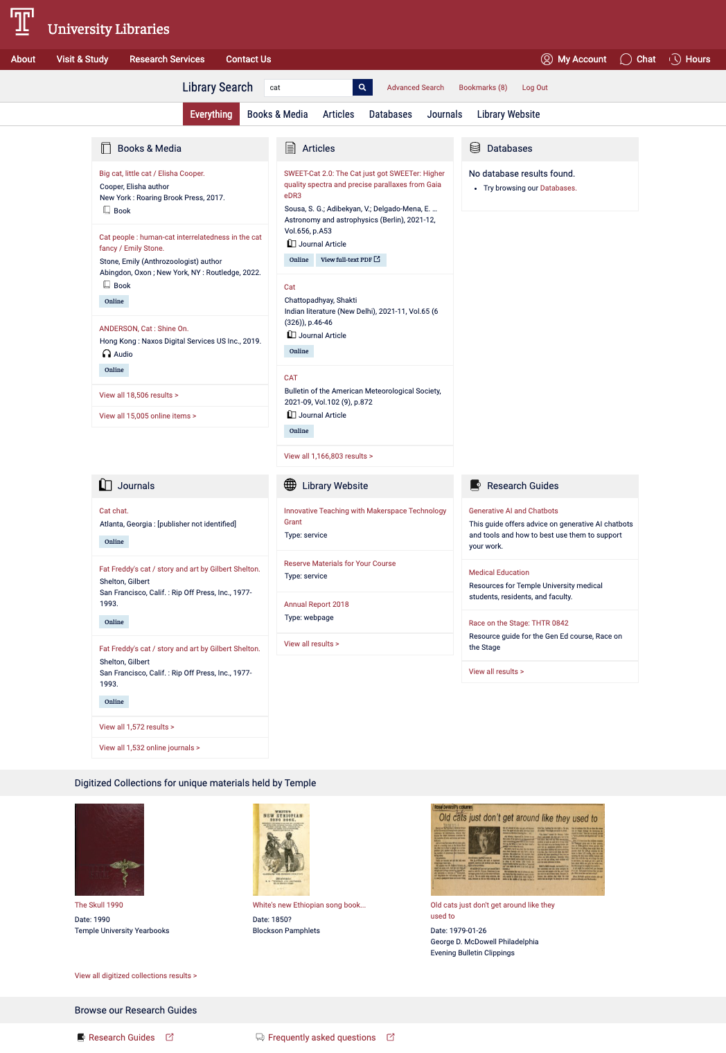
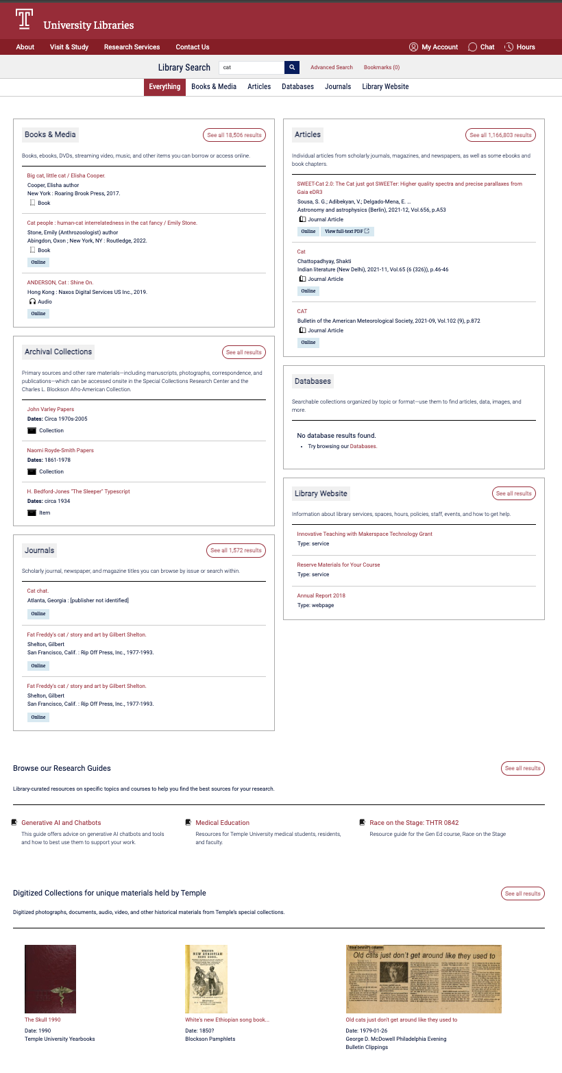
Temple University Libraries offers access to books, articles, databases, archival collections and more through Library Search — our primary unified discovery interface. The “Everything” results page uses a bento-style layout to group results by resource type and gives users a high-level snapshot of what’s available across our collections.
In Fall 2025, the Discovery Oversight Group, a team that stewards the ongoing development of Library Search, proposed adding a new resource type to the “Everything” results page: Archival Collections. With our special collections finding aids now searchable in ArchivesSpace, increasing their visibility felt timely and aligned with our broader access goals.
At first this seemed simple: add another bento. But our existing page was already a tightly packed three-column, two-row grid. Adding a seventh box risked turning a scannable snapshot into visual overload. What began as a request to add a new bento, ultimately prompted us to step back and revisit the overall design. If we were changing the page anyway, how might we improve it?
User Research
Joi Waller, Michelle Macinsky, and Jackie Sipes started by reviewing discovery layers from peer institutions and revisiting our own past user research on Library Search. As we compared sites from other libraries, we paid close attention to how they structured their results pages — whether they favored tighter grids or more editorial, column-based layouts; how they handled visual hierarchy; and where key navigation elements like “See all results” were placed.
We were especially interested in whether short, plain-language descriptions could clarify distinctions between resource types. In a unified search interface, categories like “Databases” or “Digital Collections” are not always intuitive. Small cues can make orientation easier — particularly for novice researchers.
This idea wasn’t new. In previous Library Search testing, participants had suggested adding brief descriptive text to clarify what types of content are included in each bento. Research from the University of Michigan Libraries affirmed similar findings.
Google Analytics Data
Before redesigning anything, we looked at Google Analytics click events on bento headers over a two-month period (April 9–June 8, 2025):
| Bento Resource Type | Header Clicks (4/9/25-6/8/25) |
| Books & Media | 707 |
| Articles | 395 |
| Databases | 27 |
| Journals | 12 |
| Library Website | 10 |
| Research Guides | 2 |
Books & Media and Articles were already positioned at the top of the “Everything” page, and their high engagement re-affirmed this placement. The data also clarified which bentos had lower engagement. If we needed to reposition categories to accommodate a new resource type, Library Website and Research Guides were logical candidates.
One caveat: this data captured header clicks only, not interactions with individual results inside each bento or overall impressions of the page. To understand user expectations more fully, we needed to talk to people directly.
Prototyping & User Feedback
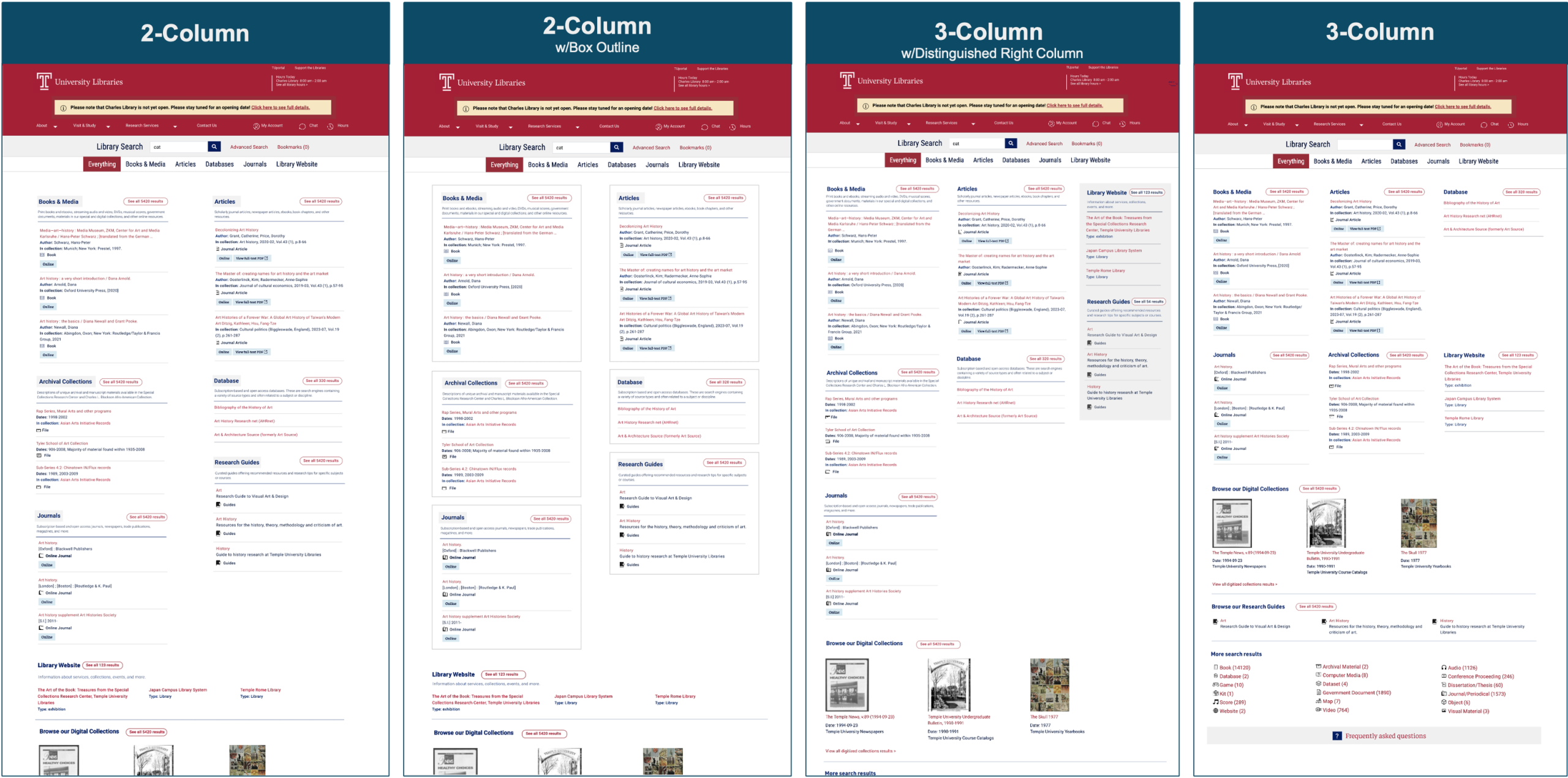
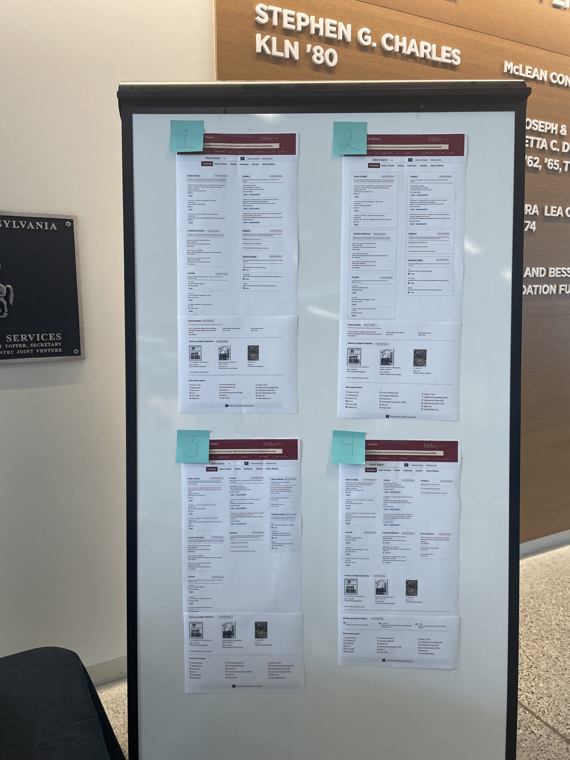
Based on our research, we developed four prototype designs. Each included the new Archival Collections bento and incorporated elements that could improve usability and readability. We intentionally varied the designs to gather feedback on those specific elements with users.
Across the prototypes, we explored different column densities, (two- versus three-columns), compared evenly aligned grid-based structures with layouts that stacked sections in vertical columns for a more newspaper-style layout, tested whether lower-priority categories should be visually grouped or set apart, experimented with boxed styling for clearer separation, and adjusted the placement of Library Website and Research Guides within the hierarchy. By isolating these variables, we were able to ask participants not just which layout they preferred, but why – and which elements meaningfully affected clarity and scannability.
We asked participants to compare multiple prototype layouts of the “Everything” page, talk through their immediate reactions, what felt clear or confusing, and indicate which version they preferred. They also completed a ranking exercise to identify which resource types they would want to see first when searching. Nine participants (4 undergraduates, 2 graduate students, 2 staff, and 1 faculty member) took part; most had previously used Library Search (7 of 9), typically to find either books or articles.
Key Findings
Prototype Preferences
- Layout preference: Prototype #2, newspaper style layout was clearly preferred. Participants described it as “more organized” and noted that the boxes helped sections feel clearly separated.
- Number of columns: Preferences were split among participants — some felt three columns were overwhelming; others liked the density on larger screens. Based on comments about focus and clarity, we ultimately selected a two-column layout.
- Microcopy: Participants consistently found the short descriptions helpful in confirming what each section contained.
Resource Types Rankings
Participants ranked resource types according to what they would want to see first when searching (lower average = higher priority):
| Resource Type | Results |
| Articles | 1.71 |
| Books & e-books | 1.71 |
| Journals | 4.57 |
| Databases | 6.00 |
| Digital Collections | 6.00 |
| Library Website (about the library, e.g. hours, study spaces, etc.) | 6.14 |
| Media (like streaming video) | 6.57 |
| Archival collections | 6.60 |
| Research Guides | 7.29 |
Books and Articles were consistently top priorities — reinforcing what we saw in analytics. Archival Collections ranked lower overall, which isn’t surprising: users don’t always anticipate archival materials in a general search. But that’s exactly why visibility matters. If something isn’t surfaced clearly, it’s effectively invisible.
Prototypes and a full description of our findings are available in our final report.
Design Refinements
Because prototype #2 was preferred by most participants, we used it as the basis of the final design. The design was then refined to fully integrate the new Archival Collections bento, and included additions, like archives-specific icons to match our existing iconography.
We also refined the descriptive microcopy through a survey of library staff and student workers. That feedback surfaced an important clarification: archival materials are non-circulating and must be accessed onsite. We incorporated this information directly into the description text to set clear expectations for users about how they can access materials.
Development and Release
Development involved integrating Library Search with the ArchivesSpace API and implementing front-end changes to support the new bento and the overall layout refinements. Because the “Everything” page is highly visible and frequently used, we timed the release during winter break to minimize disruption. We implemented a feature flag using Flipflop, allowing development to be completed ahead of release and activated at the appropriate time. The result was a smooth release with greater control over release timing.
Early Impact
Prior to the addition of the Archival Collections bento, the only direct path from Library Search to ArchivesSpace was through finding aid records accessible from the catalog search results. The new bento introduces a more visible and streamlined path to archival collections.
To assess the impact of the new Archival Collections bento, we monitored traffic from Library Search to ArchivesSpace in Google Analytics.
During the first five weeks post-launch, the “Everything” page consistently generated more outbound clicks to ArchivesSpace than catalog results. The table below shows outbound clicks from Library Search to ArchivesSpace by page type over the first five weeks following launch on 1/5/26.
| Date Range | Catalog Search Results | Bento “Everything” Page |
| 1/4/26-1/10/26 | 7 | 189 |
| 1/11/26-1/17/26 | 5 | 50 |
| 1/18/26-1/24/26 | 5 | 36 |
| 1/25/26-1/31/26 | 4 | 46 |
| 2/1/26-2/7/26 | 9 | 60 |
The first week shows a spike in traffic – this is likely due to a communications campaign we launch on January 7. Excluding that first week, the “Everything” page is driving an average of 48 visits per week to ArchivesSpace.
This early data suggests that integrating the new Archival Collections bento is increasing connections to archival materials from Library Search.
This work underscored the value of using both analytics and user feedback to inform decisions. Neither tells the full story alone, and together they provide a more complete picture of the user experience.
The design changes were not dramatic, but they were intentional. Adjustments to layout, hierarchy, and descriptive text improved clarity without altering the core search experience.
We will continue monitoring usage and gathering feedback to better understand how users discover archival materials within Library Search and whether the bento meaningfully supports archival discovery within the broader unified search experience.