
To start off the Fall 2025 academic year, we have a very special post. Dave Lacy, Director of Library Technology and Knowledge Management, shares with us his ongoing project to track the trends of library usage over time. He uses Tableau to create detailed interactive visualizations that allow us to see and explore usage data, combined from multiple sources, in new ways. This post is based on a virtual “interview” with Dave.
First, how would you describe this project?
I would describe it as an attempt to aggregate and visualize all library transactional data under one system. Once normalized under a unified model, we can then enrich this data with demographic details of the patrons so we can see service use distribution across all schools and colleges.
This work focuses exclusively on quantitative data generated by systems and employees at many of our public service points. We often communicate our quantitative data in isolation. Our newsletters and annual reports typically state numbers for a given period: For instance, in FY 24-25 we had over 8,000 reference transactions and circulated over 34,000 books, but we seldom discuss trends over time. Comparing quantitative data over long periods of time often illustrates trends, and it is the trends over time that I was most curious to learn.
What are the various datasets that are included?
- Charles Library owlcard swipe data
- Ezproxy logs (online database and journal access)
- Physical circulation (books, videos)
- Inter-library loan
- Public printing
- Battery / Laptop kiosk transactions
- Study room reservations
- Instruction sessions
- Events and workshops
- Reference transactions (in person, telephone, email, chat, LibAnswers)
These datasets are ingested into a data model, using the common attributes from each data source. Those include:
- Date/Time
- Accessnet ID
- Service Name / Data Source
- Affiliation (student, staff, faculty, guest)
- School / College
I use several quantitative measures to track service utilization over time.
- Total Transactions
- Total unique Patrons
- Service penetration – this is the ratio of total unique patrons and the size of a given community
Finally, I use Tableau Prep for the ingestion and Tableau for the visualizations. The data collection is a combination of manual and automated processes.
Let’s look at one of the visualizations. Walk us through what we are seeing here.
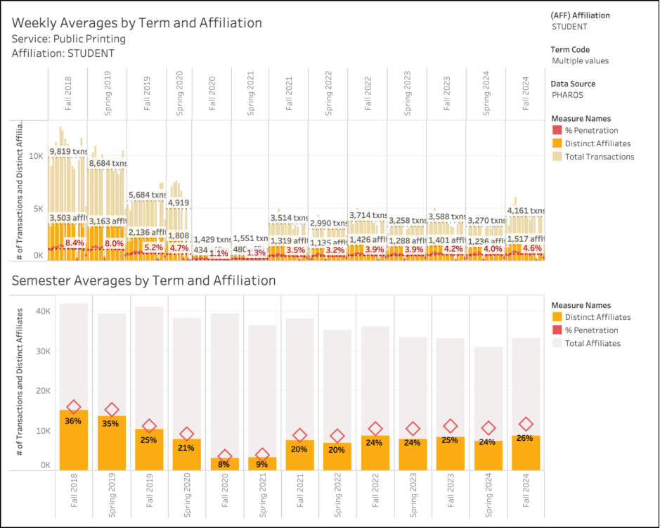
This first dashboard is the main visualization used for all data sources. The top section displays weekly averages across multiple terms. The bottom section show the semester averages across terms, as well as the total size of a given population (enrollment).
In this instance we are viewing Public Printing stats for students from Fall 2018 through Fall 2024.
In Fall 2018 we registered:
- 9,819 average weekly transactions (print jobs, regardless of # of pages)
- 3,503 average weekly unique affiliates (students who print something at one of our locations in an average week)
- 8.4% service penetration with the whole student population (8.4% of students printed something at one or our locations in an average week)
- Approximately 42,000 students enrolled at Temple (this is not an official census, nor is it our official FTE)
- Approximately 15,000 total unique students over the semester printed at the library
- 36% of students printed at the library during the semester
In Fall 2024 we registered:
- 4,161 average weekly transactions (print jobs, regardless of # of pages)
- 1,517 average weekly unique affiliates (students who print something at one of our locations in an average week)
- 4.6% service penetration with the whole student population (students who printed something at one or our locations in an average week)
- Approximately 33,000 students enrolled at Temple (this is not an official census, nor is it our official FTE)
- Approximately 9,000 total unique students over the semester printed at the library
- 26% of students printed at the library during the semester
We can see a couple of notable trends, here. Printing dropped significantly after we moved to Charles, and dropped again during COVID. Fall 2024 shows a noticeable increase from Spring 2024, but is still down from previous highs experienced in 2018.
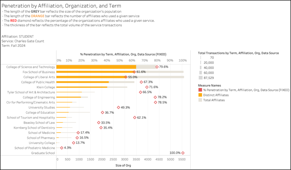
We can also look at usage of a given service across all schools and colleges for a given term. The chart below depicts all Charles library swipe access for the Fall 2024 semester. In Fall 2024, the College of Science and Technology (CST) had the highest penetration, highest patron count, and most transactions of all the schools and colleges.
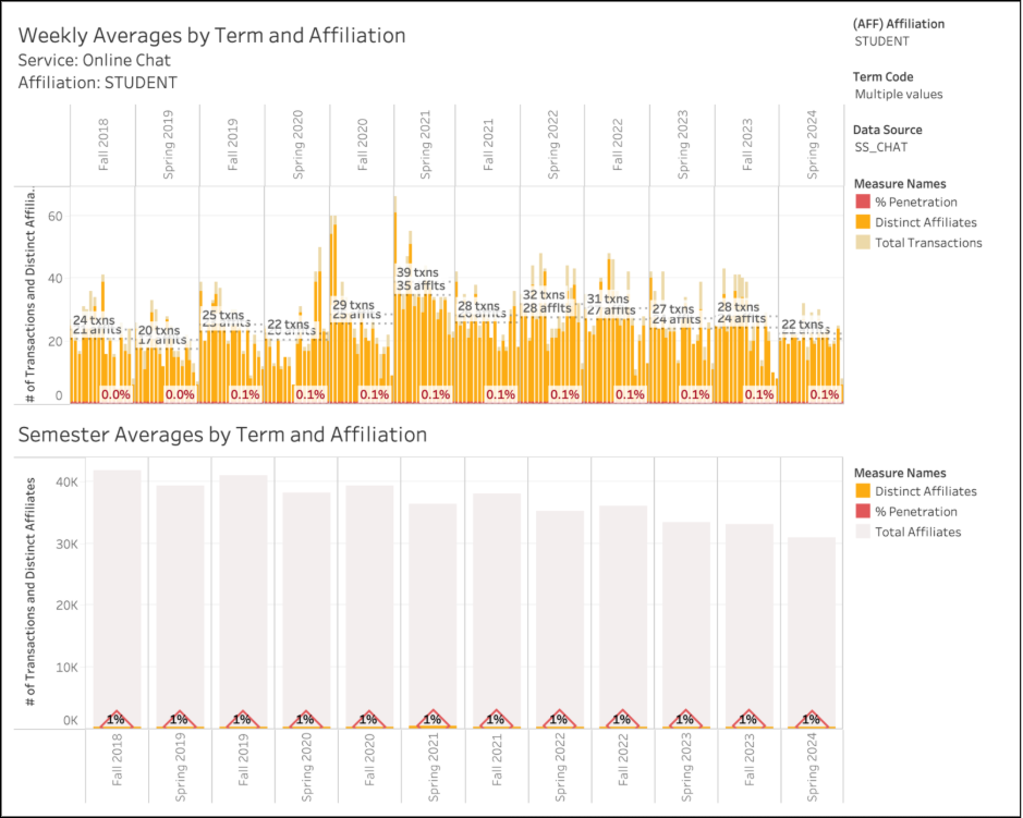
We can see what services are used multiple times by an individual, like the study rooms, versus those that are used just a few times. The chart below shows the use of our online chat service.
Tell us about the actionable insights and changes we might make based on this evidence.
This data has been used to alter location and makeup of battery/laptop kiosks that ensure we are meeting the needs of our patrons. Batteries circulate at a much higher volume than laptops and some locations get higher traffic than others.
We have also used this information to scale down public computing across multiple locations, as we were providing far more options than are necessary.
Thanks!
Thanks so much, Dave, for sharing this work with the Temple staff as well as the broader assessment community. You’ve pointed to some concrete uses for this data.
How students are using the various services offered by the library has changed so much over the years – from the use of printers to how reference is changing.
Combining the data in this way also allows us to see how the different schools and colleges use our services in different ways. For instance, students from the College of Liberal Arts are most likely to check out a book, but students in Science and Technology are more likely to use our study rooms. These differences may inform our promotion of our various services in a more targeted way. One size does not fit all.