By Tauheedah Asad
Introduction
As a media and communications doctoral student, I have an interest in exploring how digital tools can be utilized to make research and information accessible to mass audiences. My goal in the Spring 2021 CAC Practicum was to develop knowledge about and enhance skills in mapping and geographic information systems for the next phase of my work, Digging Philly: The Black Philadelphia Project — a multimodal platform that utilizes digital media and technology to explore the possibilities of storytelling and celebrate the rich experiences, institutions, spaces, and cultures of Black people in the city. This framework was conceptualized in 2014 as my thesis project in Klein College of Media under Temple faculty members’ supervision.
For the CAC practicum, this portion of the project focuses on the development of an interactive map highlighting 65 historic sites featured in Charles Blockson’s The Philadelphia African-American Pennsylvania State Markers Project (Blockson, 1992). In this blog post, I will detail the process of creating a digital interactive map, including learning frameworks for gathering, managing, and analyzing data, and working with software such as ArcGIS.
The Interactive Map Project is dedicated to Charles Blockson whose love and dedication to Black Philadelphia through The Philadelphia African-American Pennsylvania State Marker Project inspired this work.
Digging Philly: The Black Philadelphia Project is dedicated to the Temple-Taylor family legacy; and my father Tariq Asad (aka Theodore “Teddy” Croxton of North Philadelphia) who has served as the inspiration and motivation for this project since its inception.
Getting Data
Although I had significant data from the previous iteration of this project, I had to return to the drawing board to truly understand the process of interactive map-making. After several meetings, tutorials, and time-consuming missteps, I learned a valuable lesson— nothing is more important than the data. Entering into this project, I wanted to create an intuitive, dynamic, and visually appealing map. But I had to take a step back to focus on data.
The sites listed in The Philadelphia African-American Pennsylvania State Markers Project served as the data sample for the practicum. However, it’s worth noting that several historic markers have been erected since the book was first published in 1992. The Pennsylvania Historical and Museum Commission database served as a secondary source for data collection.
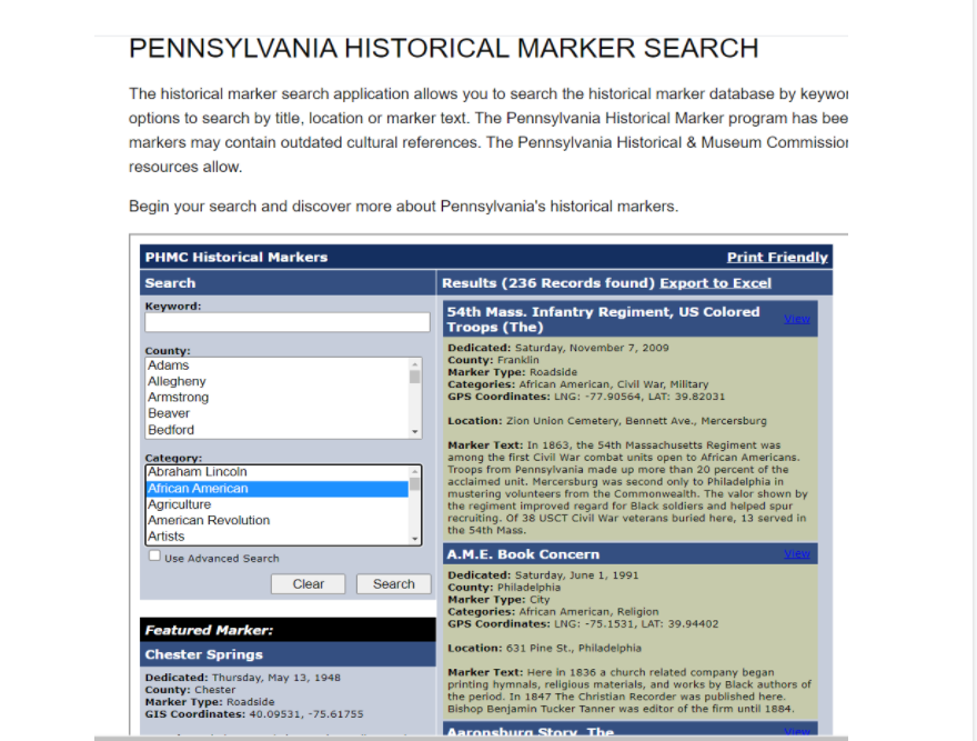 Figure 1: The Pennsylvania Historical and Museum Commission data search webpage.
OpenDataPhilly.org features a repository of themed and base maps of the city. For the purposes of my project, I used a shapefile, a common format for storing vector GIS data, for a base map that would allow the historical markers to be displayed by neighborhood. The dataset includes neighborhood boundaries for 157 neighborhoods in Philadelphia.
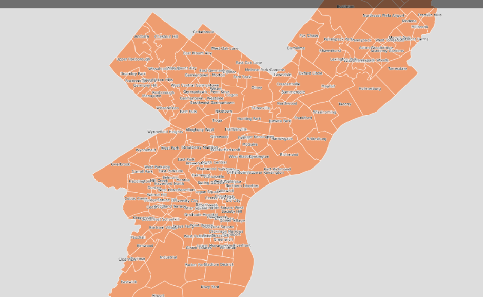 Figure 2. Shapefile of Philadelphia Neighborhoods Basemap downloaded from OpenDataPhilly.org
I then created an attribute table that listed each historical marker as its own entity. My data file included the ID#, name of the historical marker, geographic coordinates (in decimal degrees), neighborhood location, the date the marker was dedicated, subject, category of the marker, physical address, marker text, marker image file, notes on media files and aggregated materials on the internet. This file was created in Excel and saved as a .csv file.
The key to organizing this data was consistency in formatting. It was both frustrating and time-consuming to upload data, see that things were not registered correctly, and then having to comb through the data to make corrections.
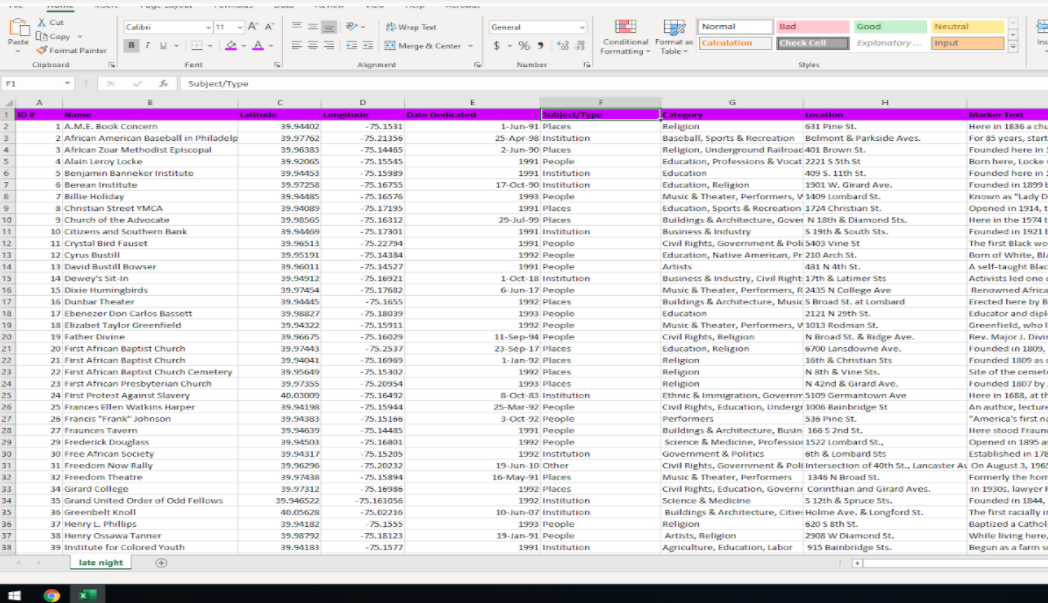 Figure 3. Philadelphia African-American Historical Marker Attribute Table
Mapping the Data
While collecting, organizing, and analyzing the data, I began exploring mapping software; first importing the data into ArcGIS/QGIS, and then Palladio and Knight Lab. While ArcGIS and QGIS are better for universal use, Palladio and Knight Lab offered visually appealing presentations of the same dataset.
The Palladio software easily translates the historical marker dataset into the form of maps, graphs, tables, timelines, and galleries that can be customized and configured based on user preferences and needs.
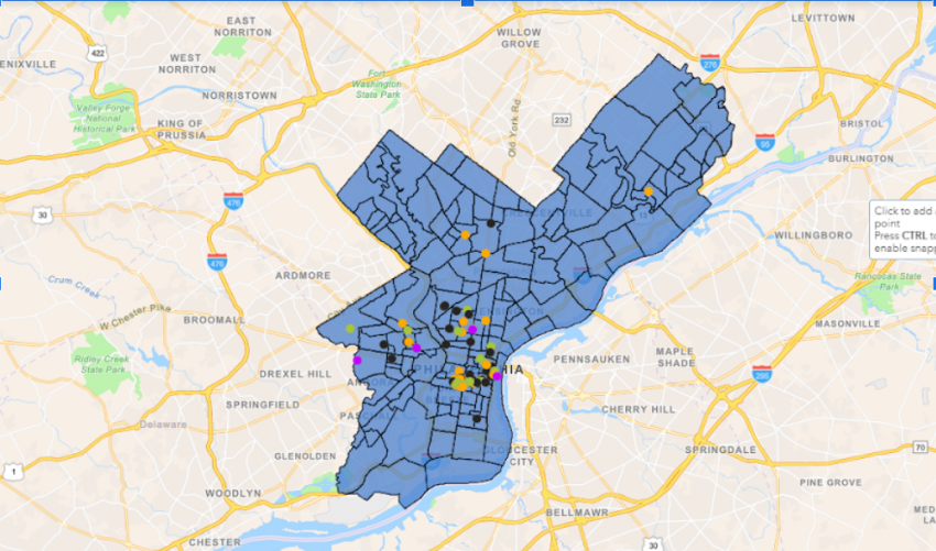
Ultimately ArcGIS and QGIS appeared to be the optimal training site for mapping and geographic information systems. The software is more sophisticated than the others mentioned but yields more benefits. Using ArcGIS I was able to upload the shapefile of the Philadelphia neighborhoods as a layer over Google’s navigation base map (see Figure 4). Next, I imported the data from the attribute table using the appropriate format and making the necessary tweaks for the information to be displayed as desired when users clicked on the plot points on the interactive map (see Figures 5 and 6).
 Figure 4. Wide Zoom of the interactive map on ArcGIS.
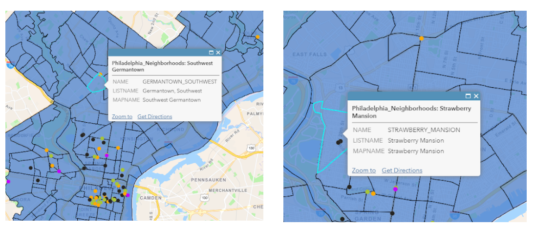 Figure 5. The Dialogue box of the Neighborhood’s layer merged with a navigation base map.
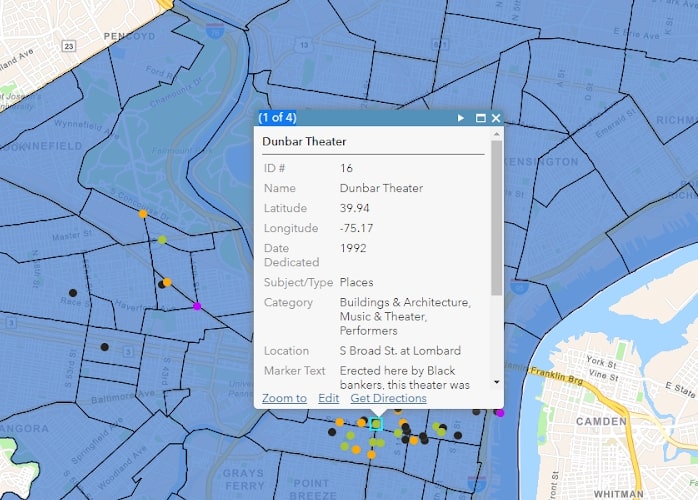 Figure 6. Dialogue box showing the historical marker, coordinates, dedication date, category, address, and marker text.
References
Blockson, C. (1992) Philadelphia’s Guide: African-American State Historical Markers.