
By Luling Huang
Numbers do not tell the complete story in data analysis. Graphs often help us to understand data better. This post explores how to use the ndtv package in R (Bender-deMoll, 2016) to perform dynamic visualization of interaction data. Pictures and animations are shown and discussed. The specific R code that generate these pictures and animations is adapted from Bender-deMoll’s (2016) tutorial. The section of “Importing event or spell data” (2016) is the most relevant for this post due to the use of edge list data.
The main use for the ndtv package is to make animations based on temporal network data. To use this package, the data has to be converted into a networkDynamic object first (so the networkDynamic package is also needed). In brief, a networkDynamic object contains temporal information for each edge: each edge has a starting time point (“onset”) and an ending time point (“terminus”). Then, after we specify the time range and interval so that the data are separated into several time slices, ndtv computes the coordinates for nodes in each slice, plot them, and smoothly combine them into animation frames (see Bender-deMoll, 2016 for more details).
Figure 1 (click to play). Animation from a temporal interaction data.
Figure 1 is an example from a temporal interaction data. The data is from an online political discussion thread with 100 posts and 28 participants (27 post authors and “Group”) within a time range of 1431 minutes. The interval for each time slice is 150 minutes. Node 13 is the thread author (i.e., the first post author). This node is very active and is at the center of a discussion network at the beginning (t=0-150). It becomes less and less active and connected later as other participants join and form their own networks. For example, Node 7 joins during t=600-750 and becomes the center of a small network.
The animation also shows that several time slices have zero or very few active edges (t=450-600, 750-900, 900-1050). With ndtv, we can plot a timeline to see during which time there are more active edges (Figure 2).
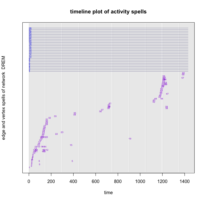
Figure 2. Timeline showing active edges.
Figure 2 shows that active edges can be grouped approximately in three slices with a larger interval (t=0-500, 500-1000, and 1000 to 1500). In the ndtv language, an “edge-spell” (purple labels in Figure 2) refers to the duration of time an edge is active. An “vertex-spell” (blue lables) refers to the duration a vertex/node is active. In the current example, an edge’s onset and terminus are the same, which means we have momentary event data because each post has one timestamp. For the vertex-spells, they are active during the whole time range, which is shown with the long tails after blue labels.
Now, we can do three more things to refine the visualization.
a. Adjust the time slicing parameters so that the number of time slices that don’t have active edges is reduced.
b. Use the weight of edges to reflect the cumulative frequency of contact between nodes.
c. Use a vertex attribute, ideology of post authors, to show nodes in different colors. This allows us to have a visual understanding of whether participants tend to talk within or across ideological camps.
I.
slice.par=list(start=0, end=1400, interval=300, aggregate.dur=500, rule='any')
Slice.par is a list of time parameters that can be later passed into animation rendering. I’ve specified the interval to be 300. I also set the aggregate duration as 500, which means that the time slices overlap to show slower change in network structure.
II. If we assign the value of 1 to be the weight of each edge and specify it as a temporal edge attribute in the networkDynamic object, we can display edges to be thinner or thicker as a function of contact frequency between pairs of participants. This can be shown in a static plot first (Figure 3).
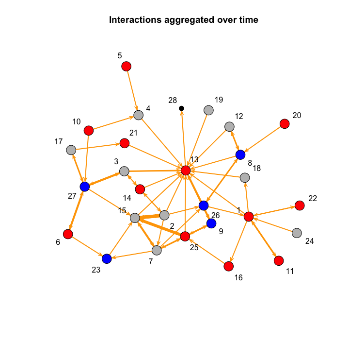
Figure 3. Static discussion network: Interactions aggregated over time. Node colors: grey for “Centrist,” red for “Right,” blue for “Left,” black for “Group.”
Figure 3 shows that Nodes 2, 7, 15, and 25 have more frequent interactions with each other.
III. To label nodes with different colors based on ideology, we need another data structure (e.g., another csv file) in which each row is for one participant and there is a column for ideology. In the current example, participants are coded into either of “Centrist,” “Right,” or “Left.” Then we can pass this vertex-ideology dataframe into a networkDynamic object. Note that the vertex-ideology attribute is static over time. A static plot is shown in Figure 3. It is clear that for this particular thread, the discussion pattern is cross-ideological. These participants did not stay within ideological silos. However, will the dynamic animation tell a different story?
Figure 4 shows the dynamic version of Figure 3 (interval=100, aggregate.dur=500).
Figure 4 (click to play). Dynamic discussion network. Node colors: grey for “Centrist,” red for “Right,” blue for “Left,” black for “Group.”
Figure 4 shows that the overall pattern is still cross-ideological. This pattern is the most obvious during time 0-500. However, during specific time slices, isolated within-ideological groups can form. For example, during time 200-700, several “Right” members are only interacting with each other (Figure 5, Nodes 11, 1, 16, 25). Moreover, as the thread develops, direct interactions between “Right” and “Left” become less frequent. Even though the entry of Node 27 (“Left”) restores the direct interaction between “Right” and “Left,” other “Left” members who enter earlier are not involved in discussion any more. The dynamic animation of discussion network does reveal some different temporal structures.
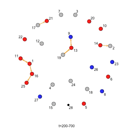
Figure 5. Four isolated “Right” (red) members.
References
Bender-deMoll, S. (2016, April 5). Temporal network tools in statnet: networkDynamic, ndtv and tsna [Web Tutorial]. Retrieved from: http://statnet.csde.washington.edu/workshops/SUNBELT/current/ndtv/ndtv_workshop.html