By Ping Feng
“The meanings of the word ‘visualize’ include ‘make visible’ and ‘make a mental image’. This implies that until we ‘visualize’ something, this ‘something’ does not have a visual form. It becomes an image through a process of visualization.”
–Lev, Manovich, 2010
From visualization to information visualization:
The concept of visualization is not new; however, it was relatively recently that the term information visualization (infovis) became widespread in both academic and industrial spheres, on account of new computational capabilities and the demand for processing large quantity of digital data.
Researchers at University of California, Berkeley recently estimated that about 1 exabyte (1 million terabytes) of data is generated annually worldwide with 99.997% of the data available only in digital form (Keim, 2001). However, without the adequate capability to analyze and make sense of it, the large amounts of data will become useless database dumps. Information visualization is hence developed from the call to visualize the data with the aim to generate insights and augment human cognitive work to process complicated issues.
There are many different ways to visualize information. The most common and easiest way is to visualize statistical data, which is usually quantifiable and immediately available for visualization; examples are x-y plots, line plots, histograms and so on. Mapping is also a form of infovis but focuses on geographical and spatial data. Until recently, there is a growing tendency to quantify and visualize text data as a result of the ever-increasing availability of digitized text data. With the ever-growing digital video and image materials scattered all over the internet on Youtube, Facebook, Instagram, and elsewhere, analyzing and visualizing this large set of visual and video data might become the next important subject for visualization researchers.
Quantify, visualize and colorize digital video/images:
So far, in my perspective, there are two ways to visualize digital video and image materials: One is to visualize the editing meta-data of digital videos and images, which I already discussed in my previous blog. Another way is to code directly to the digital video and digital image texture materials and visualize it into certain patterns. However, the special “texture” of digital video and digital image materials makes it not as easy as statistical data or geographical data to be visualized. As Lev Manovich (2010) states, “since the layout in such visualizations is already fixed and cannot be arbitrarily manipulated, color and/or other non-spatial parameters are used instead to show new information”. Therefore, this article will focus on exploring and providing a general survey on some prominent digital video/image visualization projects that feature color pattern presentation and analysis.
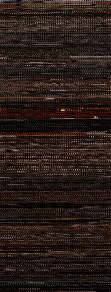
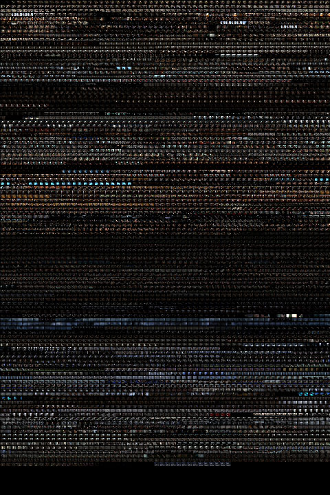
Cinema Redux is an interesting project created by designer Brendan Dawes in 2004. He wrote a program to sample a film at the rate of one frame per second and then scale down the pixels of each frame. He then rearranged these frames in a rectangular grid with each row presenting a single minute of the film. The resulting visualization, as Manovich notes, represents a trade- off between the two possible extremes: preserving as many details as possible of the original artifact and abstracting its structure completely; the former maintains the original details and aesthetic experience while the latter is more advantageous in revealing certain patterns. In this way, we can visualize and compare the length of the movies as well as how many frames or actions are contained in each single minute.
(Left: Gone with Wind; right: The Conversation)
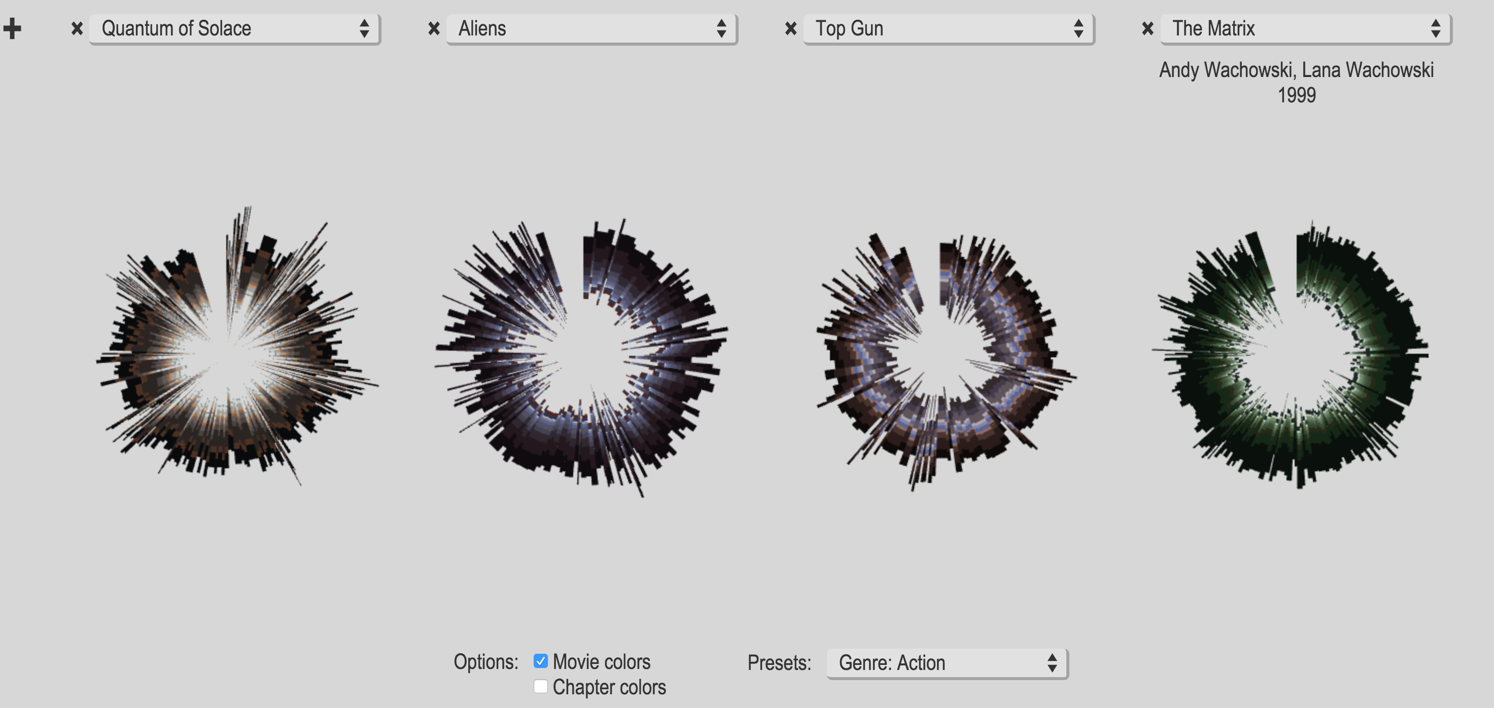
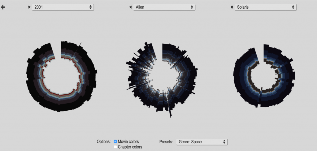
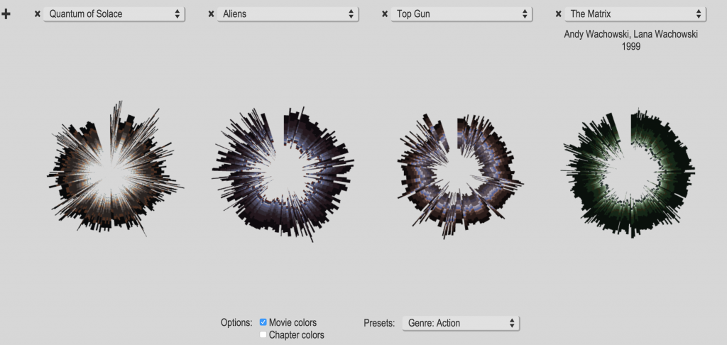
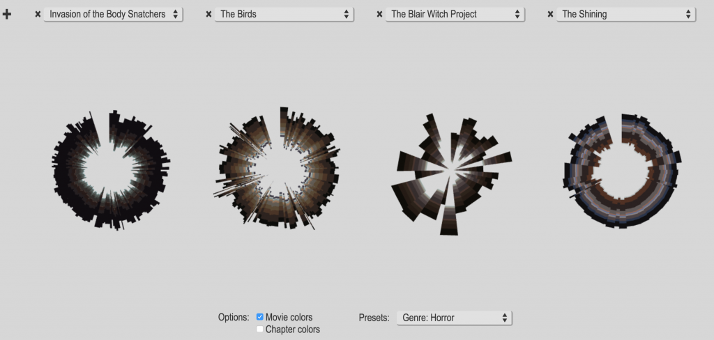
Another very exciting project is cinemetrics.site by Frederic Brodbeck, a creative designer and coder who went to the other opposite direction and focused on displaying an abstract pattern of shot length and frequency of the digital video textures via a dynamic animated color wheel. The three screenshots below, for example, shows the color wheel visualization from three different movie genres – “space”, “action” and “horror” respectively:
From the above visualization, it is very easy for us to capture and compare the basic characteristics of three genres of the movies. For the space genre, a very distinctive feature is that they are all in dark blue color, which does make sense as a lot of a space movie is typically set with dark blue sky as backdrop. For the action genre, we can easily observe much more frequent shots jumping around than the rest of genres, and this confirms many movie studies that claim action movies are usually edited with a high frequency of shots to promote a fast paced tension. As for the horror genre, the color pattern is more diversified; however, they are all consistently in dark and deep color hues, subject to the thrilling dark atmosphere in most horror movies.
In next section, we will introduce some color pattern presentation and analysis projects that are based on digital image textures.
Stay tuned!
Reference:
Manovich, L. (2010). What is visualization?. paj: The Journal of the Initiative for Digital Humanities, Media, and Culture, 2(1).
Keim, D. A. (2001). Visual exploration of large data sets. Communications of the ACM, 44(8), 38-44.
