Borough of Emmaus MS4 Program Internship

In 2017, I was an intern for the Borough of Emmaus, a small borough of roughly 11,000 people located in eastern Pennsylvania. While employed, I was tasked with creating a map of the entire borough that was required to show certain datasets and information. The information that was required included storm water pipes, water flow direction, outfalls, inlets, bodies of water, retention areas (present and proposed), manhole covers, and elevation contours. All of this information was required by a program being run by the State of Pennsylvania entitled the “MS4 program”. Creating of the program was done to comply with the federal clean water act, with the main goal being cleaning up the pollutants in our bodies of water.


One of the main challenges I was working with regarding this project was that I was the only person employed by the Borough that knew how to work a GIS software, let alone know what GIS even is. This was an obstacle I did not think I was getting myself in to. Trying to explain the processes that were happening and needed to be completed to other borough employees was challenging. Another facet of this issue was that I didn’t have a single person to bounce ideas off of o anyone to ask a question to if I got stuck. For someone that never worked a job using GIS and still completing their bachelor’s degree, this was a massive learning curve. Another major problem I had to deal with was the borough didn’t have any type of GIS data readily available. Some datasets I had to download (like borough boundaries and aerial imagery), while others I had to manually create by myself. All of the storm water pipes were hand drawn onto paper maps by the water department and I had to spend quite a lot of time digitizing every pipe segment as well as inputting the attribute data associated with each segment. For one man to complete nearly one thousand pipe segments, this took some time.


Once all of the leg work was completed and compiled onto a functioning map, it was then able to be submitted. For the borough, since they did not have any GIS professionals on staff, they first sent the finished map to be revised by an engineering firm that specialized in this municipal storm water program. A few weeks later, they approved the map and it was submitted to the state department of environmental protection.


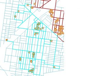
As seen below, this map is only a subsection of the much larger map. Subsections were created to be able to get much better resolution of every storm water pipe and so the water department could carry these maps with ease.


All in all this project and internship was a difficult task for me at the time and made me learn a lot about GIS and the GIS profession in a short amount of time. Just because a project may sound easy doesn’t necessarily mean it will be just that. A lot of times there are various issues and problems that are encountered which increase the difficulty of the project. It is important to learn and adapt to every project that comes in front of a GIS user, and I learned doing this will make you a much better GIS professional in the future.

Courses Offered Fall 2018

The following courses are being offered Fall 2018. All times are 5:30pm to 8pm. Please refer to Banner for more information.

Monday

  • GUS 8065 – Cartographic Design (required)

Tuesday

  • GUS 5067 – GIS and Location Analysis (elective)
  • GUS 5161 – Statistics for Urban Spatial Analysis

Wednesday

  • GUS 5062 – Fundamentals of GIS
  • GUS 8067 – Spatial Database Design (required)

Thursday

  • GUS 5062 – Fundamentals of GIS
  • GUS 5063 – Remote Sensing (elective)

Friday

  • GUS 9187 – GIS Capstone (required, does not meet every week)

From JSON to CSV

While I was working on creating a way to transfer the data to a more suitable storage site, I still needed to store some data so that I could examine it and test it on Arcmap. So I had to write a script that would take only the specific JSON that I wanted, then wrote it into a CSV from a Dictionary. To do this I had to write all of the header field names from the JSON which would allow me to load the rows.

#Use request.get().json() to call api in json format
waze = requests.get('waze_url').json()

#separate alerts
alerts = waze['alerts']
seen_alert_ids = set()

#Write to CSV using DictWriter
#In the beginning use 'wb+' for subsequent additions to csv use 'wb'
with open('filename.csv', 'wb') as csvfile_alerts:
fieldnames_alerts =['city', 'confidence', 'nThumbsUp', 'uuid', 'country', 'subtype', 'roadType',
'street', 'reliability', 'x', 'y', 'magvar', 'type', 'reportRating', 'pubMillis', 'reportDescription']
writer_alerts = csv.DictWriter(csvfile_alerts, fieldnames=fieldnames_alerts)

writer_alerts.writeheader()

The only problem I ran into was when I wrote the json to a CSV, the file did not separate x and y values. In order to fix this I simply separated out the dictionary of x and y from the ‘locations’ field, which gave me two new fields for the x coordinate and y coordinate.

#Create separate x and y fields from 'location' to replace single locations column

for a in alerts:
if a['uuid'] not in seen_alert_ids:
a['y'] = a['location']['y']
a['x'] = a['location']['x']
del a['location']

writer_alerts.writerow(a)
seen_alert_ids.add(a['uuid'])

Philly, Beyond the Grid

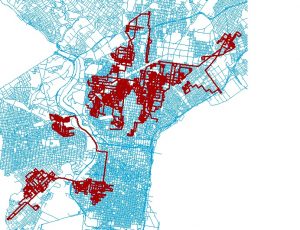
A short list of a city’s physical elements may include: buildings, streets, public spaces, and the natural landscape. All contribute something to a place’s geographical character, but, in urban environments the scale, concentration, and sheer number of buildings allow the architectural element to achieve visual and spatial dominance, a condition that imbues architecture with particular power over the physical orientation of individuals moving through the cityscape. However, once urban entities are translated into cartographic form, the street grid supersedes as the prominent navigational element—an argument supported by the default zoom level of both Google Maps and OpenStreetMap. Building polygons are not yet visible, space is explained with densely nested hierarchical ribbons of asphalt. But what happens when these familiar elements are stripped from the urban map? Are there other physical elements that can express the presence and characteristics of a metropolis? Natural features like mountains or rivers may be enough to orient the acquainted viewer, but for the unfamiliar, for example, the confluence of the Schuylkill and Delaware Rivers does little to impart that there are 1.5 million people living in between.

The industrial elements of Philadelphia—power lines, railways, power plants—were mapped using data from OpenStreetMap (download from Metro Extracts, http://metro.teczno.com/) and referenced against the accompanying OSM wiki. OpenStreetMap is entirely volunteered geographic information, yielding some interesting insights about what exactly the public feels compelled to map. Features were styled using CartoCSS in TileMill. The terms industrial and utility were taken to mean any structures or conduits that help facilitate general commercial activity, but are generally not directly accessed by the general public. For example, individuals among the general public access electricity but do not come into direct contact with power lines, thus power lines are an industrial/utility feature. An exception to this rule was the inclusion of railways, which serve to move both freight and the general public. They were included because 1.) While both Google Maps and OpenStreetMap demarcate railways, they are clearly secondary to roadways in visual hierarchy, 2.) Because unlike roadways, the general public is unable to make navigational choices or even see an unobstructed view along these routes and so are less likely to be able to conceive railways in their entirety, and 3.) The great dependence of manufacturing and industrial activity on rail systems. Though freight often moves along highways, roads were not included for the first two reasons listed in the last sentence; this is a cartographic exercise in removing the two most familiar means of urban cartographic orientation. Four categories of features were styled relating to general industry (factories, industrial land use, storage tanks), railways (railroads, railyards, train stations, and excepting subway or monorail lines which move people not freight), power (power cables, power lines, electrical poles, portals), and water (pipelines, canals, piers, drains, ditches).

Mapped, the city’s industrial underbelly clearly offers suggestions of Philadelphia’s scale and regional relationships. Cities are intense agglomerations of human effort and material exchange. These industrial underpinnings are the conduit of that interchange.  Rail lines radiate from the city’s center, but also show a distinct southwest to northeast direction, suggestive of Philadelphia’s regional context in the country’s northwest urban corridor from Washington, D.C. to Boston. Industrial buildings and land uses also follow the same diagonal pattern, reiterating the interstates that connect Philadelphia with the other regional metros. Railways visually dominate the map, perhaps because the public, who volunteered the data, interacts most frequently with this industrial feature. Interestingly, power lines and poles radiate into Philadelphia, but disappear in the city’s actual confines, their ubiquity is superseded by the cacophony of other forms.

Creating Web Maps in Python Using Folium – First Impressions

Folium is a Python package built to bridge the data wrangling muscle of Python with Leaflet’s easy-to-use JavaScript library for creating attractive, interactive web maps. The open source Leaflet is a highly popular web mapping tool due to its flexibility, with a healthy number of community-developed plug-ins further expanding its native capabilities. While Python is a robust programming language, with many packages contributing to geospatial analysis– Pandas, GeoPandas, Fiona, Shapely, Matplotlib, and Descartes to name a few– Folium differentiates itself through ease of use and the interactive potential of the final product. After some experimentation with the library, it did not take very long to produce a functional, albeit simple, web map with clustered point data, accompanied by popup windows. However, it was obvious that there is more to explore with Folium, as it plays well with many types of geospatial data, includes built-in functions and methods for producing choropleths, temporal visualizations, and allows for the marriage of the best of Python and Leaflet.

The code and resulting maps show a straightforward exercise in extracting the geographic coordinates (already matching Leaflet’s default web-mercator projection) and a few attribute values corresponding to warehouse/distribution centers in Pennsylvania’s Lehigh Valley from an excel spreadsheet. The Pandas library was used to read the excel document and convert the desired information to a dataframe. Folium was used to initialize a Leaflet map, add records as points with some stylization applied. This is brief code that could easily be added at the end of a more intensive spatial analysis using Python. It can provide a quick way to publish results in an interactive format without necessitating the use of JavaScript/html/CSS, or could serve as a jump start on more elaborate styling.

Map #1 – Mostly default styling

import pandas as pd
import folium

#converting the imported data to a pandas dataframe object

df = pd.read_excel(“Warehouses.xlsx”)
#identifying the long, lat columns, and other properties for the popup window
df.head()
pdlat='Latitude'
pdlon='Longitude'
#removing unwanted columns
avail =df[3:]
#initalizing folium map object as m and using the geographic mean of the data points to center the viewpoint; basemap defaults to OSM
m=folium.Map(location=[df[pdlat].mean(), df[pdlon].mean()], zoom_start=12)
#Iterate through edited dataframe to extract coordinates and property name for each record
for row in avail.iterrows():
prop = str(row[1]['Property'])
lat = row[1][pdlat]
lon = row[1][pdlon]
#attach each record to a default marker style based on coordinates and add property name to popup window
m.simple_marker(location=[lat, lon], marker_color='red', popup=prop)
#outputting html document with code for an interactive map to working directory
m.create_map('map.html')

Map #2 – Custom MapBox Tiles, Clustered Markers, Different Icon Imagery

Only showing code that differs
#Generate map using custom Mapbox tiles
m=folium.Map(location=[df[pdlat].mean(),
df[pdlon].mean()], zoom_start=9,
tiles='https://api.mapbox.com/styles/v1/username/yourstyle/tiles/256/{z}/{x}/{y}?
access_token=pk.yourtokenhere',attr='My data attribution')

#Iterate through edited dataframe to extract coordinates and property name for each record

for row in df.iterrows():
prop = str(row[1][‘Property’])
lat = row[1][pdlat]
lon = row[1][pdlon]
#used the marker_icon argument to select from natively supported bootstrap supported icons and added clustering affect to markers
m.simple_marker(location=[lat, lon], marker_color='red', marker_icon='flag', clustered_marker=True, popup=prop)

Courses Offered Spring 2018

The following courses are being offered Spring 2018. All times are 5:30pm to 8pm. Please refer to Banner for more information.

Monday

  • GUS 8068 – Web Mapping and Map Servers (elective) – Prof. Gardener

Tuesday

  • GUS 5062 – Fundamentals of GIS – Prof. Kaylor
  • GUS 5067 – GIS and Location Analysis (elective) – Prof. Mennis
  • GUS 5073 – Geovisualization (elective) – Prof. Middel

Wednesday

  • GUS 5066 – Environmental Applications of GIS (elective) – Prof. Dahal
  • GUS 5072 – Advanced Remote Sensing (elective) – Prof. Gutierrez-Velez

Thursday

  • GUS 5062 – Fundamentals of GIS – Prof. Gardener
  • GUS 5065 – Urban GIS (elective) – Prof. Kaylor
  • GUS 8066 – Application Development (required) – Prof. Hachadoorian

Friday

  • GUS 9187 – GIS Capstone (required, does not meet every week) – Prof. Hachadoorian

Using FFmpeg as an Animation Conversion Command Line Tool

Editing maps and doing data analysis, that’s my thing! But when it comes to video editing, I’m a bit out of my league. In addition to that, I have no expensive software that will make things look cool and fun. Or at least I thought I didn’t.

FFmpeg is “a complete, cross-platform solution to record, convert and stream audio and video.” You can download it here. This tool is limitless when it comes to production.

So, working with the time series images that I created from the precipitation data and working with FFmpeg, I was able to create an animation!

You’ll be working in command line window so you need to know where that lives. For me and my Windows 10 computer, it lives here … “C:\Windows\WinSxS\amd64_microsoft-windows-explorer-shortcuts_31bf3856ad364e35_10.0.10586.0_none_443d824ebb4341e2\01 – Command Prompt.lnk” but it may be easier just hitting the windows start button and typing command prompt.

ffmpeg -framerate 24 -i Rplot_%04d.png output.mp4

My images were named Rplot_0001.png. If your image was named img_001.jpeg you would refer to your image as img%03d.jpeg. That took me a few minutes to figure out but after I hit enter, I had a time series precipitation video. I wasn’t very specific in my frame rate but you can be. I received a lot of help from this FFmpeg wiki.

imagestovideo