Creating a Verified Inventory of Trails in Four New Jersey Counties

As an Environmental Planning Intern at the Delaware Valley Regional Planning Commission (DVRPC), I spent this past year working with staff in the Office of Environmental Planning to create a verified inventory of off-road walking, hiking, and biking trails in several New Jersey counties. This ongoing project has included several phases, including data collection and processing, feature editing, verification, and mapping/visualization, all of which I have had the privilege of contributing to. Though the inventory is still in the works for all four counties (including Burlington, Camden, Gloucester, and Mercer), much of the verification and mapping has been completed for Mercer County. The overall goal of the project is to create a single GIS-friendly file with selectable layers of verified and unverified trails, categorized by surface material and multi-use status, for each of the four counties.

After collecting data from planning staff in Mercer County, processing was completed using Excel and ArcGIS. Beyond basic processing, extensive feature editing was performed in order to ensure correct alignment and positioning of trail polylines. This was done using ArcMap’s editing tools with trail lines layered over high-resolution, leaf-off aerial imagery from Nearmap. Nearmap imagery was also used to verify trail surface material, in combination with Google Maps imagery and official published park and trail maps from organizations like the NJDEP and the New Jersey Trails Association. Figure 1 illustrates this process, visualizing trail surface types and verification status layered over aerial imagery.

Figure 1. Mercer County trail verification using Nearmap aerial imagery

In addition to verifying surface type and correcting geometry, I was tasked with classifying each trail segment according to whether it is multi-use or not. Where possible, I used ArcMap’s distance measuring capabilities to measure the width of trail segments to determine whether they conform to AASHTO standards for path width. In cases where this was not permitted by Nearmap or Google imagery, I referred to official park and/or trail brochures to determine the multi-use status of trails.

Finally, I used ArcMap to determine the percentage of each surface type, which enabled me to make the chart included in Figure 2, which is a county-wide visualization of verified and unverified trails of each surface material. As shown in the pie chart, I was able to successfully verify approximately 71% of the trails in Mercer County using the methods I’ve described so far. Future work may involve performing field checks to verify trails that are not visible in aerial imagery or included on park and trail maps. At this point in the project, next steps include verifying data for Camden and Gloucester Counties, merging the data into a single file for all four counties, and producing more maps and visualizations focused on multi-use status, verification status, surface type, spatial distribution, etc. Eventually, DVRPC hopes to combine this inventory of trails in its New Jersey counties with its existing Regional Trail network data to provide a comprehensive inventory of trails and connections throughout the Greater Philadelphia Region.

Figure 2. County-wide verification of trails

Using GIS for Criminal Justice Policy: Examining Arrest Per Capita and Rates of Pardon Applications Filled and Granted

In May of 2019, I started an internship at the Economy League of Greater Philadelphia working as a Justice Policy Research Intern. During the first three months, I was working on a Criminal Justice Research project pertaining to the economic impact that a pardon could have on an individual with a criminal record, as well as their families and communities. My main tasks for this project were to conduct literature searches that would inform the basis of the project as well as design maps on socio-demographics, arrests rates, pardon applications filed and granted (2008-2018) throughout the state of Pennsylvania. Moreover, there was an emphasis placed on five key counties that had high arrest rates that included: Philadelphia, Bradford, Dauphin, Potter, and Allegheny County.

Following that, the data used in creating these maps came from the United States Census Bureau, Federal Bureau of Investigations, and the Pennsylvania Board of Pardons. I created approximately 60 maps for the project that my supervisor asked for but due to time restraints and the narrowness of the project, only two of the maps I created were included in the final product (http://economyleague.org/uploads/files/518454652334570386-impactofpardons-final.pdf). Those maps displayed rates for pardon applications filed and granted over top of county arrest rates for Pennsylvania. Pardon applications and grant rates were visualized using graduated symbols technique, while the arrest rates used a graduated color method.

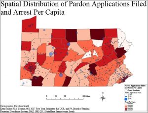
Figure 1: Pardon application rates over top of arrest per capita in Pennsylvania.

Moreover, the pardon application data were allocated to the zip code level, and the arrest rates were designated at the county level. These two geographies were overlaid with one another to create the two maps. Figure 1 displays a map showing pardon application rates over county arrest rates. In looking at this map moderate and high arrest counties have lower rates of pardon applications filed, while low arrest counties have a higher rate of pardon applications filed. Additionally, low rates of pardon applications filed seem to be concentrated in the southeastern (Philadelphia County) and western (Allegheny County) portions of Pennsylvania. Next, figure 2 shows a map of granted pardon rates over county arrest rates. In this map grant rates for pardons appear to be lower across the board except for in counties such as Bradford, Venango, and

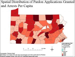
Figure 2: Granted pardon application rates over top of arrest per capita in Pennsylvania.

Washington County that have rates of 0.035. These two maps taken together show that the rate of pardon applications filed and pardons granted are higher in less crime-ridden communities, while higher crime-ridden communities have lower rates of pardon applications filed and granted. This spatial analysis revealed a disparity in how pardons are distributed to certain types of communities.

Overall, I found this project to be rewarding in that I got to utilize my knowledge of criminal justice that I obtained from my undergraduate education in conjunction with my coursework in the P.S.M program. Ultimately, this enabled me to craft nice map visualizations and contribute in a meaningful way to criminal justice policy, while gaining practical experience in the application of GIS for public policy.

Courses Offered Spring 2020

The following courses are being offered Spring 2020. All courses meet from 5:30pm to 8pm, except where noted otherwise. Please refer to Banner for more information.

Monday

  • GUS 5062 – Fundamentals of GIS – Prof. Hachadoorian – MEETS @ TU Center City campus, 5:40pm
  • GUS 8068 – Web Mapping and Map Servers (elective) – Prof. Gardener

Tuesday

  • GUS 5062 – Fundamentals of GIS – Prof. Henry
  • GUS 5063 – Remote Sensing (elective) – Prof. Wiese
  • GUS 5161 – Statistics for Urban Spatial Analysis – Prof. Kaylor

Wednesday

  • GUS 5062 – Fundamentals of GIS – Prof. Gardener – MEETS @ Ambler Campus
  • GUS 5066 – Environmental Applications of GIS (elective) – Prof. Dahal

Thursday

  • GUS 5031 – GIS Programming (required) – Prof. Hachadoorian
  • GUS 5069 – GIS for Health Data Analysis (elective) – Prof. Henry

Friday

  • GUS 9187 – GIS Capstone (required, does not meet every week) – Prof. Hachadoorian

Middlesex County Re-branding Map Series Initiative

April 18, 2019 Middlesex County, NJ won first place for ‘Best Cartographic Design’ at the New Jersey Department of Environmental Protection Agency.  Erica Del Plato and Julia Gerdes worked hard to pull together a poster that represents the county initiative of re-branding and recreating all the county park and county open space trail user maps.

In January 2018, Middlesex County launched the Marketing and Re-branding Initiative, led by the County’s Office of Marketing. As part of this Initiative, the Office of Marketing created the Middlesex County Getaway Guide to attract people to the County, which would include maps of County Parks, Open Space, and County Golf Courses. In conjunction with the new re-branding guidelines, the Office of Marketing requested that County Parks, Open Space and Golf Courses be redesigned by the Division of GIS to fit the new re-branding strategy to be incorporated into the seasonal Getaway Guide.

To achieve this, the Division of GIS utilized the current data available, as well as newly acquired data that was not included in the first county parks map series. This also gave our Division the opportunity to update existing data that would be used for these maps. This is currently an ongoing project, with 10 maps completed and approximately 30 more maps to be redesigned. The timeline to complete this project is August 2019 so that the maps can be showcased at the Middlesex County Fair with the new re-branding initiative.

The first process was to analyze current and available data to determine what would be utilized in the creation of a new county park map series. It was necessary to know what maps and data would require updating, as well as fill in missing data gaps of our currently existing parks data. Road Centerlines, Park Boundaries, Water Bodies, Streams, and County Park Land boundaries were some of the currently existing data that was already existing and was utilized within these maps. Park Picnic Groves, Trails, Walking Paths, Park Fields, and Park Amenities were data points that also already existed but needed to be updated before including them in these maps. This opportunity allowed the GIS team to review currently existing data and fill in the missing data gaps.

Planimetrics is a newly acquired dataset with robust data that was also utilized in this map series. This data came from a digitizing campaign to map structural features in Level 1 LiDAR and 3-inch aerial imagery.  Such features include building footprints, sidewalks, stormwater facilities and more.  Also included in this map series dataset is the NJ State data that was needed to complete the maps; such as Land Use/Land Cover data to add Forest, Agriculture, and Wetlands to the maps. To create a textured relief, Hillshade derived from the Level 1 LiDAR, was also added to all the maps. After all the data was up to date, redesign of the maps could begin. All maps had to be consistent in color, texture, scale, symbology, branding and format. Once the redesign phase was complete, the Division of GIS collectively reviewed the map to discuss any changes and/or comments before the map was finalized.

Ultimately, all this diligent hard work resulted in a first-place achievement award granted by the New Jersey Department of Environmental Protection for ‘Best Cartographic Design’.  Acknowledgement from the NJDEP for the hard work of the Middlesex County GIS teams is validating and inspirational for the team to keep producing good GIS work.


Winning Poster for Best Cartographic Design at the NJDEP Mapping Contest 2019

Courses Offered Fall 2019

The following courses are being offered Fall 2019. All times are 5:30pm to 8pm. Please refer to Banner for more information.

Monday

  • GUS 5073 – Geovisualization (elective, will fulfill Cartographic Design requirement) – Prof. Li

Tuesday

  • GUS 5065 – Urban GIS (elective) – Prof. Kaylor
  • GUS 5067 – GIS and Location Analysis (elective) – Prof. Mennis

Wednesday

  • GUS 5062 – Fundamentals of GIS (prereq) – Prof. Henry
  • GUS 8067 – Spatial Database Design (required)

Thursday

  • GUS 5062 – Fundamentals of GIS (prereq) – Prof. Dahal
  • GUS 5063 – Remote Sensing (elective) – Prof. Wiese
  • GUS 5068 – Census Analysis with GIS (elective) – Prof. Hachadoorian

Friday

  • GUS 9187 – GIS Capstone (required, meet at beginning and end of term)

Courses Offered Spring 2019

The following courses are being offered Spring 2018. All times are 5:30pm to 8pm. Please refer to Banner for more information.

Monday

  • GUS 5062 – Fundamentals of GIS – Prof. Hachadoorian – MEETS @ TU Center City campus
  • GUS 8068 – Web Mapping and Map Servers (elective) – Prof. Gardener

Tuesday

  • GUS 5062 – Fundamentals of GIS – Prof. Henry
  • GUS 5066 – Environmental Applications of GIS (elective) – Prof. Dahal
  • GUS 5161 – Statistics for Urban Spatial Analysis – Prof. Kaylor

Wednesday

  • GUS 5062 – Fundamentals of GIS – Prof. Gardener – MEETS @ Ambler Campus
  • GUS 5063 – Remote Sensing (elective) – Prof. Gutierrez-Velez

Thursday

  • GUS 5069 – GIS for Health Data Analysis (elective) – Prof. Henry
  • GUS 8066 – Application Development (required) – Prof. Hachadoorian

Friday

  • GUS 9187 – GIS Capstone (required, does not meet every week) – Prof. Hachadoorian

Creating 3D Maps with WRLD’s Application Program Interface (API)

Have you ever wanted to create a 3D map, well WRLD has a free solution for you to use.  WRLD is a geospatial company that provides users the ability to create 3D maps through the use of their free API.  WRLD uses reputable sources for their geospatial data including OpenStreetMap, USGS, NASA and more. The first step towards creating 3D maps is to create a WRLD 3D account at https://www.wrld3d.com.  Once your account has been created and verified, you will then need to create an API key which is located under your account information.  Each user will have an unique API key that will be used by WRLD to track the amount of usage. The API key is free as long as you have less than 60,000 users / web views per month.  

In this example I used the Brackets text editor which is available for free to download at http://brackets.io.  Brackets is cross-platform and interactive with Leaflet which is an open source map based on Javascript, HTML and CSS.  Additional coding tips are available on the Leaflet tutorial site at https://leafletjs.com which includes tutorials and code snippets.  To begin, open up Brackets and copy the following code into brackets–see the # sign for a description of the line of code and line comments for a description of a block of code:

<!DOCTYPE HTML>
<html>
 <head>

<!–Copy and paste to reference WRLD’s 3D mapping–>
   https://cdn-webgl.wrld3d.com/wrldjs/dist/latest/wrld.js
   <link href=”https://cdnjs.cloudflare.com/ajax/libs/leaflet/1.0.1/leaflet.css” rel=”stylesheet” />
 </head>
 <body>     

<!–  Change height to match parameters of your website/screen    –>
//Insert your API Key below
     var map = L.Wrld.map(“map”, “Insert API Key Here”, {
       //The center point of the map
       center: [39.981358, -75.152776],
       zoom: 17//zoom level of map–set below 18 to see 3D detail
     });
// Name to be displayed when marker is clicked
var school = “Gladfelter Hall”;
//Location of marker. Latitude/Longitude can be found from Google Maps by right clicking and selecting what’s here?
var marker = L.marker([39.981358, -75.152776]).addTo(map).bindPopup(school);
 </div>
 </body>
</html>

    Make sure to save the file with the extension with .html within Brackets in order for it to work using your localhost.  Once connected to the live preview (volt button on top right), the maps will be seen below.  Also, you will be able to zoom in and out by “pinching.”  3D coverage is available throughout the world in major metropolitan areas and additional areas can be built for a fee from the WRLD company.

Gladfelter Hall in 3D

Gladfelter Hall in 3D

Temple University in 3D

ArcGIS Server Connections for Digital Hoarders

Confession: I am terrible at keeping my own files. Really bad. Like a digital version of those houses you see on ‘Hoarders’. Yes, at work I can handle our naming systems and organizational structures, but navigating my personal computer is like navigating a maze. Its exhausting. As a result of this digital mess, I got into an unsustainable pattern of re-downloading files from the original internet source instead of finding the version I had already saved. You don’t want to know how many “2010_Census_Tracts_Phila.shp” are probably weighing my computer down right now. With that being said, here is how my poor computer is able to preserve its remaining disk space: Server connections and API links. Two terrible sounding phrases, no? No. They are not nearly as complicated as I once thought and I will prove it.
I was thrown into the world of GIS Servers as part of a project at work only a few months ago. Now I feel confident working with GIS Servers and have even started to prefer pulling API data rather than using old static shapefiles. Here is how to quickly bring in data stored on a GIS Server to enhance your project and ensure the most up-to-date accuracy:

  1. In ArcCatalog go over to GIS Servers and click the first option Add ArcGIS Server. 
  2. Then open the wizard and click Use GIS services.     
  3. Ok, now here is the real deal: Server URL. If you are connecting to a school, work or personal server you most likely already have the URL. So that’s not really what I’m talking about. This is the step where you have to do some sleuthing. The situation this is the most useful in is when there is clearly GIS data behind a web map, but the file is not easily available to you to save and use as the end user. For example, I wanted to find some tax parcel data for a county in PA and was only able to access the web map by choosing a specific parcel and seeing it on the public facing side of the map:                                      
  4. Open up Developer Tools in your browser and find the link to the server. Look through the Elements of the code until you see the src string. You will most likely have to click through several layers of elements. Typically it should have “…arcgis/rest/service” at the end of the address. As an example I have highlighted this below:   
  5. Copy the beginning of the link: “http://websitename.gov/ArcGIS/rest/services” and paste into your browser.
  6. Once you are into the ArcGIS REST Services Directory, you should click through to get to the Feature Server or Map Server you are trying to access. The services should be clearly labeled. If you plan on modifying the layer I recommend using the Feature Server instead of the Map Server. However, the Map Server maintains symbology when brought into Arc, so if you are not planning on editing it (just overlaying or using it as a base map) you can choose Map Server. I have highlighted both for the data I am interested in:     
  7. Choose the layer by clicking through and then copy the URL in the browser. It should be the same as before, but with the added ending of “…/LayerName/FeatureServer”. For example: http://w04.co.delaware.pa.us/arcgis/rest/services/Parcels_Jan2018/FeatureServer
  8. With the link to the feature you can now return to ArcMap and continue with the GIS Server wizard. When prompted by the wizard, input the full link address (including http or https) and connect. Once connected you should see the shapefiles and/or feature layers in the Catalog in GIS Servers under the server link you connected to. In the picture below you can see how I have connected to other public and private ArcGIS Servers before (but I have highlighted the one for this example):                                                           

And now you have basically any and all of the GIS data on the Internet!

Ok, obviously not all of the GIS data on the Internet, but now you have the tools to access a lot of data that might have seemed inaccessible to you before. If anything, I hope these instructions help any other digital hoarders whose computers have suffered long enough.

Points to Path in QGIS

There may be times where you have a set of points (say from a GPS receiver) and need to create a path that connects them.  There is a useful tool in the processing toolbox in QGIS that enables the connection of those points, allowing you to determine the drawing order points and the resulting path or polygon.

This discussion starts with the assumption of some kind of geospatial point data in a CSV file.  At the very least, the points should have an X and Y value that QGIS can interpret, and it is a good idea to have a field in the data that specifies the drawing order, since the resulting paths can vary widely for the same set of coordinates, although any numerical field can be used to set the order.  Once your data is set up and imported into QGIS as a delimited text layer, pull up the “points to path” tool in the processing toolbox.  The input layer and drawing order field need to be set, but there is also a field that allows for the grouping of features, which outputs individual line features per group as well as a field to enter a storage location for the resulting vector file.

The examples below shows the output of this tool.  This is a set of five airports (Atlanta Hartfield-Jackson, Chicago O’Hare, Washington Dulles, Dallas-Fort Worth and Los Angeles International, in that order), connected by the resulting path based on a “drawing order” field in the data.  By editing that field, I can get a different path result from the same data points, as shown in the second example.  I chose this data in order to present this tool in a broad context, although it seems to be useful at much larger scales.

It is worth noting that these paths are treated the same as any other vector paths in QGIS, that is, they can be styled and edited just like any other, including adding nodes and changing start and end points.  They are not connected to the layer from which they were created, but are completely independent.  They do not follow any network other than the drawing order, so there is limited use for this technique for determining distances over a large area, but it could be useful when looking at points arrayed in a small region.  Another useful application of this tool might be in collecting handheld GPS data (from a simple device such as a phone) of corners of a piece of property and converting them into a polygon (with the aptly named “lines to polygons” tool, also in the processing toolbox).

Points connected to each other by path, based on the drawing order in the data table for the point layer.

Same set of points as before, but this time with a new drawing order in the data table. Any numerical field can be used to determine the order of connections.