By Ania Korsunska
Behold, the YouTube-verse!
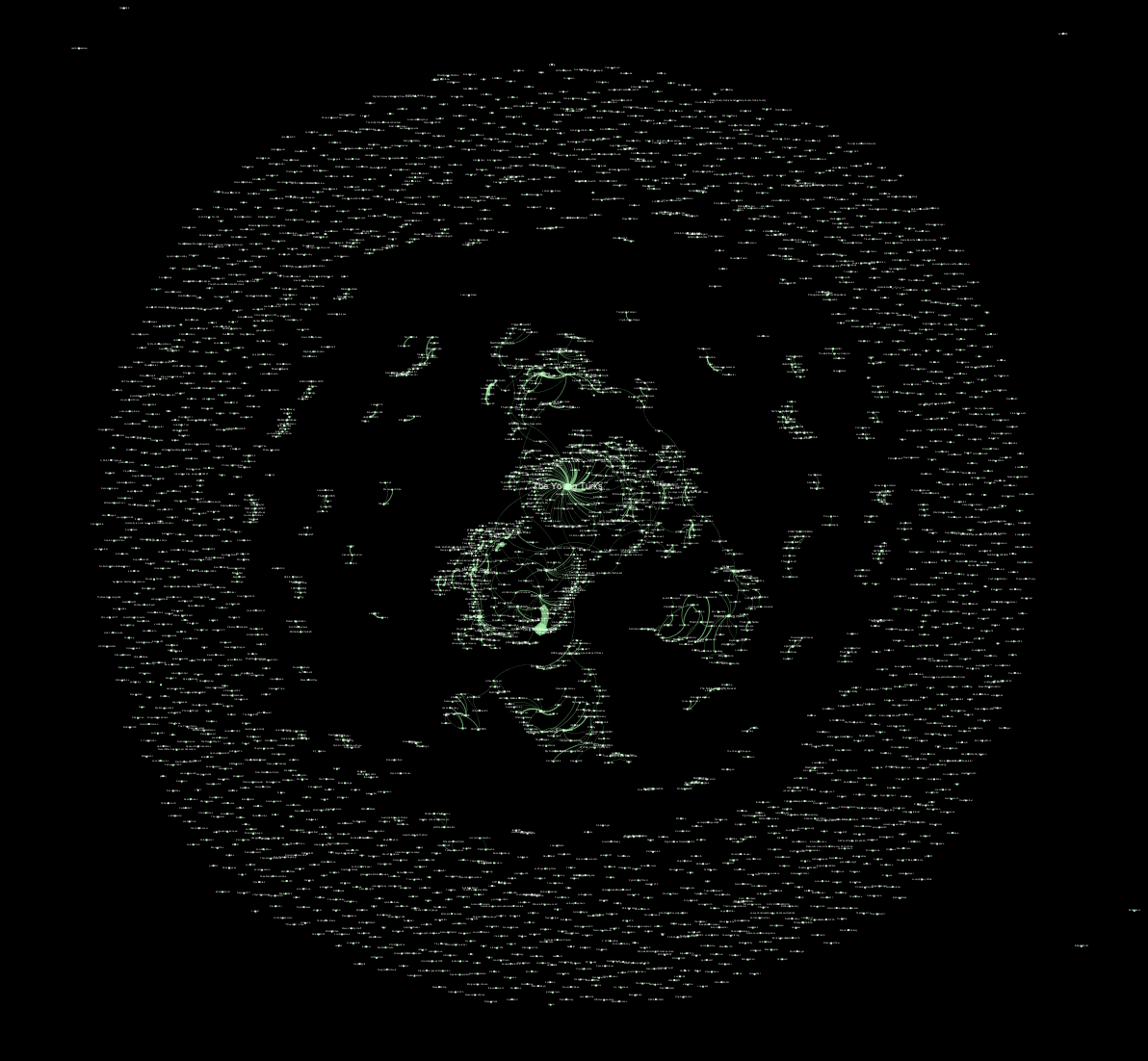
Or at least one video from the Youtube-verse, anyway. This is a network visualization of the comments posted on one YouTube video, with the points (nodes) representing users and the connections (links/edges) between them representing comment conversations! This exciting new way of looking at YouTube discourse and user interaction will be the topic of this blog post today.
Webscraping YouTube Project: The Network Analysis Stage
Earlier this semester, my colleague here at the DSC Nicole Lemire Garlic wrote a blog post titled “How to Scrape and Analyze YouTube Data” in which she introduced our collaborative YouTube web scraping project. To recap, a group of graduate students hailing from communication and media studies (Nicole Lemire Garlic and me), political science (Jeff Antsen), and CLIR postdoc Alex Wermer-Colan have joined forces to investigate national immigration and border discourses that circulate on Youtube. Though the project is utilizing multiple approaches, I’m going to be focusing on the network analysis part in this post.
Why do network analysis on YouTube?
Network analysis is a unique research method approach that allows us to not only visualize our data, but to take a “big picture” look at what kind of relationships are forming within our dataset. YouTube as a platform allows us to use network analysis on two types of networks from individual videos:
1. Comment thread network (Video Info and Comments Tool )
With the comment thread networks we will be able to identify central “hub” nodes and their sphere of influence in the conversation by looking at the statistics side of network analysis: clustering coefficient, graph diameter, node degree and graph density. These statistics can tell us how many shortest paths are between any two nodes, how close is any one node to any other node and who are the main “hubs” that are fostering the most active conversations in this video network. Identifying these “hub” nodes can help guide our later content analysis of the poster’s characteristics as well as the content of the comment itself.
2. Recommendation Algorithm network (Video Network Tool)
With the recommendation algorithms, we can visualize the path from video to video that the viewer can be taken on via the various levels of recommendations. In addition, we would be able to see any jumps in genre that might illustrate problematic paths that a user could take when going from video to video (e.g. from news to entertainment to satire/conspiracy) without realizing the shift.
How to get Network .GDF Files from YouTube Videos
To scrape comments and recommendation algorithm suggestions from YouTube videos we utilized tools from the Digital Methods Initiative in University of Amsterdam. Specifically, the Youtube Data tools developed by Bernhard Rieder, Associate Professor in New Media and Digital Culture at the University of Amsterdam and researcher with the Digital Methods Initiative. Once we downloaded the .gdf network formatted files from the Video Info and Comments Tool and the Video Network Tool, we utilized Gephi, an open source software for graph and network analysis, for visualization and analysis.
And now onto a practical demonstration of this process.
Network Analysis on Youtube: An Example
This video, titled “Turns Out THIS Is The Super Bowl Ad Right Wingers Hate” was uploaded to Youtube on February 04, 2014 by The Young Turks. As of March 11, 2019 it has 474, 684 views, 8,277 likes, 901 dislikes.
https://www.youtube.com/watch?v=F_CSaEtKtw0
The different networks on allow us to ask different questions of the data:
1. Comment Network
Who is talking to whom? Are there any big clusters/hubs? Who is at the center of the cluster? What did they say? Who is engaging in conversation and who is not? Are conversations reciprocal or one sided? Who is isolated?
When we upload the .gdf files into Gephi. It imports are one big black cube of nodes and edges, like below:
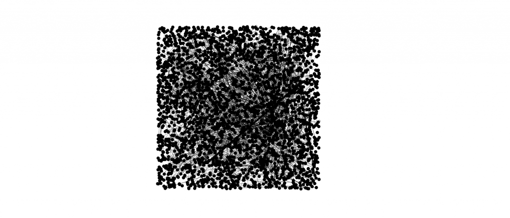
We run the data through one of the many available algorithms in the “Layout” tab (for example, Forced Atlas or Forced Atlas 2). Depending on the layout algorithm, this either pulls the data together or spreads it apart, making it easier to see trends that are otherwise hidden in the interwoven black box structure. Here’s a little video I made to show you how it works. It’s kind of magical.
https://youtu.be/OduaTzdaAZE
Then, we are also able to set attributes from our data to the network components:
- The node size can reflect some aspect of the data, for example degree (number) of incoming, outgoing connections or total connections. That way we can easily see nodes that are “hubs”, or in other words, are at the center of clusters that represent conversations.
- We can set the labels to reflect poster’s username or some other attribute of your data, like number of comments.
- We can adjust the colors of both nodes, edges and background.
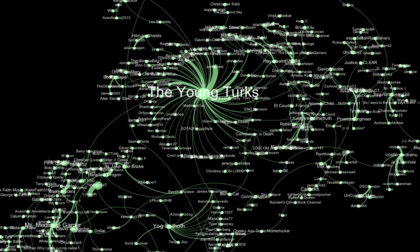
We can then zoom in to different parts of the network. From the image in the beginning of the post we can see a typical YouTube comment structure: a few tightly clustered sections surrounded by a ring of comments that no one replied to. In the snapshot below, you can see that the poster of the video was one of the central nodes in the conversations in this video, and some of those posters ended up also starting their own little secondary clusters.
Once we have this workflow, we can sample a certain amount of videos on the same topic and combine their networks of comments. We would be able to see if the same users are active across videos (this could even help us identify bots that are trying to stir up controversy). We could then use this information in our content analysis – specifically looking at the comments of the “hub” users and what differentiates their content from less connected nodes.

2. Recommendation Algorithm Network
What videos are being recommended and why? What channels are they from? What categories are they in? Are they similar in popularity (likes,dislikes, views, comment count)? What “path” are the viewers being taken on?
The recommendation algorithm network will be a very different form of analysis, as all the recommended videos will be 1 step away from the original (see below – original video is in the center). But – that means we can add additional levels of attributes to all the nodes.
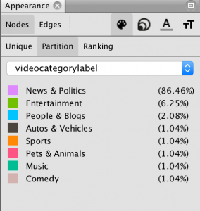
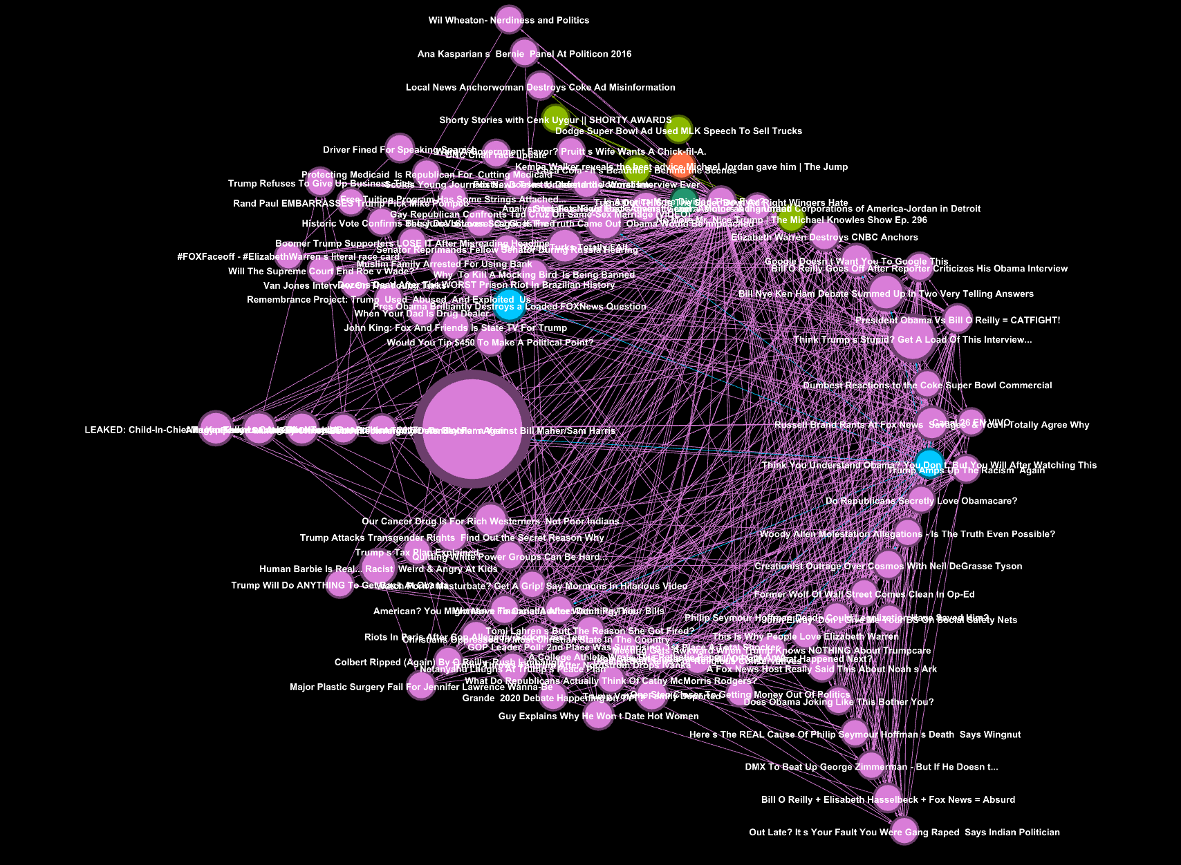
For example, in the image below: node size represents total degree, node color represents the video category, nodes are labeled by the title of the video and their comment count. Here we can see visually the paths a user could take – though most of the recommended videos are other news & politics videos, there are a few that are venturing into entertainment, people & blogs, sports and pets & animals.
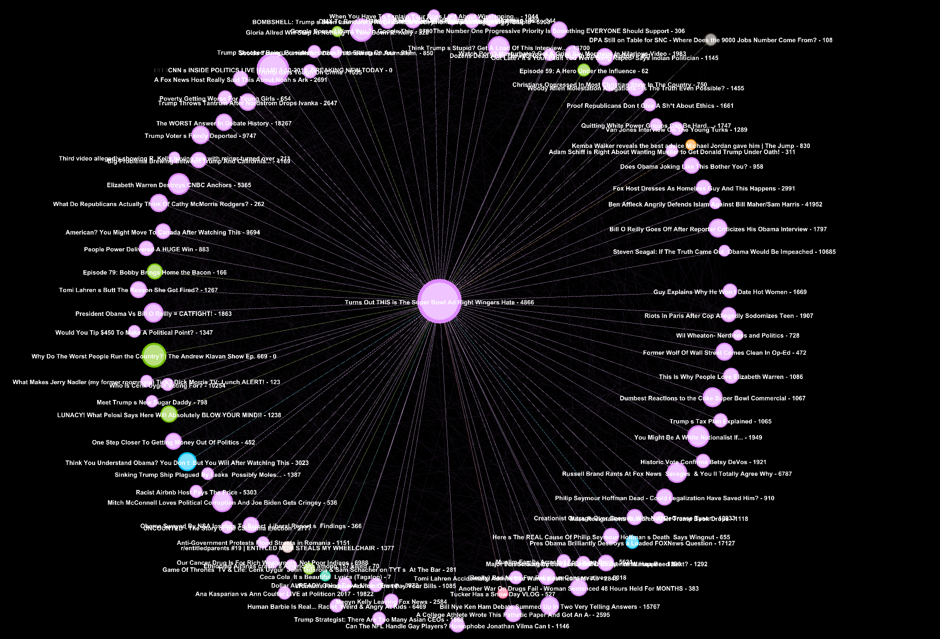
In the Radial Axis layout without highlighting any of the nodes, we can see that the recommended videos are interconnected as well, suggesting that if you take any of the secondary videos as a starting point, you would end up in the same path.
Overall, network analysis offers a great way to see general trends in your data, and by playing around with both the statistical part of network analysis and visualization aspects available through tools like Gephi, you can great head start in understanding the relationships within your data set.
In this case with the Web-scraping YouTube discourse analysis project, additional methods such as content analysis of the comments themselves will be the next step in understanding these “hub” conversations – who is saying what and how it that guiding this network of conversations on YouTube videos. Stay tuned for more posts as this project develops!
