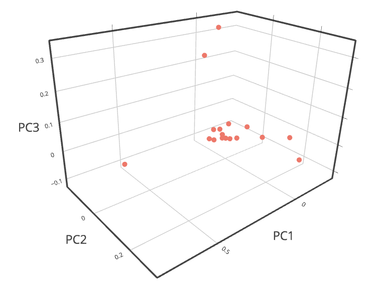
By Luling Huang
I. Intro
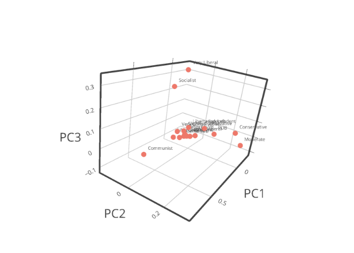
In this post, I continue to explore unsupervised learning based on my previous post on hierarchical clustering and another post on Wordfish. As explained in my post on hierarchical clustering, my goal has been to see which of the 17 ideological labels (for discussion board commenters) are similar enough lexically so that we can group them together—a basic clustering task.
By mining the same textual data, I’ve done some preliminary work on Principal Component Analysis (PCA). Section II explains why I chose PCA.
If you need some R code for doing PCA, feel free to go to Section III.
II. Why Principal Component Analysis?
The interpretation of unsupervised leaning’s results is necessarily data-, algorithm-, and model-dependent (Grimmer & Stewart, 2013). The burden of validation is now on the analyst. The key question is: How do we interpret and evaluate the results in a systematic way?
For example, if we look at a dendrogram (a tree diagram for taxonomy), we have to decide where we want to cut the branches. That is, how many clusters do we want to see from the data? If based on the dendrogram only, the decision is often pretty arbitrary. If we use k-means clustering, then we must specify a number of clusters in advance. Is there a systematic (automated) way to decide the number of clusters based on data-generating assumptions?
Yes. For example, Fraley and Raftery (1998) proposed to use the Gaussian mixture model (GMM) to compare models with different parameters (including cluster numbers) by looking at the Bayesian Information Criterion (BIC). The greater the BIC of a model, the stronger the evidence for the model. The Gaussian mixture model is straightforward enough to understand: A data point is assumed to first come from the jth cluster from a total of K clusters (according to a set of probabilities, each for a cluster), and a value for that data point is then drawn from the multivariate normal distribution for the jth cluster.
All sounds good. BUT, we are working on textual data, which means that the assumption of multivariate normal distribution is highly questionable. In a typical document-term matrix, there tend to be many zeros. For a cluster, a term’s frequency distribution tends to be skewed to the right. Here is a great post on why we should avoid GMM when the distribution assumption is not met. In other words, GMM’s don’t seem ideal for textual data, which tend to have unpredictable distribution patterns.
LDA (Latent Dirichlet Allocation) Topic Modeling (Blei & Lafferty, 2009) seems to have more plausible assumptions about how words are generated (but it still requires setting parameters ahead of time). As argued in Grimmer and Stewart’s (2013) critique, the way we use language is so complex that automated textual analysis may be inherently premised on more or less incorrect data-generating models. Therefore, I decided to forget about the model-based unsupervised learning methods for a moment, and used a method that suits my textual data better.
PCA is firstly a dimensionality reduction technique that does not rely on any explicit distribution assumptions (see Section 18.1.4 in this link). Everything PCA does is reducing the number of features/terms/variables, while minimizing information loss [check out this article for a non-technical explanation]. This would be extremely helpful in my case because I have a sparse matrix with over 10,000 columns (words). Also, after dimensionality reduction, I can still do a clustering analysis based on the reduced data.
III. PCA in R
1. Preprocessing:
This part has been addressed in my previous posts [I just used the standard ‘tm’ package in R]. Assume that we now have a document-term matrix called “dtm.”
2. Scaling/normalization:
The PCA results rely heavily on the scales of features. Here, word frequency is just discrete count data. Therefore, scale is not a problem. Still, we need to take into account the fact that some document’s length is longer than others. I normalized my document-term matrix by dividing the frequency of a term in a document with the Euclidean norm of that document’s vector:
dtm_norm <- t(apply(dtm, 1, function(x) x/sqrt(sum(x^2))))
3. The ‘irlba’ package in R:
Because we are dealing with a high-dimensional sparse matrix, to make the calculation more efficient, we use ‘irlba.’
4. How many principal components?
In general, the maximum number of principal components we can specify is the smaller value of (the row length — 1) and (the column length — 1). I have 17 documents and more than 10,000 words, so the maximum number of components is 16.
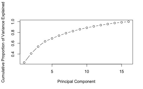
We can first run a PCA with 16 components and check the cumulative explained variance by component graph:
p_dtm_norm_16 <- prcomp_irlba(dtm_norm, n=16)
percent_variation_16 <- p_dtm_norm_16$sdev^2 / sum(p_dtm_norm_16$sdev^2) ## sdev is the standard deviation of each component
plot(cumsum(percent_variation_16), xlab = "Principal Component",
     ylab = "Cumulative Proportion of Variance Explained",
     type = "b")
Here is the graph showing the proportion of explained variance by component: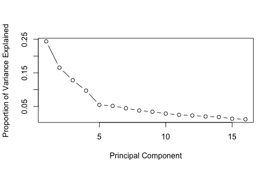
The first graph above does not look like a line, which is good news. The second graph shows that the first 4 components explained more variance than the others. After the 10th component, there is not much difference in explained variance. Let’s just set the number of components as 10 for now.
p_dtm_norm_10 <- prcomp_irlba(dtm_norm, n=10)
5. What are the important words in a component?
The code in this section was adapted from Silge’s (2018) wonderful blog post. The additional required R packages are: ‘tidyverse,’ ‘broom,’ and ‘scales.’ Now, we would like to know which words have the greatest absolute loadings on the first component, PC1.
tidied_pca_10 <- bind_cols(Tag = colnames(dtm_norm),
                        tidy(p_dtm_norm_10$rotation)) %>%
  gather(PC, Contribution, PC1:PC10)

tidied_pca_10 %>%
  filter(PC == "PC1") %>%
  top_n(40, abs(Contribution)) %>%
  mutate(Tag = reorder(Tag, Contribution)) %>%
  ggplot(aes(Tag, Contribution, fill = Tag)) +
  geom_col(show.legend = FALSE, alpha = 0.8) +
  theme(axis.text.x = element_text(angle = 90, hjust = 1, vjust = 0.5),
        axis.ticks.x = element_blank()) +
  labs(x = "Terms",
       y = "Relative importance in principle component")
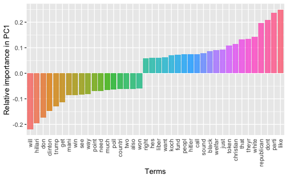
On PC1, if we look at the words with large negative factor loadings and the ones with large positive loadings, we may interpret that this component is about a contrast between different topical aspects of the 2016 Presidential Election. On one hand, with key words like “hillari,” “trump,” “win,” and “poll,” people are focusing on the “horse race” aspect of the election; On the other, with words like “parti,” “republican,” “white,” “christian,” “black,” people are talking about the candidates’ and/or voters’ demographics.
What about PC2?
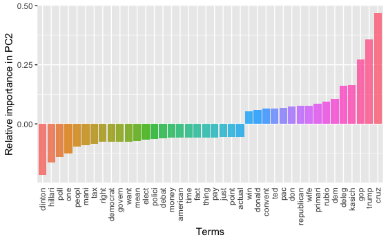
PC2 seems to be a contrast regarding the topics/persons between the two major U.S. political parties.
We can do one graph for each component (out of 10), but I’m not showing it here.
6. A 3-D projection
