By Nicole Lemire Garlic
Introduction
The prospect of coding in YouTube webscraping projects can be both daunting and exhilarating for academic researchers. Coding can give you more flexibility, power, and control over your data. But for those with little coding background, learning to code in R, Python, or Java will require dozens of hours of additional work. So how do you decide if it’s worth it to code?
I recommend first testing a user-friendly tool to see what sort of data is easily accessible and analyzable. It may be that a tool or combination of tools gives you everything you need.
If not, systematically thinking through the three stages of project design─collection, analysis, and visualization─can help you figure out whether to invest time in coding. It may be that you’ll need code for some stages and not others. To demonstrate this approach, let’s walk through some YouTube webscraping illustrations.
Stage 1: Collection
Collection is the data gathering stage. In this stage, you may find a tool that scrapes popular content. YouTube Data Tools, for example, collects video stats, channel stats, comment text, and recommended video networks.
For many projects, this will be sufficient, but there are two instances in which a coding-based approach will do more─when you need data not scraped by the tool or you need to quickly and efficiently download data for many videos and/or channels at once.
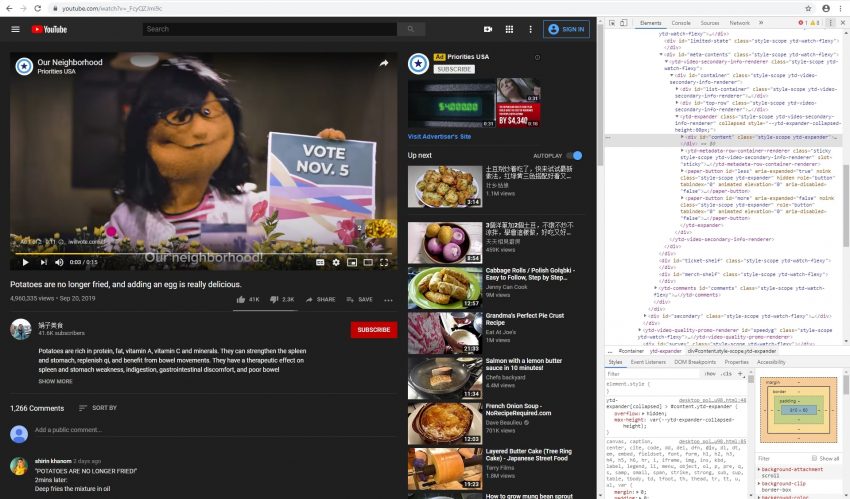
If you are looking for additional data types, you’ll first need to confirm that you can get access to it. There are two ways to access YouTube data computationally─through code that calls on its API, or code that scrolls through the web page’s html and extracts specific data. To see what sort of data is available through YouTube’s API, click here. Scraping the html is challenging but can be done. To do this, you’ll need to navigate to a YouTube page and inspect the code. That process is beyond the scope of this post, but for an example, click here.
If it turns out that you can access the data, investing time in developing code may be worthwhile, especially if a quick Google search reveals scripts in R or Python already posted online in Github. Through code, you can also “loop” requests and collect data for multiple video or channels at once. To see looping scripts we’ve adapted in R and Python for our projects, click here.
In either case, these scripts would need to be adapted for your project but can save you from having to code from scratch. If you have trouble quickly finding scripts, a better approach may be to work with a developer (perhaps a computer science student) who can write the code for you instead.
Stage 2: Analysis
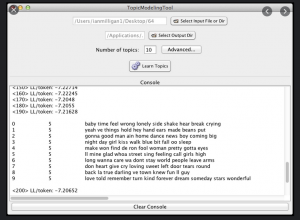
In the analysis stage, the collected data is processed and converted so that the researcher may ask questions of it. Open-source, user-friendly tools like Voyant can be used to provide summary statistics about word frequency in YouTube comments. Topic Modeling Tool can also be used to implement the popular topic modeling machine learning toolkit MALLET on comments.

MS Excel is another tool that is often overlooked. If, for example, you are interested in analyzing the time between comment postings, you may simply create a formula in Excel based on the comments timestamps. Additionally, you could use Power Query in Excel (or even OpenRefine) to clean up textual data.
On the other hand, if you are interested in converting your YouTube data into variables for subsequent statistical analyses, or you are analyzing uniquely-formatted data like video transcripts, a coding-based approach may make more sense. Through R or Python, you can shape your data into matrices, arrays, or other specific data types in preparation for importing it into SPSS or other statistical software.
Stage 3: Visualization
The data visualization stage is where you showcase your work. Gephi is an open-source network analysis tool that can be used to visualize connections between YouTube users or recommended videos. (And YouTube Data Tools outputs files that may be uploaded directly into Gephi!)
Visualizations that rely upon custom categories that you created during the analysis stage may fair better with code-based approaches. As this blog post shows, you can use Python to create a correlation matrix of comment rate, like rate, and dislike rates for YouTube videos and display that matrix through a heat map.
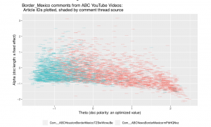
Also, if your research involves discipline-specific constructs, you’ll likely need to code. For example, the political science tool WordFish is designed to measure ideological scaling. One of our prior blog posts explains how an R package implementing WordFish can create this kind of visualization.

Thinking through the three stages of project design can help you figure out if user-friendly tools give you all that you need, or if you’ll need to bite the bullet and venture into coding on your own or with the assistance of a developer.
