
By Gary Scales
In this blog post I demonstrate a quick and simple method of generating a ‘normalized bivariate choropleth’ map. While cartographers wisely caution against simple and inflexible techniques (and I echo their sentiments in many ways), I also argue that these approaches can dismantle the obstacles which can prevent some people from engaging with digital tools. While any project produced too quickly will always be of lower quality than a thoroughly considered and edited piece of work, fast production can help in a number of ways; it can show significant trends quickly, highlight potential unforeseen issues, and most importantly, impart new skills and fascinations. As a form of both experimentation and access to advanced digital tools, basic and simple processes have an important role in the digital humanities.
Demystifying Terminology
Rendering a ‘normalized bivariate choropleth’ map might sound intimidating and demanding of developed knowledge and skills, but it doesn’t have to be complex. This simple step-by-step guide not only shows how to make the map, but hopefully assuages any fears that more advanced analytical mapping is beyond the reach of GIS beginners.
Understanding the terminology is important, and fortunately not difficult. First, a choropleth map is simply a map which shows quantities in certain spaces; for example population by state. A bivariate map shows two variables (as opposed to a univariate map which shows one). Thus a bivariate choropleth map shows two variables in one set of defined spaces. ‘Normalized’ means that bias has been addressed; in this example percentages are used instead of numbers to account for differences in population density.
Two datasets (one per variable) are required for the map and both need to include one common spatial category (countries, states, counties, etc.). For this example, Local Authority Districts in the United Kingdom were chosen as the unit of space, and the two variables were:
- The percentage of voters who voted ‘remain’ in the June 2016 Brexit referendum
- The number of houses purchased under the ‘Right to Buy’scheme between April & June of 2017
The final map will be made from two separate maps. The first will show the percentage of voters who voted remain, while the second will show the number houses purchased under the ‘Right to Buy’scheme. The example uses QGIS, but the principles will be the same for ArcGIS and most other GIS.
Importing Data
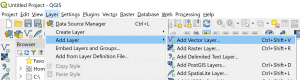
To start, a Vector Layer is added showing the Local Authority Districts:
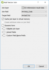
The dataset can be added next. The step is the same as before only with a Delimited Text Layer. The layers can then be joined together. This is done using the Joins option under the Layer Properties menu. It is important the fields used to make the join contain identical information. In this example the titles of the matching data is different in each dataset – “Area_Code” and “lad17cd”:
Creating Styles
Under the Symbology option in the Layer Properties menu the type can now be set as Graduated, and the data to be shown selected as “EU-referendum-result-data_Pct_Remain.” A bright and clear color should be selected – in this case red – and the number of classes can be set to three.1 In this case the best algorithm to use for rendering is Quantile.2 This completes the first choropleth map.
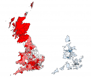
The second map is completed by repeating the above steps but using the housing sales data instead of the voting data. When complete there will be four layers: Local Authority Districts (for voting data); Voting Data; Local Authority Districts (for housing data); and Housing data. Turning off the Visibility of the layers from the first map (below left) leaves the second map (below right) showing house purchase data by Local Authority District:
Final Adjustments
All that is required at this stage is to overlay map two onto map one. All the layers must be turned on, and by clicking on the color bar in the Symbology option under the Layer Properties menu, the Opacity of the layer can be changed. Some experimentation with the percentage value will be required depending on preferences, however 55% works for this map.
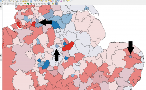
Zooming into the map more closely reveals the areas where the colors of the two variables are most clearly blended – the gray/mauve districts are those with a high number of ‘Right to Buy’ purchases, and a high percentage of remain votes.
This is a quick and accessible method which shows that analytical mapping is not always a complicated operation. Nonetheless, this technique is not the most refined or flexible, and more advanced ways to render a map with improved accuracy, colors, and visual contrast should be used for larger projects, especially those purposely developed for display.3 Nonetheless, the convenience of such an approach is that reasonably advanced maps can be produced easily and can help identify key data trends quickly if needed.
1. As a general rule, maps should have as few data classes as possible as this makes them easier to read.
2. For more on how to properly select algorithms for rendering social data, see John Nelson “Telling the Truth”, Last Modified: October 12, 2011, Available: <http://uxblog.idvsolutions.com/2011/10/telling-truth.html>, [Accessed: October 31, 2018]
3. For more on these methods see Robert E. Roth, Andrew W. Woodruff, and Zachary F. Johnson, “Value-by-alpha Maps: An Alternative Technique to the Cartogram,” The Cartographic Journal, Vol. 42, No.2 (May 2010): 130–140.