Written by Liz Rodrigues
The word frequency experiment with country names got me thinking about more ways to visualize relationship to place. I decided to stick with place names, but think about them more broadly. How does the immigrant subject in early 20th century US narratives plot the world map?
I was also interested in learning how to do this as programmatically as possible. So, what follows is a how-to based on cobbling together others’ tutorials for each step of the process of taking a relatively clean but unstructured full text and getting it ready to load into a mapping tool.
First step: named entity extraction
The Stanford Named Entity Recognizer is a commonly used free tool to extract proper nouns from texts. It offers a GUI (graphical user interface) so that you don’t have to do anything resembling programming to use it, although you could use it that way if you wanted to. For this step of the process, I recommend the tutorials put together for Rachel Sagner Buurma’s Rise of the Novel class–one for Mac and one by student Claudia Lo for PC.
Next: getting the place names all into one document
What the Stanford NER returns to you is a tagged version of your text. Everything it identifies as a place name, for example, will now have a tag around it. Eg: <LOCATION>New York</LOCATION>
To create a list that you could add to a spreadsheet or run through a geocoder, you will need to isolate those tags and, most importantly, what is between them. The PC tutorial listed above explains how to do this using Notebook++, which is what I used. Basically, what you have to do is use a regular expression:
<LOCATION>(.*)</LOCATION>
To find all the tags no matter what string of letters or numbers is between them. Then, you replace those selections with another regular expression that will put every tag on its own line:
\nLOCATION = \1\n
Using Notepad++ or another robust text editor, you’ll be able to select and copy only those lines that now start with LOCATION
LOCATION = (.*)
which can be pasted into a new document to remove the tags themselves with a simple find & replace.
Next step: CLEAN THE DATA (for the first of many times)
Stanford NER is powerful but it is not perfect. It works from both a dictionary and contextual guesses about what is a place name. So there will be things on your list that actually aren’t–these would need to be removed. There will also be multiple ways of referring to the same place. These may need to be normalized for geocoding to work.
You also want to think, at this point, about whether you want a list with duplicates (all the times the text named places) or without (all the specific places named in the text, with no difference made whether they were mentioned one or a hundred times). For my purposes, I wanted to keep the duplicates.
Does this seem too time consuming? Consider your goals: if you are looking for polished, rigorous results, you will need to go through multiple stages of cleaning. If you are experimenting, perhaps less cleaning will do.
Next step: geocoding
Depending on what you want to do now, you can either upload this list directly to Google MyMaps, which will automatically geocode the list and show you what places cannot be geocoded, usually due to the fact that they aren’t actually a place, are unclear, or have unparseable typos. To the best of what I could find, though, you will not be able to easily get those lat/long numbers out of Google. So if you want to use a more flexible or prettier or less proprietary tool, you will need to create you own geocoded list.
Fortunately, you can still use Google’s geocoding server, and even more fortunately, there are people who have created tutorials to show you how. I used the tutorial created by historian Fred Gibbs, which walks you through how to construct a script to query the server using python and your handy list of places.
What you’ll get, if it’s anything like what I got, is a mostly geocoded list with 1) some places inexplicably not coded, even if they were coded elsewhere in the list 2) some places not coded because they are not in a format that was legible to the server 3) some places not coded because they aren’t actually places. While you’ll have less of all these if you cleaned the data first, you’ll probably need to do some cleaning.
Next step: mapping
Once you have lined up your place names and lat/long coordinates in a spreadsheet, you will be able to use a variety of tools to map them: Google MyMaps, QGIS, Tableau are a few. I chose QGIS because of its flexibility and because there are several resident experts here at the Digital Scholarship Center.
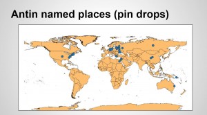
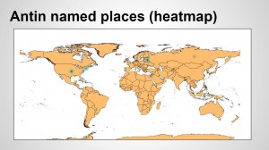
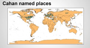
These maps show a few of your options using QGIS: straight pin drops, heat maps to show frequency of mention, and adding the place names alongside the pin drops.
Interestingly, when you compare the pin drop versions Cahan’s looks much more dense than Antin’s, even though Antin mentions places far more times in a shorter text. Antin mentions fewer places more often while Cahan mentions more different places. Is this an element of genre–autobiography, ostensibly limited to Antin’s own experience and memory of reading about & interacting with immigrants from other places versus fiction, ostensibly much more expansive in allowing Cahan to imagine an exceptionally well-traveled & well-read protagonist?
My final step for now: animating
I was interested in the way places are mentioned throughout the text as well, so I decided to take an additional step of animating place mentions (this is why I kept duplicates in my list). As I learned from taking the DSC workshop on historical GIS, QGIS has an animated timeline plugin called TimeManager that is free and easy to install. To use it, I needed to add a time column of some kind to my data. I was interested in textual time, so I decided to use the line numbers of place mentions as a proxy for time.
To identify line numbers, I went back to the result text from the Stanford NER, with all of the tags in full text but on their own line, and located those lines & sent them to a csv file using an R script:
text.v <-scan(“your-text-file-name.txt”, what=”character”, sep=”\n”)
total.lines<-length(text.v)
location.lines<-grep(“^LOCATION = “, text.v)
location.names<-list()
minutes<-list()
for(i in 1:length(location.lines)){
location.names<-(c(location.names, text.v[location.lines[i]]))
minutes<-c(minutes, location.lines[i])
}
write.csv(rbind(location.names,minutes), file=”output-file-name.csv”,row.names = FALSE)
I then used Excel’s read number as time formatting feature to turn it into 24 hour time (basically, seconds & minutes). A couple of monkey wrenches came up here: after I converted the numbers to times, I had to copy the row to text so that it would be readable as a date by the QGIS plugin. I also had to do some clean up work in Notepad++ to make sure that there were enough zeroes & such to fit the international date code formatting standards in the plugin.
Using these videos analytically is going to take more close work, but I will say that one thing that comes across pretty quickly is the comparative nature of much of the texts–mentions of the core scenes of immigration tend to be mentioned in quick succession, ping-pong style during large sections of the text–and that these writers’ geographical imaginaries extends well beyond the places their narrators are physically.


