Effectively Reduced Inequalities?

Education researchers have noted the durability and persistence of socioeconomic inequalities in educational outcomes, a situation that has alternatively been called “Maximally Maintained Inequality” or “Effectively Maintained Inequality“.

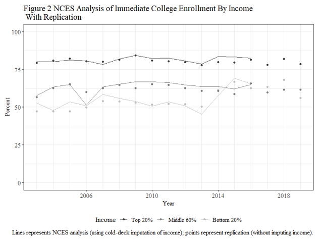
Four years ago, my collaborator Jennifer C. Lee at Indiana University and myself were wrapping up an article on college enrollments and she brought to my attention a National Center for Education Statistics (NCES) data series showing that income inequalities in college enrollment among recent high school grads had dramatically reduced starting in 2014 where low-income young adults’ chances of enrolling in college shot up, completely eliminating the gap between themselves and middle-income young adults.

This was surprising to us, as it goes against the general thrust of MMI/EMI. Along with Genesis Arteta at Temple University, we investigated this finding in more detail. I am pleased to report that the fruits of this are forthcoming in Socius: Sociological Research for a Dynamic World (the article is not up yet, but a preprint is available on SocArXiv; and we are presenting this study on Sunday, August 7 2022 at 2pm in the LA Convention Center, room 153C at the annual meeting of the American Sociological Association).

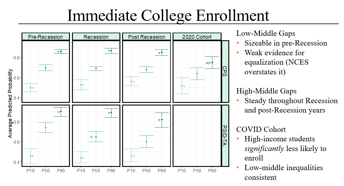
There are problems with the data used to generate this data series, the Current Population Survey, and we are not the first to talk about this (indeed, NCES has discontinued the data series due to this problem). Namely, a good chunk (around 15 percent) of recent high school graduates are independent adults who are never observed living with their parents, and so we have no information on the incomes of their families of origin. We sought to get around this issue in two ways. First, we imputed the incomes of independent adults using other young adult high school graduates who were observed living with their parents, but subsequently left their parental household during the CPS data collection period. Second, we used an additional data source, the Panel Study of Income Dynamics – Transition Into Adulthood supplement (PSID-TA) which tracks individuals over their entire life course and does not run into the same issue of independent adults that CPS does.

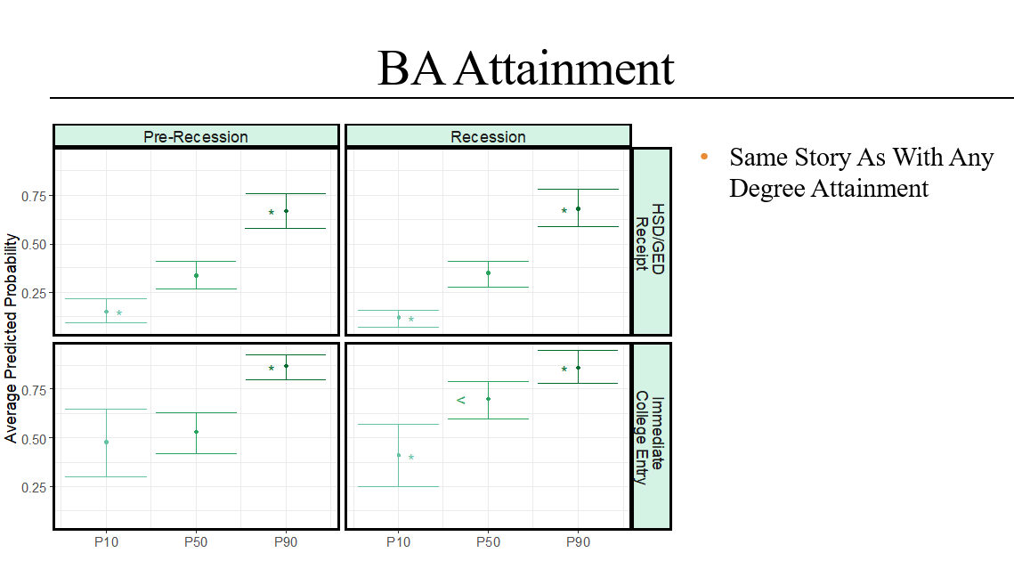
Interrogating the NCES data series is worthwhile (it has informed policymakers), but we sought to make additional contributions to knowledge. First, we extend the data series to 2020, the first cohort of high school graduates navigating the decision to go to college or not in the COVID era, and we know little about how the pandemic has differentially influenced educational transitions by social class. Second, we examine not just college enrollment but also (using just the PSID-TA) degree attainment for the cohorts coming of age before and during the Great Recession.

We find that in both the corrected-CPS results and in the PSID-TA the low-middle income gap remains strong and statistically significant for the cohorts graduating from high school between 2014-2018. The gap may have weakened (we are not sure), but the original NCES analysis is definitely overstating the case in saying it completely disappeared. Income gaps in college enrollment also remained strong for the 2020 cohort, although curiously we do find that higher-income students were less likely to enroll in college which may have reduced the high-middle gap.

We also find that income gaps in getting a college degree (any degree, as well as a BA degree specifically) remained robust. If anything, it looks like the low-middle gap may have increased among college entrants for cohorts graduating from high school during the Great Recession years (as opposed to those graduating in the pre-Recession years).

In short, we uphold the essential gist of MMI and EMI: class inequalities in college-going (as well as getting college-degrees) persist. There is some evidence that inequalities in enrollment weakened in the post-Recession and COVID eras, but it is weak. We see no evidence that inequalities in degree attainment have weakened for cohorts coming of age during the Recession.

COVID and loss of taste

This morning I woke up with a pretty strong sore throat. I took some throat lozenges and while it is is not necessarily sore, I have a strange sensation in my throat and my sense of taste is a bit impaired. My girlfriend and I had plans for tonight, so I texted her explaining that I had this throat issue (but still tested negative for COVID). I also explained that I heard that loss of taste is not a common symptom of COVID anymore so I thought I didn’t have COVID.

But…this is what I heard through friends. I wanted to see for myself what the evidence was. Some searching turns up a May 2022 article in a medical jorunal first-authored by Daniel Coelho. Coelho used a database consisting of 3.7 million COVID+ patients (the “National COVID Cohort Collaborative” or “N3C” database). The authors did a very simple tabulation of COVID strain and whether or not the patient was formally diagnosed with smell/taste disturbance.

One thing that struck me about this table is that smell/taste disturbance makes up quite a small fraction of COVID patients, and it always has. Only 1.3 percent of COVID patients from the initial wave were formally diagnosed with smell/taste loss, and this has only gone down with recent variances, to less than one percent of people with the Alpha, Delta, and Omicron variants.

My one question about this is how was smell/taste disturbance measured and to do that I would have to know more about the N3C data. Apparently a medical practitioner would have to make this determination (which I am guessing is based on asking the patient), but do we know if this means the patient ever had smell/taste disturbance or only if they had it at the time they were seeking medical treatment? Are the practitioners asking all 3.7 million patients if they have smell/taste disturbance or is that recorded only if the patient volunteers that information? Or, are doctors even bothering to officially record this diagnosis even if they know the symptoms exist, since it is a relatively benign symptom and they have bigger fish to fry, namely, a potentially lethal case of COVID?

Another point is that my assurance to my girlfriend that I probably did not have COVID because smell/taste loss is becoming less of a symptom of COVID was falling prey to a common numeracy error I caution my students again. Smell/taste disturbance may be an uncommon symptom of COVID (e.g. the proportion of COVID cases with smell/taste disturbance is small) but COVID may be common among people with smell/taste disturbance (the proportion of smell/taste disturbance cases with COVID is high). In fact, Coelho did say that this is the case when he was interviewed by the PR person at Virginia Commonwealth University: “Loss of smell and taste is still a good indicate of a COVID-19 infection…” Of course, to speak authoritatively to this, one would have to have data on cases of people with smell/taste disturbance and calculate the fraction of COVID cases, but I assume Coelho is using his medical expertise to say that smell/taste disturbance is very uncommon outside of the COVID context.

Physical fitness and police shootings

In a discussion on the cowardice exhibited by the Uvalde police (school district or otherwise), Twitter user Frizzy Missy points to widespread lack of fitness among police, citing this article (PDF) appearing on “Gilmore Health News” which I have never heard of.

This article, headlined “Police Recruitment Poor Standards: Physically Unfit Cops Are More Likely to Use Lethal Force” was unusal for me in that the headline posits a statistical association that it does not even bother to support in the text.

The article in fact makes many assertions that it does not bother to back up. It first posits a “steady decline in standards” for physical fitness: “…a good number of police departments in an attempt to attract people to this low-pay [?], high-risk [??] job, have loosened a lot of these age-long [???], military-style standards.” The closest it comes to supporting this is “an FBI study reveals that eight of every ten police officers are overweight.” There are a couple of problems here. First and most obviously, this statistic says nothing about trends over time (if 90% of police officers were overweight in 1980, then police are becoming more fit) and second, I cannot even find this statistic! When I search for it, all roads lead to a Dallas/Ft Worth CBS article which itself contains no links and focuses on a local police department implementing policy to improve officer fitness.

The article points to the high number of shootings by police officers, and its logic basically is, “We have a high presence of the overweight among police, and the United States has a high number of police-related fatalities, and so the two must be related”.

I am a bit surprised at how poor this piece is, but the fact that it is out there, and people are touting it on social media, makes it a great example for quantitative literacy classes.

Twin Designs and Cultural Capital

I am late to this party, but in 2017 sociologists Mads Meier Jæger and Stine Møllegaard published a study using a monozygotic twin design to study the effects of cultural capital, a concept in education research capturing familiarity with the dominant culture.  Other sociologists [1,2]  have made convincing claims that cultural capital matters for academic success, but I am not so sure about this study.

The study’s design is clever.  The authors used administrative data to get a list of all twin births in Denmark from 1985 to 2000.  In 2013, they surveyed the mothers and asked them, for each of their children (both twins and up to two non-twin siblings), 12 questions about the kind of cultural capital they received when they were 12 years old.  They linked these cultural capital reports to the children’s academic success at the end of their compulsory schooling years (which is grade 9 in Denmark).  They estimate the “within-twin-pair” effects of cultural capital and find some astonishing findings–the standardized effect of cultural capital on an end-of-compulsory-schooling exam is .301, and a standard deviation increase in cultural capital is associated with a 12.5 percentage point increased chance of enrolling in upper-secondary schooling.  They also had some sizable but nonsignificant effects for GPA and Danish exams.

My suspicion, however, is that the paper says little about the effects of cultural capital on academic success and more about the effects of academic success on mothers’ recall of the cultural capital their twin children recieved.

To their credit, the authors are upfront about potential issues with their measurement of cultural capital.  They report intra-class-correlations (ICCs) for the mother’s cultural capital reports; for their omnibus cultural capital scale the ICC is .972.  This means that the correlation between twins’ cultural capital reports is .972.  In other words, there are precious few differences between twins’ cultural capital reports.  The large effect sizes the authors see are are driven by minute differences between twins.

I am just trying to imagine what would produce a situation where a parent, raising identical twins, says that one twin had more cultural capital than the other twin (e.g. they took one twin to a museum more times than the other twin, or one twin had many more books than the other twin, or they talked with one twin about social issues much more often than with the other twin).

I can think of three scenarios.

Scenario A: These mothers are filling out an online survey; we don’t know how many questions total are asked on the survey, but they have to answer at least 12 cultural capital questions for each twin (as well as up to two non-twin children).  I would guess the survey is kind of boring and is asking a lot of mothers to accurately estimate the extent of each of these forms of cultural capital for at least two kids.  Most parents are probably not going to think too hard about each question.  To the extent that they think about distinguishing the cultural capital each kid gets, they are probably going to fall back on easily retrievable information, like how the kid is doing presently, or how overall did the kid fare in school, and that is going to influence their reports of cultural capital.

Now, Jæger  and Møllegaard anticipated this objection, and argued that this “recall bias” should mean that parents are much less consistent about reporting cultural capital for differently-aged kids than for equally-aged kids like twins.  Fortunately they did ask parents about their non-twin children and they show that moms are roughly as consistent in reporting on cultural capital for differently-aged kids as for their twins.  I do not find this compelling and it seems to me they are taking the “recall” in “recall bias” too literally.  I believe the scenario I laid out above is going to be very similar for a mother reporting on her 25-year-old twin children as for a mother reporting on her 15-year-old twins.

Scenario B: An alternative scenario is that within-twin differences in cultural capital were caused by some kind of health mishap or trauma (e.g. if a kid gets disabled they will not be making many trips to museums; if a kid gets bullied at school they may not talk much even with their parents).  In that case, the effects of cultural capital in this study are not the effects of cultural capital but rather trauma.  In this case, the study is failing to account for important confounds.

Scenario C: Within-twin differences in cultural capital are random.  This could especially be the case if the survey is asking mothers to estimate each child’s cultural capital on different screens as opposed to a grid-like format (Jæger  and Møllegaard are not clear on this point).  The authors acknowledge this possibility as well and say “Random measurement error leads to attenuation bias, i.e. downwardly biased estimates of the effect of cultural capital on educational success…we get statistically significant estimates of the effect of individual cultural capital on educational success even in the presence of attenuation bias.”

This is falling prey to the “‘What does not kill my statistical significance makes it stronger’ fallacy”, coined by statistician Andrew Gelman the same year this study came out.  In statistics, “power” means the ability of a statistical test to detect a real effect. One thing that weakens power are small sample sizes.  Another thing is random measurement error.   The fallacy is the tempting notion that if you detect an effect using an underpowered design, that effect must be real.  Jæger  and Møllegaard are essentially saying that they have an underpowered design but they still found an effect–it must be REALLY real.

It is true that if you have an underpowered study, you will be less likely to detect an effect that exists in the population.  HOWEVER, if you have an underpowered study, and you still detect an effect, as Gelman shows, the chances your effect is of the wrong sign increase, and if your effect is of the right sign it will inevitably be overestimated.

My guess is that the Jæger  and Møllegaard estimates of the effect of cultural capital are the results of a mix of Scenarios A and C, especially if mothers were answering questions about each kid on a different screen.  If the questions were presented using a grid and making it easy for mothers to compare their answers across kids Scenario C seems less plausible to me.  For some reason, Scenario B seems unlikely to me–about as unlikely as cultural capital having the sizable causal effects that Jæger  and Møllegaard present.

The Quantitative Literacy Gap in Sociology Undergraduate Education

Thomas Linneman wrote an article appearing earlier this year in Teaching Sociology that documents a continual upgrading in the statistical methods used in sociology articles.  He asks the reader to ponder whether or not sociological statistics courses are preparing undergraduate students to read most published sociological quantitative investigations (they are not) and for statistics instructors to think about covering interaction and nonlinear terms in regressions and logistic regression so undergraduate students.  This way, our undergraduate students will at least be able to understand the bulk of published quantitative sociological work.

I am sympathetic to Linneman’s aims here.  In my own upperclassmen statistics course I have the students read David Brady et al.’s “Rethinking the Risks of Poverty” which uses multi-level linear probability models with interaction terms.  I try mightily to get the students to understand interaction terms so they can understand the statistics that Brady and his co-authors present.  Interactions come at the end of the term; in some semesters this is more rushed than it should be and when that happens I wonder if my students would have been better off if I hadn’t covered interactions at all.

I am having a hard time envisioning how I could cover the other “advanced” topics that Linneman advocates for (nonlinear effects and logistic regression).  The main issue is I need to review some basic quantitative literacy concepts which take up a third of the semester before I can even dive into regression.

The only way I could see this working is if I dispensed with spending class time on basic quantitative literacy (e.g. percentaging tables, comparing quantities, measures of central tendency, levels of measurement).  Instead, I would either (a) offload those topics to readings students would do on their own time, or (b) hope the General Education quantitative literacy course required of undergraduate (who may take it before, during, or after they take my statistics course) covers those things.  I am not sure either option is that appealing.

I don’t really have a solution here; I think Linneman’s goal could be met more easily if (a) the department requires majors take multiple statistics courses and (b) the instructors of the two courses work closely together to coherently sequence the content covered.


About that youth responses to COVID study…

A couple of weeks ago I wrote skeptically about a CDC study by Mark Czeisler et al. reporting very high rates of mental health issues among young people in 2020 due to COVID.  I wrote:

If it was me doing the study, I would have minimized mention of COVID-19 and tried to mimic questions about substance abuse and suicidal ideation that are fielded in other recent surveys (pre-pandemic) and just do a pre/post comparison. 

I am chagrined to report that they actually did try to do this.  A write-up in the Philadelphia Inquirer alerted me to this and sure enough in their conclusion  they say this:

Elevated levels of adverse mental health conditions, substance use, and suicidal ideation were reported by adults in the United States in June 2020. The prevalence of symptoms of anxiety disorder was  approximately three times those reported in the second quarter of 2019 (25.5% versus 8.1%), and prevalence of depressive disorder was approximately four times that reported in the second quarter of 2019 (24.3% versus 6.5%) (2). However, given the methodological differences and potential unknown biases in survey designs, this analysis might not be directly comparable with data reported on anxiety and depression disorders in 2019 (2). Approximately one quarter of respondents reported symptoms of a TSRD related to the pandemic, and approximately one in 10 reported that they started or increased substance use because of COVID-19. Suicidal ideation was also elevated; approximately twice as many respondents reported serious consideration of suicide in the previous 30 days than did adults in the United States in 2018, referring to the previous 12 months (10.7% versus 4.3%) (6).

So the numbers regarding anxiety and depressive symptoms come from the National Health Interview Survey (NHIS).  The NHIS’s sample is quite different from that of the Czeisler et al. study.  While Czeisler et al. relied on a Qualtrics panel and an online survey, the NHIS actually randomly sampled households to do their interviews and use computer-assisted personal interviewing (CAPI).

The Czeisler et al.’s measures appear comparable to those used by the NHIS, but it is hard to tell.  Here is what Czeisler et al. say about how they measured anxiety and depression:

Symptoms of anxiety disorder and depressive disorder were assessed via the four-item Patient Health Questionnaire (PHQ-4). Those who scored ≥3 out of 6 on the Generalized Anxiety Disorder (GAD-2) and Patient Health Questionnaire (PHQ-2) subscales were considered symptomatic for these respective disorders. This instrument was included in the April, May, and June surveys. [p. 1050]

Here is how NHIS measured anxiety and depressive symptoms:

They are derived from responses to the first two questions of the eight-item Patient Health Questionnaire (PHQ-2) and the seven-item Generalized Anxiety Disorder (GAD-2) scale.  

In the PHQ-2, survey respondents are asked about how often in the last two weeks they have been bothered by 1) having little interest or pleasure in doing things, and 2) feeling down, depressed, or hopeless. In the GAD-2, survey respondents are asked about how often the respondent has been bothered by 1) feeling nervous, anxious, or on edge, and 2) not being able to stop or control worrying. For each scale, the answers are assigned a numerical value: not at all = 0, several days = 1, more than half the days = 2, and nearly every day = 3. The two responses for each scale are added together. The NHIS indicators in the table are the percentages of adults who had reported symptoms of anxiety or depression that resulted in scale scores equal to three or greater. These adults have symptoms that generally occur more than half the days or nearly every day.

I think both studies used two items each to measure anxiety symptoms (the questions about frequency of feeling nervous, anxious, or on edge, and not being able to stop or control worrying) and depressive symptoms (the questions about having little pleasure in doing things and feeling down, depressed or hopeless), all four of which were coded on a 0-3 scale (0=not at all; 3=nearly every day).

The questions about suicide ideation come from the 2018 National Survey on Drug Use and Health (NSDUH); the sampling strategy and interviewing method seems very similar to the NHIS, although NSDUH uses audio computer-assisted self-interviewing for sensitive questions. (Fun fact: I think I was interviewed for the 2016 NSDUH; I was definitely part of a very similar study at least).  It does appear that Czeisler et al. did use the same question wording regarding suicide ideation than did NSDUH, with the exception of shortening the time frame (from seriously thinking committing suicide within the past 12 months to the past 30 days).

So Czeisler et al. did their due diligence ensuring comparable measurement across the two studies, so we are left with two possibilities explaining the different prevalences of mental health issues across the two studies: the population did change (probably due to COVID-19) or the Czeisler et al.’s Qualtrics panel was biased towards representing people with mental health issues.  This is plausible but I have talked before about Stephanie Fryberg’s research on Native American attitudes towards Native American mascots for sports teams and showed her Qualtrics panel of Native Americans tended to be more highly educated than the general population of Native Americans.  I suppose a Qualtrics panel for the nation as a whole might skew towards people really struggling with COVID but it seems a bit of a stretch.

So I have to reluctantly conclude that I think Czeisler et al. are correct that people are more likely to say they have seriously considered suicide, or experienced anxious or depressive symptoms, now than they did last year or in 2018.  Having said that, the description of the PHQ makes me wonder if the measure is really tapping into the debilitating natures of clinical anxiety and depression.


That fat politician study

Today my twitter feed had people commenting on Pavlo Blavatskyy’s study correlating the body-mass index of post-Soviety politicians with country corruption measures.  This is a fortuitous coincidence as this is one of the few studies which I can use to illutrate the importance of paying attention to the unit of analysis.

So Blavatskyy used machine learning to infer politicians’ BMI from photographs and he shows this is highly correlated with corruption indices like the Transparency International Corruption Perceptions Index (r=-.92), the World Bank Control of Corruption (r=-.91), the Index of Public Integrity (r=-.93), IDEA Absence of Corruption (r=-.76), and the Basel Anti-Money Laundering Index (r=.80).

So let’s aside two problematic aspects of this study.  First is the utter ridiculousness of it–Blatatskyy cannot even be bothered to even come up with some kind of mechanism that would explain this association.  Second are the corruption indices which I have not looked into but I am skeptical about projects to quantify such a hazy concept.

The real issue is, what is this study good for?  If you take the corruption indices for granted–which I do not–then why should anyone bother with politicians BMI?  The reality is that Blavatskyy has a nation-level cross-sectional design.  It does not speak to whether or not individual politicians are corrupt.  But Blavatskyy disregards this issue and suggests in fact that we can infer an individual, post-Soviet politicians’ corruption by their physical appearance:

Does our median estimated ministers’ body-mass index capture meaningful changes in grand political corruption? The Armenian velvet revolution (which is also known as #RejectSerzh movement) that occurred in spring 2018 offers a convenient natural experiment. The third president of Armenia, Serzh Sargsyan, at the end of his second (and last) term in office initiated a constitutional reform transforming the country from a semi-presidential to parliamentary republic. Mass protests erupted when Serzh Sargsyan was elected as the new prime minister in spring 2018 setting him as a de facto head of government for the third term. The protests resulted in a minority coalition government formed  on 12 May 2018 and headed by Nikol Pashinyan/  Our median estimated body-mass index of ministers in the Pashinyan government (cf. online Appendix Q) is 31.2, which is lower than Armenia’s 2017 value of 32.1 (cf. Table 1). Thus, according to our measure, the Armenian velvet revolution lowered grand political corruption. Yet, the Transparency International Corruption Perceptions Index 2018 for Armenia is the same as it was in 2017, indicating no change in corruption before and after the Armenian velvet revolution. This is perhaps not surprising as the Transparency International Corruption Perceptions Index is based on subjective perceptions. Individual perceptions are known to be sticky and change relatively slowly over time. In contrast, our proposed measure of grand political corruption changes every time a median cabinet minister (on the body-mass index scale) is changed.

So essentially, Armenia had a change of government headed by thinner politicians.  Blavatskyy gives no evidence this new government is less corrupt than its predecessor.  For some reason, he thinks that one of his indices should have shown a lower corruption index but it doesn’t, and this is evidence for using a dynamic, BMI-based, measure of politicians to gauge corruption of individual politicians and/or regimes.  Based on a cross-sectional, country-level design.  Talk about tautological, and all based on an n of 1.

So essentially, for the purposes of a quantitative literacy class, we can say Blavataskyy fell afoul of confusing units of analysis (the ecological fallacy).

Youth Responses to the COVID-19 pandemic

I was a bit skeptical of this statistic when I saw it; a quarter of young people having such strong, adverse reactions to the pandemic seemed a bit incredible to me.  I looked up the study and sure enough Wellmon is accurately portraying the findings, although I am still a bit skeptical.


First, this was a Qualtrics survey, so recruitment was presumably done among Qualtrics panelists.  My suspicion is that online panelists are a bit unrepresentative of the general population, but one way to counteract this is to use weights which this study did (although it appears the weights were based on only a few core demographic variables–gender, age, and race).  The write-up in MMWR says that respondents were informed of the study purposes beforehand, and so one wonders if that drew on people who were more likely to see themselves as victimized by the pandemic.

Second this appears to be a relatively lengthy survey with 86 questions gauging people’s adverse emotional reactions to the pandemic.  Doing a survey online with so many questions tapping into relatively similar things can be pretty mind-numbing, and lends itself to careless responses.  This does not automatically translate into upwardly-biased estimates, but is just a reservation I have.

Third, the question on substance abuse explicitly asks people to attribute their behaviors to the pandemic, and I am not a fan of asking people for their conscious motivations for their behavior.  The question on suicide does not do this, but still it is being fielded in a survey that informed its participants upfront that it was looking at the effects of the pandemic on people’s lives.  Again, this does not mean the percentage is biased upward but is another reservation I have.  If it was me doing the study, I would have minimized mention of COVID-19 and tried to mimic questions about substance abuse and suicidal ideation that are fielded in other recent surveys (pre-pandemic) and just do a pre/post comparison.

And of course, starting or increasing substance use is pretty vague and one can imagine a lot of situations where someone would say yes but still not suffering from substance misuse disorder.  This does not just include people becoming alcholics or misusing opioids.  For the record, the study says that substance use was defined as use of “alcohol, legal or illegal drugs, or prescription drugs that are taken in a way not recommended by your doctor.”  (p. 1051).

I note that the percentage of young people also are also classified as suffering from anxiety disorder, depressive disorder, or trauma or stressor-related disorder (TSRD) also are quite high and I would guess we have a similar problem of quite broad conceptual definitions

COVID testing data addendum

In my last post, I expressed some dissatisfaction with attempted take-downs of Donald Trump’s assertion that increased COVID cases are just an artifact of testing.  While looking over the COVID Tracking Project I found this nice visualization:

I think this does a better job of putting to rest Trump’s excuse for a greater COVID cases.  For one thing, the number of new cases does not track with the number of tests being done.  From May through June cases declined while testing grew.  For a second thing, the smoothing of the death trend makes the increase starting in July a bit clearer (although still obviously the number of new deaths is fortunately quite lower than it was in April).  For a third thing, the hospitalization data is very clear that we have seen a true increase in COVID cases that is hard to wish away as data artifacts (I mean, I suppose one could argue that COVID cases have been constant and the dip in June was because people were staying from the hospital, but that stretches credulity). But the hospitalization trend looks quite different than the trend I showed in my last post, from COVID-NET:

I missed the fine print that the hospitalizations are really based on 100 counties  in 14 states (although I am not sure if it is actually 100 counties in the 10 states in the Emerging Infections program  and the entirety of four states in the Influenza Hospitalization Surveillance Project), whereas the COVID Tracking Project aggregates reported hospitalizations from all 50 states (although again, the quality of state reporting on COVID hospitalizations is a bit murky to me).

COVID testing data

Donald Trump’s disastrous interview with Jonathan Swan centered around COVID testing data which I want to take up here and just organize my thoughts on the subject.  I am looking for a good overview of COVID case data and where its potential biases are and I am a bit flummoxed.

https://twitter.com/axios/status/1290497186489348096?s=20

As best as I can tell, there are two main stages where COVID data goes awry:

  • Who Gets Tested
  • How Testing Data Is Aggregated

Who Gets Tested

It goes without saying that those infected with SARS-Cov-2 but are not tested are not going to show up in the data.  Who are these cases?  My initial thought was that these would primarily be asymptomatic cases and people who get sick but get over the disease fairly quickly.  But this does not take into account how testing availability is segregated by race and class.  Science Magazine discusses the research of epidemiologists Wil Lieberman-Cribbin, Stephanie Tuminello, Raja Flores, and Emanuela Taioli showing that in New York City testing rates in March 2020 were highest in White-dominated zip codes (although it was not correlated with zip code SES).  Taioli told Science Magazine that NYC equalized testing capacity  since March but we do not know what the situation is in other parts of the country (h/t Vox).

How Testing Data is Aggregated


Even more depressingly, even the very simple act of combining testing data to get a picture of what’s going on in the entire United States is fraught.  Ourworldindata talks about their data sources for COVID tests which is the COVID Tracking Project and the CDC (they don’t make clear how they combine these two sources of data). As of this writing, the CDC’s “Testing Data in the U.S.” page (updated 8/3/2020) lists 52.9 million tests done and 5.0 million positive tests, while the CDC COVID Data Tracker (also updated 8/3/2020) lists 61.5 million tests done and 5.5 million positive tests.  And the COVID Tracking Project (updated today 8/4/2020)  lists 52.5 million tests and 4.7 million positive tests.

Sigh.

As best as I can tell, all COVID-testing labs are required to report their testing results to “the appropriate state or local public health department”.  [I am not sure about this, but I believe that the recent kerfuffle over HHS being the sole recipient of hospital COVID data is not related to this basic issue of COVID testing and case counts but I could be wrong].  In turn, these state and local public health departments report their data to the CDC (as well as make it public, so the COVID Tracking Project picks that up).  We also know that the testing aggregation is screwed up as some states are combining viral tests (which measure if someone has a current infection) and antibody tests (which measure if someone was infected in the past) which really screws things up (the focus of most international comparisons and time trends have been viral tests).  According to the CDC Data Tracker, the states still doing this as of now are Delaware, D.C., Maine, Mississippi, Missouri, Oklahoma, Puerto Rico, Tennessee.  It appears this aggregation is where we are getting these different estimates.

Back to Trump

Trump’s argument that increased COVID cases is just an artifact of increased COVID testing is not a totally crazy idea.  As Joel Best points out in Damned Lies and Statistics, often times when researchers start counting incidents of a new social problem, they inevitably show dramatic increases early on just because surveillance has gotten better, but not necessarily because the actual problem got worse).  Best illustrates this with the example of FBI statistics on the incidents of hate crimes.

Sharon Begley at StatNews wrote an article taking on this argument.  Essentially, she treats the percentage of tests that are positive as a more “valid” measure of prevalence.  So in Florida (the state that saw the biggest relative increase in COVID cases from May to July), .002% of the population tested as positive in mid-May; in mid-July, the corresponding percentage was .059%, 25 times the percentage in May.  But Florida’s testing also increased over time, from 479 tests to 65,567 tests.    That 2,400 percentage increase in positive cases could just be an artifact of the increased tests.  So Begley looks at the percentage of tests that were positive over the same time frame; in mid-May, it was 3.160 percent; in mid-July, it was 19.254 percent, 5 times the percentage in mid-May.  So the prevalence of COVID increased even among the tested which undermines Trump’s argument.

According to Begley’s calculations, there is only a handful of states seeing increased cases of COVID but steady (or even declining) percentages among those tested: Colorado, Indiana, Michigan, Missouri, North Carolina, Ohio, and Wisconsin.

I find this exercise a bit unsatisfying though.  Although Begley did not do it, we can do the same calculation for the United States.  In mid-May, .008 percent of the population tested positive; in mid-July it was .019 percent of the population, 1.4 times that in May.    And guess what? The percentage of tests that came back positive help pretty steady from mid-May to mid-July, from 7.4 to 7.6 percent.  So if you really think the percentage of positive cases among the tested is a more valid measure of COVID prevalence, you would have to accept Trump’s argument that overall, the increased number of COVID cases in the United States is due to greater testing.  I guess the state-level analysis is a bit more valid because it is getting “closer to the ground” but it seems like an arbitrary unit of analysis (why is the state-level better than, say, the county-level?).

[to be clear, I am skeptical of the argument that trends in the percentage of positive cases among the tested is a more valid estimate of trends in the population overall; it seems to me that the number of tests is responding to more and more people getting the disease]

I think more compelling would be looking at COVID hospitalizations and deaths.  Both trends increased since mid-June, but the levels are still quite lower than what the United States was experiencing in April (although hospitalization data has been disrupted due to the switchover to HHS reporting so the recent hospitalization counts are probably downwardly biased).


To be honest, I am a bit pessimistic that data could really put Trump’s argument to rest, because our data is so poor (which I would guess is the legacy of our federal system combined with willful negligence in the executive branch).  Vox had an interesting argument about the need for “surveillance testing” which, instead of aggregating all tests ever done,  would involve outpatient clinics recording data on all patients showing symptoms.  This would supposedly yield trends that would be more comparable over time.