In my last post, I expressed some dissatisfaction with attempted take-downs of Donald Trump’s assertion that increased COVID cases are just an artifact of testing. While looking over the COVID Tracking Project I found this nice visualization:
![]()
I think this does a better job of putting to rest Trump’s excuse for a greater COVID cases. For one thing, the number of new cases does not track with the number of tests being done. From May through June cases declined while testing grew. For a second thing, the smoothing of the death trend makes the increase starting in July a bit clearer (although still obviously the number of new deaths is fortunately quite lower than it was in April). For a third thing, the hospitalization data is very clear that we have seen a true increase in COVID cases that is hard to wish away as data artifacts (I mean, I suppose one could argue that COVID cases have been constant and the dip in June was because people were staying from the hospital, but that stretches credulity). But the hospitalization trend looks quite different than the trend I showed in my last post, from COVID-NET:
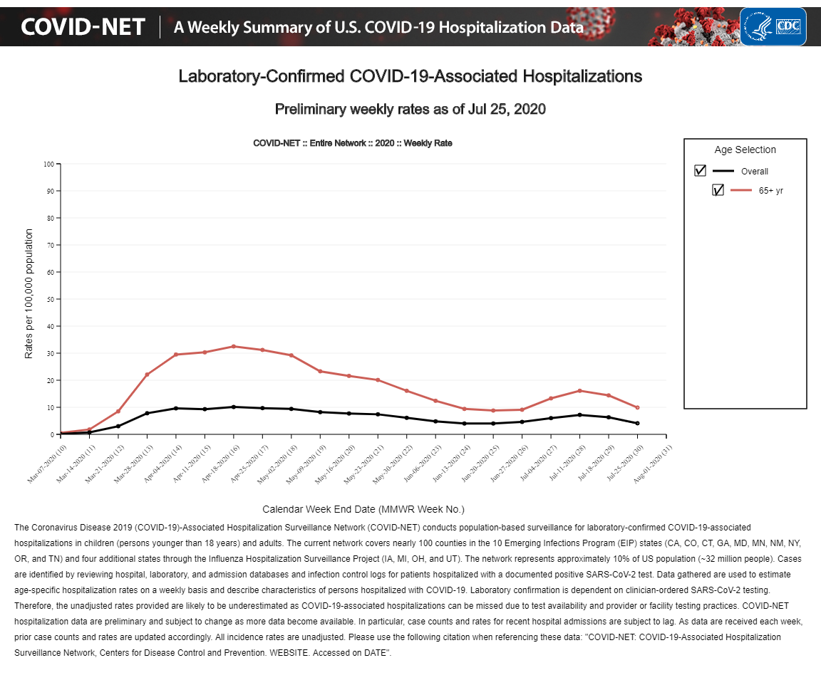
I missed the fine print that the hospitalizations are really based on 100 counties in 14 states (although I am not sure if it is actually 100 counties in the 10 states in the Emerging Infections program and the entirety of four states in the Influenza Hospitalization Surveillance Project), whereas the COVID Tracking Project aggregates reported hospitalizations from all 50 states (although again, the quality of state reporting on COVID hospitalizations is a bit murky to me).