Research Resource Repository
- Tool
Hotel Resilience to Natural Disasters Tool
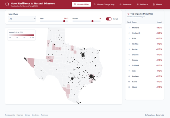
Tool link: https://uflyy.github.io/natural-disaster/
This interactive dashboard serves as the companion tool for the research paper Nam and Yang (2026): Hotel performance under extreme weather: a contingency perspective on organizational resilience, published in the Journal of Sustainable Tourism (Link). This tool bridges the gap between theoretical econometric models and practical hotel management, allowing stakeholders to visualize the historical and future impacts of natural disasters on hotel revenue across various scenarios.
The Historical Map provides a geospatial visualization of actual hazard impacts across Texas counties. By selecting specific hazard types (e.g., flooding, hurricane, hail) and historical timeframes (2002-2019), users can observe the distribution of past events and the estimated percentage impact on local hotel performance. The top 10 most severely impacted counties for the selected month are dynamically highlighted.
The Climate Change Map allows stakeholders to conduct forward-looking macro stress tests. By anchoring on the 18-year annual average of specific historical hazards, this module enables users to project future spatial risks by adjusting the frequency deterioration slider (e.g., +20% flood frequency). It maps how a shifting climate trajectory will aggravate expected annual hotel revenue damages across different counties over the long term.
The Simulation Module equips hotel portfolio managers to estimate financial losses under hypothetical disaster severities. Users can configure an aggregate portfolio’s characteristics—including ownership mix (independent vs. chain vs. franchise), hotel class structure, and baseline revenue—to analyze how these organizational boundaries mitigate or exacerbate absolute revenue loss during a hazard shock.
The Resilience Module translates the study’s empirical findings into a scoring system for individual properties. By inputting key hotel determinants such as room count, operational age, and chain affiliation, the tool computes a normalized ‘Resilience Score’ (0-100). This score is benchmarked against predefined industry percentiles, empowering owners to understand their property’s inherent capacity to withstand extreme weather disruptions.
- Tool
PS-SAT: Predictive Scheduling & Satisfaction Analytics Tool
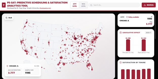
This web-based dashboard is designed to visualize tourism and hospitality employee satisfaction data across U.S. geographic units at both the City and Metropolitan Statistical Area (MSA) levels. The application provides interactive mapping, subgroup breakdowns, and (where applicable) legislative pre– and post–comparisons.
Key Features:
- Dual-Level Geographic View: Users can switch between City-Level (point markers) and MSA-Level (polygon map) visualization.
- Interactive Search & Selection: Users can search locations dynamically and select them either via the map or the dropdown search interface.
- Subgroup Breakdown Analysis: Satisfaction scores are displayed by:
-
- Job tenure
- Business model
- Skill level
- Front-of-house vs. back-of-house
- Legislative Effect Comparison: For locations with valid policy-period data, the dashboard displays Pre-Law vs. Post-Law satisfaction comparisons.
- Visual Encoding of Sample Size: City marker size scales with sample size (N), allowing immediate identification of data-rich locations.
- Dataset
Government Attention to Tourism Data
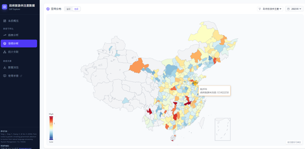
This web-based application is designed to provide researchers and policymakers with an interactive platform for querying and analyzing data regarding Government Attention to Tourism (GAT) in China.
Based on the research findings of Yang, Yang, Huang & Yan (2026), this tool visually demonstrates the spatiotemporal relationships and statistical correlations between the GAT index and various tourism economic indicators. This tool supports a bilingual interface in both Chinese and English. You can switch between the two language modes in real-time by clicking the language toggle button (中文/EN) located in the top-right corner of the page.
Key Features:
Multidimensional Data Coverage: Includes GAT indices and 11 key tourism economic indicators at both the provincial and prefectural (city) levels.
Interactive Visualization: Provides trend analysis, spatial distribution maps, and statistical correlation scatter plots.
Data Resources: Supports viewing summaries of raw data and downloading data.
Tool Link: https://uflyy.github.io/gat-database/
本网页应用旨在为研究人员和政策制定者提供关于中国政府旅游关注度 (Government Attention to Tourism, GAT) 的交互式数据查询与分析平台。
该工具基于 Yang, Yang, Huang & Yan (2026) 的研究成果,通过可视化手段展示了 GAT 指数与各类旅游经济指标之间的时空关系和统计关联。本工具支持中英文双语界面。点击页面右上角的语言切换按钮(中文/EN),即可在两种语言模式间实时切换。
核心功能:
- 多维数据覆盖: 包含省级和地级层面的 GAT 指数及 11 项关键旅游经济指标。
- 交互式可视化: 提供趋势分析、空间分布地图和统计关联散点图。
- 数据资源: 支持查看原始数据摘要及下载。
- Tool
Extended MASEM Analysis from SO, YANG AND LI (2025)
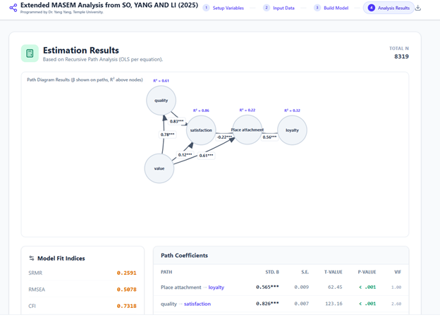
This web-based application is designed to conduct Meta-Analytic Structural Equation Modeling (MASEM). It is built upon the foundational research of So, Yang, and Li (2025), which synthesized 15 years of research to determine the interrelationships between Customer Loyalty, Customer Satisfaction, Perceived Value, and Perceived Service Quality.
Key Features:
- Replication: Users can replicate the findings of So, Yang, and Li (2025) using pre-loaded, industry-specific data.
- Extension: The tool allows researchers to expand the original model by adding new variables (e.g., Place Attachment, Trust, Brand Image) to test novel theoretical frameworks.
- Methodology: It utilizes the Harmonic Mean or Minimal N methods to aggregate sample sizes.
- Dataset
Pulse of American Domestic Tourism
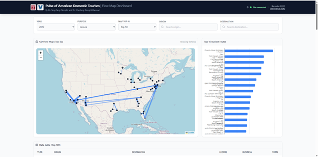
“The ‘Pulse of American Domestic Tourism’ project serves as a digital monitor for the nation’s internal mobility. By mining transportation-derived mobility data, we develop a comprehensive matrix of tourism flows connecting American MSAs. This data-driven approach unveils the rhythmic shifts in visitor demand and regional connectivity. Crucially, we ground these digital insights through extensive cross-validation with household survey data, creating a verified, high-resolution framework for understanding the evolving landscape of domestic travel.”
Key Vocabulary Used (Why it works):
- Inter-MSA travel flows: Specific and accurate to your methodology.
- Arterial circulation / Rhythmic shifts: Reinforces the “Pulse” metaphor without being cheesy.
- High-granularity / Spatiotemporal precision: Highlights the “Big Data” advantage.
- Rigorously cross-validated: Emphasizes the reliability of your model (crucial for academic trust).
- Ground-truth metrics: A professional way to refer to the survey data as the standard of truth.
- Dataset
COVID19tourism Index
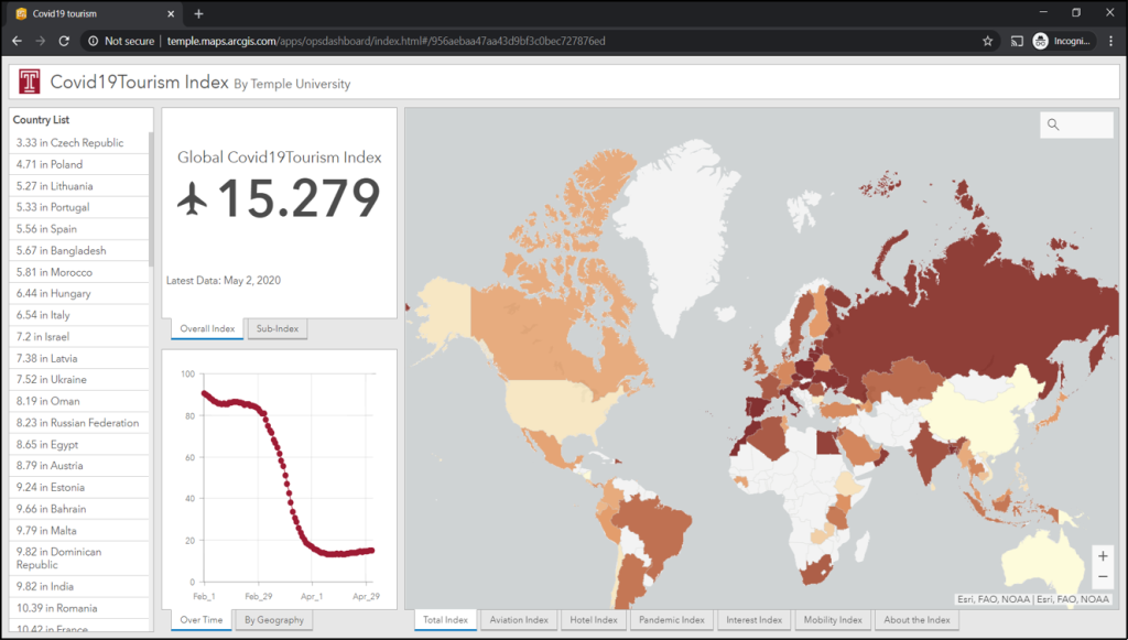
The COVID19tourism index was developed to monitor the pandemic’s multifaceted impact on the global tourism industry. This index comprises five distinct sub-indices designed to track the specific effects of COVID-19 across various aspects of tourism activities. By utilizing this tool, destinations are enabled to assess their recovery status, generate rigorous forecasts, and benchmark their performance against potential competitors. Sub-indices The COVID19tourism index is comprised of five distinct sub-indices. These sub-indices were designed to track the specific effects of the pandemic across different aspects of tourism activities.
Dashboard Utility The index functions as a tool that enables destinations to perform three primary functions:
• Evaluate Recovery: Destinations can use the tool to assess their current recovery status.
• Forecast: The tool allows users to produce rigorous forecasts regarding tourism trends.
• Benchmark: Destinations can use the index to benchmark their performance against potential competitors
Link to the COVID19tourism Index Dashboard
Link to download the data