Research Resource Repository
- Tool
Restaurant Week Impact Explorer
Tool link: https://uflyy.github.io/restaurant-week/

Academic Reference:
Yang, Y., Yin, Q., Hwang, G. K., Liang, S., & Yang, D. (forthcoming). Restaurant week paradox: Asymmetric effects of event-based marketing on online engagement. International Journal of Contemporary Hospitality Management.
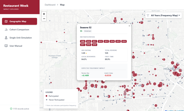
1. Geographic Map View
- Year Filtering: Use the dropdown in the top right corner to filter participation status by a specific year.
- Frequency Mapping: If “All Years” is selected, the size (radius) of the cherry-red markers expands dynamically based on the total number of years a restaurant has participated.
- Interaction: Click on any marker to open an information popup with historical baseline data and predictive metrics.
2. Cohort Comparison
- Purpose: Compares the structural and baseline performance differences between restaurants that participated in RW versus those that did not.
- Visual Variables: Recharts-based grouped bar charts are used to visualize the mean values of quantitative variables (Rating, Review Volume, Local/First-time mix) and the proportional makeup of categorical variables (Price Level, Fine Dining status).
- Frequency Histogram: When filtering by “All Years”, a unique frequency distribution chart activates, revealing the historical retention and loyalty of participating restaurants.
3. Single Unit Simulation
- Purpose: A sandbox environment detached from the map data. It allows you to model hypothetical scenarios based on econometric estimation formulas.
- Controls: Adjust the baseline consumer mix (Local Reviewers and First-Time Reviewers) and toggle the Fine Dining status to see real-time marginal treatment effects.
- Tool
Bike sharing and tourism impact tool
Tool link: https://uflyy.github.io/bike-sharing/
The tool is an interactive, data-driven dashboard designed to visualize the synergistic relationship between urban micro-mobility and tourism. Grounded in empirical econometric research, the tool uses Chicago as a case study to demonstrate how bike-sharing systems impact the demand and visitor experience of nearby tourist attractions. It features interactive spatial mapping and a predictive policy simulator, bridging the gap between academic research and smart city tourism management.
- Tool
Rating Adjustment Tool
Tool link: https://uflyy.github.io/rating-adjustment/
The Rating Adjustment Tool is an advanced analytical web application designed to standardize hotel online reviews by correcting for “scaling heterogeneity”—the phenomenon where different types of reviewers interpret and use rating scales differently. Powered by a Hierarchical Ordered Probit (HOPIT) model grounded in peer-reviewed academic research , the tool mathematically controls for systematic response biases tied to traveler demographics (such as age and gender) and trip characteristics (such as travel type and reviewer expertise). By offering individual review adjustments, hotel-level aggregate score calculations, and batch CSV processing, the tool effectively translates subjective, raw user ratings into objective, comparable latent scores and standardized 1–5 metrics, ensuring fairer and more accurate hotel evaluations.
This rating adjustment tool is built on the theoretical framework and empirical results from the following paper:
Leung, X. Y., & Yang, Y. (2020). Are all five points equal? Scaling heterogeneity in hotel online ratings. International Journal of Hospitality Management, 88, 102539.
- Tool
Green Hospitality Dashboard
Tool Address: https://uflyy.github.io/green-hotels/
How to Use This Dashboard
- Global Map Aggregation: At the global or country level, cities are represented by aggregated markers scaled by hotel volume. Click a city marker to seamlessly zoom in and load individual hotel properties without clutter.
- Dynamic Popups: Popups intelligently pan into the view to ensure long lists of Green Features or Hotel Styles are never clipped by the screen edges.
- Deep-Dive Graphing: Navigate to the Graph View to instantly evaluate structural differences across subgroups using Native Boxplots (min, Q1, median, Q3, max), Standardized Radar Profiling, and 100% Stacked Bar Charts.
- Top 10 Feature Slicing: When grouping by specific environmental practices (Green Features), the system automatically filters for the top 10 most adopted measures to preserve visual clarity.
- Tool
Global Tourism Flows
Tool link: https://uflyy.github.io/global-tourism-flow/
This interactive analytical platform serves as a high-fidelity visualization tool for examining the complex dynamics of global tourism flows. The tool allows researchers and practitioners to explore bilateral tourism interactions through both spatial flow maps and regional intensity choropleths. At its core, the system quantifies “World Flatness” by calculating the elasticity of cultural distance, incorporating Hofstede, World Values Survey, and Schwartz frameworks, to demonstrate how technological and economic globalization have mitigated historical barriers to international travel. Users can simulate temporal shifts, analyze geographic friction, and identify proximal cultural markets, transforming abstract statistical data into an intuitive, evidence-based dashboard for strategic tourism intelligence.
- Tool
Hotel Resilience to Natural Disasters Tool
Tool link: https://uflyy.github.io/natural-disaster/
This interactive dashboard serves as the companion tool for the research paper Nam and Yang (2026): Hotel performance under extreme weather: a contingency perspective on organizational resilience, published in the Journal of Sustainable Tourism (Link). This tool bridges the gap between theoretical econometric models and practical hotel management, allowing stakeholders to visualize the historical and future impacts of natural disasters on hotel revenue across various scenarios.
The Historical Map provides a geospatial visualization of actual hazard impacts across Texas counties. By selecting specific hazard types (e.g., flooding, hurricane, hail) and historical timeframes (2002-2019), users can observe the distribution of past events and the estimated percentage impact on local hotel performance. The top 10 most severely impacted counties for the selected month are dynamically highlighted.
The Climate Change Map allows stakeholders to conduct forward-looking macro stress tests. By anchoring on the 18-year annual average of specific historical hazards, this module enables users to project future spatial risks by adjusting the frequency deterioration slider (e.g., +20% flood frequency). It maps how a shifting climate trajectory will aggravate expected annual hotel revenue damages across different counties over the long term.
The Simulation Module equips hotel portfolio managers to estimate financial losses under hypothetical disaster severities. Users can configure an aggregate portfolio’s characteristics—including ownership mix (independent vs. chain vs. franchise), hotel class structure, and baseline revenue—to analyze how these organizational boundaries mitigate or exacerbate absolute revenue loss during a hazard shock.
The Resilience Module translates the study’s empirical findings into a scoring system for individual properties. By inputting key hotel determinants such as room count, operational age, and chain affiliation, the tool computes a normalized ‘Resilience Score’ (0-100). This score is benchmarked against predefined industry percentiles, empowering owners to understand their property’s inherent capacity to withstand extreme weather disruptions.
You must be logged in to post a comment.