Slides, slides, slides

It’s the middle of the semester and most of the Code Rascals are busy with library instruction. As an instructor, I typically rely on slide decks created in PowerPoint to deliver workshops and presentations to courses. Slide decks help me stay on track during a talk, prompt discussion and explain workshop activities, and create a record of how I’ve tailored sessions for different sections of the same class to meet student or instructor needs. I also really like designing slides. It’s a creative, almost soothing activity, that offers a brief distraction from more complex tasks.

Each semester I find myself dusting off slide decks from previous semesters to reuse and repurpose in old and new courses. Locating and editing slide files is a reminder of the ways PowerPoint falls short as a presentation tool for me (storage and access to the files can be cumbersome, custom fonts don’t display on some machines). I’m getting better at keeping my instruction files organized, but I still find myself scrambling to identify the most recent version of the slide deck, to remember which version I used for which instructor, and to ensure the slideshow will display properly on older PCs in campus classrooms I may have never set foot in. And, then I also have to successfully transport the files with me to various campus locations. OwlBox has been great for cloud storage and organization, but navigating within OwlBox to locate the file at the beginning of class can cut into instruction time, and there’s always a worry that wireless access will cut out leaving me unable to access my files. I hear that some folks use USB thumb drives, but I have a talent for losing those.

I do like PowerPoint, and this is not a rant against it. It’s typically my go-to presentation tool, but I’ve experimented with a couple of other tools this semester.
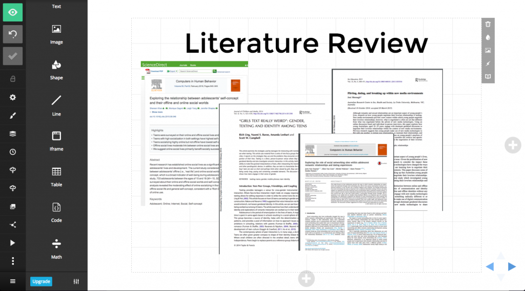
Slides (slides.com)

Slides is a web-based tool (with a free version) that allows you to create and store your slides in one place. The slides are HTML-based, built on reveal.js, an open source HTML presentation framework, and are viewable through a browser, so you don’t need to to have access to PowerPoint or other software to access them.

screen shot of editing screen in slides
The Slides editing screen has the same basic features as PowerPoint. You can insert and edit text, media, shapes, and choose from a few basic style templates.
screenshot of slides speaker notes on an iphone
Another benefit is that you can use your phone to view speaker notes and advance through slides during your presentation

Benefits

  • Simple, intuitive editing interface
  • Version control
  • Slideshow can be played from your browser
  • Slide decks can be downloaded in the free version
  • Displays the same across devices (so, less worrying about whether the fonts you chose, images you selected, etc. will display properly on a different machine)

Drawbacks

  • Slide decks are public under the free version
  • A few of the transition effects are reminiscent of Prezi’s that make people feel sick
  • Downloadable files are not recommended for offline play; you really need an internet connection if you want to retain the styling and functionality of the slides

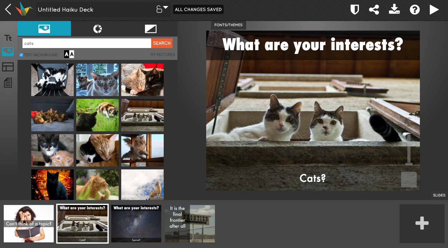
Haiku Deck (haikudeck.com)

Haiku Deck is another web-based tool. I’ve only played with Haiku Deck a little, but the interface immediately feels less intuitive than Slides. I couldn’t control-z to undo my edits which could honestly be a deal-breaker. The great thing about Haiku Deck is the access to images, so if you’re one of those folks who loves using stunning photos to add meaning to what you’re saying, this may be the tool the for you.

Editing interface in Haiku Deck

Benefits

  • Embedded image search within the application
  • Access to high-quality images that photographers have licensed under Creative Commons
  • Automatically pulls in the attribution for photos

Drawbacks

  • Slide decks are public under the free version
  • Slide deck cannot be downloaded
  • Lots of pop-ups asking you to upgrade (though, it should be noted they have an education edition for only $5)

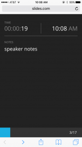
So, should you try any of these? Sure, but remember that the message of your presentation should not be overshadowed by your medium. It’s probably best not to use a new tool just for the sake of using a new tool. A good rule of thumb for using a PowerPoint alternative is to use it because it does something PowerPoint cannot do. For me, Slides offers portability, the assurance that my presentation will display the way I want it to, and access to speaker notes regardless of equipment setup which makes it a good tool in presentation environments with a lot of unknowns. Will I stick with it over PowerPoint? I’m not sure, but I enjoyed making these slides for one of my Gen Ed classes.


🙂

Writing on the web

The Code Rascals are hard at work analyzing and summarizing our first round of usability testing of LibGuides. As we observe participants looking at our guide content, I’m reminded of a webinar I watched last fall called Web Writing with the User in Mind, hosted by Florida Library Webinars. The presenter, Rebecca Blakiston, UX Librarian at Arizona State Libraries, discusses ways that we can create a better user experience by writing better content for our sites. Blakiston begins with premise that people come to websites for content and to perform tasks. At the core of the presentation are 10 writing tips that we can use make it easier on users to complete tasks and find the content they need. The examples she provides refer mostly to content on library websites, but many of the principles can also be applied to our Research Guides. I’ll recap a few highlights here, but if you’re interested you can view her full slide deck.

Tips for Writing on the Web from Web Writing with the User in Mind

  1. Know how users read on the web. Deep reading is rare and visitors are likely to scan to find content that’s relevant. Users also tend to focus their eyes on the left side of the screen, skimming down, but staying toward the top of the page.
  2. Know your users. Use analytics data and talk to your users to better understand what they need need.
  3. Simplify your text. Use no more than 25 words per sentence, use active voice, and avoid adverbs for stronger sentences. Fragments and shorter paragraphs can help users scan your content quickly.
  4. Be Human. Use a conversational tone as if you were talking to the user at the reference desk. Write like you talk. Test by reading your text aloud to see how it sounds. Cal Poly San Luis Obispo library’s website is a good example of a conversational, but not overly casual, tone.

Thinking back to LibGuides, our guide text, including database and link descriptions, impact how users interact with our guides. One place we may do well to write more succinctly and intentionally is in our database descriptions. In our usability test, we observed that participants do read database descriptions (some more deeply than others) when selecting a database, signaling to us that we need to be thoughtful about what goes into the descriptions. We should customize database and link descriptions to the guide’s purpose and include details that tell the user how to use a specific resource or why it might benefit them. With course guides, for example, we can use language from course assignments to craft custom database descriptions that connect resources to specific course themes or assignments. In my Meaning of Madness:SPSY 0828 guide, I’ve included language from course assignments in my box titles, and I’ve attempted to keep my database descriptions short and related to the assignments. Writing custom descriptions also forces us to be more cognizant of which resources we’re presenting to users.

If you do add a custom database description, remember to set the description to “Display beneath item title” rather than hover, so that the user can see the description!

We’ll have another post later in the semester summarizing our findings alongside discussions of other best practices.

More on writing for the web from Usability.gov.

Usability Testing: Round 1

The Code Rascals turned their attention to user experience in late Spring with the intention of conducting a usability study of the Libraries’ Research Guides over the next year. To prepare, we took a break from our more tech-focused tutorials and worked through a Lynda tutorial called Foundations of UX: Usability Testing and Treehouse’s Usability Foundations course.

Overview

The purpose of our usability study is to understand how undergraduate users execute research and discover resources in our Research Guides, address system-level usability issues, and to generate a list of best practices for guide creators. We chose to do two to three rounds of testing and study only five participants at a time. This decision was based on findings from the Nielsen Norman Group that “the best results come from testing no more than 5 users and running as many small tests as you can afford.” The idea is that the same usability issues pop up again and again with each participant, and you eventually stop discovering new problems. This approach also gives us the flexibility to make small changes to Research Guides along the way and to re-design each test to probe more deeply into usability issues. To design our study, we began by generating a list of research questions to guide the creation of usability test tasks and to determine specifically what we wanted to know about the way users interact with Research Guides.

Recruitment & Testing

In October, we concluded the first round of usability testing. We recruited in early Fall semester using fliers, social media posts, and digital signage. Interested undergrads submitted their names in a Google Form and Jackie coordinated final meeting times through email. Participants were given $50 Barnes and Noble Gift Cards for their time.

Five users participated in usability tests that ran from 35 minutes to 1 hour. Each session took place in a breakout room in the Libraries’ new Digital Scholarship Center. Our set-up included a Mac laptop, mouse, and external monitor for the facilitators to observe as the participant navigated through the usability tasks. The sessions were also broadcast to a library conference room where other library staff gathered to observe the live sessions. We asked observers in the conference room to note usability issues and gave them the opportunity to ask follow-up questions of the participant. Two Code Rascals facilitated the test in the DSC breakout room while at least two others facilitated observation in the conference room. Sessions were also recorded using Quicktime, so that we could conduct a more thorough analysis later. While each test highlighted a number of usability problems right away, we also wanted the ability to re-watch the tests later in co-viewing sessions as this method provides rich insights that may be overlooked during the live session.

Participants included

  • 1 Freshmen Biology major
  • 1 Sophomore Film major
  • 1 Sophomore, Actuarial Science major/Spanish minor
  • 1 Freshmen Secondary Education/English major
  • 1 Sophomore Psychology major/Italian minor

Overview of the test protocol

We began with a few basic questions including

  • What is your major and department?
  • Have you used the library website to conduct research before?
  • Have you attended any library workshops since you’ve been at Temple?

We then asked participants to complete a series of tasks using the “think-aloud” method or to “literally talk us through what you’re doing and what you’re thinking.” Each participant explored Research Guides freely for 2-3 minutes and gave us their general impressions, completed 7 research-based tasks in different scenarios, and completed an “XO” test where they circled things they liked and crossed out things they did not like on print outs of a subject guide and course guide in their major or minor. The full usability script is available here.

The Rascals are still in the midst of analyzing each recording. We’ll report some preliminary findings here, though look for a more thorough analysis and report at the end of the academic year. Next steps for us include designing a second round of usability testing for Spring semester and generating best practices for guide creators based on the findings by early Summer.

Rascals Roundtable at ACRL 2015 Portland

A cadre of Code Rascals visited Portland, OR this spring to attend the ACRL 2015 National Conference.  Caitlin, Jackie, and Jenifer conducted a roundtable discussion, “Upskilling Liaison Librarians: Code, Community, and Change.”  We were thrilled to have a table full of colleagues from around the nation who were interested in sharing their thoughts and experiences.  Discussion topics ranged from the challenges of evolving liaison roles to practical tips for forming a learning community within the library and reaching out to the wider campus community.

Virginia Tech Demystifying the Summon 2.0 Interface

Earlier today, Proquest hosted a webinar with Godmar Back and Annette Bailey on the work they’ve been doing at Virginia Tech to customize some aspects of the Summon interface.  See their Code4Lib paper for the technical details.  Much of the webinar consisted of watching Godmar Back think aloud, navigating the code, to show how they “reverse-engineered” Summon code to identify components of the AngularJS framework they could augment.  They used a utility for deobfuscating the source code (Code Rascals W0rd of the Day: Grep) so that they could identify Summon developers’ custom directives that they could modify with their own JavaScript.  At least, I think that’s what they said they did.

According to a recent interview with Proquest, the original motivation for all of this was to be able to capture user click-throughs in Summon results for Virgina Tech’s libFX project.  Check out the “discipline ticker” for an example of what they were trying to do.  But, of course, it opened up the possibility for other customizations.

image of expanded facet in summon results
Example of a default expanded facet.

Examples included being able to improve labeling of links, or to have certain facets default to an open state on search results pages, and to retain that choice after page reloads.  Another example, demoed at the end of the webinar, was the insertion of local notices, such as simultaneous user limits, into certain result displays.

They acknowledged that considerable technical skills were necessary for sleuthing the Summon code.  They also acknowledged what they felt were the “moderate” risks associated with “writing code that directly interfaces with vendor code,” and expressed confidence that the risks were manageable.  A big takeaway from the webinar is that much is possible, even when dealing with seemingly inscrutable vendor interfaces.  It would seem that what it takes is a culture that supports experimentation, and a willingness to invest the necessary resources into creating the best possible user experience regardless of whether a system was developed in-house or purchased from a vendor.

Now you can use sticky tabs, too!

Sticky tabs can now be applied to any LibGuide using the “Sticky Tabs” template.

See sticky tabs in action (they remain “stuck” to the top of the page even as the user scrolls).

To use them in an existing guide

  1. Select Guide Navigation Layout from the top-right menu on the Guide Edit screen.
    Screenshot of LibGuides edit screen
  2. Select Sticky Tabs — tabs stay in place from the template dropdown menu. screenshot of template selection screen in LibGuides
  3. Save.
  4. Preview your guide to see them in action!

Email Jackie at jsipes [at] temple.edu with any questions or to report technical issues.

Sticky tabs are ADA compliant.

Ewww… “Sticky” Tabs?

I recently stumbled upon a post in ACRL’s TechConnect blog from librarians Margaret Heller and Will Kent at Loyola University Chicago describing their migration to LibGuides 2.0. Their implementation of ‘sticky tabs‘ intrigued me. They implemented the Affix plugin for Bootstrap (the framework on which LibGuides is built) which fixes LibGuides’ tabbed navigation to the top of the page as the user scrolls through the guide content. The tabs are more visible, and the user doesn’t have to scroll back to the top to navigate to another section of the guide.

After some preliminary investigations, the Code Rascals decided that sticky tabs looked simple enough to implement. Jenifer located some helpful tutorials on the affix plugin, and we spent one of our meetings tinkering with incorporating the code into LibGuides’ customizable settings. After some trial and error (and frustration), I finally had some success a few days later!

screenshot of guide with tabs
Sticky tabs in action

I’ve noticed on many of my own guides that the homepage has the greatest number of hits, while other pages and subpages have far less traffic perhaps suggesting users are finding what they need on the homepage, or perhaps that they don’t notice the navigation to other sections of the guide. Without presuming too much about user behavior, here’s hoping that the sticky tabs increase user awareness of content beyond what’s visible on the homepage. The sticky tabs should at least ease navigation through the rest of the guide.

Try the sticky tabs out yourself here and let me know if you have any feedback. We plan to introduce a template that you can select for your guide if you’d like to start using sticky tabs!