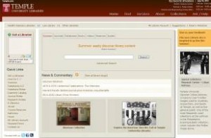
After many years of maintaining its current website, the Temple University Libraries is poised to move to an entirely new design for its website.On Thursday, July 12, 2012 the new website made its debut. We hope you find the new design refreshing – and that it makes your experience using our library resources much better. Please use the feedback link in the upper right corner of the homepage to tell us what you think of the site – what can we continue to improve?
For the past several months a preview of the website has been available to the campus community, and we have received encouraging positive feedback about the new look of the website, which is more streamlined, less cluttered with links and makes use of more visual content.

Temple Libraries New Website Design
The Libraries’ Summon search, which is a great starting point for research in almost any subject area, is the focal point of the new homepage design. A tabbed approach allows for easy navigation to other types of search modes and other sections of the website. We’ve added the daily hours right on the homepage, and an instant messaging tool allows for quick communication with library staff when help is needed.
Please know that some areas of the site are still being refined, and it is possible you will encounter a broken link or some other minor problem. If that happens, please contact us – using the feedback link on the homepage – to let us know of any problem. We hope to keep improving our website so that all of our community members will have the best possible experience using the Temple Libraries.

Honestly, the new website looks way better now. It is less cluttered with links and makes use of more visual content than ever before. Not only that, just like Kuknus it is mobile responsive too. The easy navigation to other types of search modes and other sections of the website make it worthy.