This past fall, librarians here at Temple worked with a professor in the Tyler School of Art and Architecture’s Graphic & Interactive Design (GAID) department to support students in an introductory graphic design course.
At the beginning of the semester, Professor Jenny Kowalski assigned students in GAD 2001 a project to design posters on the theme of information literacy, using the Libraries’ “Fake News,” Misinformation, and Disinformation Research Guide as a resource. Jill Luedke, art and architecture librarian, and Kristina De Voe, English and communication librarian, also visited the class virtually to discuss the role of information literacy in an era of mis- and disinformation as students were introduced to the project.
The students in this course created some really fantastic posters exploring this assigned theme. Below, we present a sampling of their works. You’ll also read—in the students’ own words—about their poster concepts as well as their processes, inspirations, and any challenges they encountered.
A project like this is a great example of instructor/librarian assignment collaborations that often take place throughout the academic year. It’s also an engaging way to help spark important conversations around mis- and disinformation, especially in our current context. The Libraries is planning to further highlight these images—via displays in the Charles Library and integration in learning materials—in order to help foster critical reflection and discussion.
Kristin Burnett 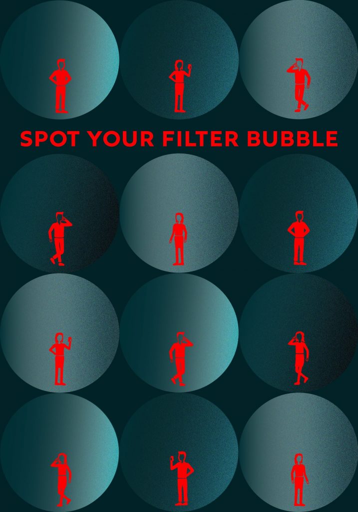
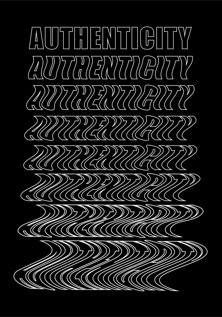
Concept: So far for each of my two poster designs, I have an individual concept. My first poster talks about being aware of our filter bubbles when it comes to accessing and internalizing our own information, and my second poster’s concept is more abstract by communicating the message that the authenticity/truth in the information we read can be skewed and manipulated, especially when passed along through many sources.
Process: When working on these posters, the beginning of my process was reading many articles on topics like misinformation and going through visual examples that explore ideas surrounding information literacy. My main inspiration included a variety of different elements like graphic styles, illustrations, and compositions, which were all collected in mood boards and ended up being very helpful tools when bringing my ideas into Illustrator. One problem I faced in the midst of this process was deciding which sketches/concepts I needed to choose; as I worked on one poster concept, I usually would have a new idea for another concept and later on needed to narrow them down objectively. The main solution to this problem was getting feedback from others.
Marcus Frye-Boyd 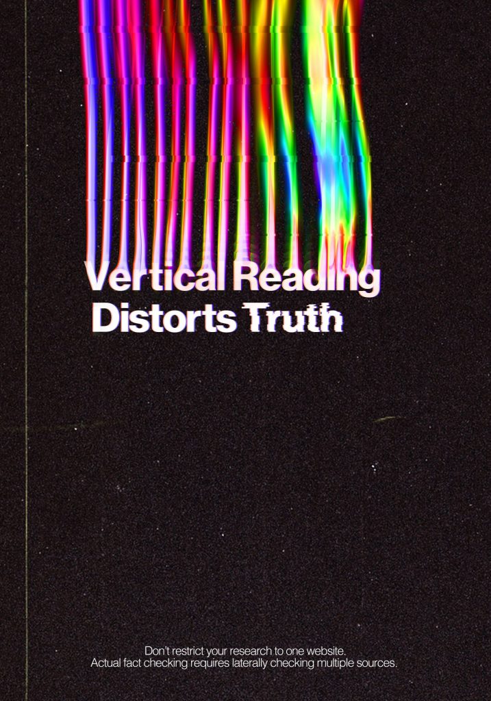
Concept: The concept of my poster stands behind informing others that when we use vertical reading/research techniques we limit and distort full truth. So I used photoshop digital distortion techniques to my text to show this visually. [Note from the Libraries: for more on vertical vs lateral reading, check out the News Literacy Project or watch this video.]
Process: So I had quite a few inspirations for my digital distortion and aesthetically I wanted to make a cooler version of those iconic the more you know posters but my biggest inspiration was by a designer named Mishko who uses the technique a lot. The liquify distortion technique is actually a little hard and slightly random in results so I had to commit early. My first technique looked a little corny and had spacing issues so ended having to start from scratch. Also maintaining different versions before and after using a tool is important because photoshop is very destructive. But the biggest challenge to overcome was the slowness it forced into my computer when using the recommended mixer brush. At one point I didn’t think I’d be able to execute at all and had no control of the marks I made on the color distortion. I found out though if I edit the spacing on the brush it would move faster. Then voila I was in business to continue what I set out to do.
Rachael Hollar 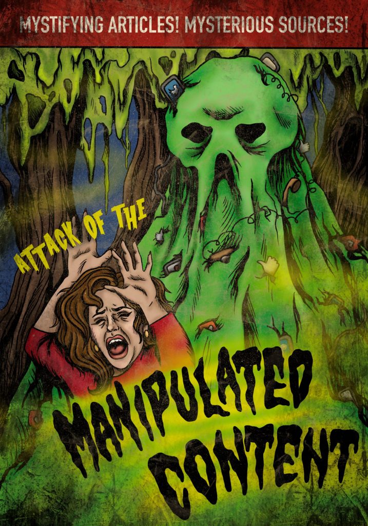
Concept: My poster is trying to approach the idea of information literacy and the problems with “fake news” and social media as a whole in how it spreads manipulated content. I am doing this by using a layout and style inspired by vintage horror movies.
Process: My inspiration is vintage horror movie posters, and I am using Procreate for the whole thing. I had some initial problems with layout and how I wanted to personify the “manipulated content monster,” but I solved those by getting feedback from my classmates.
Audrey Lee 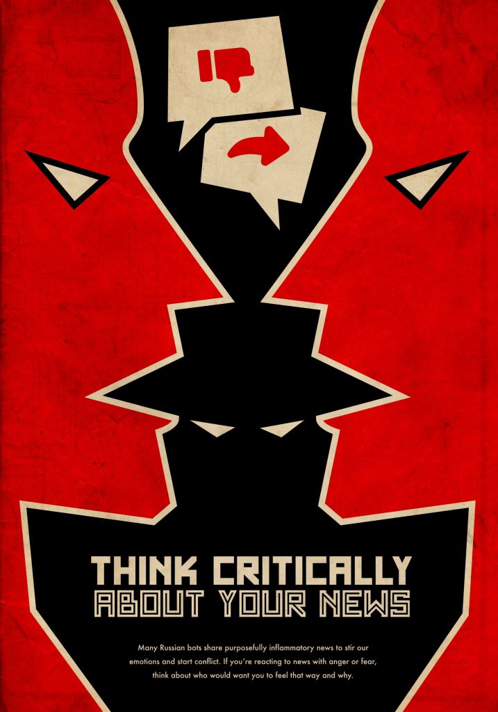 Concept: I wanted to create a poster that emphasized the fact that fake news is a national threat, and that other countries (particularly Russia) are using it to purposefully divide and weaken our country. The colors and negative space are meant to create a sense of alarm and urgency, while the font and texture emulate Russian activist art from the early 20th century.
Process: I took a lot of inspiration from editorial illustrators like Jon Krause and Aad Goudappel, who use simple shapes, negative space and visual metaphors to convey clear political messages. I also took some inspiration from comics like Spy vs. Spy, which use visual contrasts and reconnaissance themes. I started in pencil for the sketches and thumbnails, created the rough in Illustrator, and added texture in Photoshop. I had a few issues with the concept—the negative space wasn’t totally clear at first, nor was the message. After adding the bold colors and the references to Russian design, the poster became conceptually clearer.
And check out the rest of the students’ work for this class:


