1st place: “Chibok Girls”*
Raquel Wilkins
Klein College of Media and Communications, Art Direction
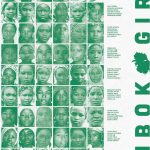
Description: In April 2014, members of Boko Haram, a terrorist group, kidnapped 276 schoolgirls from a secondary school in Chibok, Nigeria. The girls were abducted because their captors believed that women should not be in school. In response to this, my poster is formatted like a yearbook page with the compiled photographs and names of most Chibok girls. Emphasizing the idea that they and all Nigerian girls have a right to an education. The poster has a green and white color overlay to represent the Nigerian heritage of Chibok Girls. Costus Spectabilis, the national flower of Nigeria, is placed on the center right-hand side. This plant is said to depict the beauty of Nigeria and resilience of its people. The flower in this piece symbolizes the parents of all missing and found Chibok girls, who stay hopeful that one day their children will be reunited with them. Finally giving them the peace they’ve been seeking. It has been 7 years since the Chibok kidnapping and more than 100 girls are still missing. The blank portrait at the bottom left-hand corner is for the Chibok girls who have not been found or identified.

2nd place: “Pattern for Peace”*
Hannah Tarlov
Instagram: @htarlovart
Klein College of Media and Communications, Advertising/Art Direction
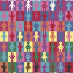
Description: Gender expression is the way an individual chooses to express themselves to the world around them, whether that is through their clothes, actions, mannerisms, etc. This pattern demonstrates all different types of people, whether or not the way they express their gender is in alignment with their identity or biological sex. A peaceful world is one where everyone receives equal space, respect, and freedom to present their gender however they wish to do so. As the viewer’s eye travels from the top of the pattern to the bottom, the symbols and colors become more expressive in efforts to stray away from our society’s stereotypical, heteronormative, and gender binary ideas. The very bottom row includes just some of the pride flags that represent different facets of the LGBTQIA+ community.
3rd place: Trash the Violence*
Andrew Flynn
Instagram: @flynnandrew24
Klein College, Art Direction
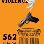
Description: For this contest, I chose to focus on justice for Philadelphia. As the city of brotherly love, it was heartbreaking to see that my community had a record high for homicides in one year. For my poster, I chose to draw inspiration from Emory Douglas, an art director for the Black Panther Newspaper. His work often combined illustration and photographs while only using one color, which I interpolated in this poster. I chose orange as my color because it represents gun violence prevention nationwide which isn’t the full problem, but it represents the bulk of it. An important part of my poster is the white space on the left side. I recognize that it seems awkward, but I feel it gives the readers eyes a break before reading this horrible statistic.
*Do not use, reproduce, alter, etc. without creator’s permission
