A straightforward theme with bold typography designed by Tran N. Featuring multiple post formats, custom background, custom menu, and custom header. Also comes with an optional footer widget area.
Archives: Themes
Themes that may be used when creating a site on Temple Sites.
Twentyseventeen
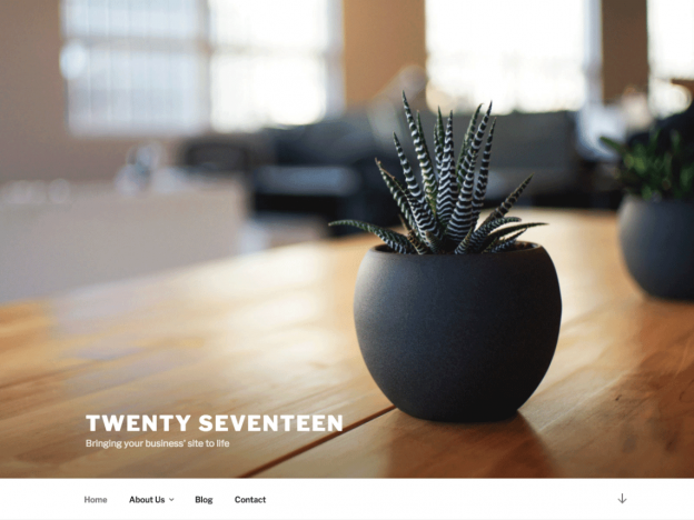
Twenty Seventeen brings your site to life with header video and immersive featured images. With a focus on business sites, it features multiple sections on the front page as well as widgets, navigation and social menus, a logo, and more. Personalize its asymmetrical grid with a custom color scheme and showcase your multimedia content with post formats. Our default theme for 2017 works great in many languages, for any abilities, and on any device.
Veganos
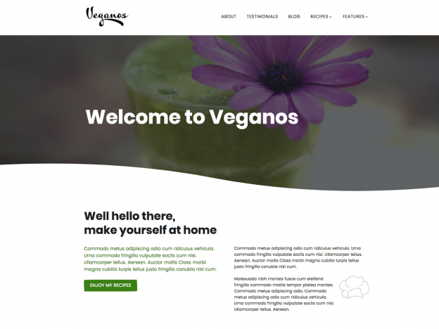
Veganos is a wonderfully designed, clean and responsive free WordPress theme built using the new Gutenberg editor. Veganos is perfect for creating food-related websites like recipe websites, blogs, magazines and more. It is built mobile first and is pleasure to view on devices of all sizes. It features modern, easy-to-read typography and minimalistic design.
Twenty Fifteen
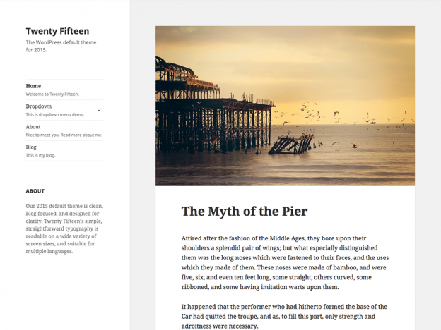
Our 2015 default theme is clean, blog-focused, and designed for clarity. Twenty Fifteen’s simple, straightforward typography is readable on a wide variety of screen sizes, and suitable for multiple languages. We designed it using a mobile-first approach, meaning your content takes center-stage, regardless of whether your visitors arrive by smartphone, tablet, laptop, or desktop computer.
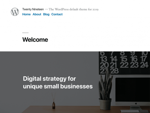
Twenty Fourteen
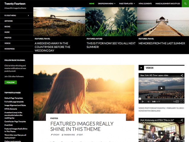
In 2014, our default theme lets you create a responsive magazine website with a sleek, modern design. Feature your favorite homepage content in either a grid or a slider. Use the three widget areas to customize your website, and change your content’s layout with a full-width page template and a contributor page to show off your authors. Creating a magazine website with WordPress has never been easier.
Twenty Thirteen
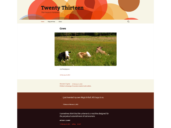
The 2013 theme for WordPress takes us back to the blog, featuring a full range of post formats, each displayed beautifully in their own unique way. Design details abound, starting with a gorgeous color scheme and matching header images, optional display fonts for beautiful typography, and a wide layout that looks great on large screens yet remains device-agnostic and is readable on any device.
Gallery
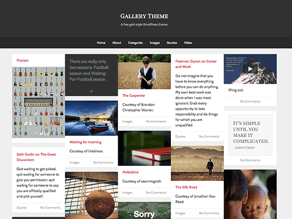
A grid-based theme with masonry layout, infinite scroll, and single column post layouts.