Last updated on May 27, 2026
Want to see air quality data for your neighborhood? Well, you can with PurpleAir’s website, which hosts a hyper-local, real-time air sensor map.
To start, navigate to purpleair.com, and click on “Explore the Map”.

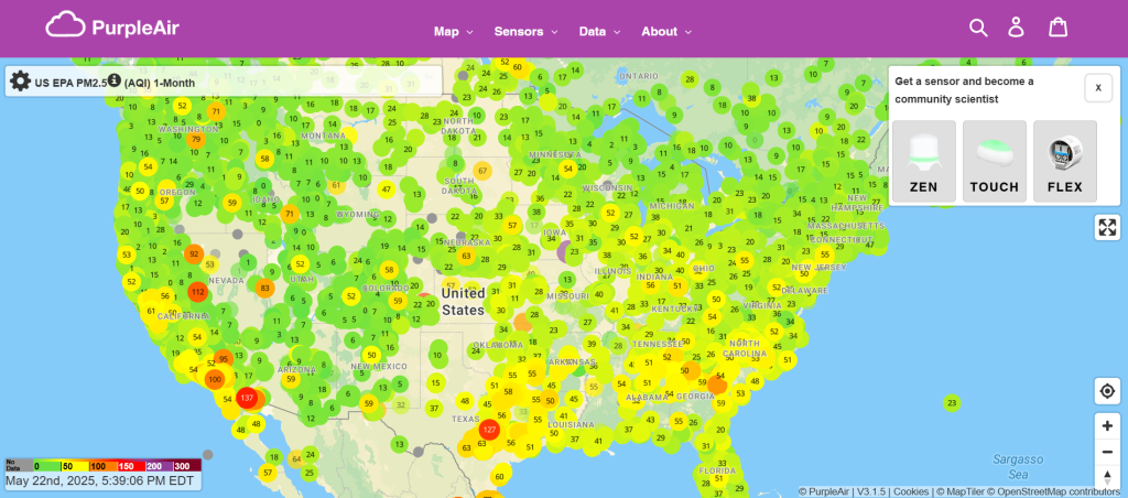
This map shows every active PurpleAir sensor in the world! Zoom to Philadelphia to see real-time AQI readings for each sensor in the city or explore air quality readings in other areas.
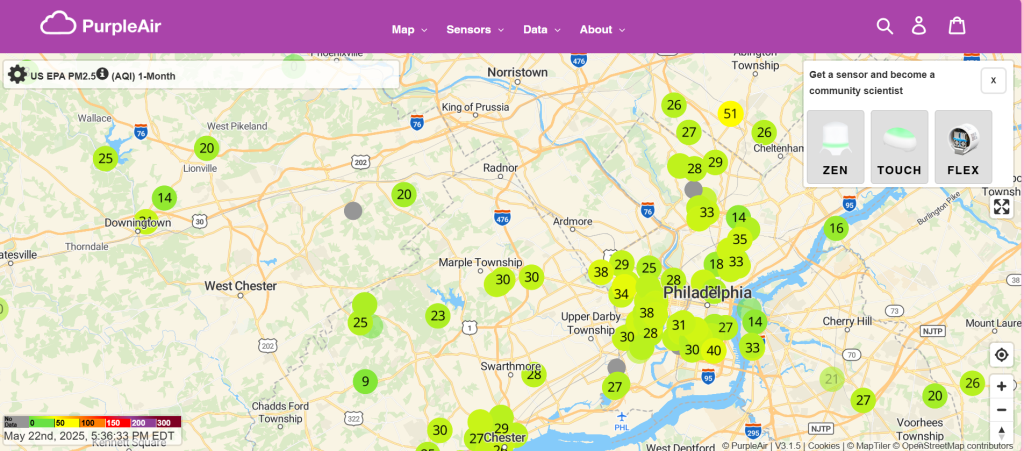
Keep in mind that there is a LOT of data being collected and as such the website may take up to a minute to load when you zoom out.
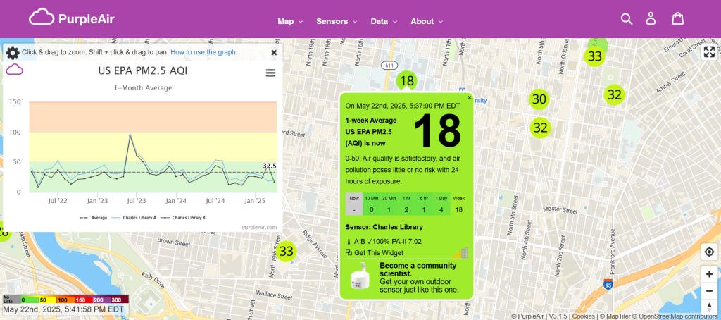
If you click on an individual sensor, a pop-up will emerge with the name of the sensor, the AQI, an interpretation of the AQI, and a confidence measure for the sensor.
Here we see that this sensor is at Charles Library on Temple’s main campus, the AQI average for the week is 18, which is in the healthy range, and the confidence level is 100%, meaning the AQI information is accurate (They are 100% confident the AQI is correct).
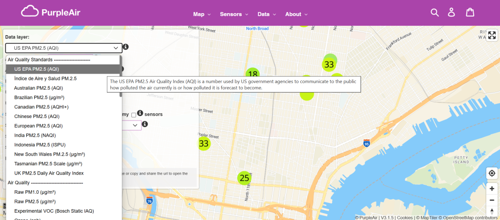
Additionally, you can change the type of data being represented in the map by going to the first drop down menu in the left-hand box. You can see the AQI, PM2.5 level, humidity, and temperature for each sensor. If you click on a data layer and your sensor shows up as gray, that typically means your sensor does not collect that data.
From this box on the left side, you can also change map settings, the averaging time period for the data, and hide indoor sensors.
Still have questions about how to use the map? Look through PurpleAir’s map guide, where they have detailed information about how to interpret the data and how to navigate the site.
If your area does not have any air sensors, consider getting one! They are relatively cheap and easy to set up. If you live within our study range, North/North Central Philadelphia, please think about joining our project. We would love to have you on board.
Be First to Comment