By Ping Feng
In last section, we just displayed some digital video visualization projects that highlight color and editing pattern display. In this section, I will introduce some visualization projects that focus on displaying the color hue patterns or brightness patterns for large set of digital images.
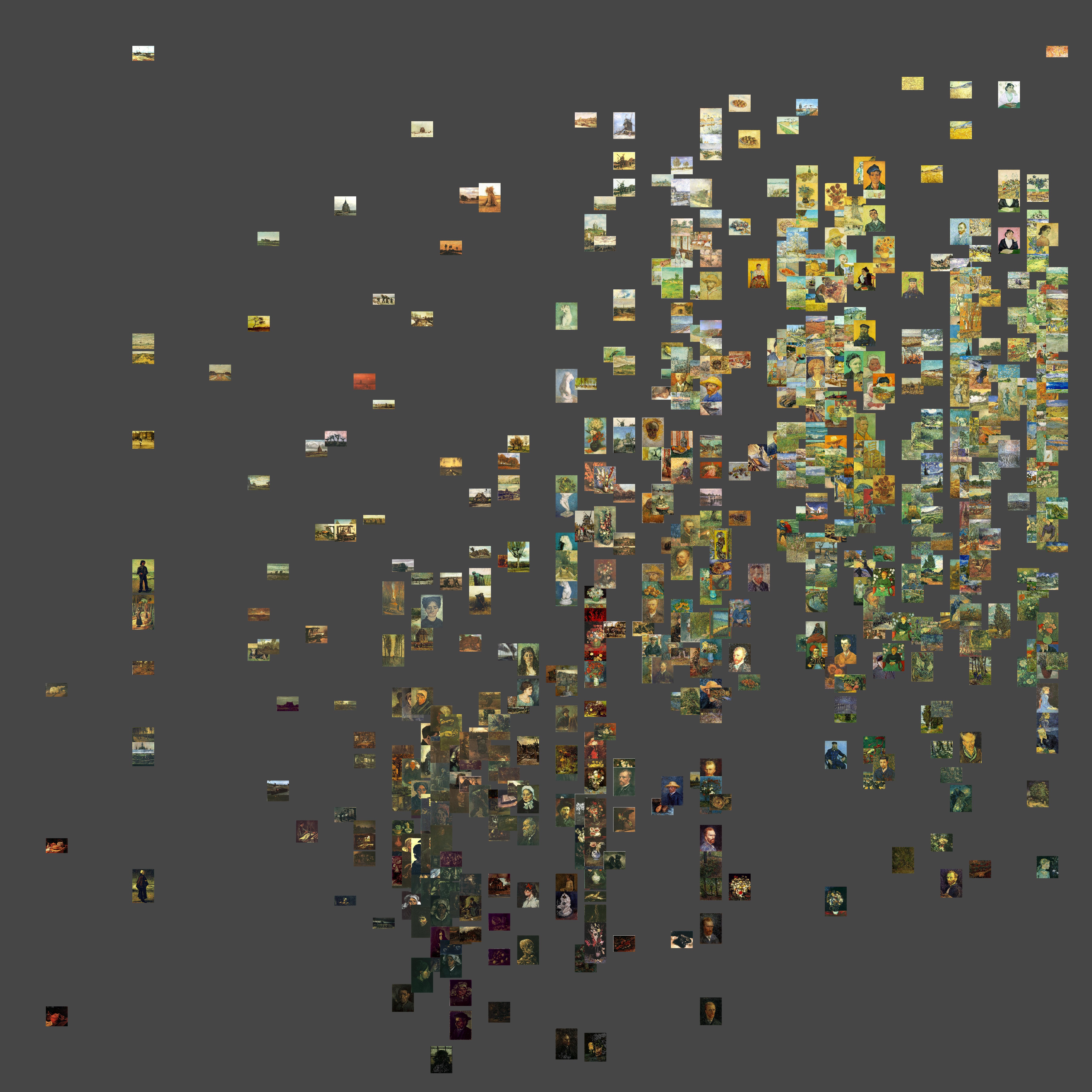
Softwarestudies.com has created a very useful tool- ImagePlot to help us visualize large set of digital images by inputing the metadata and original graphic images. The tool allows us to choose two dimensions of the image data to display, e.g. time longitude in x axis and brightness in y axis. Below is a sample display of a collection of Van Gogh’s paintings with the x axis showing the year and time information and y axis presenting the brightness information. We can easily observe the trend that when it comes to the later stage of his life, Van Gogh’s painting tends to be lighter. Thus, it allows us an easier way to observe the pattern of large sets of images, discover insights and tell the story behind it by visualizing art history so that humanistic analysis can be undertaken at a broader scale.
Netflix has utilized color analysis in digital video/ image materials for consumer insight and business intelligence:

Figure1: Cover of House of Cards Versus Cover of Macbeth (2010 version)
![]()
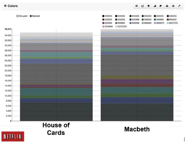
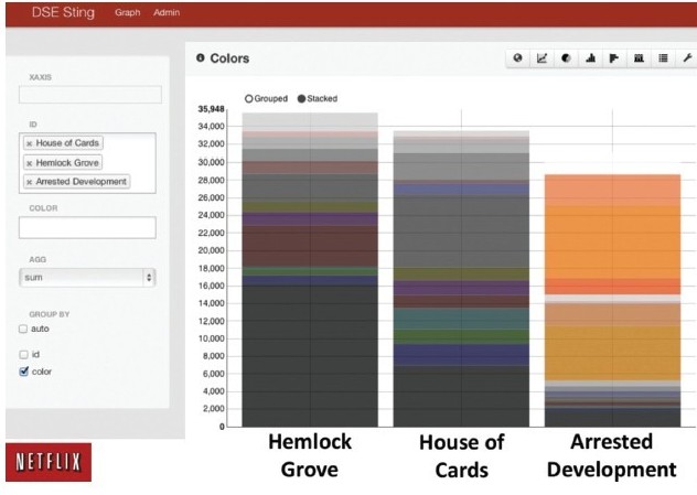
Figure2: Detailed Color Comparison of House of Cards and Macbeth
Figure3: Detailed Color Comparison of hemlock Grove, House of Cards, and Arrested Development
Source: Netflix Technology Blog (techblog, netflix.com), Big Data Lessons From Netflix(Wired)
As we can see in figure1 that the covers of House of Card and Macbeth are quite similar to each other at the first glance: both displays older white men with blood on their hands agains primarily black or grey backgrounds. And this can be further confirmed by looking at figure2 which illustrates the detailed color break down. The comparison demonstrates that the covers of the two shows are quite similar, though differences do exist. By the same token, figure3 demonstrates the contrast of color distribution of the covers among three different shows. Below video also shows a surprisingly color hue consistency among various shot in House of Cards:
Then what’s the value for Netflix to invest efforts in doing so? Why is it necessary to quantify and compare those detailed color differences? The potential value will be tremendous if we take one step further to look at it. First, it will be easier for Netflix to see if this will have discernible impact on subscriber viewing habits, recommendations, ratings, and the like and therefore acquire informed decision-making in business. In addition, as one Netflix leader has confessed at a Hadoop summit, analyzing colors will allow company to measure the distance between customers and develop a database and algorithm to determine the average color of tiles for each customer in a 216-degree vector over the last N days, which will further inform them in precise-targeting.